

Calligraphy Magazines in the UK
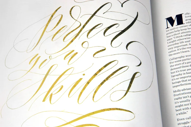
I am always on the search for calligraphy magazines in the UK, so please do let me know in the comments if you hear of any.
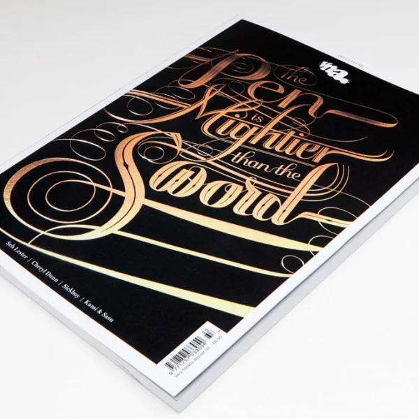
VNA Magazine
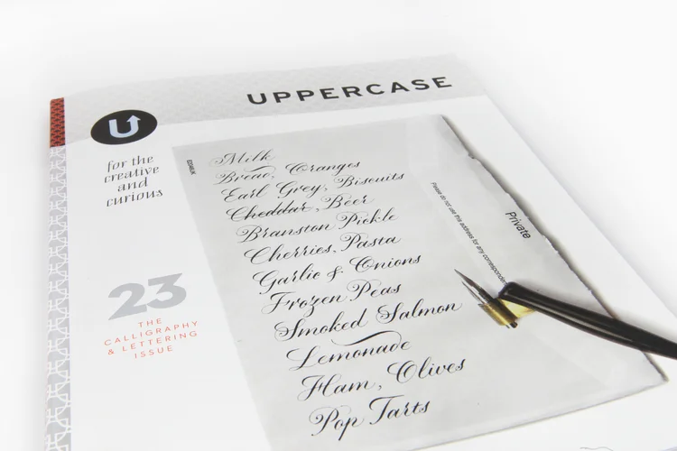
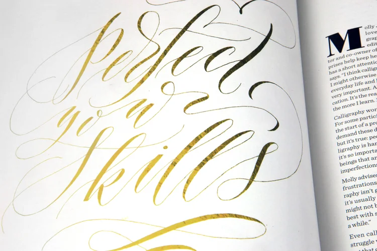
U P P E R C A S E magazine
U P P E R C A S E magazine Issue 23 (Oct 2014) – $18 – boasted a special feature on calligraphy lettering. Unfortunately, I believe that the back issue has sold out, but you can check for availability online here.
Dasherie Magazine
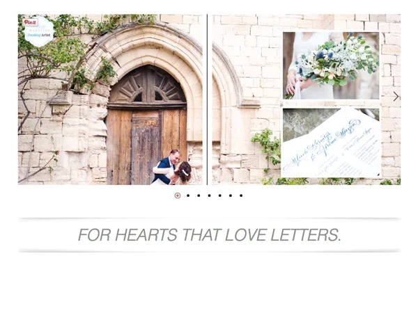
Dasherie Magazine is the beautiful brain child of the person who brought us The Flourish Forum: Erica McPhee, from Paperwhite Studio. It's pitched as the world's only magazine dedicated purely to the art of modern calligraphy, lettering and design. You can order this calligraphy magazine from the US now ($18 + £10pp).

Giveaway: The ABC of Custom Lettering
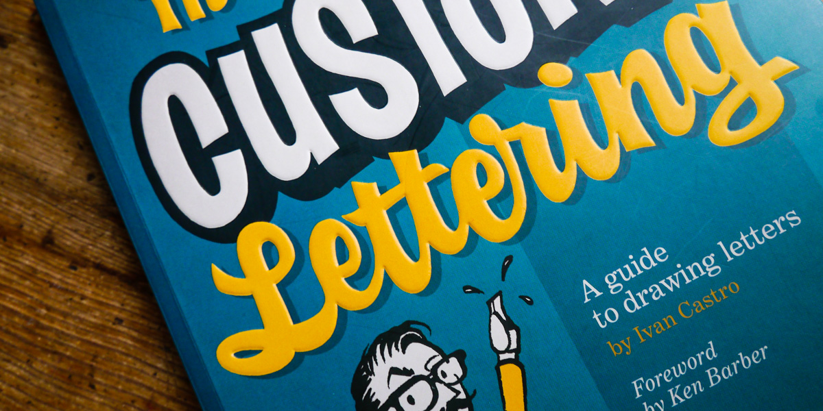
A great place to start learning calligraphy
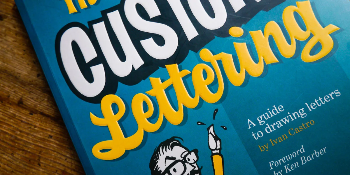
I don’t want to seem hyperbolic, but The ABC of Custom Lettering by Ivan Castro has changed my life; creatively, at least. For years, I have lamented my inability to progressively learn more scripts — the ones that make a great calligraphic foundation such as Roman Capitals, Italic, and, of course, Foundational hands. I don’t mean my inability to learn in the technical sense; I can definitely learn new things. I mean my inability to know where to start. To pick a script and go. To wade through the technicalities of pen angles and x-heights. To do it on my own at home as a full-time mum and working calligrapher.
A word from the author, Ivan Castro
I quickly realised how great this book was for me and thought I’d say thanks to the author, Ivan Castro, via email.
Me to Ivan:
I'm currently working through your latest book, The ABC of Custom Lettering, and wanted to send a personal word of thanks. In the three years since I started learning calligraphy (Copperplate script), it's the first time I haven't felt overwhelmed by all of the various hands that I should be learning as a great foundation. So, thank you.
Ivan to me:
You make a point in not being overwhelmed by a lot of information and different hands. After a few years of teaching calligraphy, I know that what a beginner needs is not one hundred models, just mastering three or four basic scripts. All the rest will be variations of that. So, thanks for getting the point and I hope it really helps you through the way of the pen.
Since 2014, I’ve focused my attention on Copperplate (English Roundhand), consequently using it as a jump-off point to its rule-breaking counterpart, modern calligraphy.
Use the ABC of Custom Lettering to better your calligraphy skills
The book is broken into two key sections —
Calligraphy: The written Word
The first section walks you through building a foundation of calligraphic skills, featuring five main models:
- Carolingian Miniscule
- Roman Capitals
- Italic
- Brush Script
- Blackletter
- Numerals
Lettering: Drawing Letters
The second section uses the calligraphic foundations you build in the first section to draw letters and create your own style and design. Example projects using Gothic Letter, Slab Serif and Script include a title for a musical movie, a logotype for a BBQ restaurant and a logo for a burlesque dancer.
I’ll be focusing on the first section of calligraphy in this blog post, with my primary interest in familiarising myself with a broader range of alphabets to see what suits me and where I might apply them in my working life. I’ve set a goal of working through a different calligraphic model each month, and posting my progress here.
Take a look at Korero Press's walk through of the book
The ABC of Custom Lettering Giveaway
As part of this blog feature, Ivan’s publisher has kindly offered some books to giveaway — an excellent opportunity for others to learn calligraphy and hand lettering, too. To enter, submit your entries via the widget below. It will require you to sign in and then check off each step that you take to enter (e.g. if you tweet something, you need to indicate that you’ve done it in the widget — it’s not automatically detected).
a Rafflecopter giveawayThe giveaway is open to anyone worldwide, so please do share with friends and family who you think would benefit from this book.
Learning Carolingian (pronounced Caro-lin-jian)
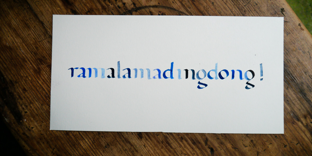
Materials I used for practice
Ink: Parker blue ink (for my near-daily letterform practice).
Paper: Goldline layout paper (links to Penman Direct), a very smooth 50gsm paper that you can see through but doesn’t bleed. It allows you to see your guidelines easily underneath the really churn through your practice.
Nibs: Manuscript Tape (3mm) bought many years ago in a student calligraphy set (links to Amazon.co.uk). I wouldn’t necessarily recommend these nibs, but they did serve me just fine to begin.
Holder: When I have to use a straight holder, my go to is this cork-tipped one (links to Amazon.co.uk).
How the ABC of Custom Lettering helped me prosper
I was surprised, but pleasantly, that the first script to try my hand at was Carolingian. I was expecting to be launched in with the big guns such as Roman or Italic. Having heard only the slightest mention in my travels (via Joan Quiros and Amanda Adams) of Carolingian, I have to admit I felt that the pressure was off. I had no preconceived idea of what my alphabet should look like, so very much focused in on Ivan’s direction without the constraints of expectation. Suddenly I had grasped a broad-edge nib alphabet without much fuss at all.
My struggles with Carolingian script
One of my main challenges with this hand was having no concept of overall proportions for the script. This is no fault of the book’s. When writing in Carolingian, my words would always end up much longer than I anticipated and completely misaligned. I’ve spent years learning the ways of the much finer pointed pen, so, of course, my brain tries to overlay that information. This is purely something only time and practice can fix.
The other issue I had was trying to get my head around scale. Maths has never been my strong point, and the pointed pen doesn’t require adjusting for nib width, so, unfortunately, Ivan’s explanation of drawing up my guidelines and applying it to different sized nibs and scale didn’t correlate with how my brain works. I wanted to recreate the variations of scale Ivan had outlined, but I struggled to adjust my scale for playing around with varying x-heights. I chatted to a calligrapher friend who is familiar with this script and she told me that, as varying the scale of the script created a more modern effect anyway, I could play around with working out what ascender and descender heights worked for me.
Carolingian calligraphy after a month of practice
After my month of focusing on Carolingian (and this probably actually amounted to about two weeks of daily 30-min practise, really), I’m really happy with how I’ve progressed and confident about using this script when it’s called for. I’m looking forward to mixing majuscules with it to see what works best. Stay tuned as I progress through the scripts in coming months.
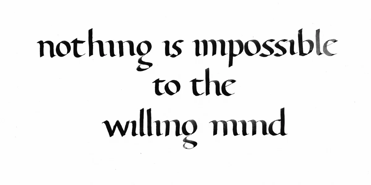
Some examples of Carolingian in practice
I have been writing birthday cards to friends this year, and decided to use Carolingian combined with Copperplate or Spencerian scripts to highlight recipients' names.
A post shared by Kate Watson 🇬🇧 (@oliveandreid) on Jan 17, 2017 at 2:50pm PST
A post shared by Kate Watson 🇬🇧 (@oliveandreid) on Feb 9, 2017 at 4:34am PST

Giveaway — The Joy of Lettering: Negative letters
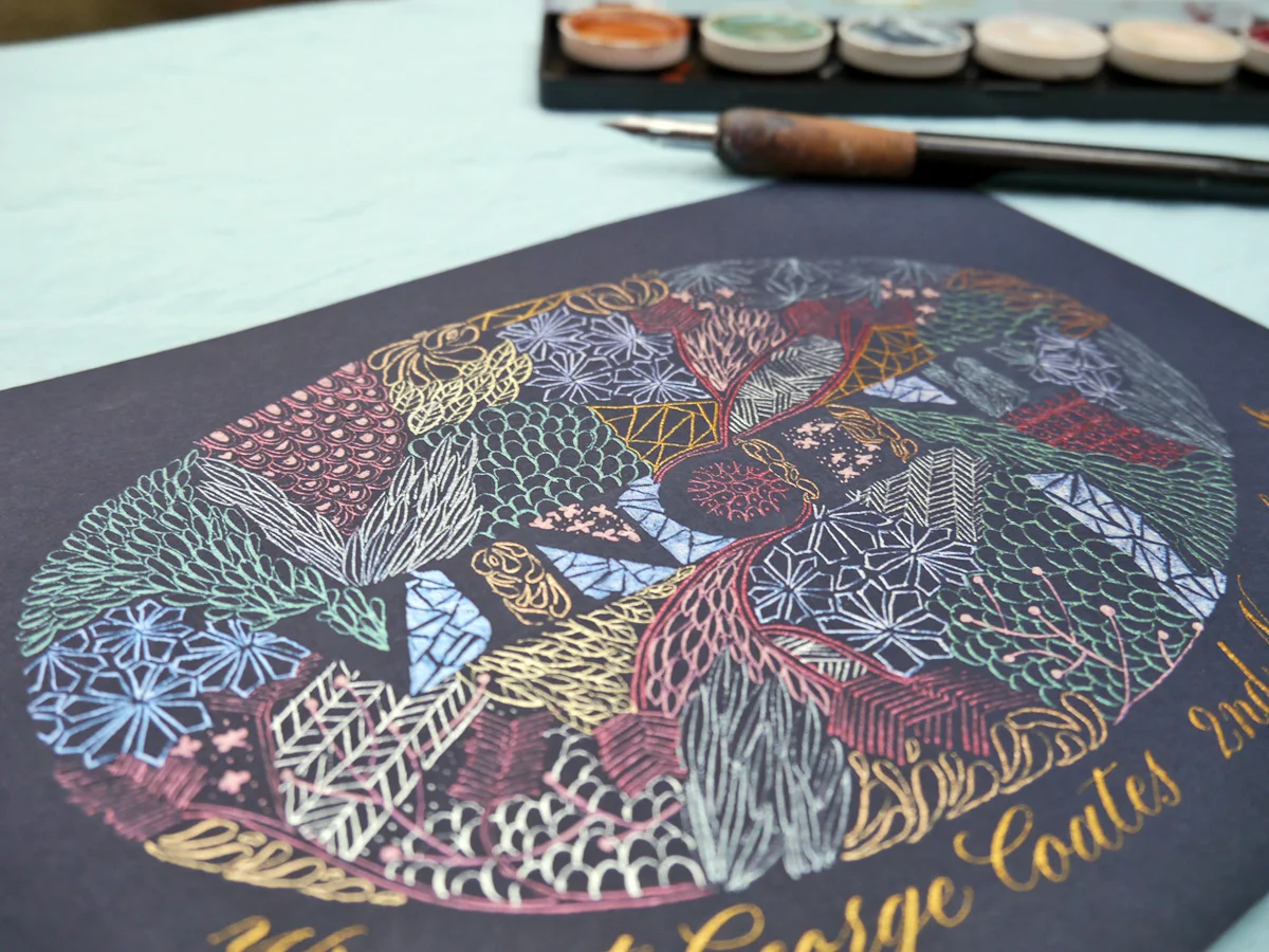
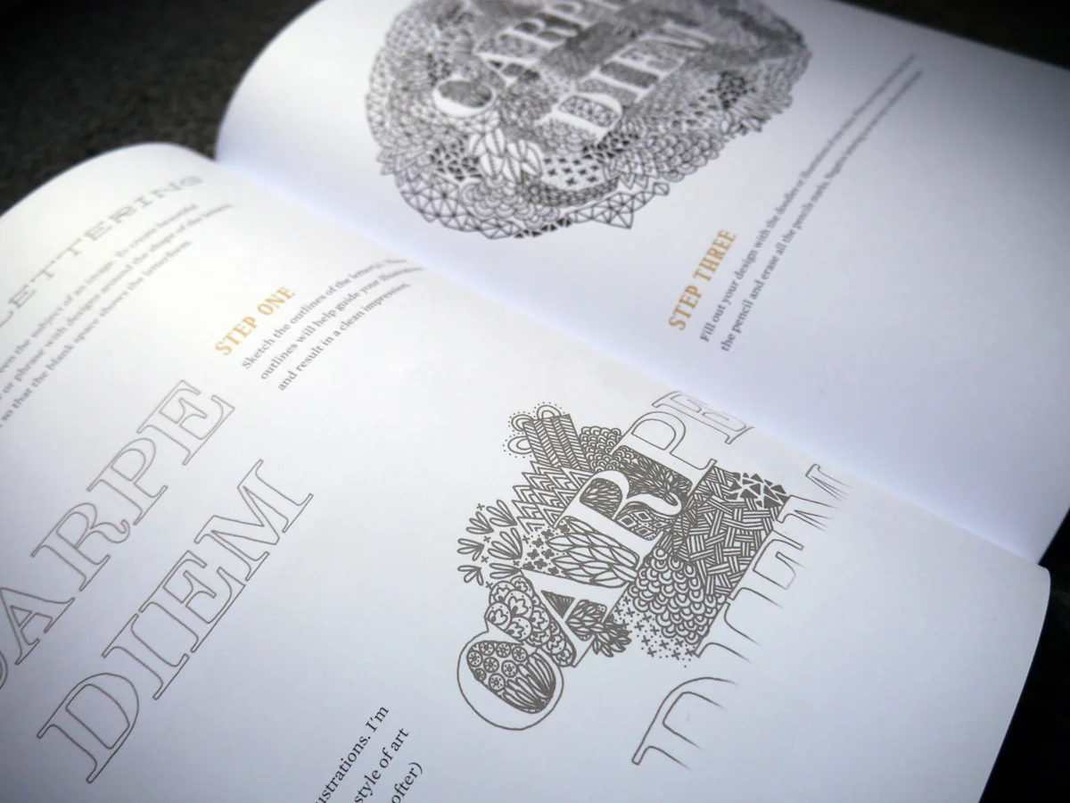
With thanks to Quarto publishing, you have the chance to win The Joy of Lettering: A creative exploration of contemporary hand lettering, typography & illustrated typeface, Gabri Joy Kirkendall and Jaclyn Escalera's new lettering book. Find out how to enter at the end of this blog post. As part of my upcoming overall review for The Joy of Lettering, I've selected three projects to dedicate time to and see what transpires. In addition to giving you a walk through of my process, I'll be rating each project difficulty (easy/medium/hard), duration and accuracy to step plan.
Negative lettering
Duration - (I took approx 2 hours excluding practice)
Difficulty - (medium)
True to step plan — Yes. I added a couple of extra steps of my own, but you could definitely follow as instructed.
sml-negletters1
1. Planning your negative space and doodling
I haven't done any doodling/zentangling for a really long time, so I gave myself an extra step of roughly sketching out and getting in the zone. When I searched for zentangling ideas, I learned (from WikiHow, no less), that this art form is as much about the journey as it is the outcome. It is a meditative process, and definitely one that is going to take time. But hopefully the time you take is mentally restorative. So...worth it. I also learned that a zentangle shouldn't really be planned, but should evolve (which is why the rough draft isn't finished... I just wanted to get to a point of confidence before putting pen to paper).
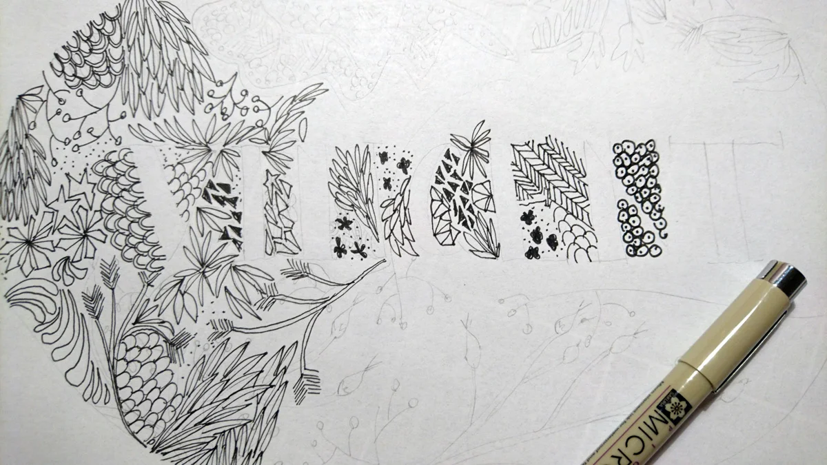
sml-neglettersa
2. Preparing your paper and letters
I knew immediately when I saw this project in The Joy of Lettering that I wanted it to be for a newborn baby boy, and that I wanted it on navy card stock. This added an element of difficulty for me because I couldn't just whip out my black ink pens and doodle away on some white paper. I was going to have to use white or metallic ink so that the zentangle would show. I decided I would use Finetec's metallic watercolour paints and apply them with a Nikko G calligraphy nib (in a straight holder).
Even choosing an A5 piece of card, I knew the doodling could take a while, so I took a shortcut with my letters and simply printed out the word in a font I liked at a size that fit.
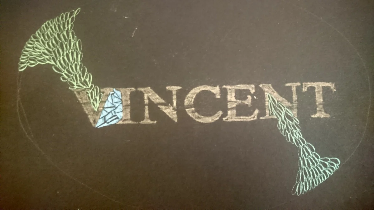
I applied chalk to the back of the paper, then lay that on my card and traced over the letters with a soft (2B) bluntish mechanical pencil (Faber Castell TK9400). I then drew a very (regrettably) rough oval shape around the lettering in soapstone to contain the doodles.
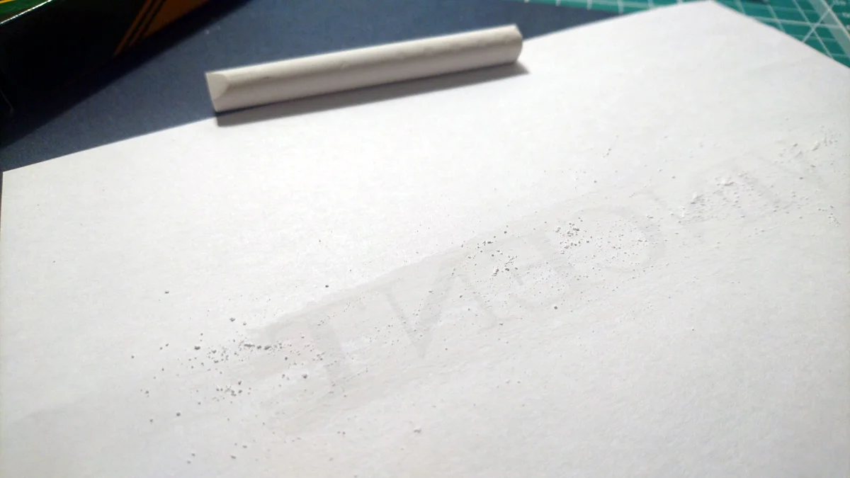
Chalk applied to the back of paper in order to trace lettering onto dark card stock
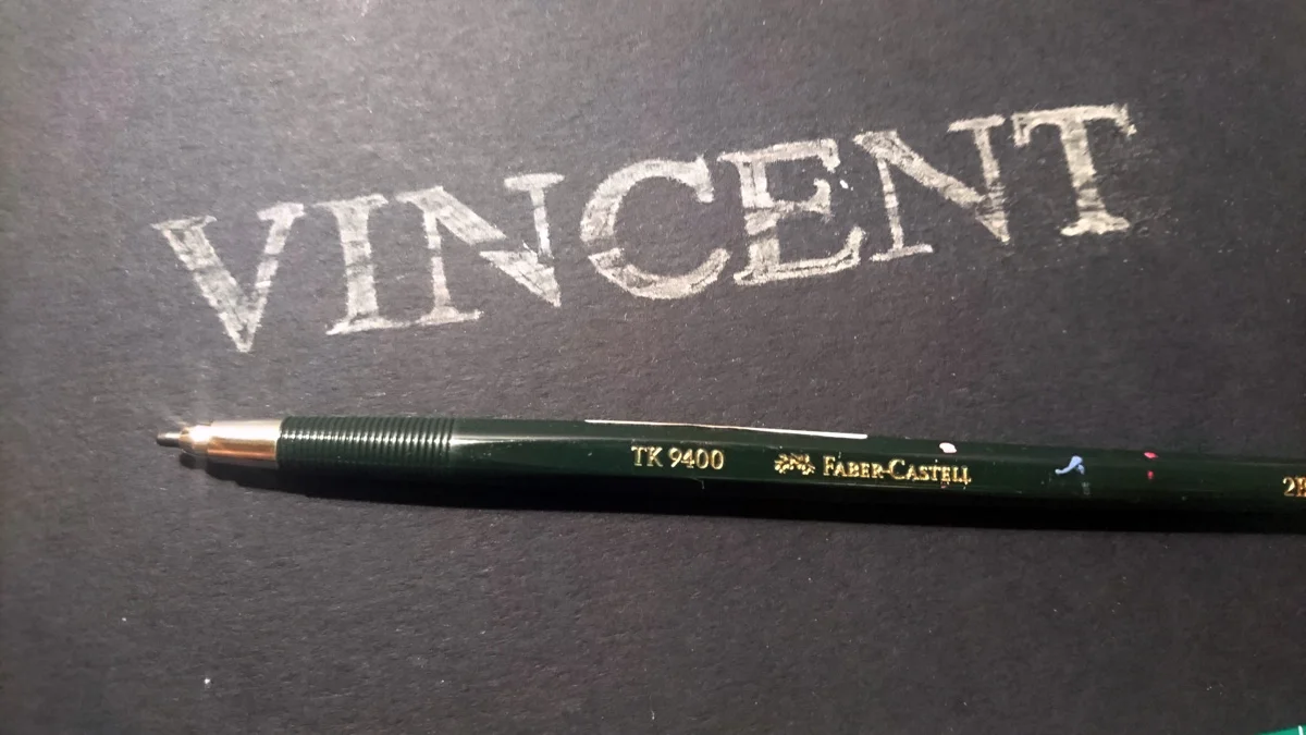
sml-neglettersc
3. Doodling around your negative letters
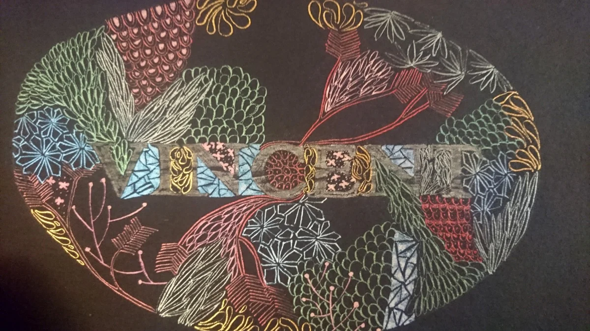
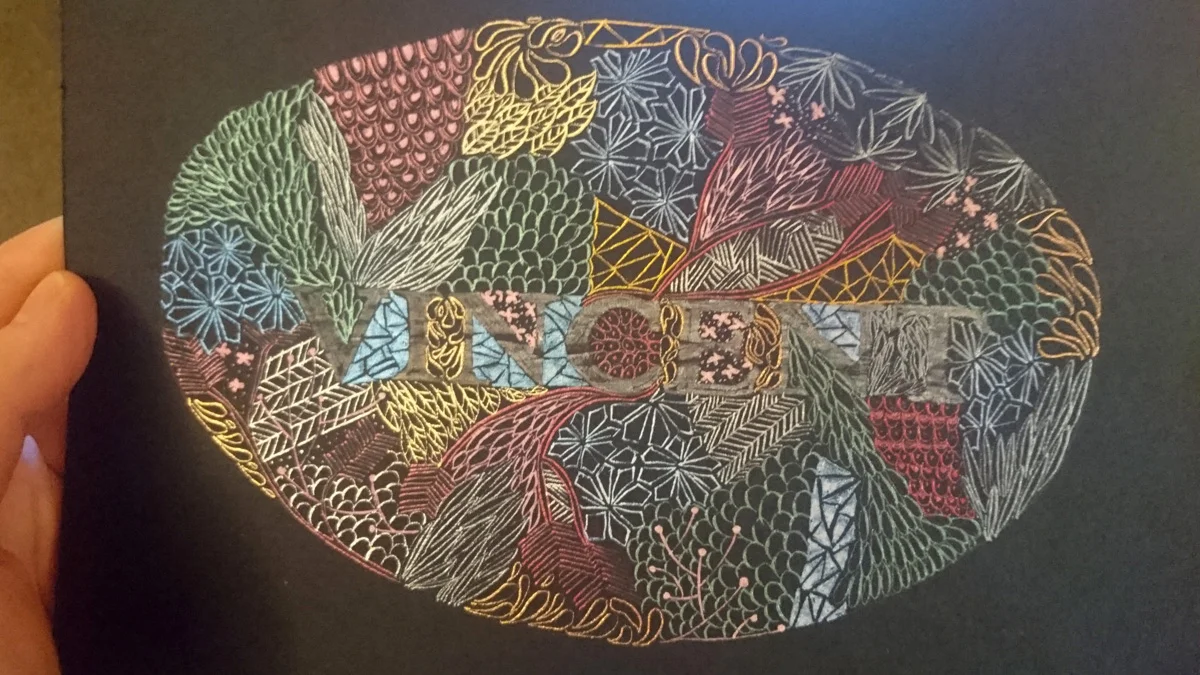
I won't lie, I was a little daunted about how I was going to fill all of this space and have it look good. So I broke it down into manageable pieces with the help of my Finetec palette of colours. Each colour could represent one or two doodle styles, so I could just work through each colour block and build it up that way. It really allowed me to stop thinking too much about things and just be serious about my meditative lettering.
sml-neglettersd
sml-negletterse
sml-neglettersf
4. Finishing up
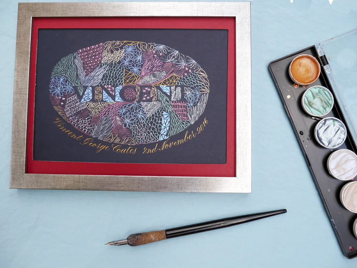
The final thing for me to do was to clean away the chalk (with a soft tissue or cloth) so that my negative letters took pride of place, and to add the little one's birth details in gold copperplate calligraphy beneath. You could easily add a frame (I bought one from Fielders, Wimbledon, courtesy of the Ready Made Picture Frame Company, and cut my own mount to fit the A5 card stock from their offcuts).
sml-negletters2
Enter the Joy of Lettering giveaway
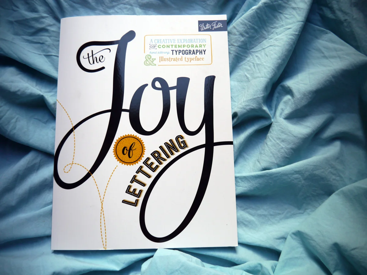
sml-joyofletteringbook
I'm really pleased to be able to offer this book as a prize to my readers. I think it's an invaluable source of inspiration for your collection, set out in a really accessible way for beginners and professionals alike. Unfortunately, I can only offer the prize to those based in the UK, but I promise I'll be doing more international giveaways in the future so stay tuned!
To enter, submit your entries via the widget below. It will require you to sign in and then check off each step that you take to enter (e.g. if you tweet something, you need to indicate that you've done it in the widget — it's not automatically detected).

Learn Modern Calligraphy — British Style
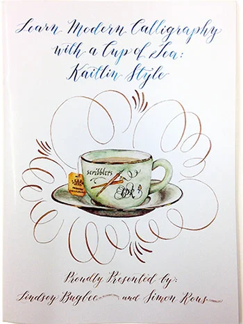
Highly regarded calligraphy supplier, Scribblers, has teamed up with Lindsey Bugbee at The Postman's Knock to create a guide to Modern Calligraphy for Brits.
Learn Modern Calligraphy with a Cup of Tea
Based on Lindsey's original downloadable Kaitlyn style, the team at Scribblers has created a special printed edition for the UK (replete with a complimentary tea bag... because, as Brits well know, tea makes everything better).
Scribblers A4 printed handbook (£9.75) boasts 32 pages of:
- Kaitlin Style Alphabet
- Letter and number formation practice sheets
- Stroke and word practice
- Letter formation practice with a dip pen
- Stroke dips
- Letter connections
- Common calligraphy problems and their solutions.
This edition also includes a complimentary 4-page pull-out practice guideline sheets.
So, make haste! Over to Scribblers to buy your copy of Learn Modern Calligraphy with a Cup of Tea.

A Simple Copperplate Manual
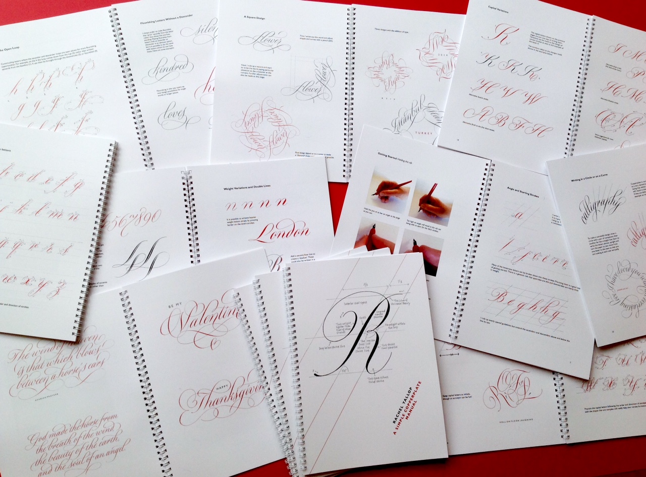
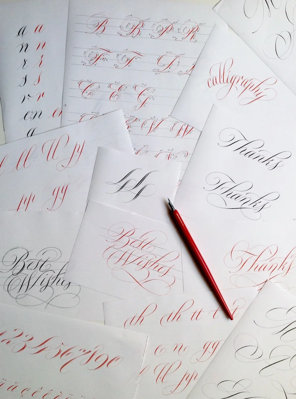
In 2016, British calligrapher and lettering designer, Rachel Yallop, released a back-to-basics Copperplate calligraphy manual that promptly sold out. It's now in its first reprint, so get in touch with Rachel via her website or Facebook page. if you're interested in ordering a copy (or see ordering details below). Adapting her workshop handouts, Rachel has created a "collection of examples to help and inspire", rather than a weighty 'how-to' manual. But don't be fooled by her humble description. This is still a great guide for anyone learning Copperplate calligraphy script.
This comprehensive manual covers:
- minuscule (small letter) construction, joining, spacing and double letters
- common problems you might face
- majuscule (capital letter) construction and variations
- numerals and punctuation
- weight variations and double lines
- the open loop and flourishing
- writing in a circle, on a curve, or in a square
- white on black
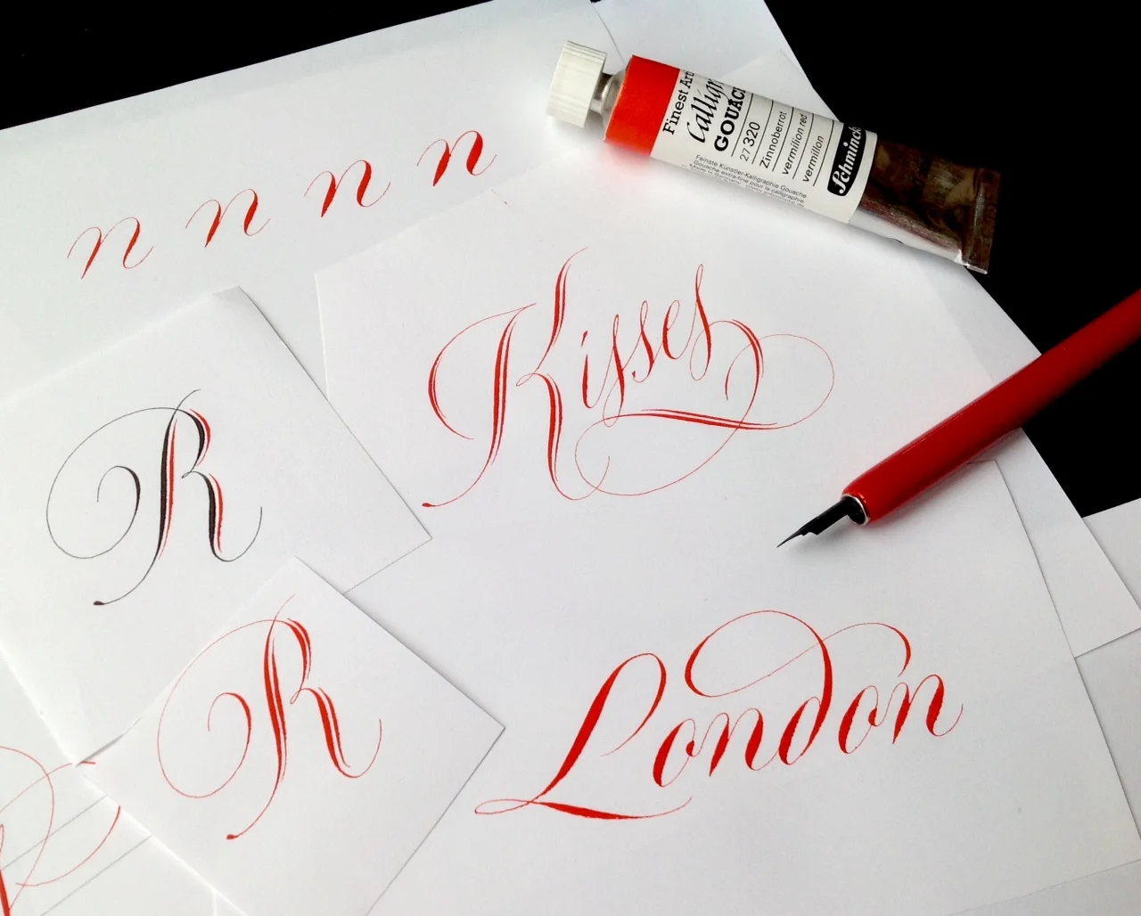
Features of Rachel's Copperplate manual
- 50 A4-size pages, printed on 150 gsm silk coated paper with 300 gsm covers.
- Wire bound so that it will open flat on your table or drawing board.
- 35 instructional pages covering lowercase letters and capitals, joining and spacing, numerals, weight variations, flourishing and design ideas.
- 15 pages of gallery pieces.
I've been poring over A Simple Copperplate Manual since I bought my copy late last year, and I love the simple styling — black and red font throughout, and how accessible Rachel makes the script. It's a little different from what I'm used to as Rachel's style avoids the 'square tops and bottoms' I've learnt, but I love seeing variations of script to keep things interesting! Her manual has given me courage to try a little flourish!
Buy your copy of A Simple Copperplate Manual
If you are interested in buying a copy, prices including shipping, are as follows:
- UK: £18
- USA: $38
- Europe: €31
- Australia: AUD$53.
You can pay Rachel by her PayPal web page. You can find out more about Rachel or get in touch with any questions via her website or Facebook page.


Nib & Ink — A modern calligraphy book
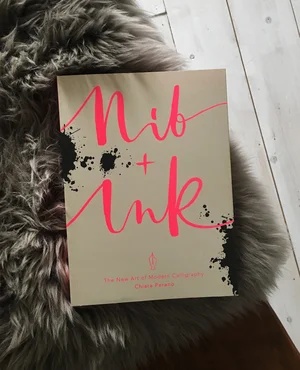


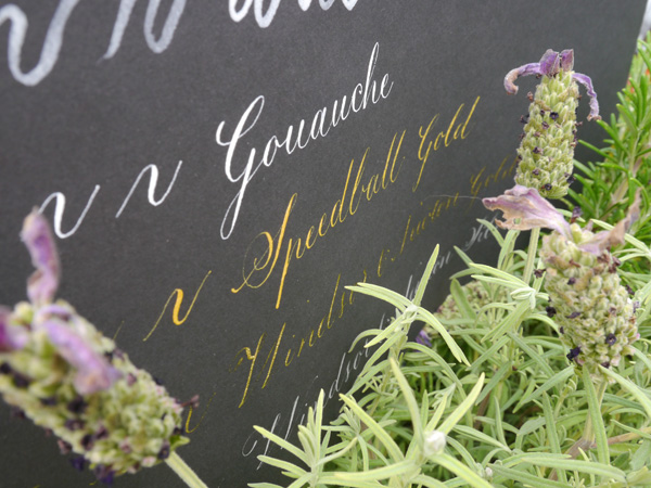
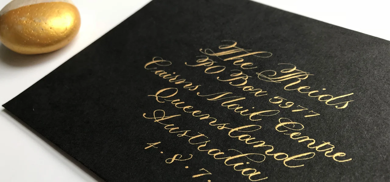
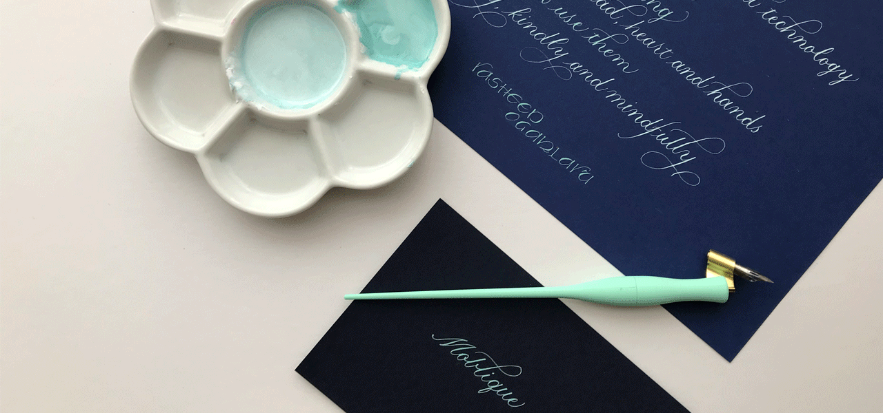
I always love finding out about modern calligraphy books to add to my growing collection of calligraphy reference material. I saw on Lamplighter London's Instagram account that Chiara is publishing a new handbook: Nib & Ink: The New Art of Modern Calligraphy.
I love Chiara's way with romance and whimsy when creating her personal style of calligraphy, so this modern calligraphy book is definitely one I've pre-ordered via Amazon.co.uk. I'll get a review posted for the summer. Who's with me?
A photo posted by Lamplighter • Creative • Type (@lamplighterlondon) on Jan 19, 2016 at 10:50am PST