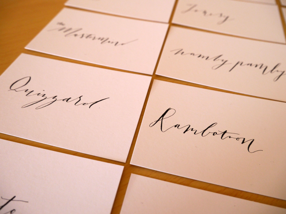
Mellissa and John's Wedding Place Cards
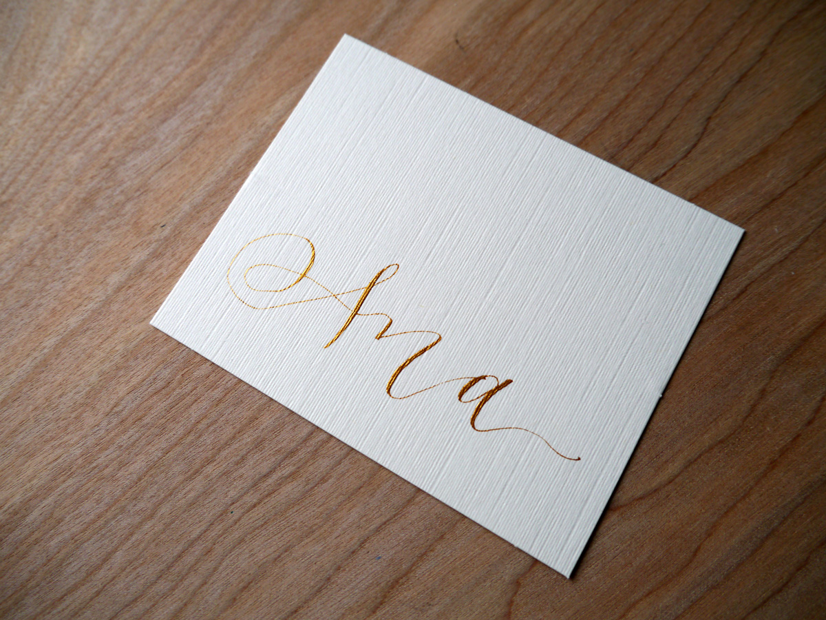
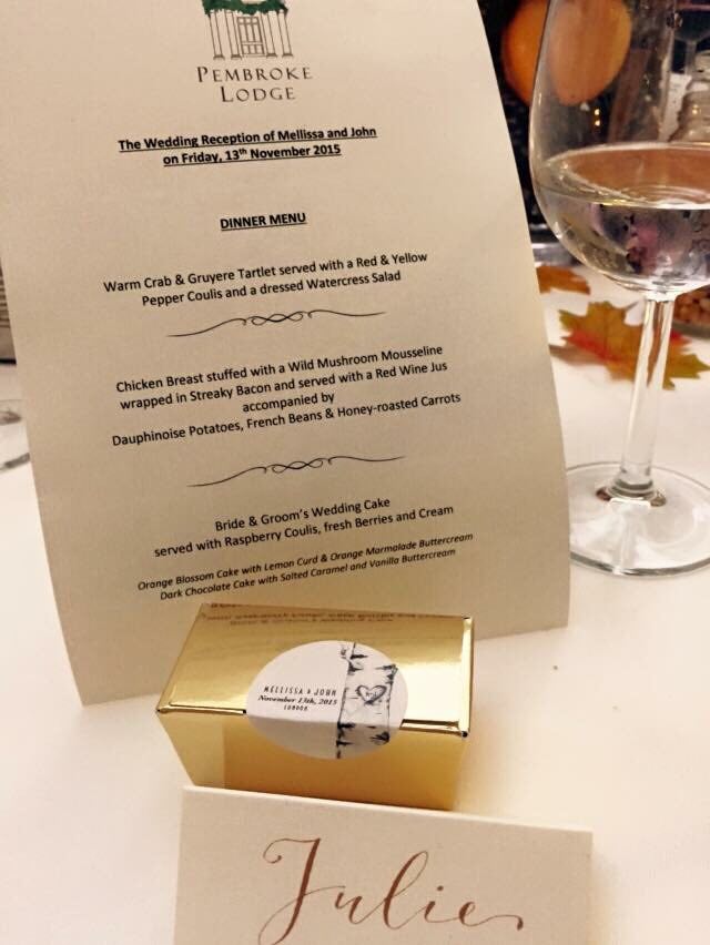 Quite by wonderful coincidence, I met with Mellissa, owner of Hercules Cakehouse. I mentioned my calligraphy work to her, should she need a little something to go along with her delicious favours, and she later got in touch with me to help out with her wedding place cards.
With a simple, yet classy brief of gold ink on ivory to suit the autumnal wedding, Mellissa was wonderful to work with. I gave her two script style options, traditional(ish) copperplate, or a more modern take on it. We went with the latter.
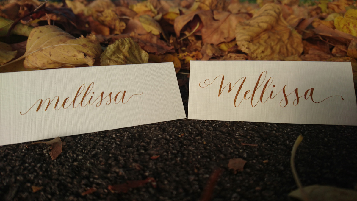
Mellissa provided the linen ivory place cards (Amazon, £6/100), and, while it's always risky working with card stock you've never tried out, her selection was perfect. It also helps that the Finetec metallic watercolour selection I used are so much more forgiving that ink.


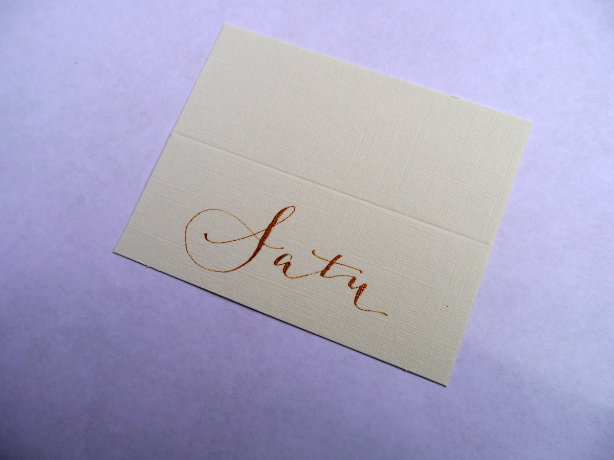
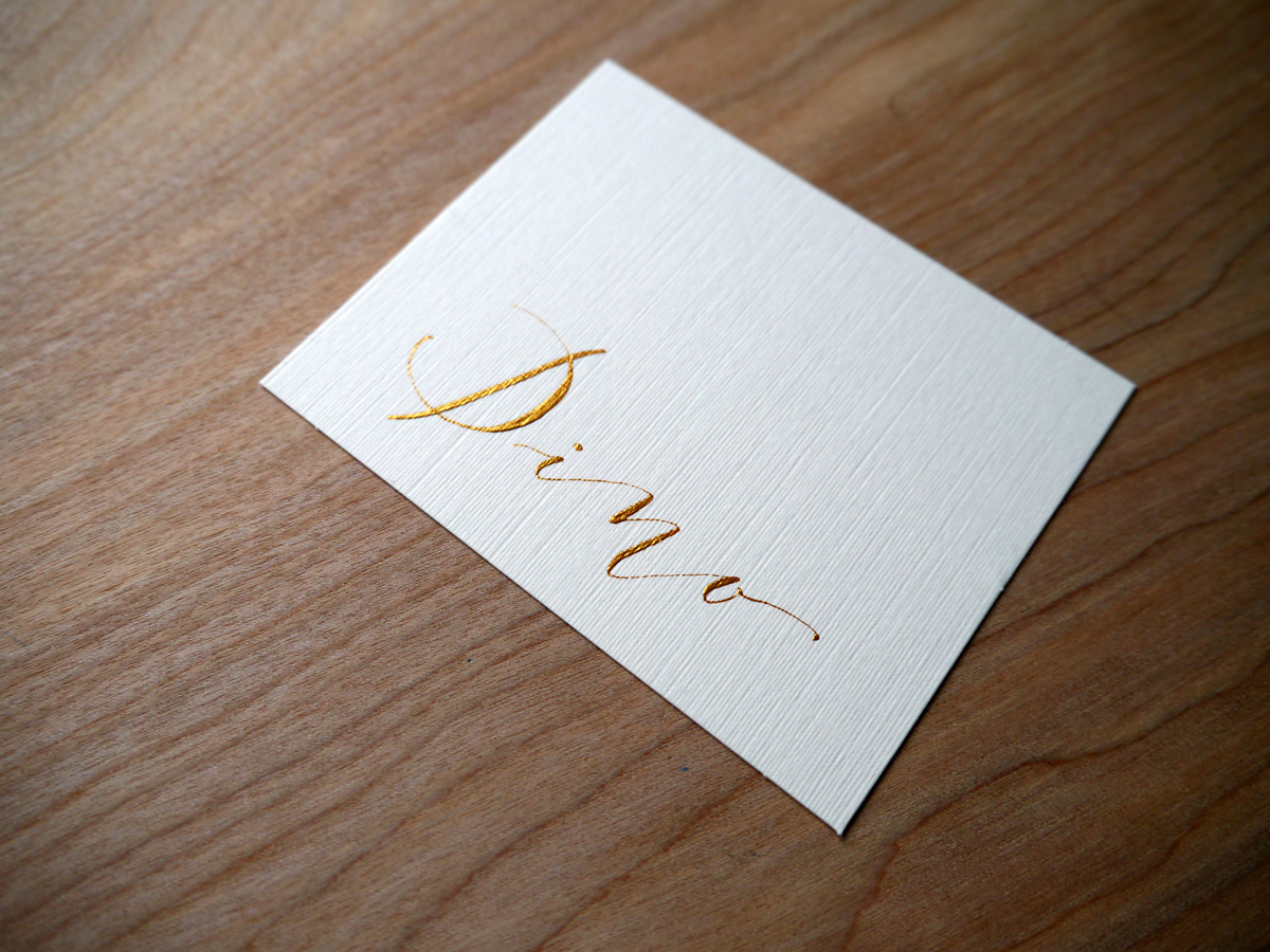
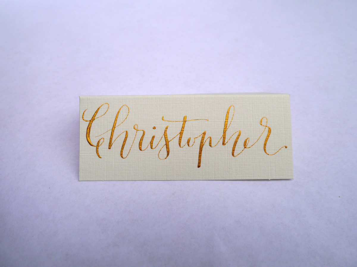
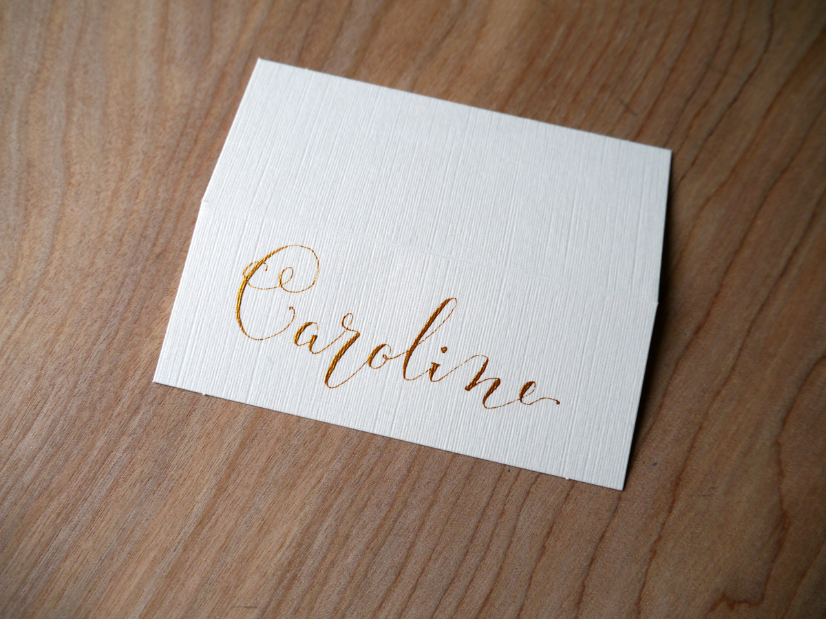
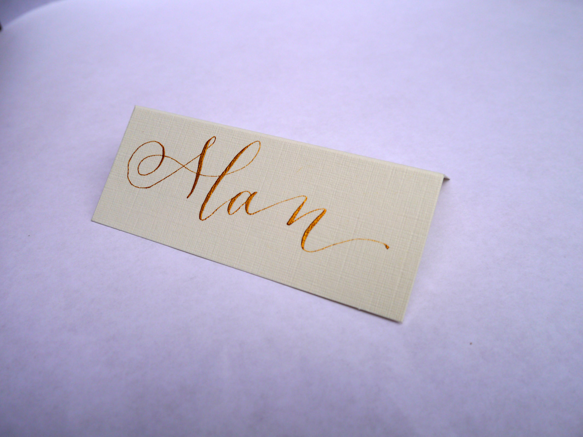
If you're looking for a unique, hand lettered piece of calligraphy, feel free to get in touch and we can chat about what you're after.
Festive calligraphy gift tags
I'm never usually organised enough to make festive gift cards, but, as always, Lindsey at The Postman's Knock sent a shot of inspiration to my inbox with her tutorial DIY Holiday Gift Tags. I had to give it a go.
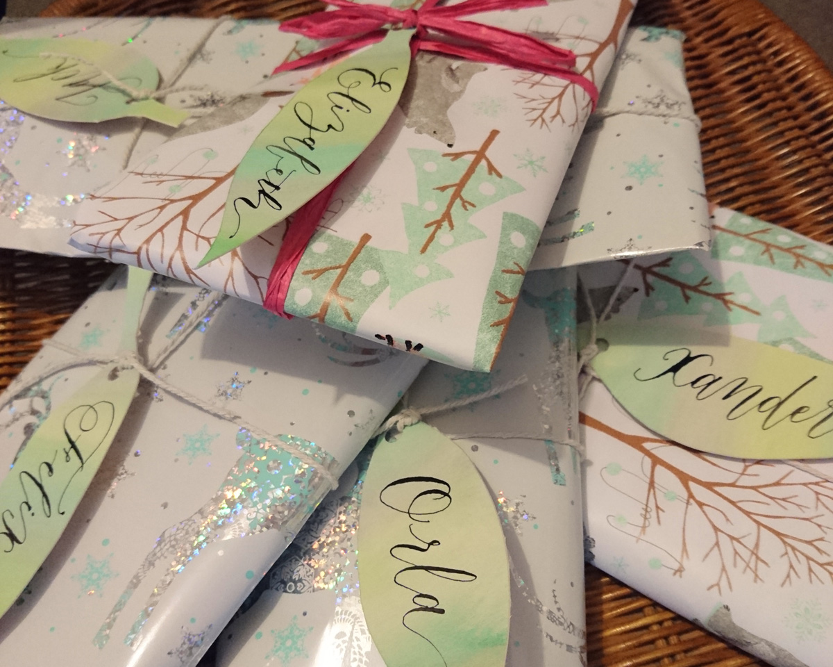
I love how simple these watercolour and calligraphy leaves are to make, but really are a stunning addition to your wrapping.
These calligraphy tags took me about half an hour to make, and I used practice Canford card stock used for a recent quote commission.
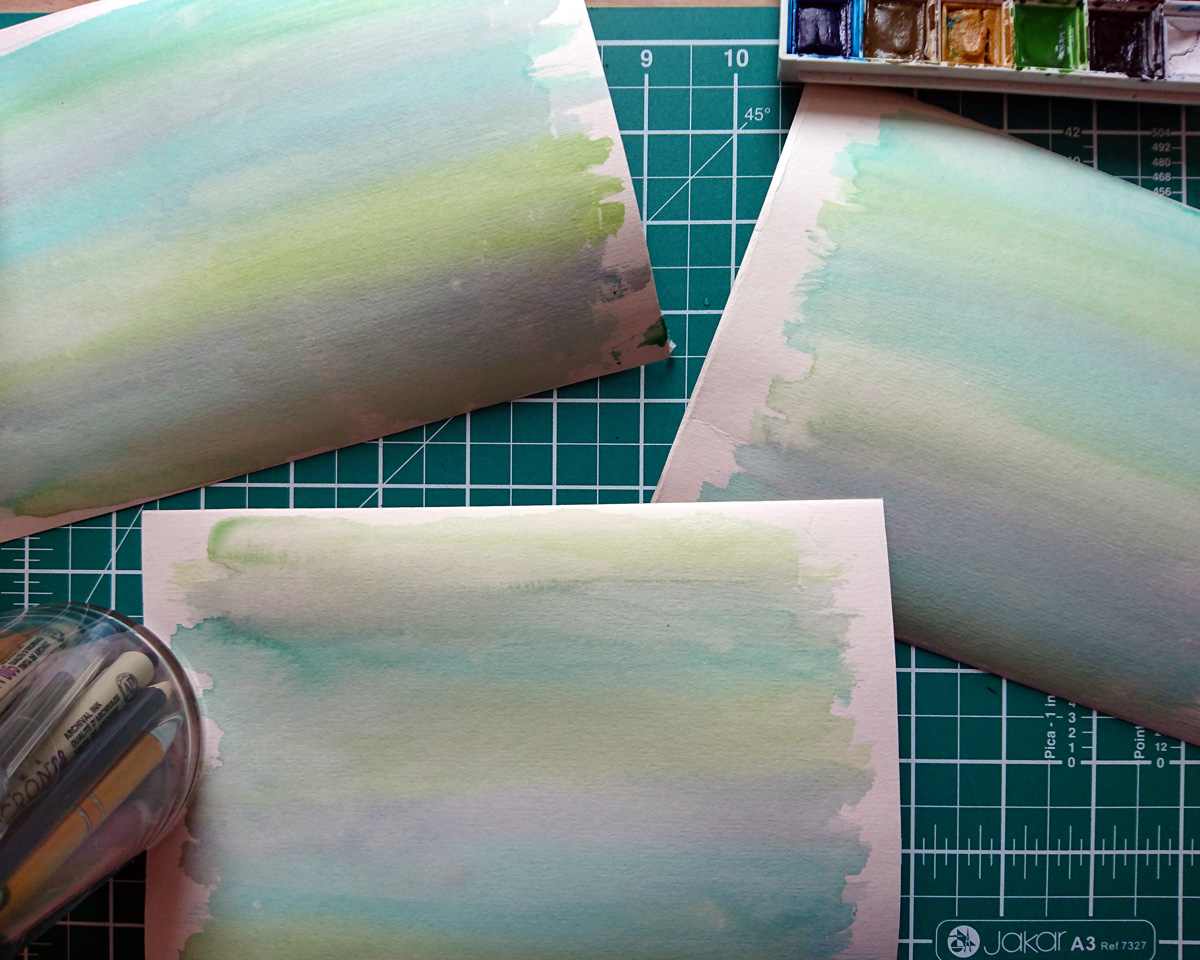
I used my Winsor & Newton watercolour set to paint a wash of three hues of green/blue. Once that was dry, I drew my leaf shapes and cut them out with my scalpel. Before I applied my calligraphy ink (Winsor & Newton black calligraphy ink), I did a little test on some excess card to make sure it wouldn't bleed. Then I used an informal modern style to keep the process easy and quick.

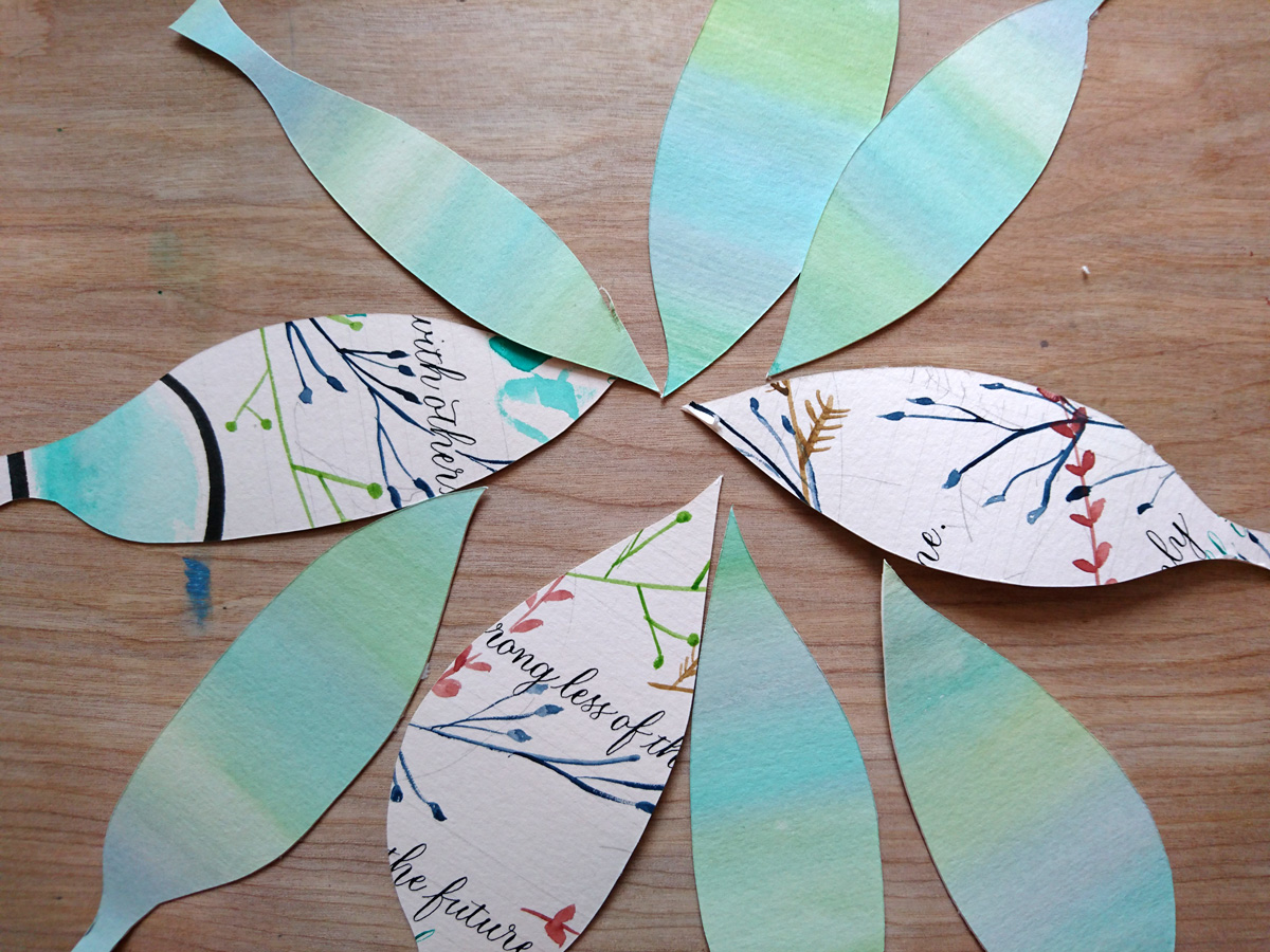
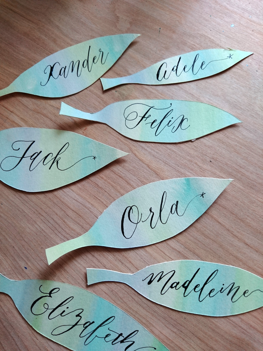
Head over to Lindsey's blog post for a detailed tutorial on how to do this project, and have fun!
Watercolour calligraphy and botanical wreath
Forget adult colouring books; get over to The Postman's Knock and learn some easy watercolour and calligraphy skills to DIY art therapy the heck out of yourself. I recently spotted Lindsey's botanical watercolour wreath tutorial and had to give it a try. I'm using it to surround quotes for some newborn babies, and also to send a message of affirmation to my friend Beck, who is head deep in her university degree at the moment.
Here's how my wreath turned out on a watercolour postcard (I made a little video so you can see it come together). I don't even know if 'studier' is a word meaning 'someone who studies', but it is now! The best part about this process for me was realising a better technique for holding my paint brush (for some reason I have been wielding it like a wand rather than controlling it like a pencil...I think I was scared of the brush, so I was keeping my hands as far from the business end as possible).
Here's one of the watercolour calligraphy quotes for the newborn babe. I didn't really like the colour scheme (it was all I had in my diddy little travel watercolour set), so I headed to my local art store and grabbed a couple of other colours to work with (and what I used in the video for Beck's).

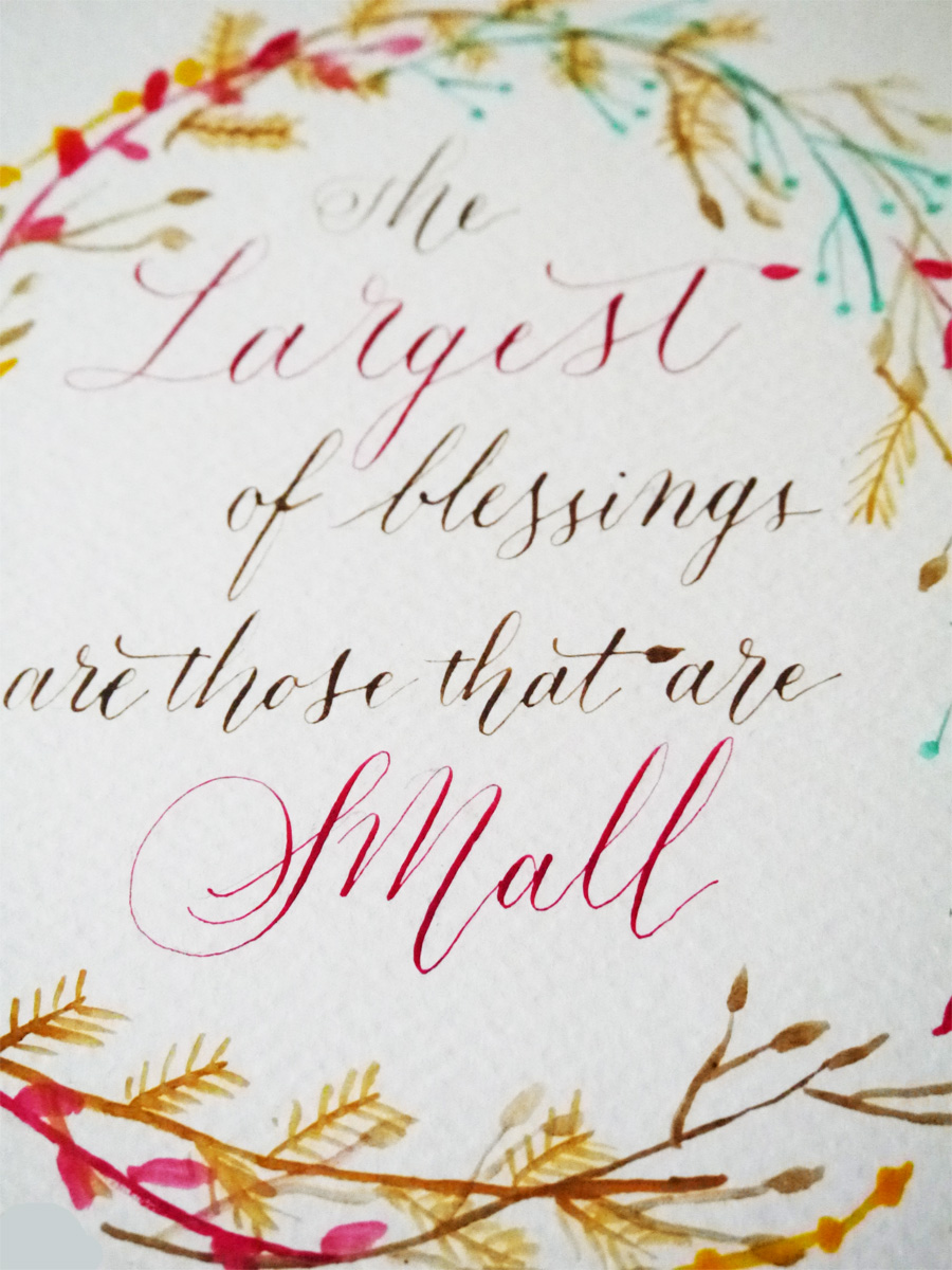
Lindsey has given me lots of ideas of where I could use these lovely motifs, so looking forward to plastering the world in tiny watercolour flora.

Sponsored: Valentine's Day calligraphy haikus
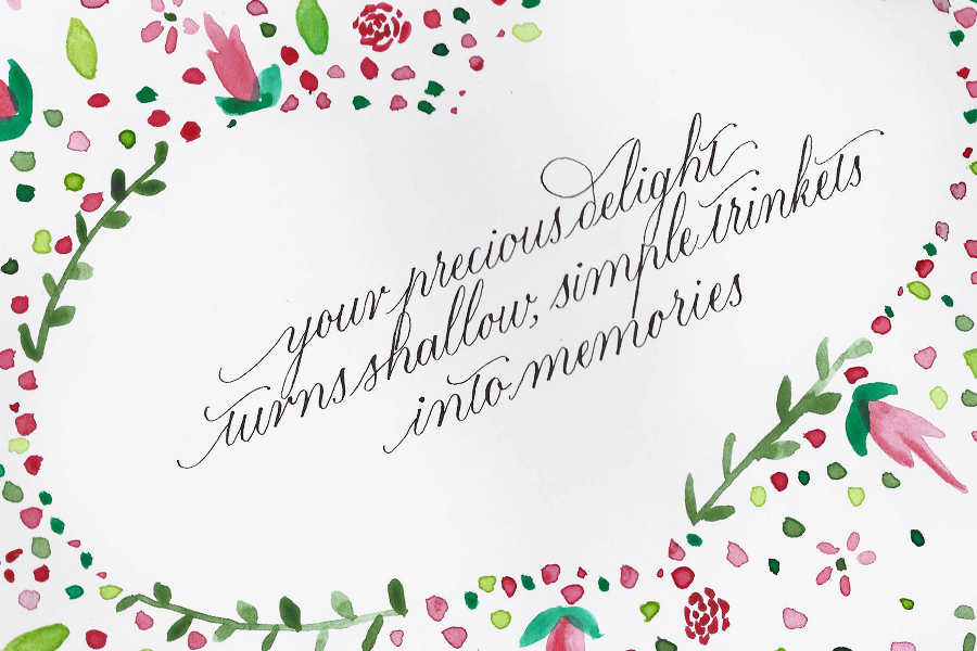
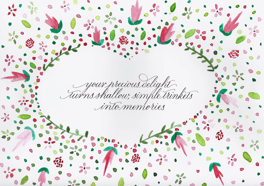 This post is brought to you by Pen Heaven, who, this Valentine's day, is collaborating with calligraphers to bring a little lettering love to the V-day spirit with calligraphed haikus.
I've never been great with Valentine's Day romance (or any gift giving particularly). I think one year JW got a small tin of (4) Ben's Cookies. I appreciate that people use the day to celebrate their love, but I'm usually not that organised.
This year, I got a little heads up from Pen Heaven, when they asked me to bring a love haiku to life with my calligraphy.
If there is one thing that I will profess love for any day of the week, it's haikus, so it felt right that Olive & Reid's first foray into an online collaboration like this would satisfy all forms of my word nerd tendencies. Pens, calligraphy, haikus!
I was asked to calligraph the following haiku:
Your precious delight
Turns shallow, simple trinkets
Into memories
When I considered which style I would go with for this piece, I knew that another contributor, Chiara Perano from Lamplighter London, had presented a stunning, simple modern white copperplate on black background, which probably would have been my modus operandi, so I decided to go out on a limb, and, working with what The Postman's Knock tutorial has taught me, bring a little floral watercolour into the mix.
Why love and calligraphy go hand in hand
As I got to work on the calligraphy for the haiku, I started thinking what it is about beautiful handwriting that is so well connected to the art of romance. I think, at the heart of it (do NOT excuse the pun) is the fact that handwriting is so unique and personal much like the way we love. Everyone can write, everyone can love: they are a perfect pair.
Wedding beer label design
Even though I don't drink any more doesn't mean that I don't enjoy the company of those who do. Very early in our wedding planning, Jim and I decided that we would have a special beer brew in honour of the brewing he and my brother used to do regularly at Brew Brothers Microbrewery when we all lived in Brisbane. We call the boys the "Brew Brothers". Bonded by beer. Jim and Mitch agreed that the Honey Cream lager was their favourite, and since then my creative cogs have been whirring about designing a bespoke wedding label for the beer bottles.
Here's how the beer label design process played out.

Beer label design: sourcing the label
After a bit of searching the internet, we went with an American company called GrogTag.
- Their website was the easiest to navigate
- They provided downloadable templates
- The price seemed comparable, even with shipping to the UK
- The quality (vinyl stickers) looked pretty good.
We weren't disappointed. The labels arrived in under a week, and look fantastic.

Beer label design: Concept phase
The name: "You owe me 25 cents for the honey"
Every beer has a name, and when the boys decided on a honey lager, it was a no brainer what we should call the beer. Throughout my childhood (and still now), whenever we would ask mum for the honey (or sometimes even when we didn't), the following dialogue would have to play out:
Mum: "You owe me 25 cents for the honey."
Us: "What honey?"
Mum: "Oh, I never knew you cared."
I now carry on the tradition forever more, a Pavlovian response, into our future life together; it was the perfect thing to call our wedding brew.
Jim has been a big part of all of the stationery design decisions for the wedding, and if anything, I was going to give him even more say with the beer label (with mild trepidation, given his and my eye for design slightly differ). It was, after all, his thing.
Our criteria for design:
- oval tag
- something related to honey
- my calligraphy
I wanted the beer label to be stylish, and I wanted to try out some typography skills I've been learning, so I started a little conceptual drawing.
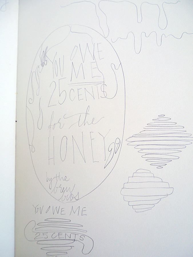
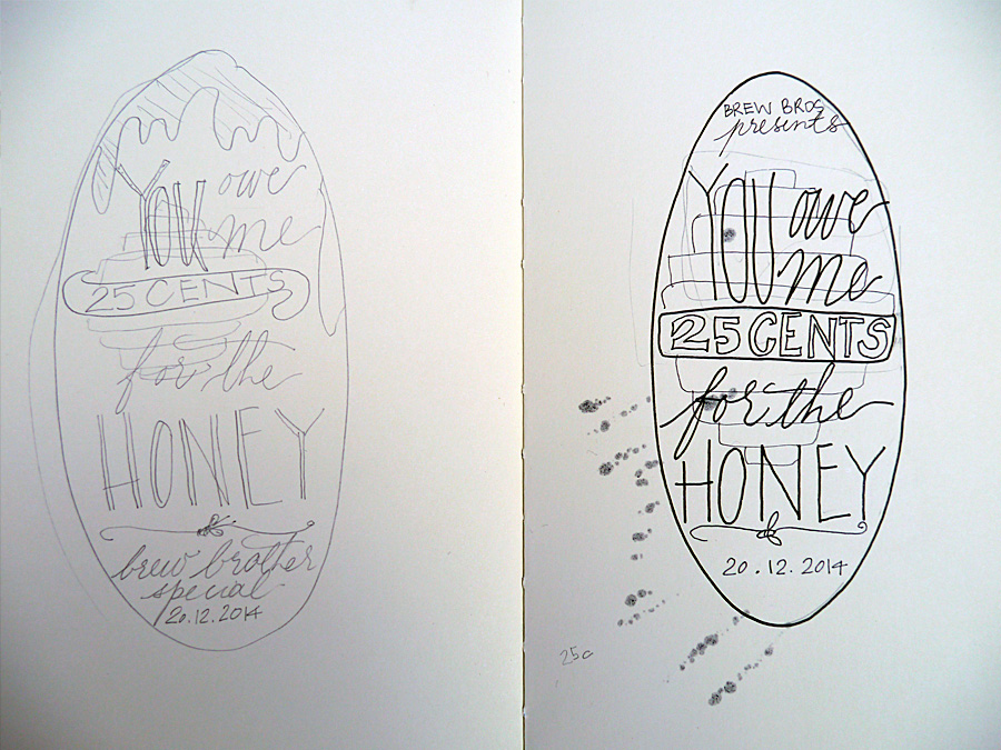
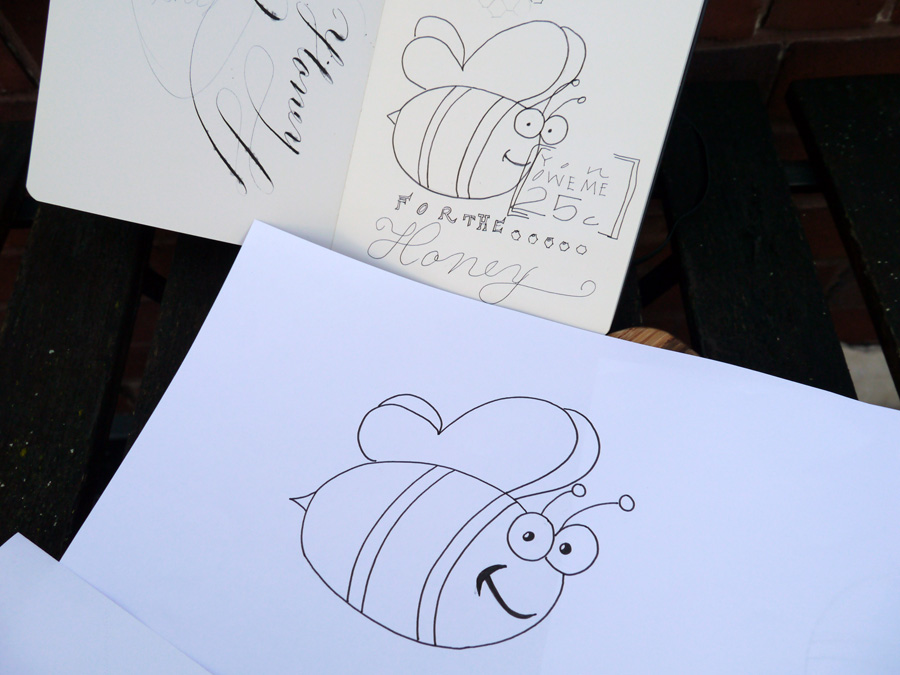
At this stage, Jim interjected with some thoughts. Namely, he didn't like the beehive or the dripping honey, and that he wanted a cartoon bee. So, with a somewhat reluctant heart, I went to task to include this guy in the design. I was not convinced about including a cartoon bee on our beer label, but it was what Jim wanted.
Beer label design: Calligraphy phase
I wrote out all the words I wanted in either calligraphy or another handwriting style to scan in at high res. While I kept the calligraphy in the end, I ditched the other handwriting styles because, to be frank, I haven't done enough typographical study to be confident with my work. We instead found a great complimentary font and rolled with that.

Beer label design: Layout
The final step was for us to put it all together in Photoshop. We had the GrogTag template to guide us on sizes, so all that was left was to import the scanned images and writing, style and adjust to fit, and choose our colours.
In addition to the calligraphy and the bee, we both wanted to add some honeycomb. Jim smartly suggested using the hexagonal tool (I was trying to draw them very shoddily), and after a general colour agreement of green and gold, a nod to our Aussie heritage, we shifted from pastels to the deep hues we settled on in the end.
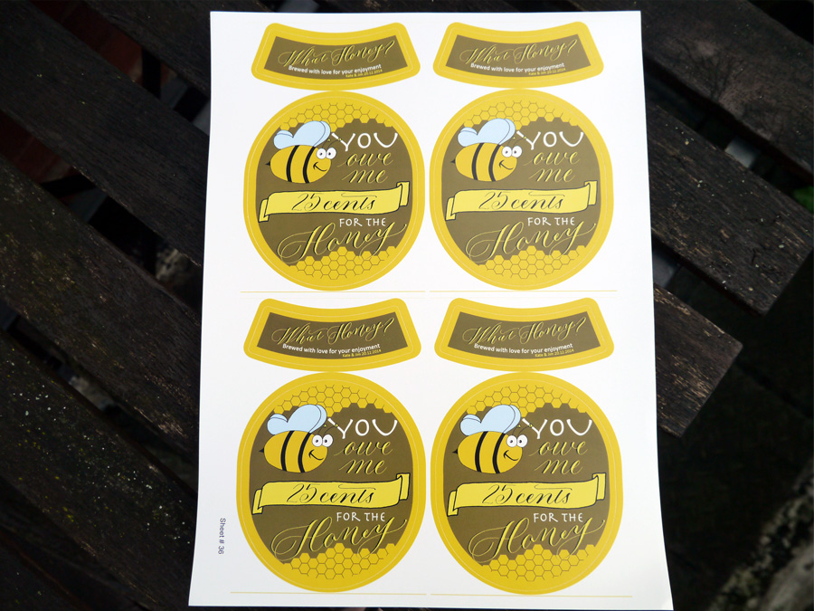
I think we've all earned a brew, don't you!
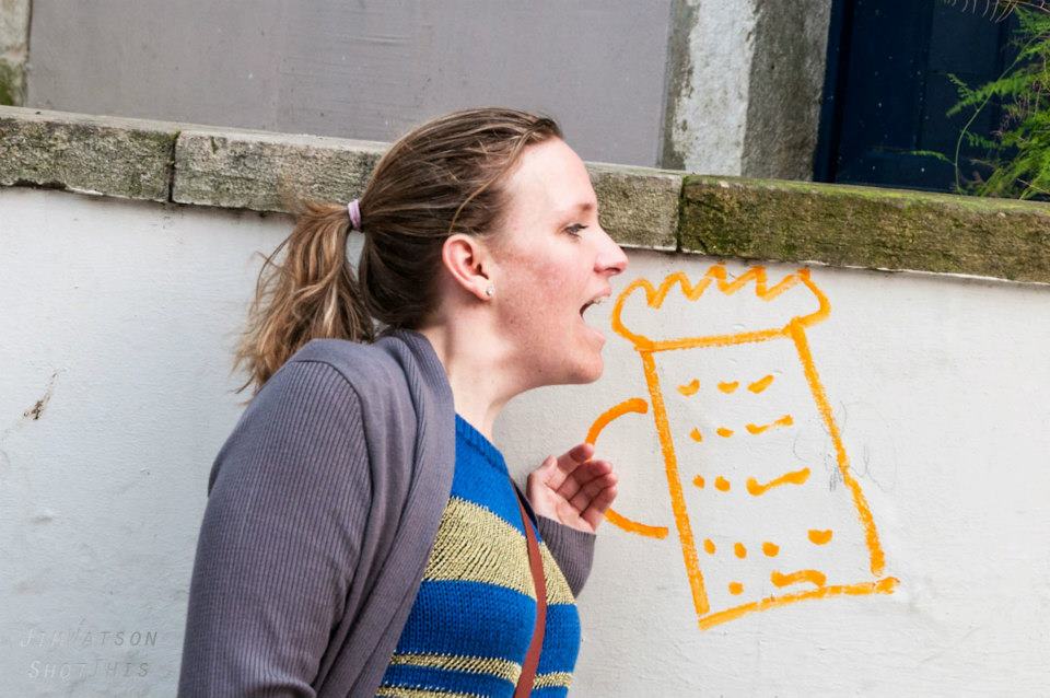
Designed by: Olive & Reid Studio Printed by: GrogTag
Gold on blue calligraphy wedding envelopes
I'm leaving London for the weekend, and heading to Norwich. I've no idea what I'll find there, but I know what I'll take there: a little modern calligraphy wedding note card for friends celebrating their wedding last year in Australia.
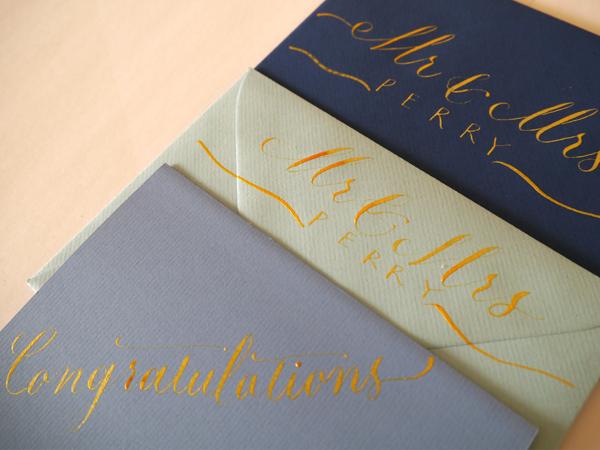


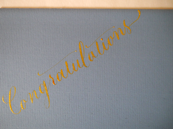

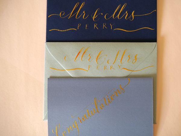

Equipment for modern calligraphy envelopes
- Speedball Super Pigmented Acrylic: "Gold"
- Gillott's 303 nib
- Nib holder (I used Cornellisen's Cork Ended Nib Holder)
- Envelopes/notecard from Partridges Clapham Junction
Calligraphy by Olive & Reid Studio
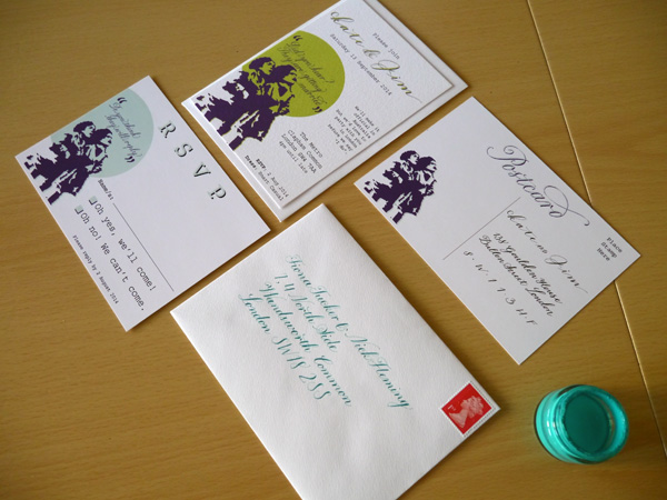
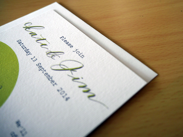
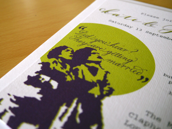
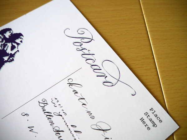
Summer and street art wedding invitation suite
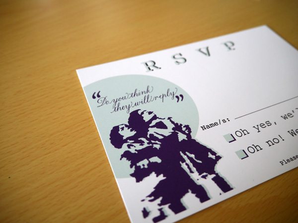
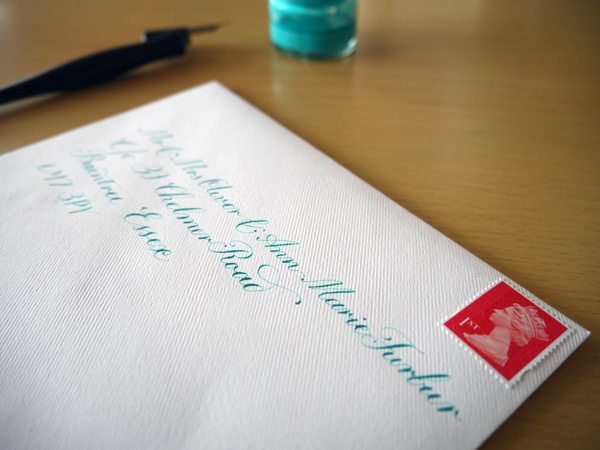
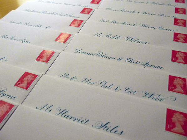
Inspired by my fiance's photograph of stencil graffiti that he took in Passau while kayaking the Danube for three months last year — and our mutual love for street art — this invitation suite strikingly represents all of the beautiful moments we've had travelling the UK and Europe full of clever artwork accessible to all. Calligraphy & Design: Olive & Reid Studio Printing: Printed.com (on Nettuno)
Light touch calligraphy and modern lettering
 Since finishing up my first round of wedding invitations and handwritten calligraphy envelopes two weeks ago, and feeling a sense of certain completion about that goal, I've not been as focused on my calligraphy practice. But it's Friday, and I had a hankering all day to get my calligraphy nibs moving.
It's amazing how rusty you can become so quickly, so I spent a lot of time focusing on slowing down, and holding my calligraphy pen as lightly as possible that would still let me have control over the lettershapes I was making. A workshop teacher once told me that I should pretend as though I'd burnt the tips of my fingers and how I would have to hold the pen if I had. That really helps when I remember.
So after doing some copperplate drills, I decided to have some Friday fun relaxing into some modern calligraphy of imaginary party guests. I had some plain business cards lying around, and put them to use to create a name for every letter of the alphabet.
I do look forward to the time when I can have a style of writing that is easily identifiable as mine, and I imagine it could be something a little unique like this.