

Anna Akhmatova's Requiem for the SLLA exhibition
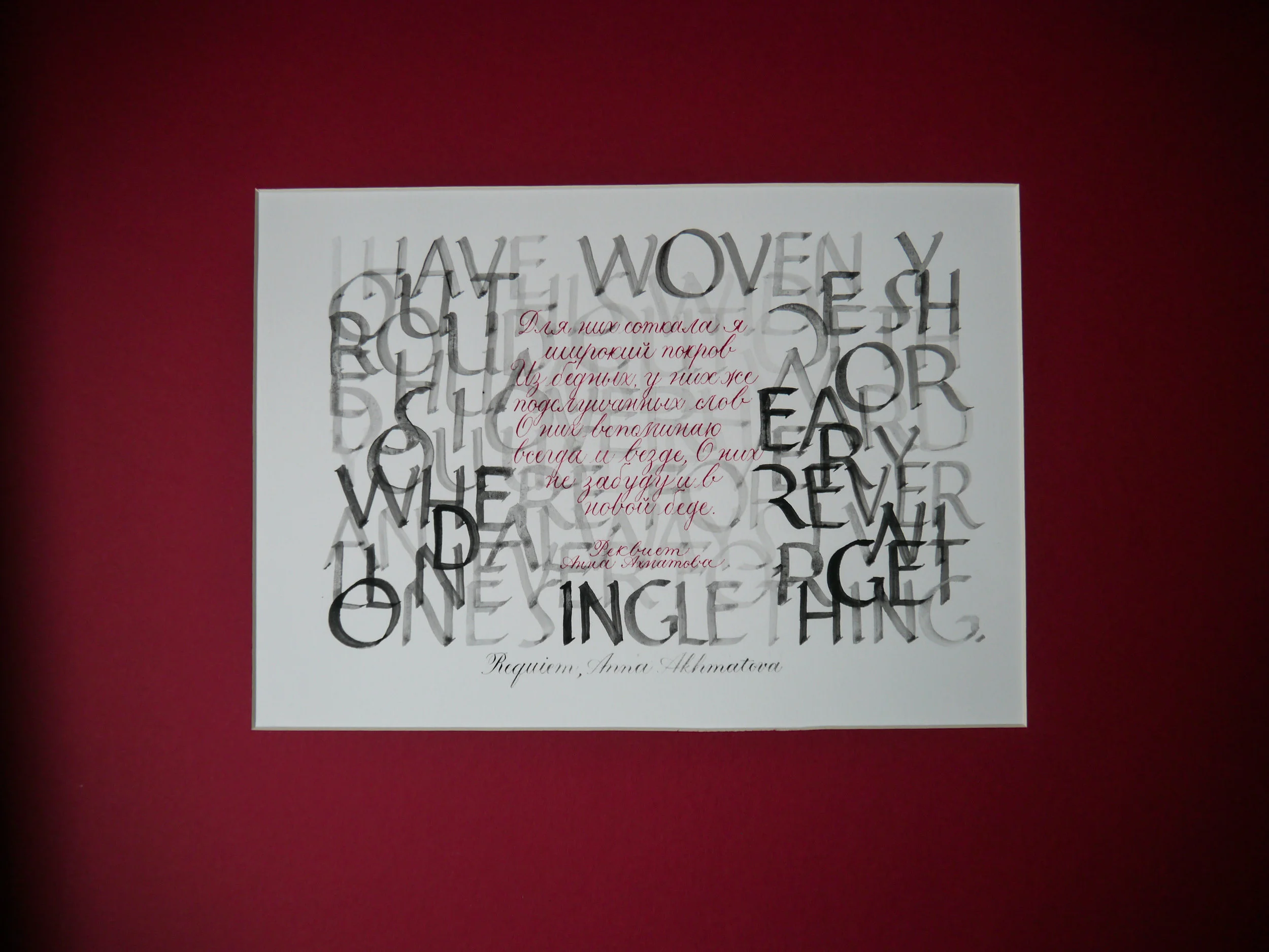
I nearly did not submit a piece of work for this year's South London Lettering Association SLLA exhibition. With a toddler and a three month old, I didn't think I would have the gumption to get it done. Last year I exhibited a commissioned work which I had already prepared, but this year I needed to create something specifically for the exhibition. With the theme, Romance & Revolution: commemorating 200 years since Jane Austen's death and 100 years since the Russian Revolution, it would be natural for my experience with the traditionally romantic copperplate script to inspire me toward Jane Austen. However, I was drawn to the Russian Revolution, and quickly decided that I would not only work with a key piece of prose of the time, but that I would also capture both English and Russian versions.
I discovered seminal poet, Anna Akhmatova's Requiem resonated with me. In particular:
I have woven you this wide shroud out of the humble words I overheard you use. Everywhere, forever and always, I will never forget one single thing. Even in new grief.
Для них соткала я широкий покров Из бедных, у них же подслушанных слов. О них вспоминаю всегда и везде, О них не забуду и в новой беде
Creating bilingual calligraphy for the SLLA exhibition
My first task was to find the Russian text of the poem. I could easily find the English translation, but not the original, so I asked Anton at Ufoblique Penholders to help me out. Then I set to work studying the Cyrillic alphabet and determining how to create the letters in Copperplate script. I sought help from local Russian mums via Facebook groups, as well as the lovely calligraphy community on Instagram, to make sure that my script was correct and legible. (I really hope it is!)
This piece is purely my own design, not for a client, and I felt a great sense of freedom for where it could go. I ruminated over a number of nights letting thoughts develop into what could be possible. Black, red and strength were my inspiration.
I wanted a striking juxtaposition of the two languages. I work predominantly in fine, pointed pen scripts such as Copperplate, Spencerian, Uncial and modern calligraphy, so it seems crazy that I decided to create the English translation with Roman capitals — the most daunting of broad-edged hands, which I have never even dared attempt. I dunno, I just decided that's what needed to be done, so I grabbed my copy of Veiko Kespersaks' Calligraphy in 24 One-Hour Lessonsand hoped for the best!
My intention was for these English letters to be a curtain, a shroud,a backdrop — almost illegible and unimportant — to the original text. It's why I wasn't worried that words wrapped from line to line, rather than being complete. The letters had to be bold enough to carry the weight of this duty, yet light enough that the Cyrillic script stood out on top. I created the Roman capitals in watercolour, ensuring that the letters faded significantly in the centre where the Russian would overlay. For the Russian prose — the main feature — it had to be delicate yet striking, hence created in blood red copperplate script.
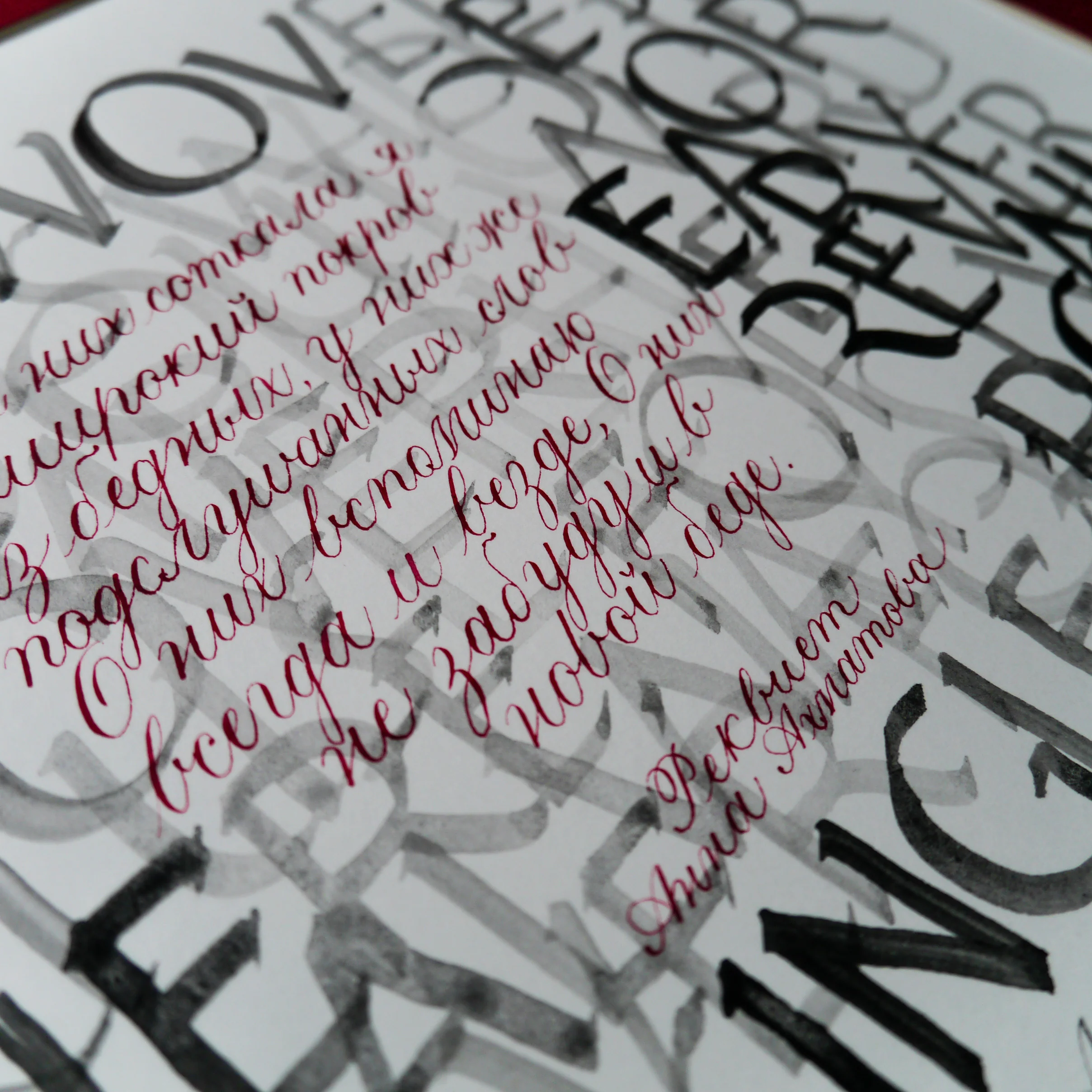
Although my Roman caps would make someone more experienced cringe, I feel heartened by the fact that SLLA welcomes amateurs and the piece itself is written by a woman who was not following the rules but succeeding nonetheless. I'm so proud of this piece for so many reasons:
- I challenged myself to develop a new alphabet into my existing script
- I shook off my nerves and just bloody well painted some Roman capitals, Sinatra style (aka, my way)
- I learned to cut mount board, you know — fancy angles and whatnot and did that too
I'm so excited to be showcasing this piece (which is also for sale, FYI, wink wink). I hope that if you're in London between Oct 17 – Nov 3, that you might just drop in to the SLLA exhibition and see it in the flesh, alongside some fantastic works from local calligraphers.
I also welcome all feedback, but don't tell me I spelt something wrong in Russian or I'll cry.

Graded watercolour calligraphy
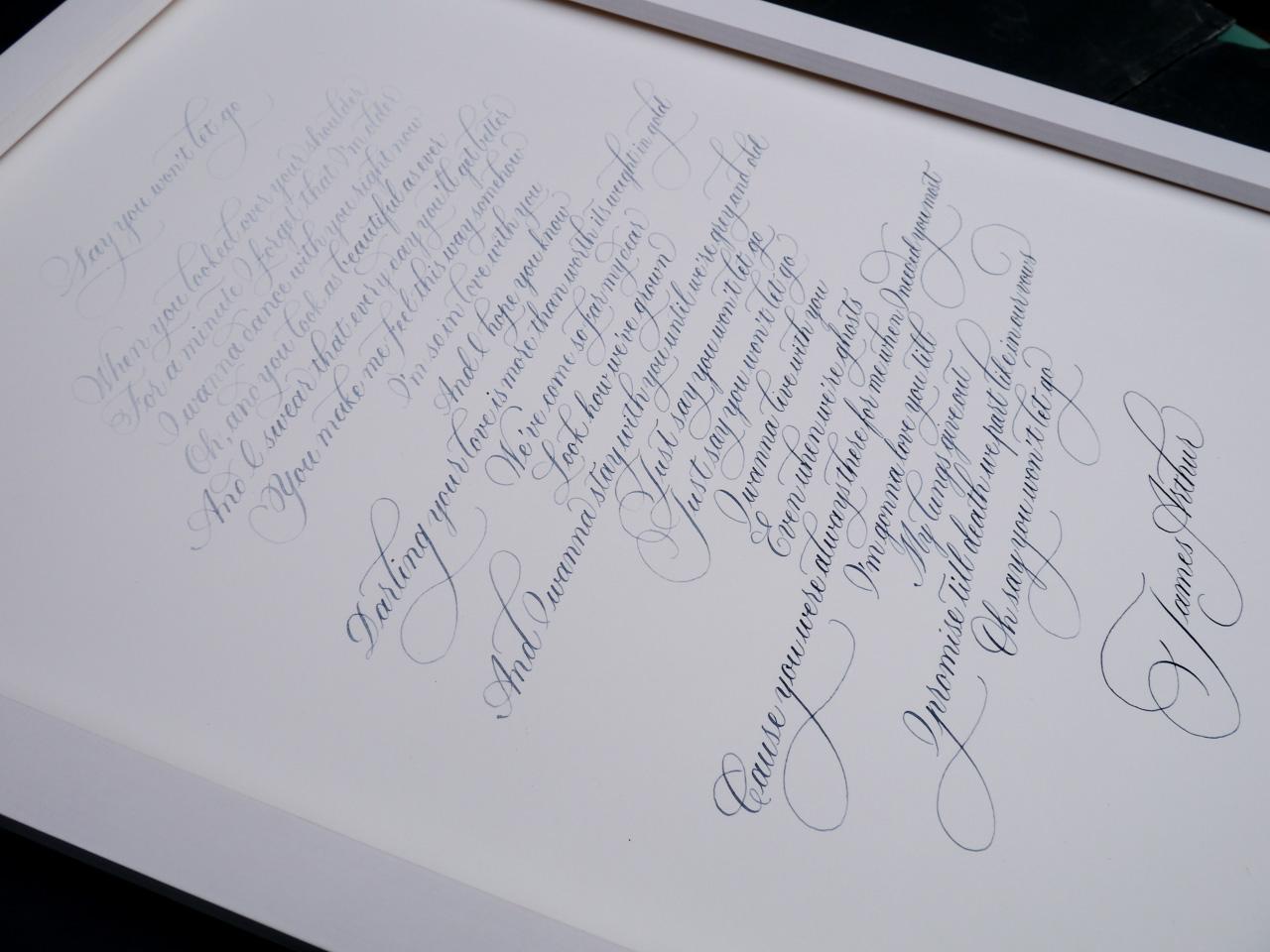
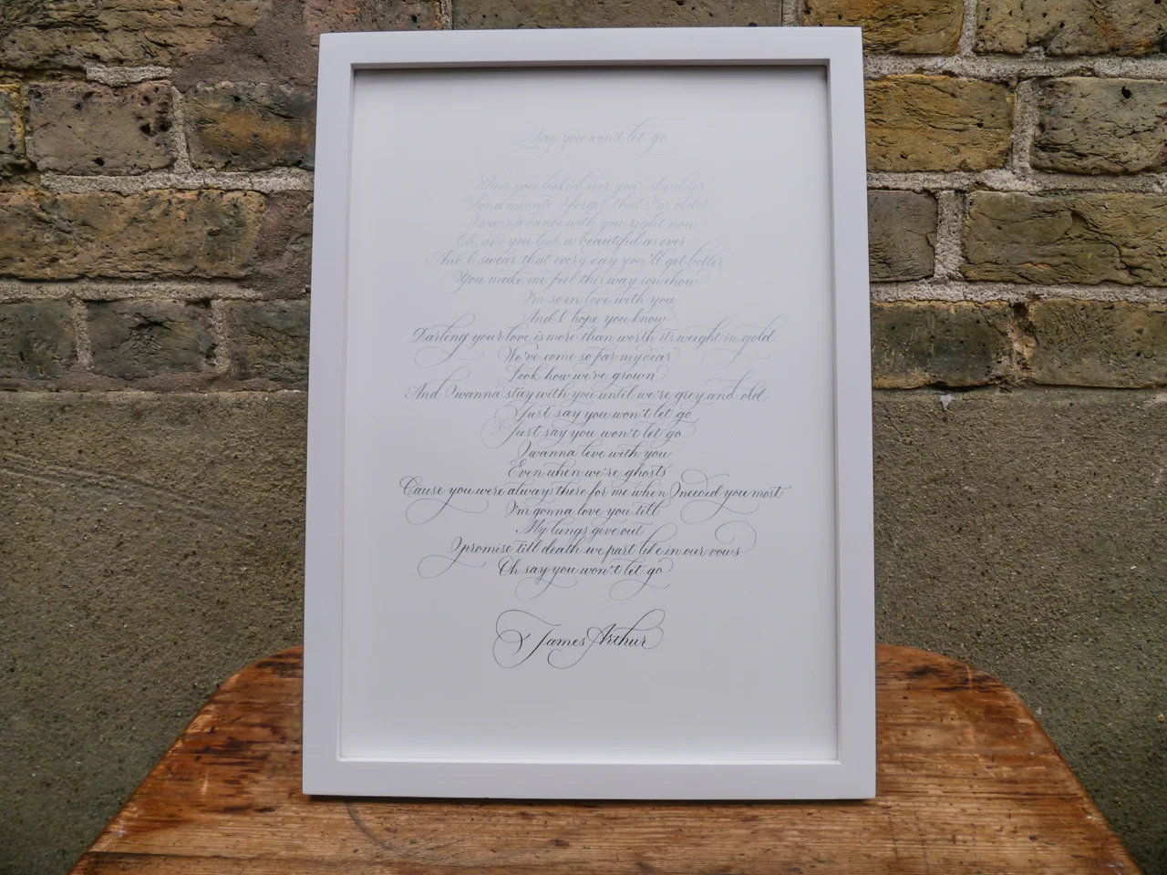
Taking inspiration from the abstract blue hues of a painting, I decided to give graded watercolour calligraphy a try. The plan was to start with very diluted colour (Cotman's Indigo: links to Amazon.co.uk) and gradually add more pigment over the course of the piece. I worked with a section of the moving James Arthur lyrics from his song, Say You Won't Let Goon Bockingford 300gsm watercolour paper at A3 size. I used flourished Copperplate script for a traditional style with a little flair. Satisfyingly, the gorgeous blue gradient ended up looking exactly as I planned — deepening dramatically with the words down the page. Before I started, I worked out that, for 23 lines, I would add more colour approximately every 3.5 lines, building up the hue six times over the course of the full piece.
My method of mixing was an inexact science, simply dipping my brush into the saturated watercolour pan and moving across into my diluted colour. Of course, the saturation could be decreased or increased, depending on how long your piece and the final look you're going for.

London hand lettered stage props
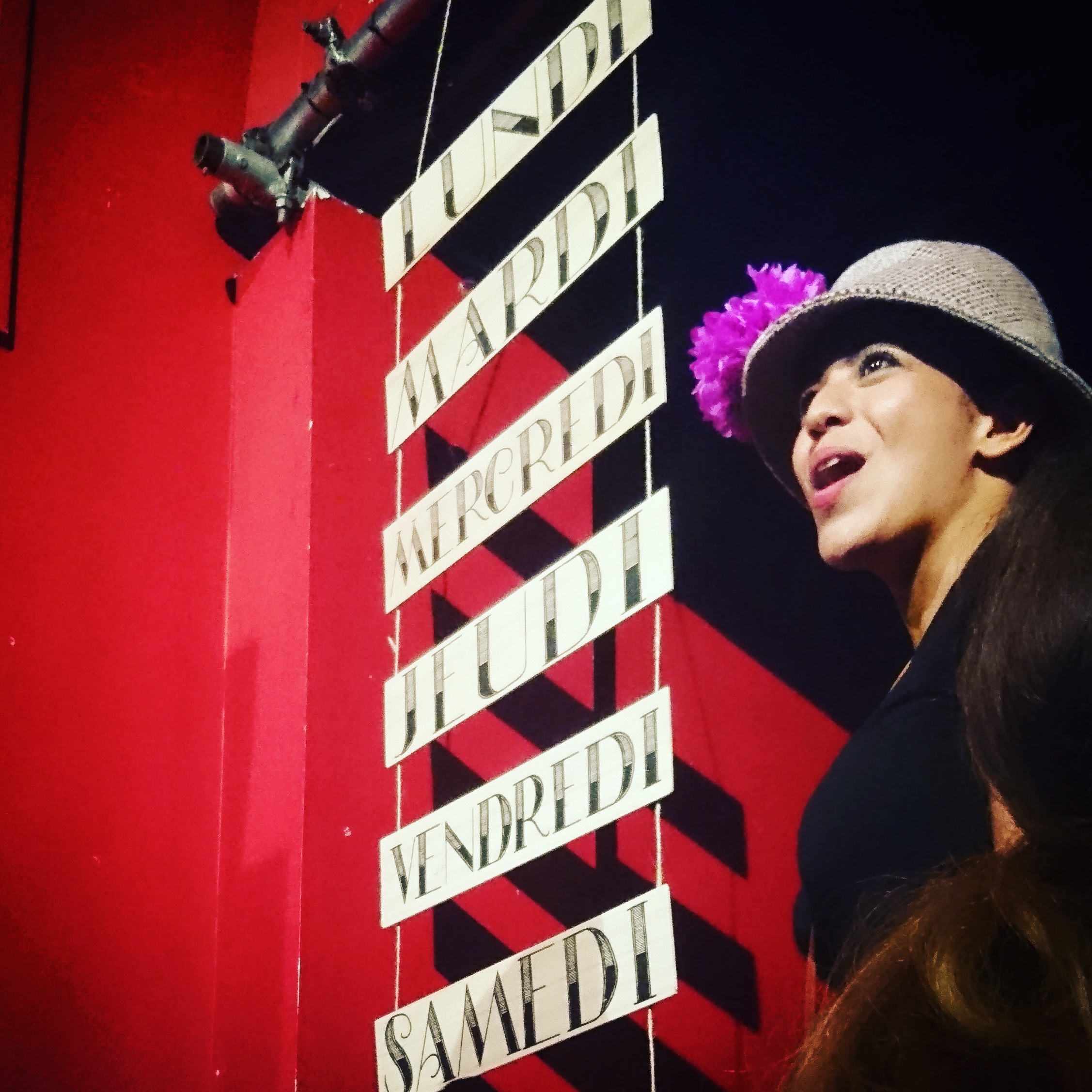
As my first foray into hand lettered stage props, I was given the fantastic opportunity of helping Sing in French with some signage for the musical theatre production of Pinot the Musical. I slipped in to see the final summer showing for 2016. Although I don't speak French and was way above the demographic age, I had the best time watching Pinot the Musical. In an intimate South West London venue at the Merton Abbey Mills (a most perfectly quaint piece of British history) and it was just so much fun! A ridiculously awesome plot, and epically charming cast, my cheeks were sore from smiling so much.
About Pinot the Musical
{taken from Get Surrey}
Pinot The Musical is a fun, family singalong-in-French show suitable for all ages and especially effective with 8 – 14 year olds (Key Stages 2 and 3) A young Russian cyclist, Petrov Popov, has a dream to win the Tour de France in memory of his champion-cyclist great-grandfather. So he and his Cossack-dancing friends escape from Russia and enter France illegally. Aided by a wily beggar and two rival gangs, Petrov gets a job, changes his name to ‘Pinot Blanc’, acquires a brand new racing bike and does his training in secret between police chases. After a spell in jail and a dramatic escape, he achieves victory as the winner of the Tour de France and the police give him and his friends their freedom. Kids absolutely love it. The show is an audience participation event. Sing along with 18 educational songs specially written for this show. Dance styles include Cossack dancing, Rock n Roll, Jazz, Ragtime, Waltz, Bluegrass, Charlston, the Twist, Tap and more! Pinot The Musical will leave you and your kids buzzing – in French!’
See the hand lettered stage props
Free download: January envelope template
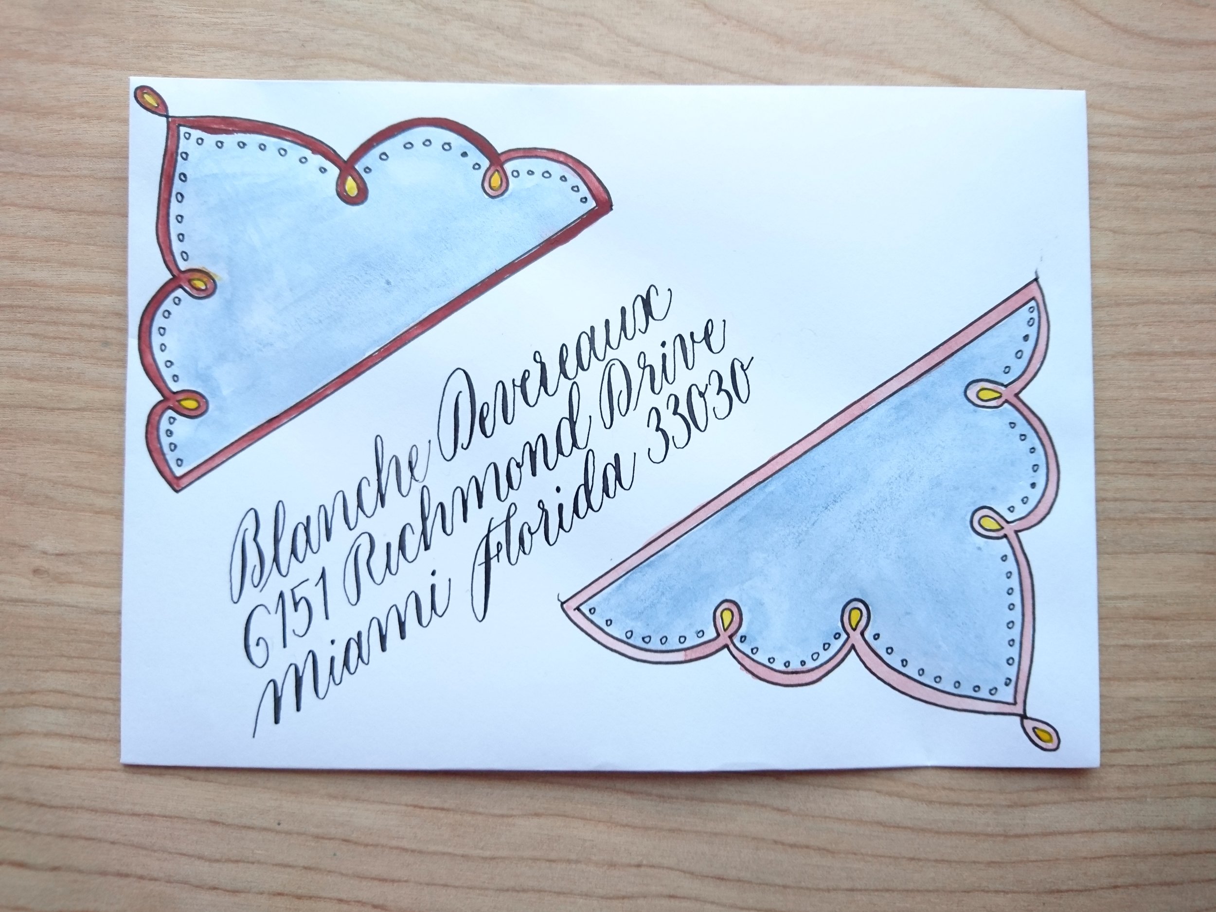
January envelope template
I was just creating an envelope template for my January post (yes, yes; I'm arranging my post by month now!) and thought I would share it with you. You might like some snazzy envelopes, too.
Give your post a lift with this envelope template

Cut out the template and insert into your envelope
Trace over the design (you can use a lightbox, or tape your envelope to a window)
Colour in the design however you like. I'm probably going to stick with watercolour this month, but might give colour pencil a go, too.
Address your envelope using the lines provided, or create your own within the space.
Feel free to share your own with me on Facebook, Twitter, or Instagram (#janenvelopes). I'd love to see what you get up to.
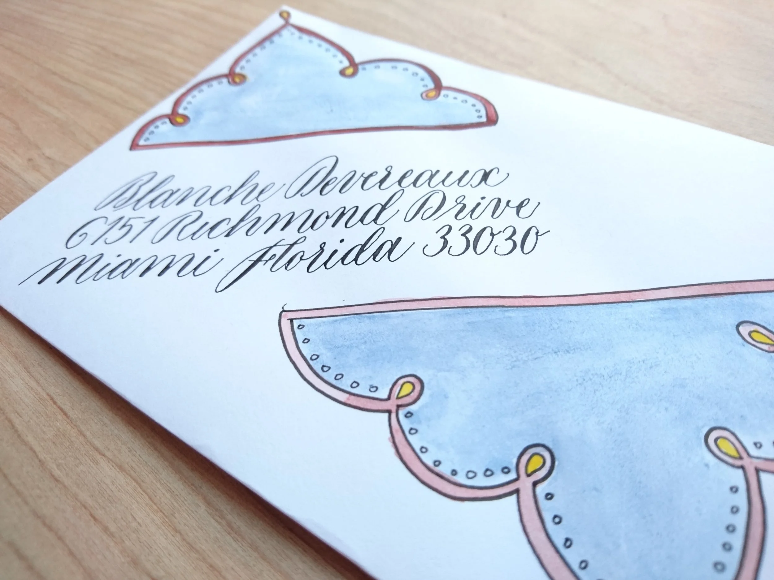
January envelope template
Mellissa and John's Wedding Place Cards
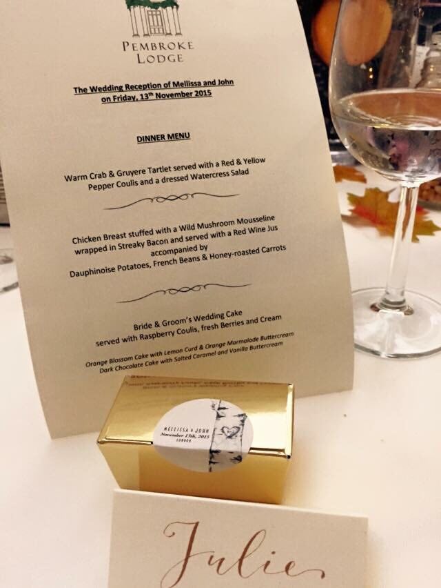 Quite by wonderful coincidence, I met with Mellissa, owner of Hercules Cakehouse. I mentioned my calligraphy work to her, should she need a little something to go along with her delicious favours, and she later got in touch with me to help out with her wedding place cards.
With a simple, yet classy brief of gold ink on ivory to suit the autumnal wedding, Mellissa was wonderful to work with. I gave her two script style options, traditional(ish) copperplate, or a more modern take on it. We went with the latter.
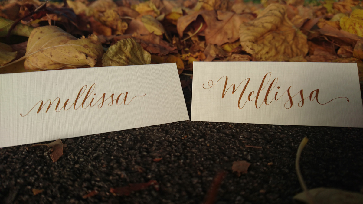
Mellissa provided the linen ivory place cards (Amazon, £6/100), and, while it's always risky working with card stock you've never tried out, her selection was perfect. It also helps that the Finetec metallic watercolour selection I used are so much more forgiving that ink.


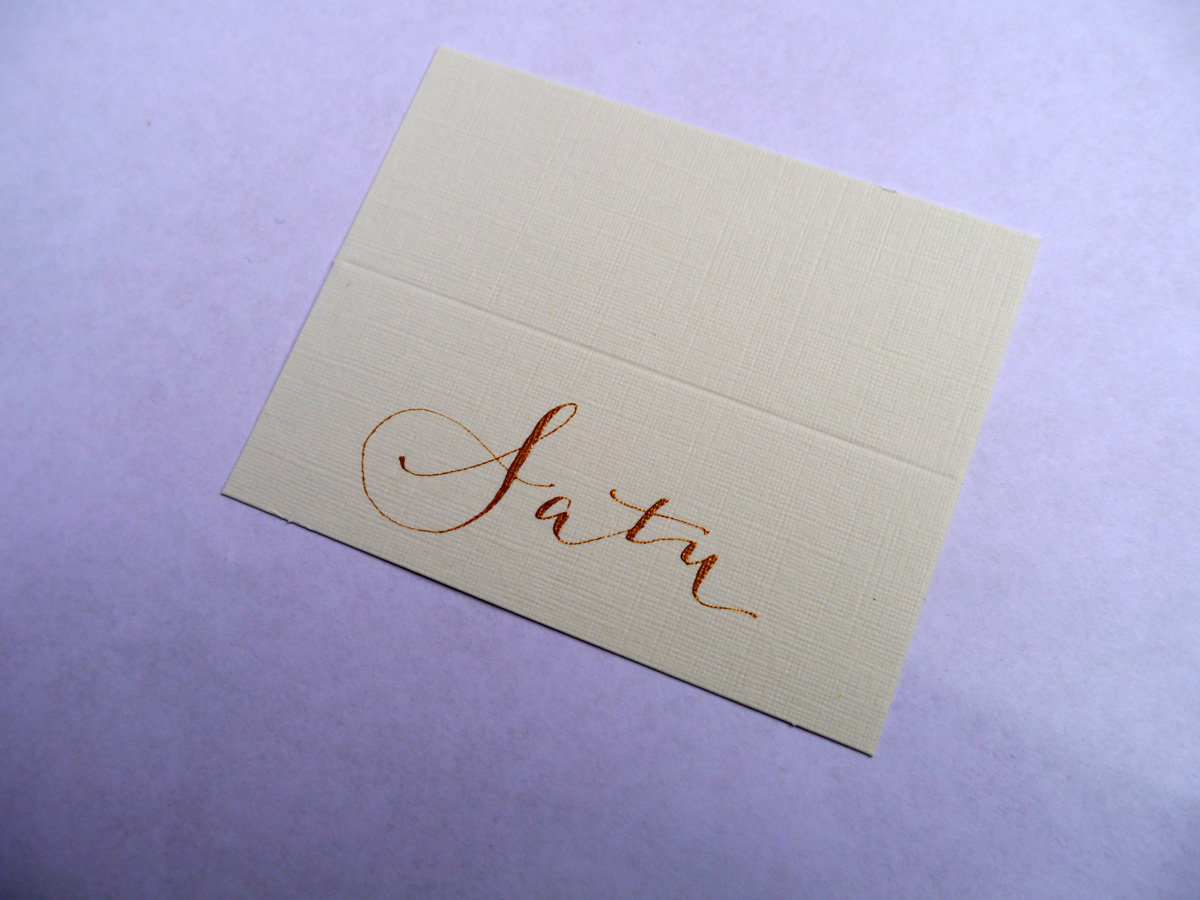
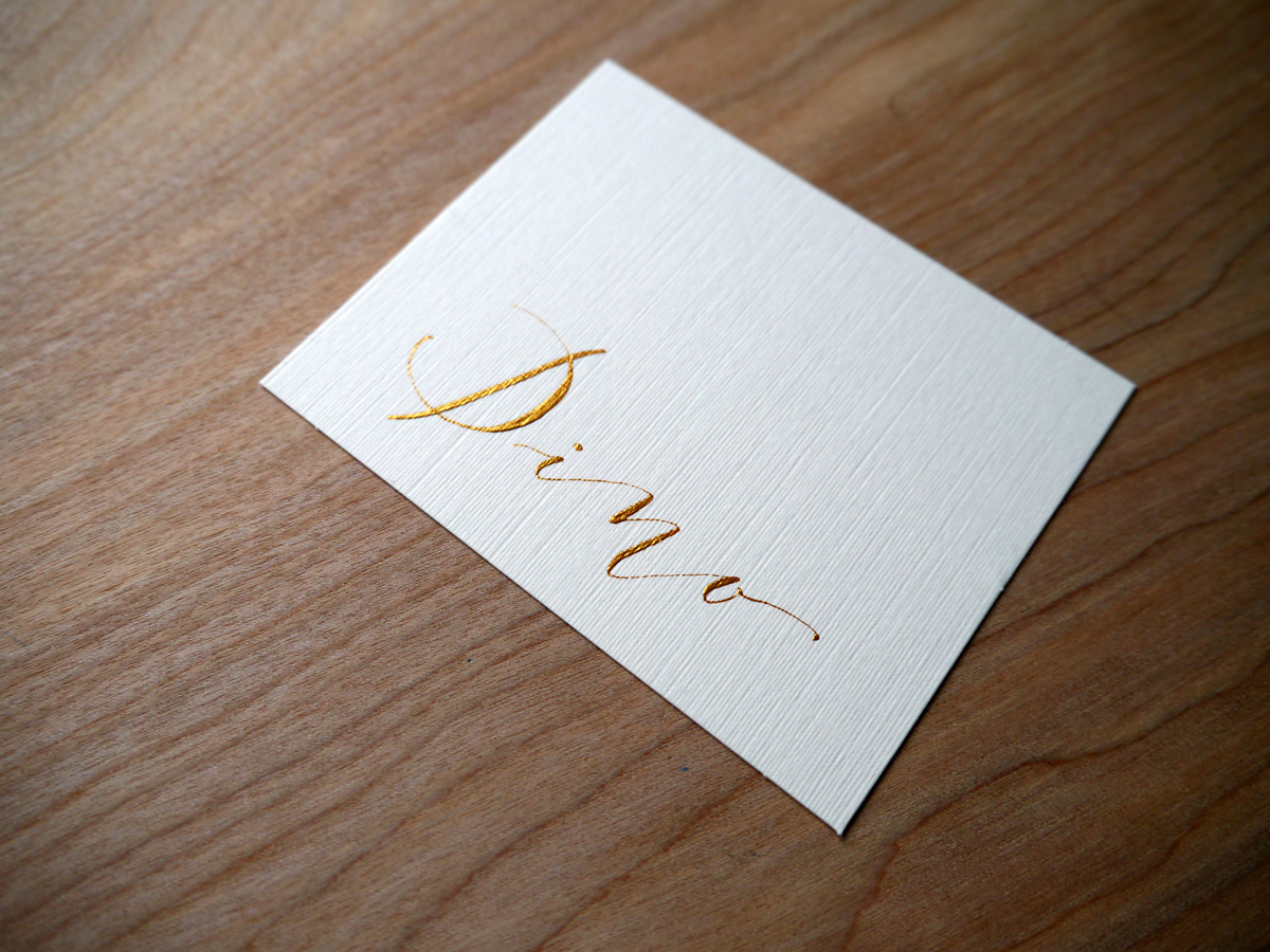
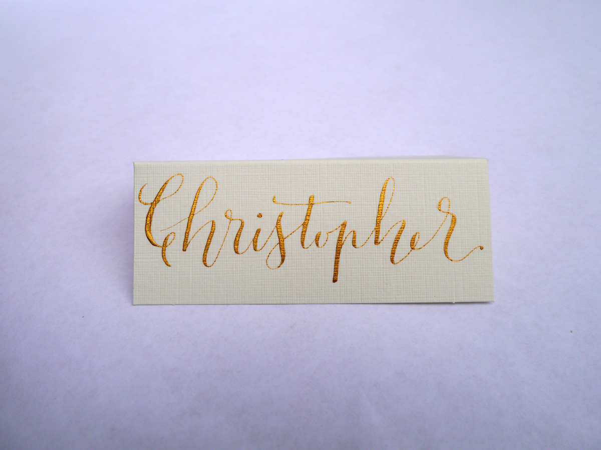
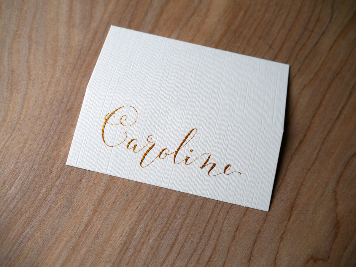
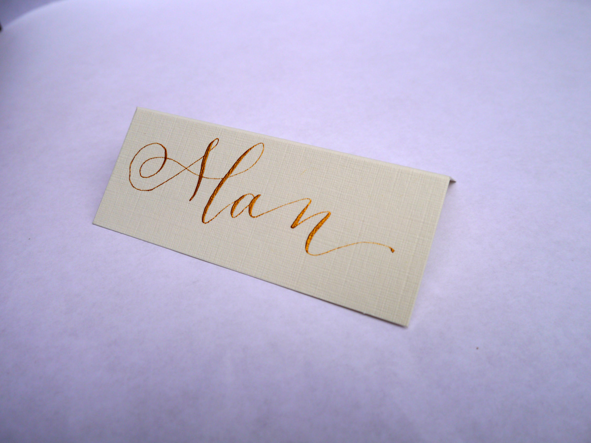
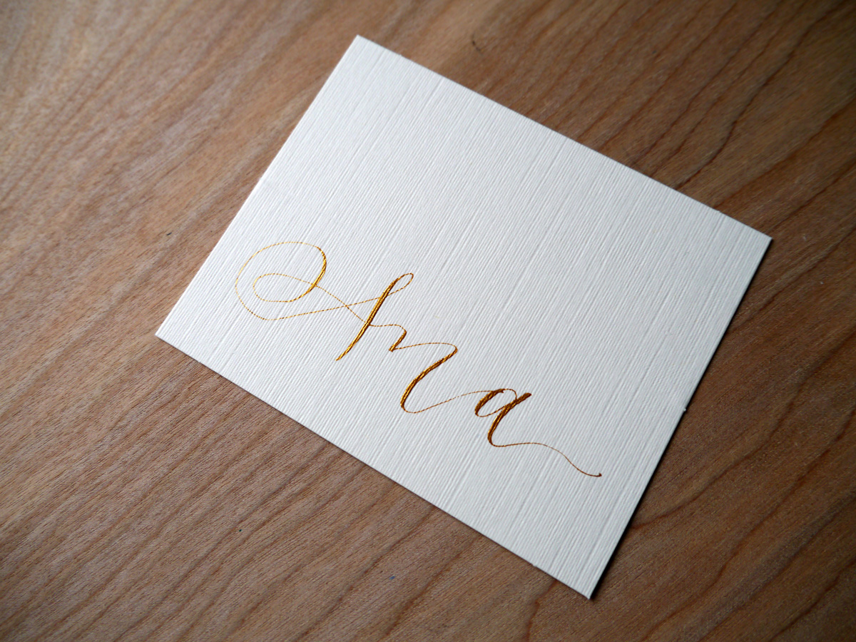
If you're looking for a unique, hand lettered piece of calligraphy, feel free to get in touch and we can chat about what you're after.
Festive calligraphy gift tags
I'm never usually organised enough to make festive gift cards, but, as always, Lindsey at The Postman's Knock sent a shot of inspiration to my inbox with her tutorial DIY Holiday Gift Tags. I had to give it a go.
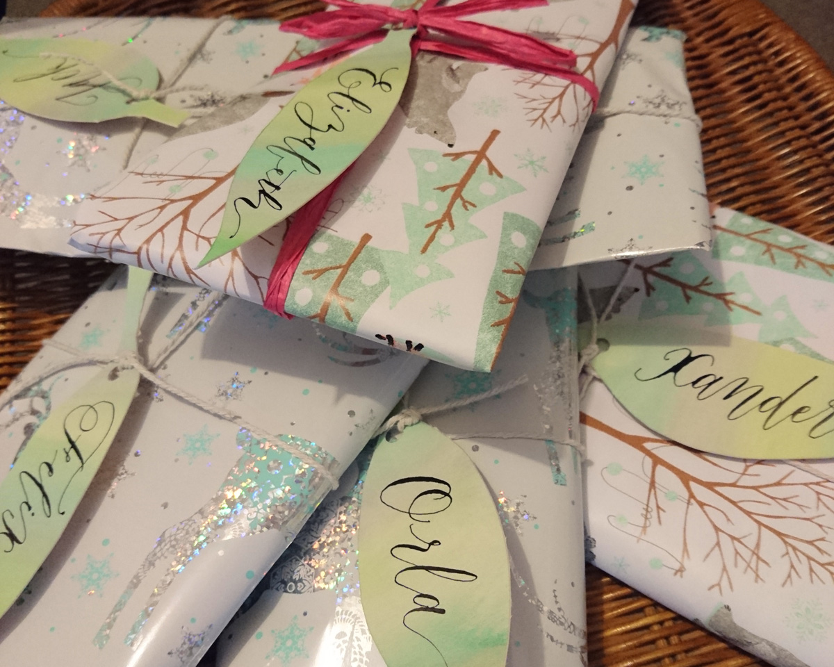
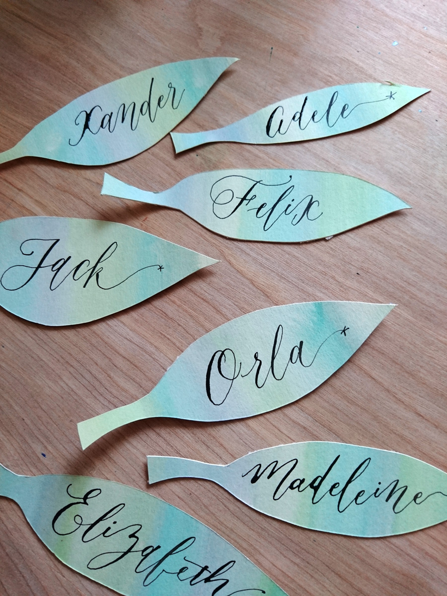
I love how simple these watercolour and calligraphy leaves are to make, but really are a stunning addition to your wrapping.
These calligraphy tags took me about half an hour to make, and I used practice Canford card stock used for a recent quote commission.
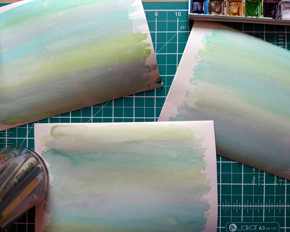
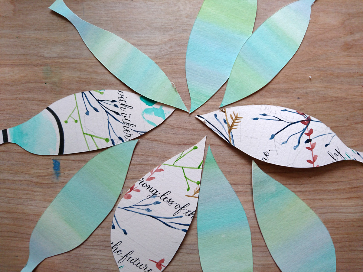
I used my Winsor & Newton watercolour set to paint a wash of three hues of green/blue. Once that was dry, I drew my leaf shapes and cut them out with my scalpel. Before I applied my calligraphy ink (Winsor & Newton black calligraphy ink), I did a little test on some excess card to make sure it wouldn't bleed. Then I used an informal modern style to keep the process easy and quick.

Head over to Lindsey's blog post for a detailed tutorial on how to do this project, and have fun!

Sponsored: Valentine's Day calligraphy haikus
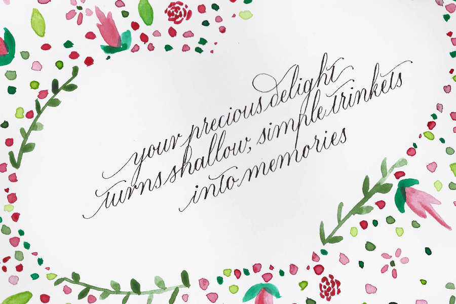
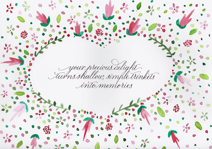 This post is brought to you by Pen Heaven, who, this Valentine's day, is collaborating with calligraphers to bring a little lettering love to the V-day spirit with calligraphed haikus.
I've never been great with Valentine's Day romance (or any gift giving particularly). I think one year JW got a small tin of (4) Ben's Cookies. I appreciate that people use the day to celebrate their love, but I'm usually not that organised.
This year, I got a little heads up from Pen Heaven, when they asked me to bring a love haiku to life with my calligraphy.
If there is one thing that I will profess love for any day of the week, it's haikus, so it felt right that Olive & Reid's first foray into an online collaboration like this would satisfy all forms of my word nerd tendencies. Pens, calligraphy, haikus!
I was asked to calligraph the following haiku:
Your precious delight
Turns shallow, simple trinkets
Into memories
When I considered which style I would go with for this piece, I knew that another contributor, Chiara Perano from Lamplighter London, had presented a stunning, simple modern white copperplate on black background, which probably would have been my modus operandi, so I decided to go out on a limb, and, working with what The Postman's Knock tutorial has taught me, bring a little floral watercolour into the mix.
Why love and calligraphy go hand in hand
As I got to work on the calligraphy for the haiku, I started thinking what it is about beautiful handwriting that is so well connected to the art of romance. I think, at the heart of it (do NOT excuse the pun) is the fact that handwriting is so unique and personal much like the way we love. Everyone can write, everyone can love: they are a perfect pair.
Floral watercolour and calligraphy baby updates
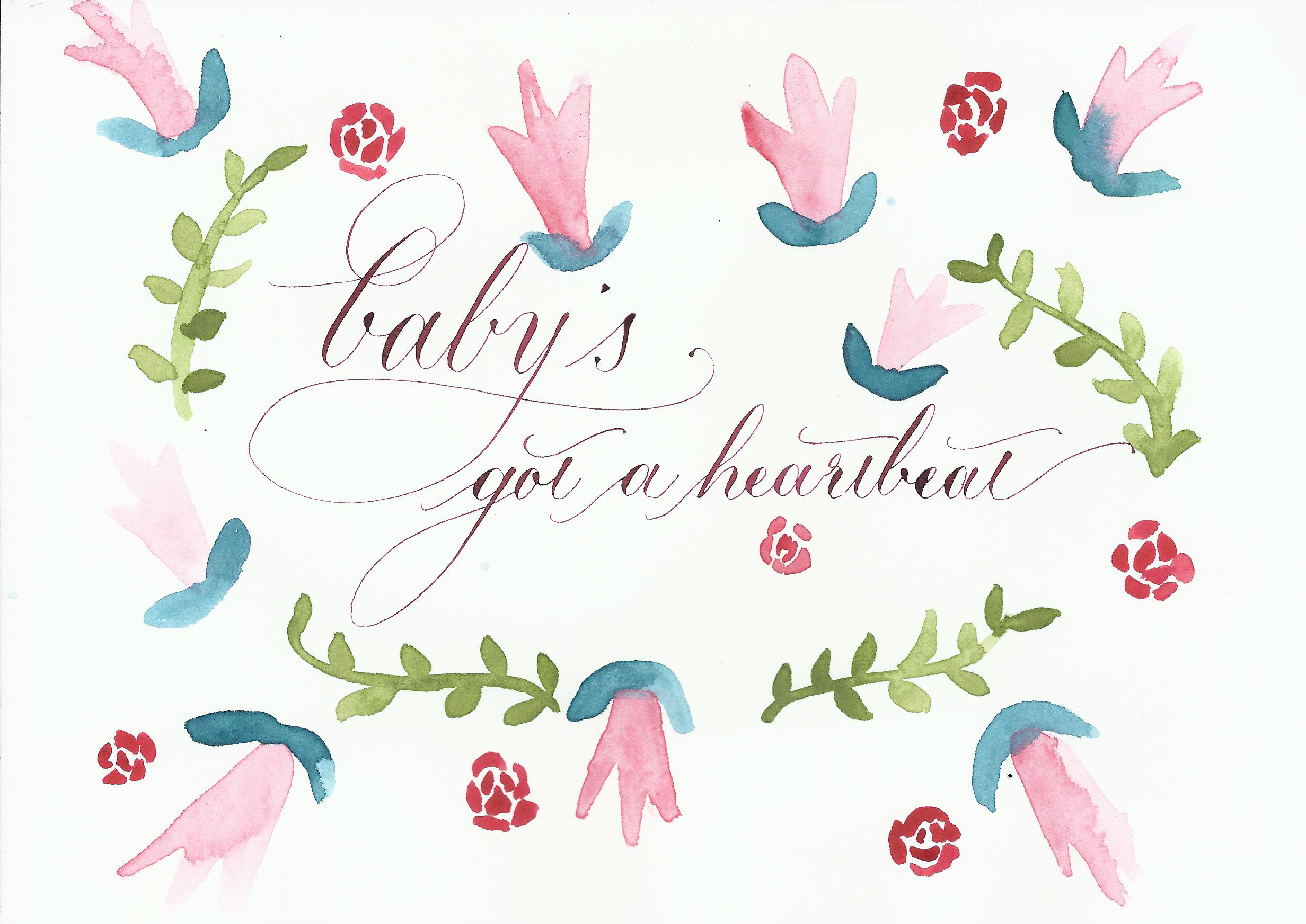 I'm just going to put this out there: if you haven't checked out Lindsey Bugbee's blog, The Postman's Knock, you really should. She is so willing to share her knowledge and skills to help other people learn, and I have already learned so much from her.
This post comes from a combination of inspiration. Today I heard my baby's heartbeat for the first time, and I just had to put it down on paper.
It seemed a perfect opportunity to try out Lindsey's Watercolour Lettering tutorial I've been looking at for ages. I didn't quite get this watercolour and calligraphy combo finished (because I didn't scroll down enough and then got distracted by spaghetti bolognese), but it's a start and, as always, gave me the confidence to keep trying new things. I feel very lucky to be surrounded by such creative teachers like Lindsey.
So, break out the watercolours and get over to Lindsey's blog so you can learn to immortalise your own life moments in uniquely creative ways.
Wedding beer label design
Even though I don't drink any more doesn't mean that I don't enjoy the company of those who do. Very early in our wedding planning, Jim and I decided that we would have a special beer brew in honour of the brewing he and my brother used to do regularly at Brew Brothers Microbrewery when we all lived in Brisbane. We call the boys the "Brew Brothers". Bonded by beer. Jim and Mitch agreed that the Honey Cream lager was their favourite, and since then my creative cogs have been whirring about designing a bespoke wedding label for the beer bottles.
Here's how the beer label design process played out.

Beer label design: sourcing the label
After a bit of searching the internet, we went with an American company called GrogTag.
- Their website was the easiest to navigate
- They provided downloadable templates
- The price seemed comparable, even with shipping to the UK
- The quality (vinyl stickers) looked pretty good.
We weren't disappointed. The labels arrived in under a week, and look fantastic.

Beer label design: Concept phase
The name: "You owe me 25 cents for the honey"
Every beer has a name, and when the boys decided on a honey lager, it was a no brainer what we should call the beer. Throughout my childhood (and still now), whenever we would ask mum for the honey (or sometimes even when we didn't), the following dialogue would have to play out:
Mum: "You owe me 25 cents for the honey."
Us: "What honey?"
Mum: "Oh, I never knew you cared."
I now carry on the tradition forever more, a Pavlovian response, into our future life together; it was the perfect thing to call our wedding brew.
Jim has been a big part of all of the stationery design decisions for the wedding, and if anything, I was going to give him even more say with the beer label (with mild trepidation, given his and my eye for design slightly differ). It was, after all, his thing.
Our criteria for design:
- oval tag
- something related to honey
- my calligraphy
I wanted the beer label to be stylish, and I wanted to try out some typography skills I've been learning, so I started a little conceptual drawing.
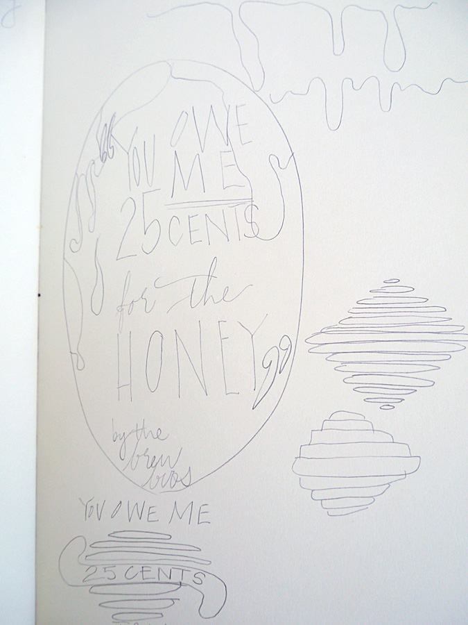
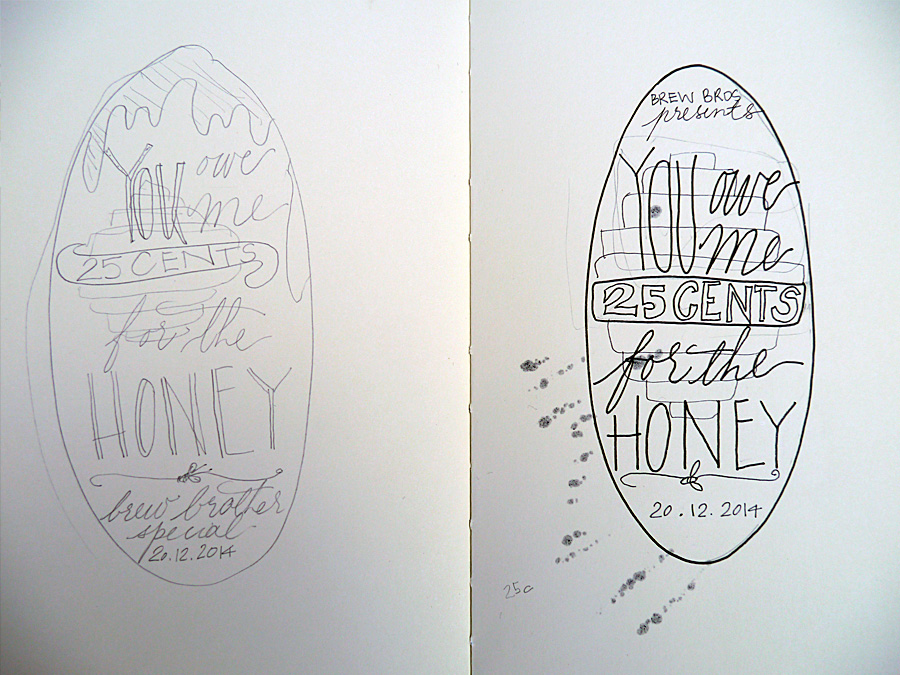
At this stage, Jim interjected with some thoughts. Namely, he didn't like the beehive or the dripping honey, and that he wanted a cartoon bee. So, with a somewhat reluctant heart, I went to task to include this guy in the design. I was not convinced about including a cartoon bee on our beer label, but it was what Jim wanted.
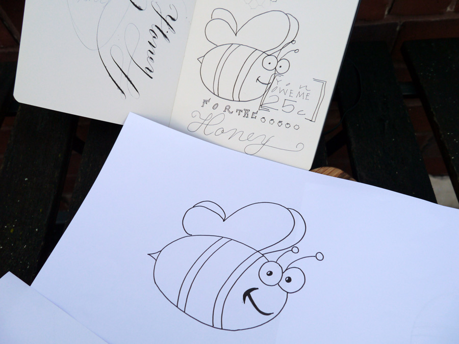
Beer label design: Calligraphy phase
I wrote out all the words I wanted in either calligraphy or another handwriting style to scan in at high res. While I kept the calligraphy in the end, I ditched the other handwriting styles because, to be frank, I haven't done enough typographical study to be confident with my work. We instead found a great complimentary font and rolled with that.

Beer label design: Layout
The final step was for us to put it all together in Photoshop. We had the GrogTag template to guide us on sizes, so all that was left was to import the scanned images and writing, style and adjust to fit, and choose our colours.
In addition to the calligraphy and the bee, we both wanted to add some honeycomb. Jim smartly suggested using the hexagonal tool (I was trying to draw them very shoddily), and after a general colour agreement of green and gold, a nod to our Aussie heritage, we shifted from pastels to the deep hues we settled on in the end.
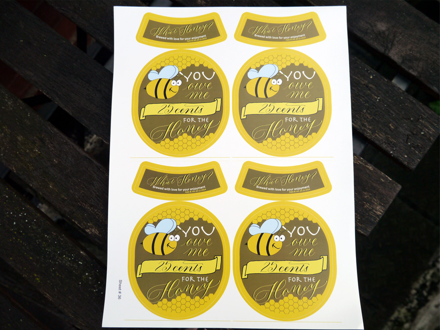
I think we've all earned a brew, don't you!
Designed by: Olive & Reid Studio Printed by: GrogTag