

What is modern calligraphy?
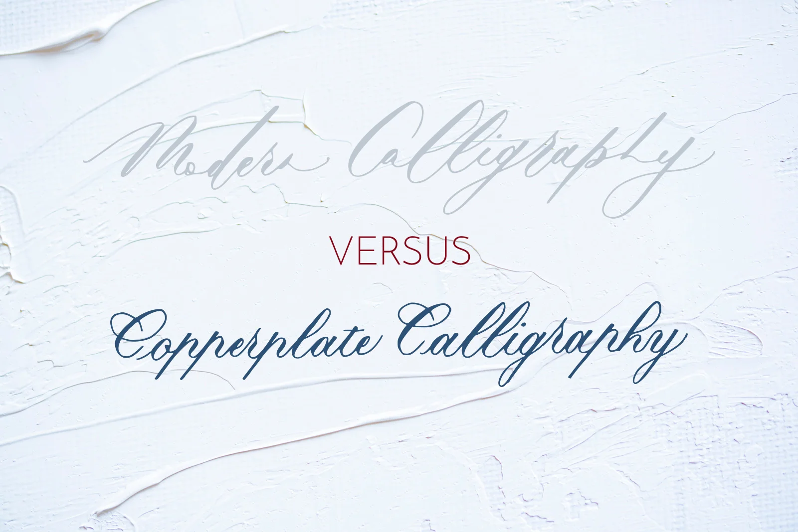
Modern calligraphy has swiftly become the go-to script for brides looking for a unique finishing touch for their wedding, or for learners looking to ease themselves into dealing with calligraphic scripts and paraphernalia.
When I started teaching myself calligraphy in 2014, I didn't start with modern calligraphy. I didn't even know that was a thing. I instead found a style that I like the most, and seemed the most practical out of them: Copperplate.
What I quickly found was that Copperplate script, with its distinctive thick downstrokes and thin upstrokes, has now taken on a contemporary twist into what's termed "modern calligraphy". Although this style may be considered disdainfully by some traditionalists, I have seen it executed with breathtaking beauty by some of my favourite calligraphers.
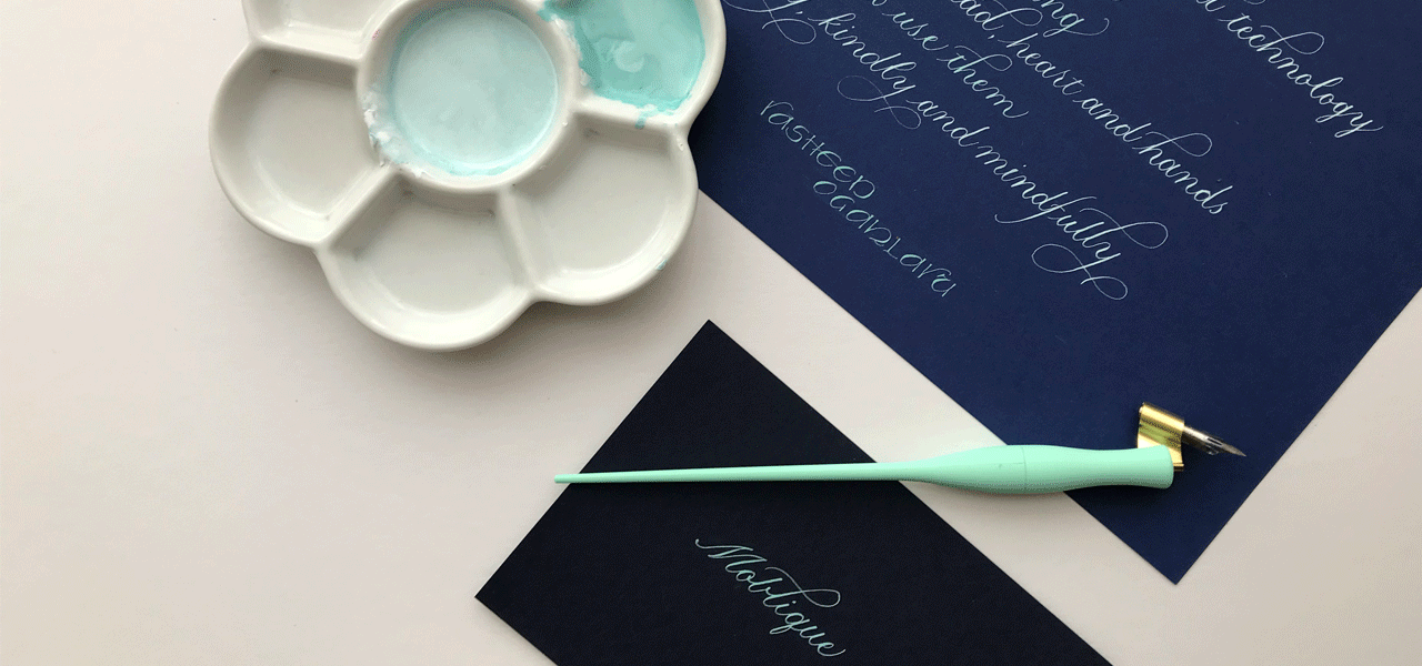
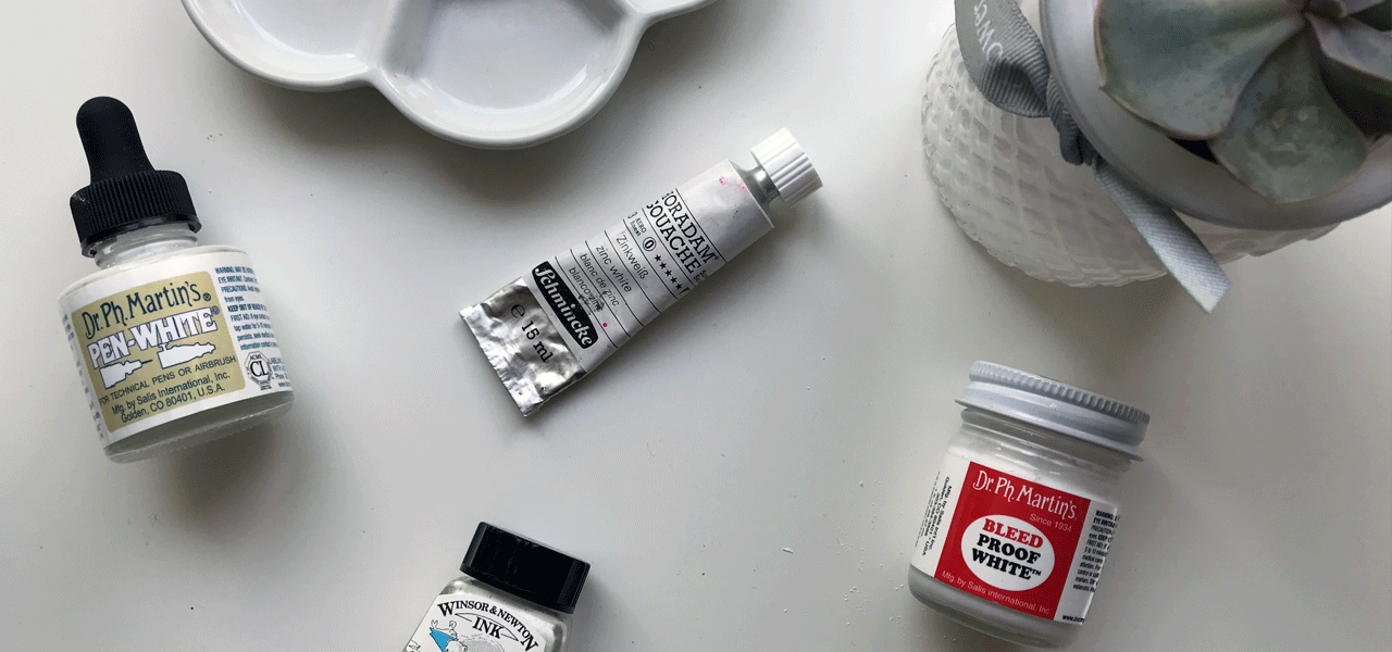
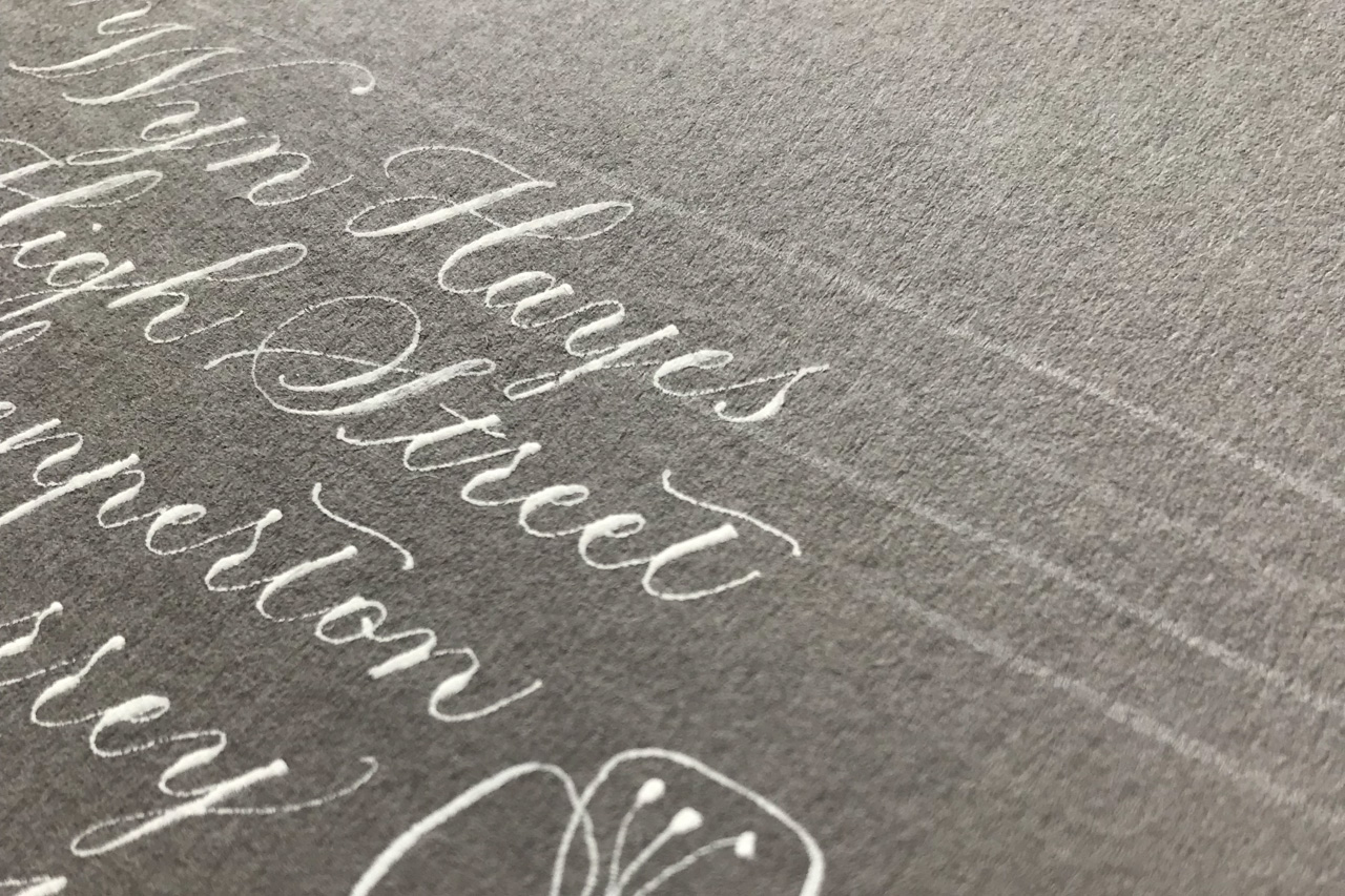
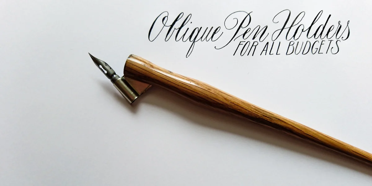
The difference between Copperplate script and modern calligraphy
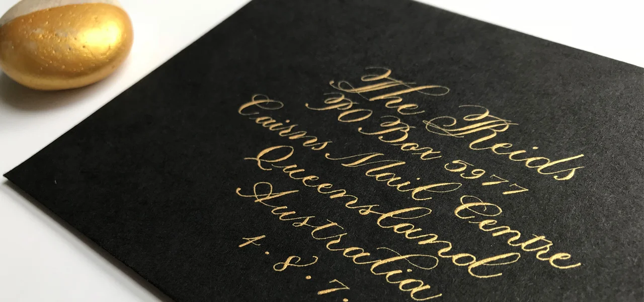
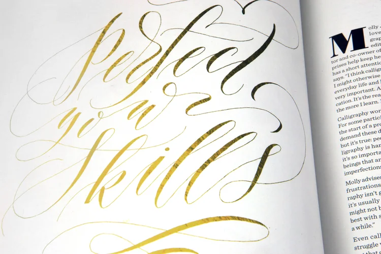
Modern calligraphy has its grounding in Copperplate script, which is why many teachers recommend getting Copperplate under your belt first. Copperplate calligraphy:
is structured with specific, individual strokes used to form the letters
requires varying pressure on up and down strokes to create thick down lines, and thin — hairline — upstrokes.
Therefore, mastering these techniques not only give you an excellent foundation, but also confidence, for doing modern calligraphy. The only difficulty I've been having is loosening up and being free outside of the Copperplate constraints. Beautiful constraints.
Modern calligraphy is a fresh, new style that brings a flexibility and uniqueness that is both appealing and accessible. Where Copperplate dictates form and function, modern calligraphy lends itself to a more fluid, closer-to-your-handwriting approach. With some practice, dedication, and inspiration, anyone can define their own modern calligraphic style.
My top resources for learning traditional and modern calligraphy:
Mastering Copperplate Calligraphy by Eleanor Winters
Modern Calligraphy by Molly Suber Thorpe
Modern calligraphers to follow

Graded watercolour calligraphy
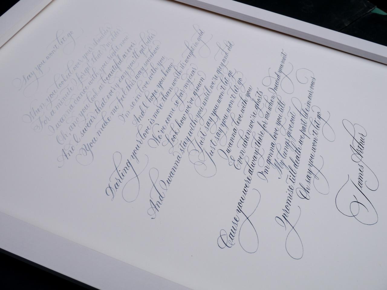
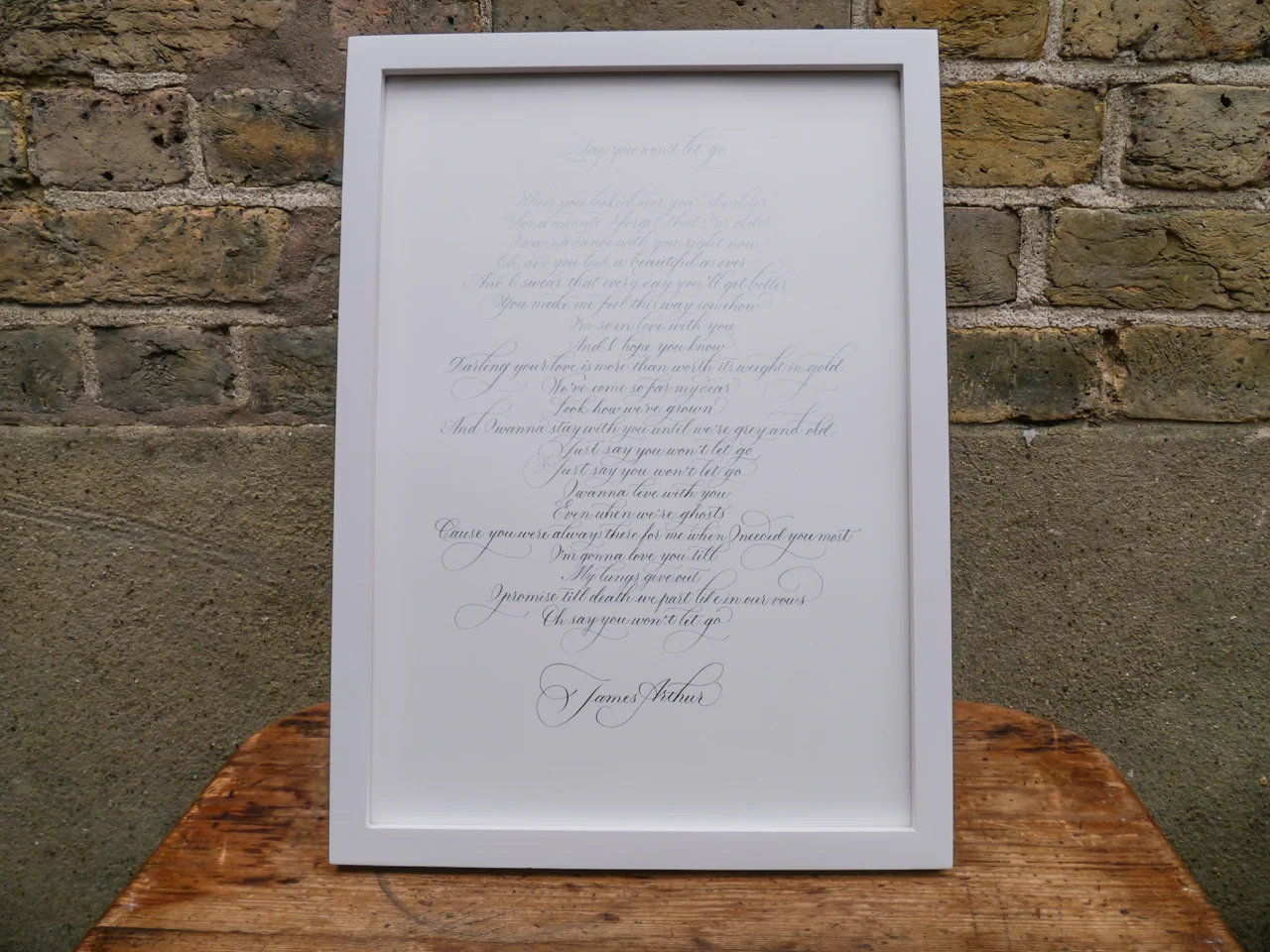
Taking inspiration from the abstract blue hues of a painting, I decided to give graded watercolour calligraphy a try. The plan was to start with very diluted colour (Cotman's Indigo: links to Amazon.co.uk) and gradually add more pigment over the course of the piece. I worked with a section of the moving James Arthur lyrics from his song, Say You Won't Let Goon Bockingford 300gsm watercolour paper at A3 size. I used flourished Copperplate script for a traditional style with a little flair. Satisfyingly, the gorgeous blue gradient ended up looking exactly as I planned — deepening dramatically with the words down the page. Before I started, I worked out that, for 23 lines, I would add more colour approximately every 3.5 lines, building up the hue six times over the course of the full piece.
My method of mixing was an inexact science, simply dipping my brush into the saturated watercolour pan and moving across into my diluted colour. Of course, the saturation could be decreased or increased, depending on how long your piece and the final look you're going for.

Ruling pen calligraphy with Rachel Yallop and Michael Clark
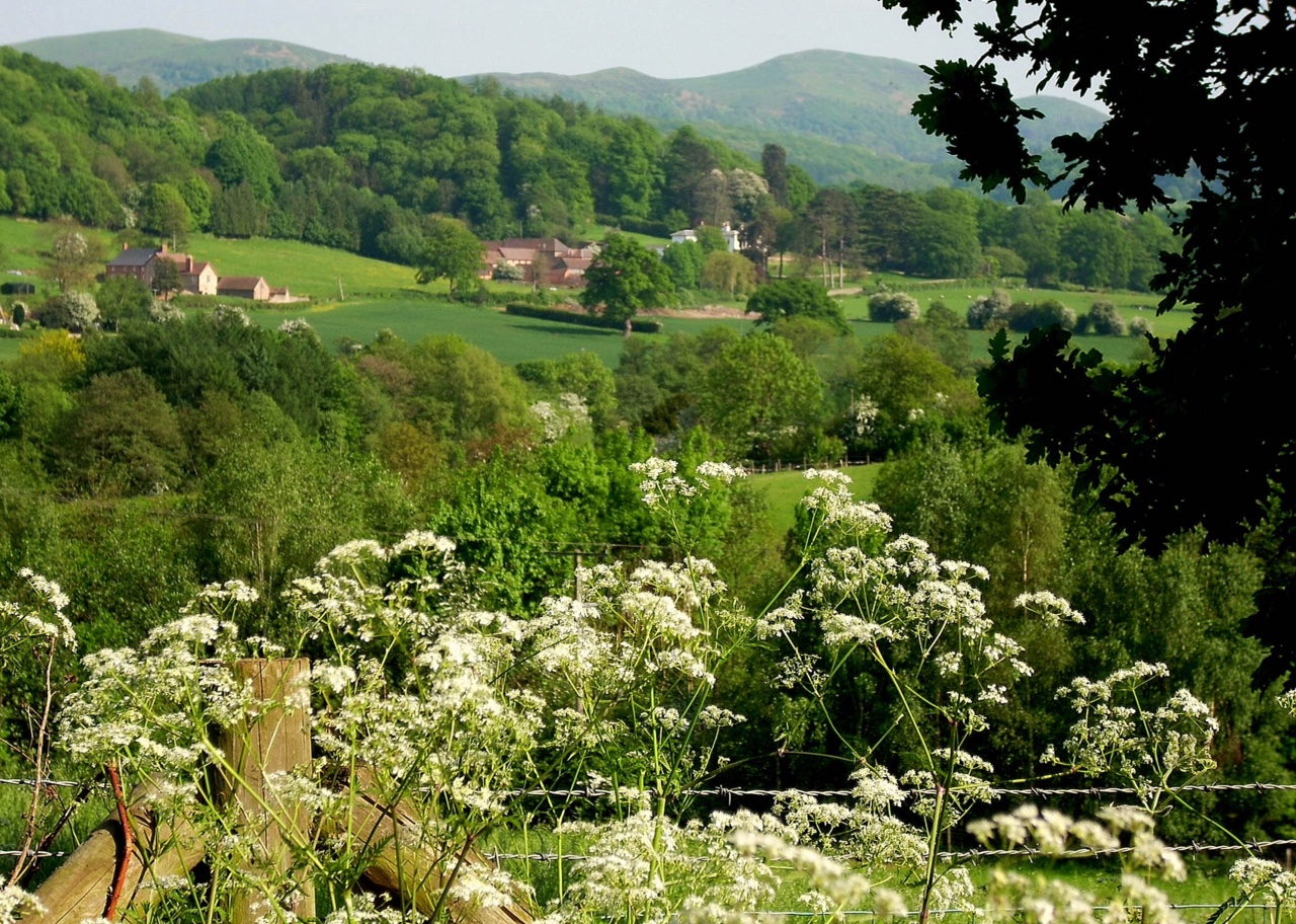
Getting out of London for a ruling pen calligraphy workshop run by Rachel Yallop and Michael Clark, in the most wondrous UK setting of Cradley, near the Malvern Hills, was the perfect excuse for a little family weekend getaway this October. Even though I would be spending the majority of the weekend at the workshop, I still got to breathe the fresh air, spend some quiet time overlooking two horses with my daughter at our accommodation, The Ash, and have some lovely evening chill-out time with the fam and a friend somewhere far away from our London lounge room.
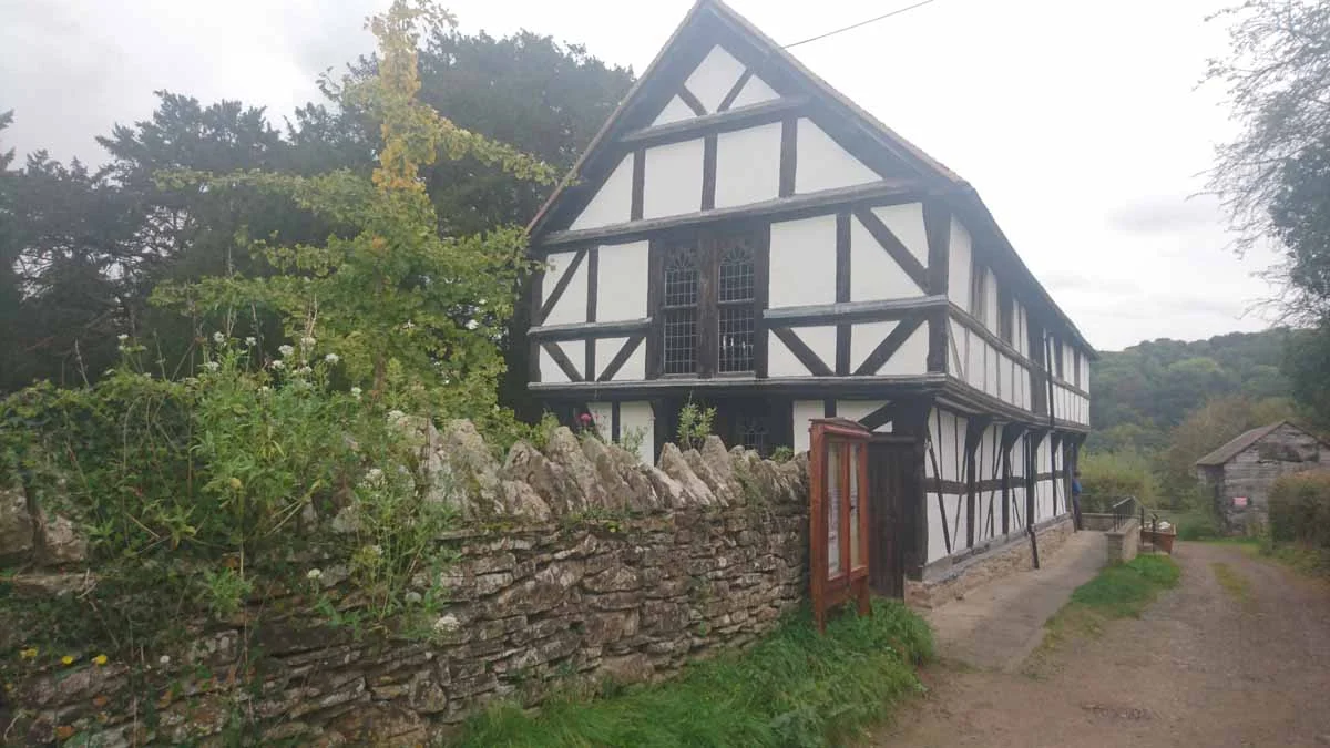
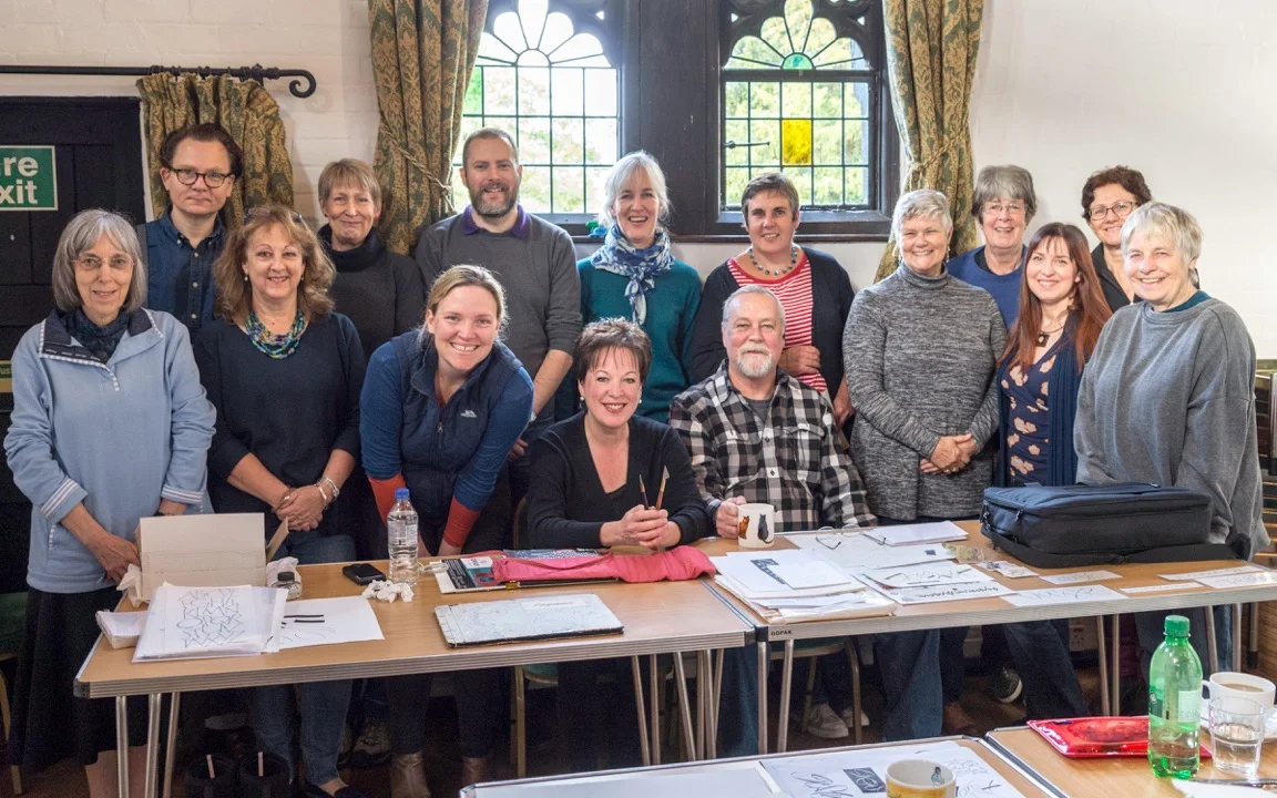
The course was held in Cradley Village Hall, a centuries-old building with all the charm needed for a group of 12 calligraphers.
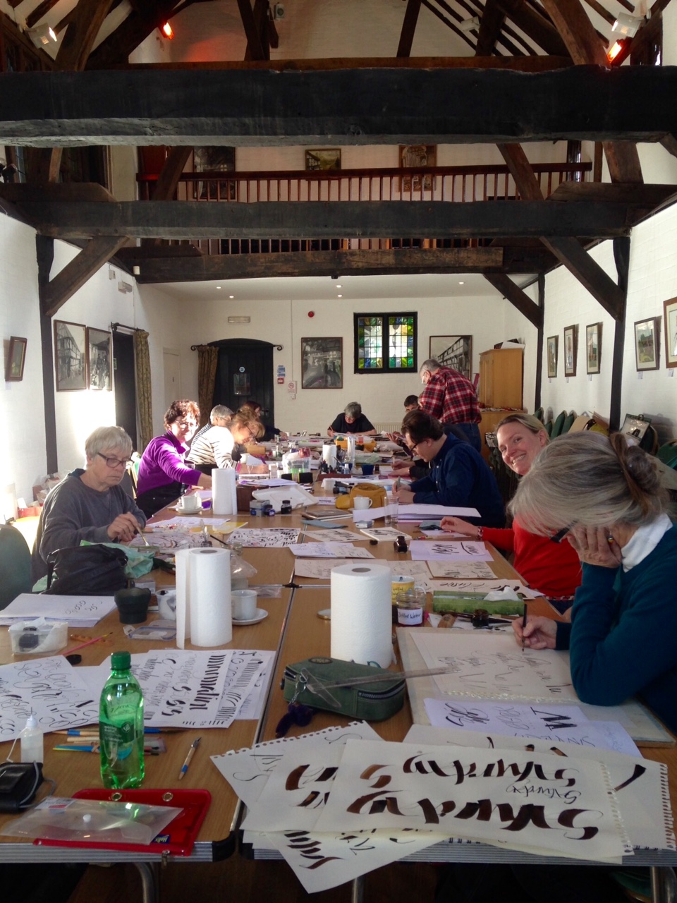
Of course, being a relative newcomer to calligraphy, I felt a little out of my depth surrounded by such fantastic talent. However, armed with Paula Comparini's ruling pens, and charmed by Michael's gentle yet passionate will to teach what he has learned, I kept my humour and wielded my weapon as best I could.
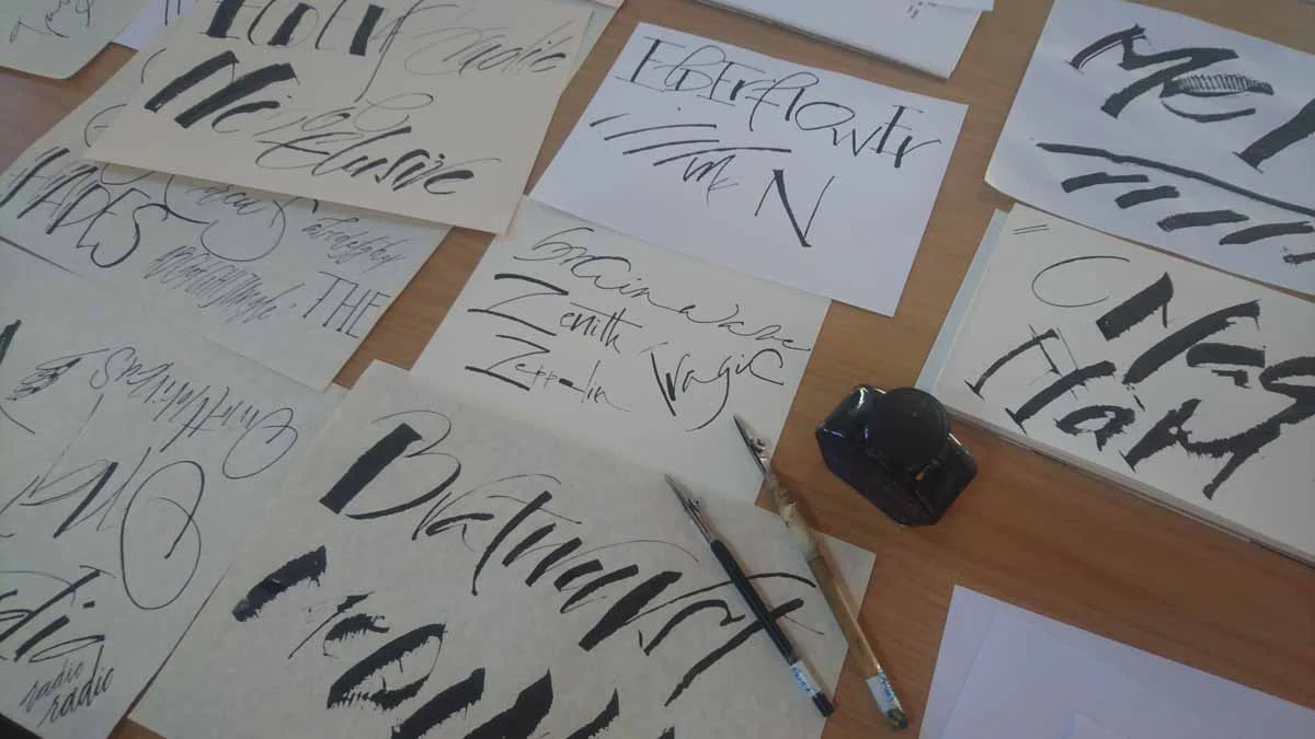
Ruling pen example styles
When I say I was surrounded by fantastic talent, I'm not joking. My friends for the weekend were churning out inspiring, thoughtful and thought provoking pieces, mixing media and styles deftly. I have included some examples here with the artists' permission. As you can see, ruling pen applications are so diverse and unique as each person using it, and is a stark contrast against the regimented consistency of more formal scripts.
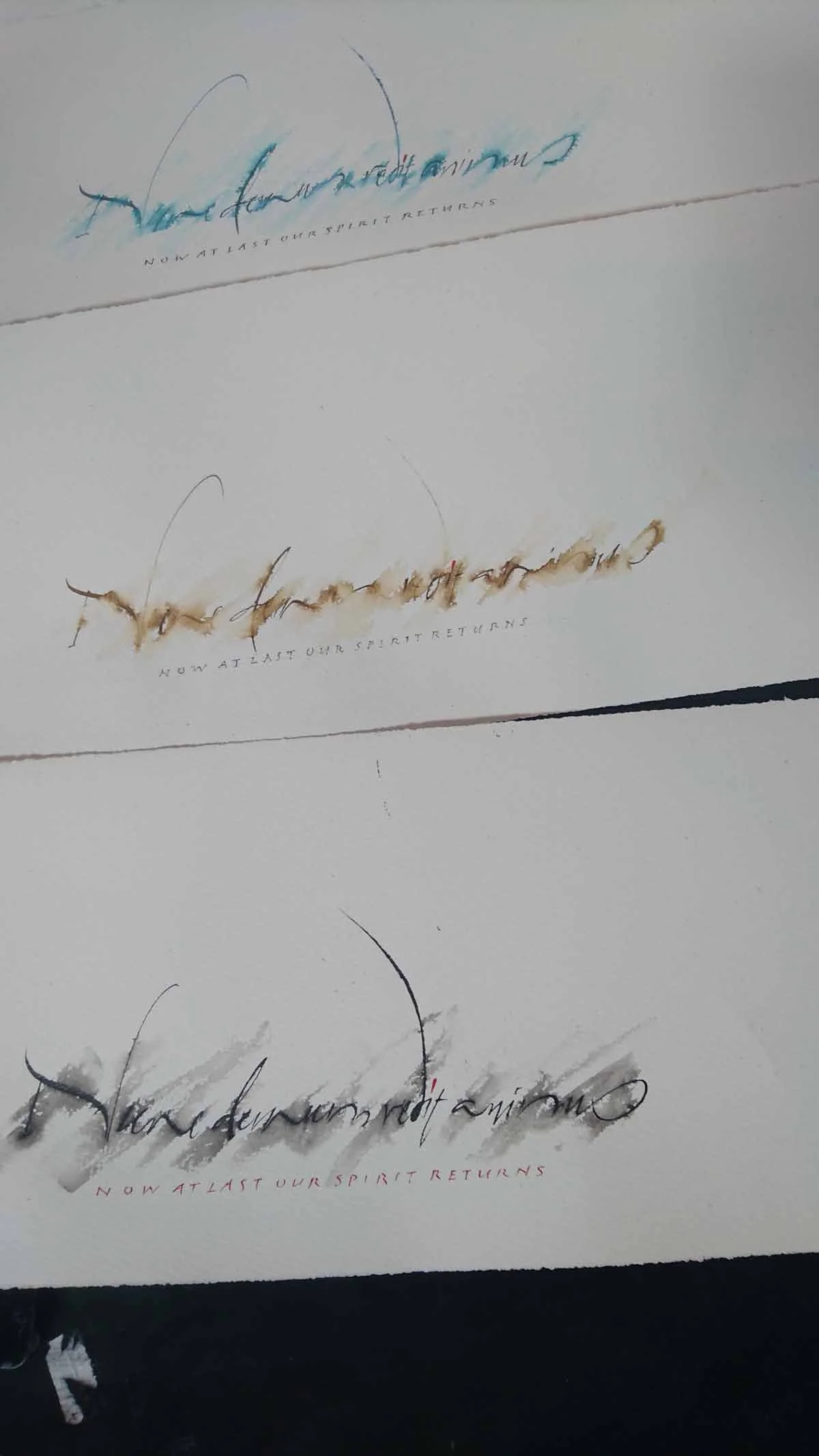
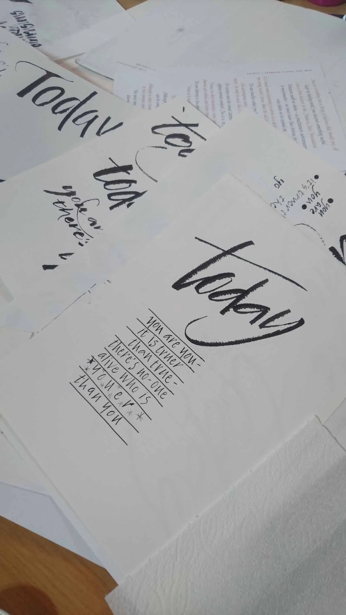
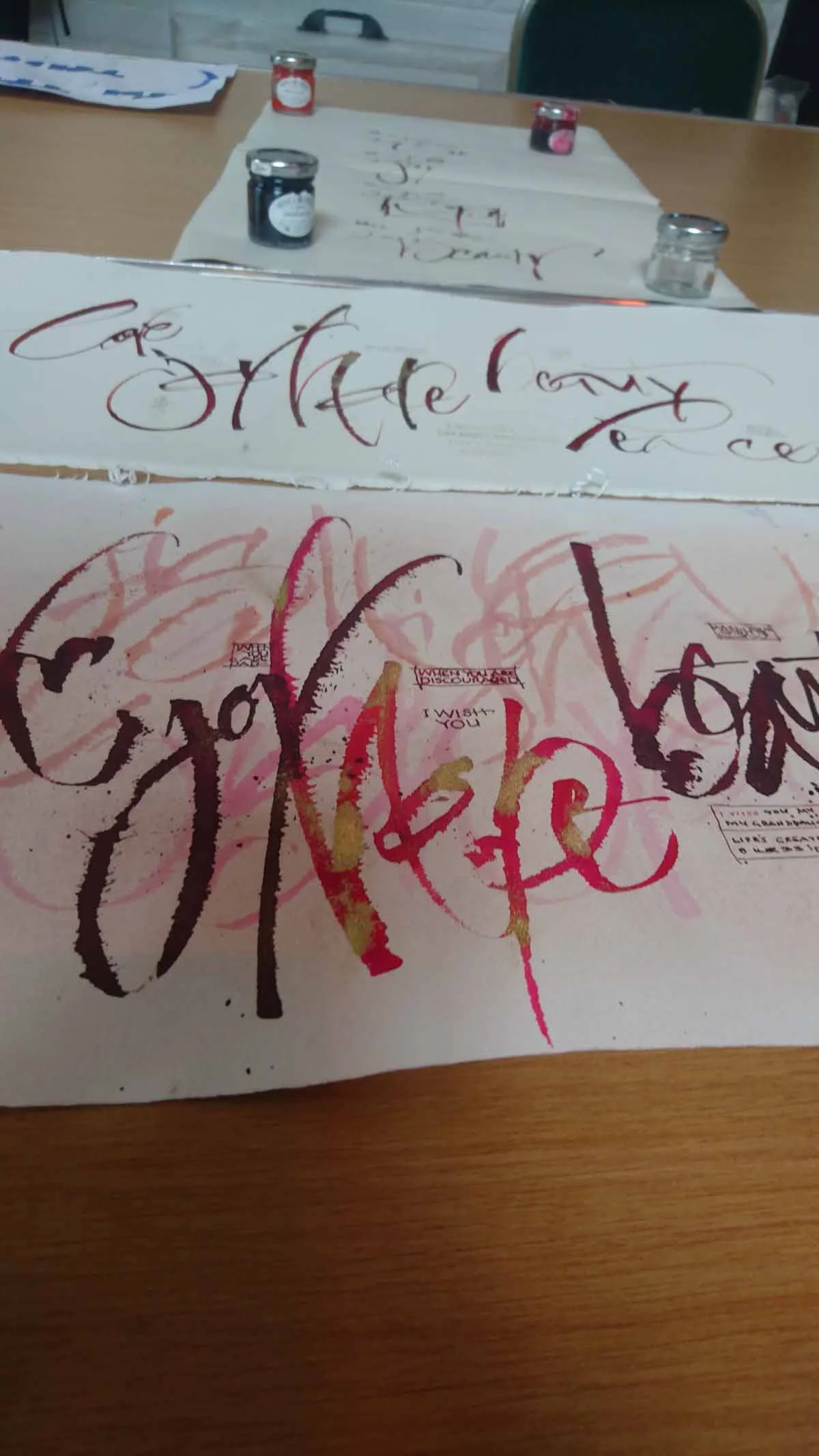
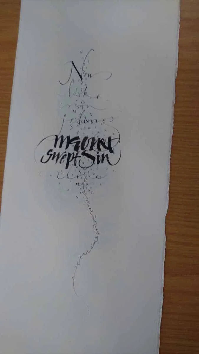
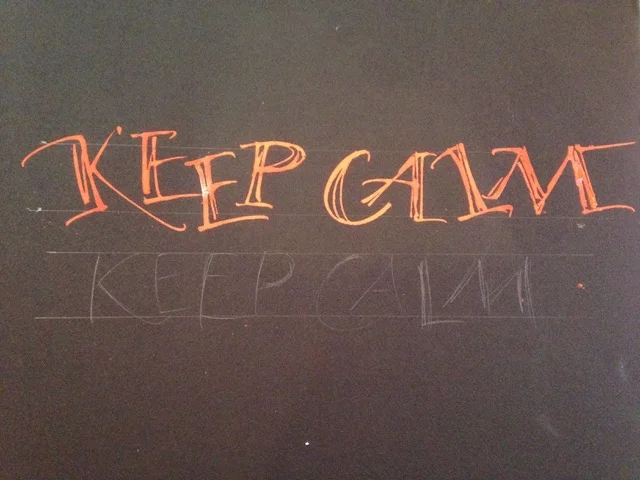
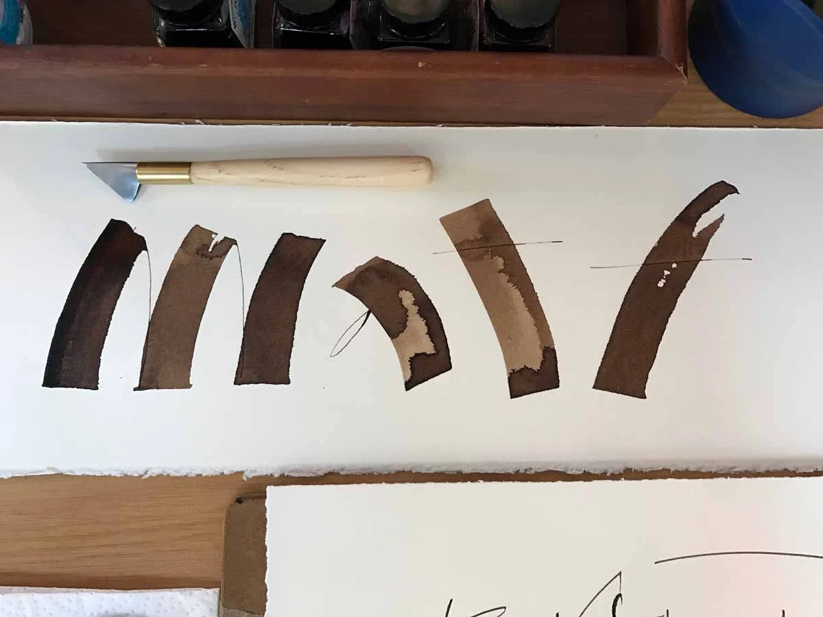
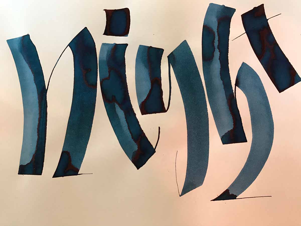
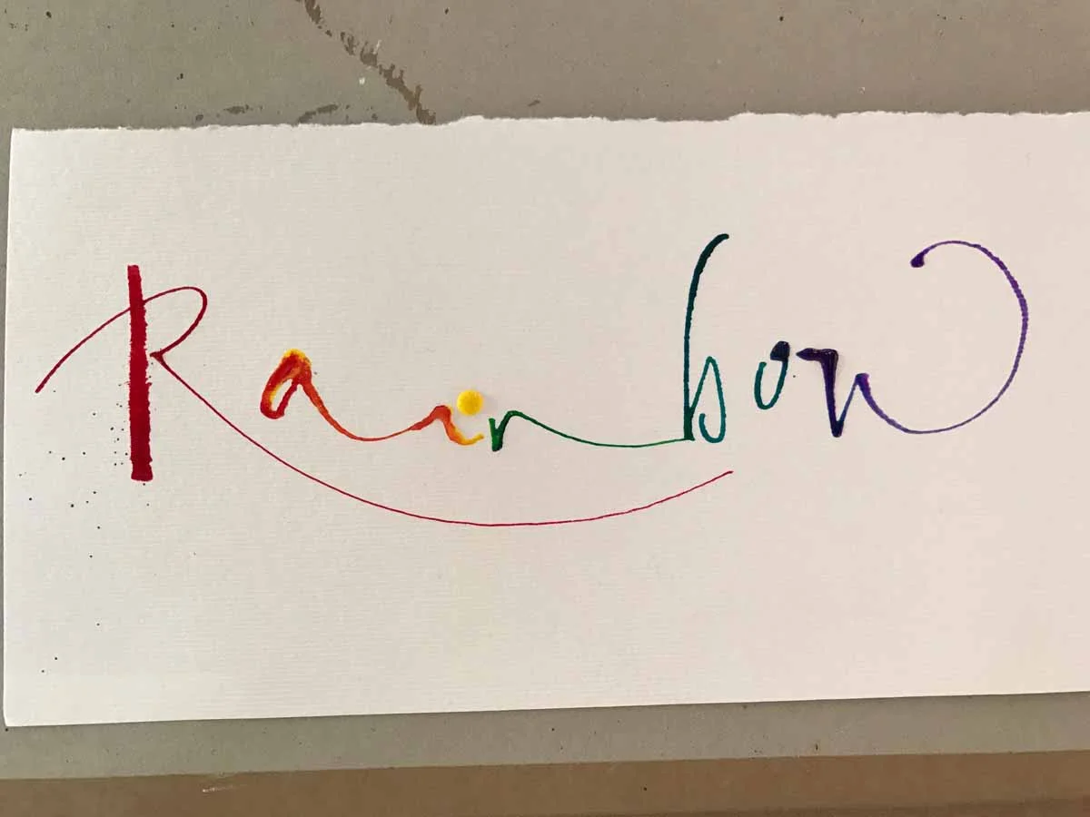
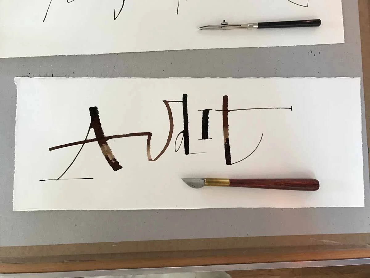
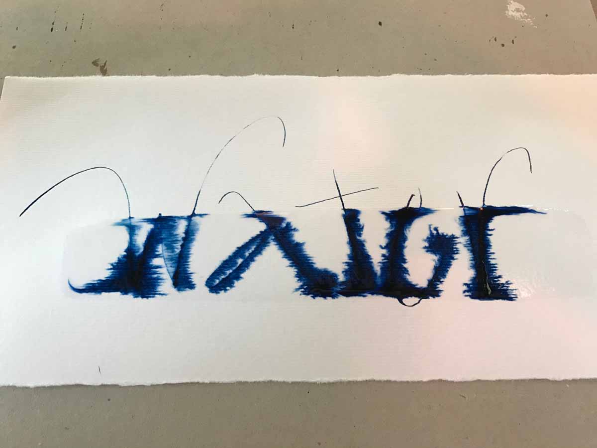
Thanks to Els van den Steen, Meg Chapman, Judith Porch, Janet Smith, Margaret Morgan and Tony Woodhams for their permission to use their pictures.
What happens a ruling pen calligraphy workshop?
This ain't Vegas, so I'm here to spill the beans. Imagine tea, ink, paper. Did I mention tea? And amazing locally supplied lunches. Over the course of the two days, Michael and Rachel guided us through ruling pen calligraphy demonstrations as a starting point but predominantly gave us plenty of time to experiment as they travelled around the room, patiently listening to our concepts and giving advice.
Day 1 focused on experimenting with the pens and seeing the range strokes you could create with them just by alterning which side you used or the angle it was on. We later moved into trying to capture the essence of words like 'angry' and 'gentle', using the ruling pen to reflect its meaning.
On day 2, our task was to work with a quote of our choice, developing not just layout but a design that, again, captured its meaning. It was impressive to see how my fellow calligraphers adapted their quotes to suit their style using different colour inks, strokes and textures.
Michael brought with him from the US two of his books filled with original ruling pen calligraphy designs from his commercial work that showed exactly how they looked on paper before it went digital. It was an invaluable resource to be able to see what was involved in his process. I admired the fact that he comes from a self taught, often uncoventional background, which he is proud of, defends and supports in others.
I could tell how prepared both Rachel and Michael were for this workshop, but they made it look effortless. I understand how much work goes into to teaching other people, and I appreciate that these two talented artists take that time to teach. I certainly felt very much the baby artist of the crew, but armed with a new folding pen from Tim Leigh, new skills and empowering messages from Michael, I'm excited about continuing to develop my calligraphic and lettering style.
Order your copy of Rachel and Michael's ruling pen book
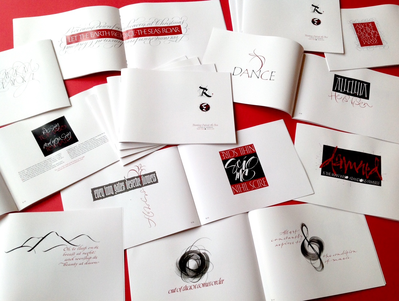
If you missed Rachel and Michael's workshop, you still have the opportunity to buy their latest book collaboration, Thinking Outside the Box. The cost for UK shoppers is £14 (inc. postage).
You can pay Rachel by her PayPal web page or find out more and get in touch with any questions via Rachel's website or Facebook page.

Recycling Amazon packaging for fun hand lettered projects
When Joyce from Artsy Nibs recently shared a fun hand lettered project by revamping her Amazon packaging, I just had to give it a go.
Turned that @AmazonUK packaging paper into a wall decor. Gonna be humming to @OneRepublic everyday now. #letteringpic.twitter.com/hgIR8TFQ6o
— Joyce Lee (@artsynibs) September 13, 2016
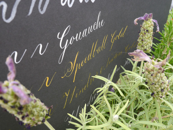
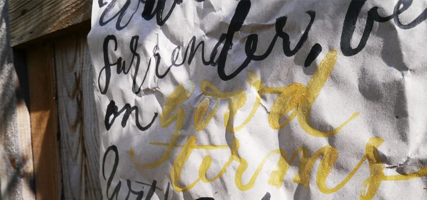
I had a brief window this weekend to try it out — yep, a rush job — but thought I'd get a feel for it at least. My first hand lettered project attempt was for a wall hanging of my favourite poem, Desiderata, featuring black writing with gold highlights of key (positive) words:
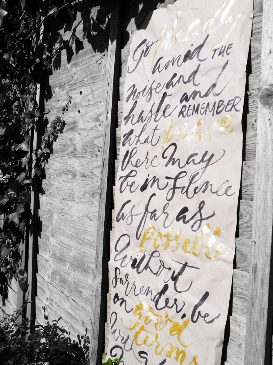
For this I used black Parker Quink and Speedball gold and a size 6 round brush. The black bled a little with too much on the brush, and seemed to flow better after I'd first dipped the brush in water. The gold was not as vibrant as these pics imply, but was a lovely contrast of the positive words regardless. When I have more time, I'll test other inks and paints to see what works best.
Have you revamped something unsuspecting lately? I love that I can give this paper a little longer life — whether as a wall hanging, or some wrapping paper (my second fun hand lettered project for some ventilator bonnets for First Touch). Let me know in the comments, or share with me on social media tagging @oliveandreid.

A pretty little giveaway: wattle you win?
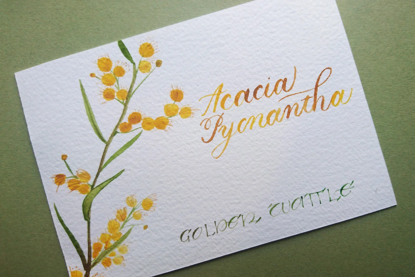
I'm often 'giving away' a lot of calligraphy and lettering information here on the blog, but have never given away a prize. Today, it begins. Giveaways giveaways giveaways! A wattle giveaway, to be precise. How exciting! At this year's South London Lettering Association's exhibition — themed 'celebrations and festivities' — I'll be exhibiting a celebration of my Australian heritage with two floral prints. Featuring Callistemon Citrinus (Bottle Brush) and Acacia Pycnantha (Golden Wattle), these two A6 pieces combine watercolour illustration with brush lettering and calligraphy script.
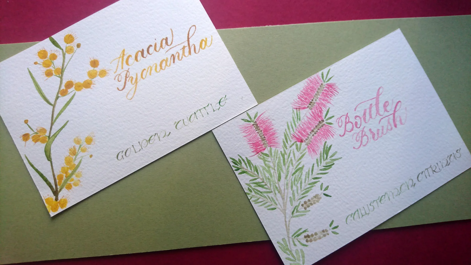
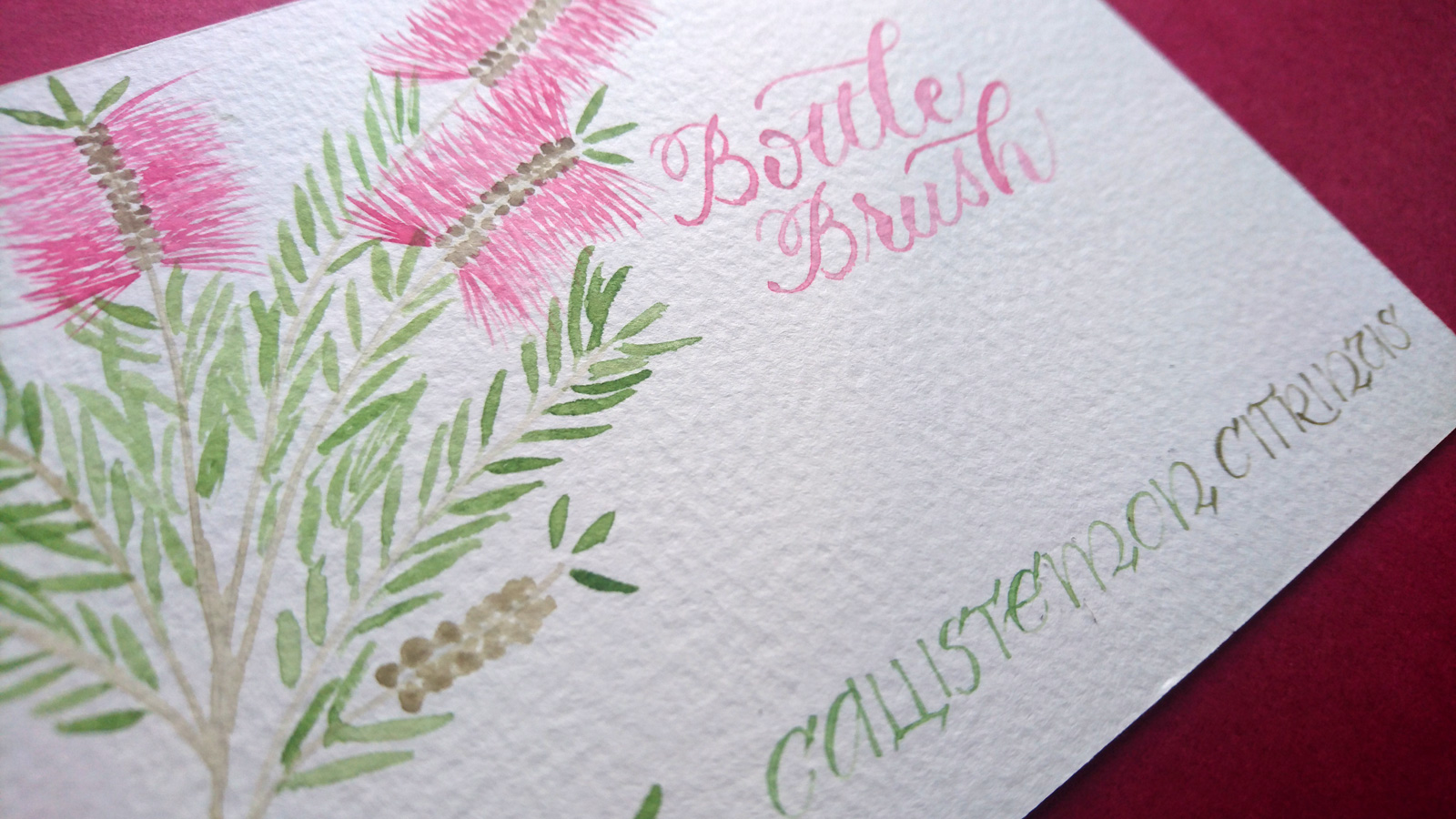
I'm really excited to be exhibiting for the first time and wanted to share it with you, not just the description, but the real life, real deal original artwork.
Your golden ticket to the golden wattle
In this wattle giveaway, I'm offering the chance to win not one, but two!, original A6 hand lettered and illustrated print of Australia's national flower, the Golden Wattle.
All you need to do to win is fill out the widget below. The competition ends on 25 September 2016.
It's worth noting: as I try to be a calligrapher with a conscience, this artwork has been created on exceptionally high quality paper (300gsm cold pressed watercolour) that I have reused after trialling another artwork on the other side.
Good luck!
The serious bit — Ts and Cs
Let's keep it light, but real. Here is some information that you might want to know.
- This giveaway is for 2 x A6 original print featuring wattle illustration and hand lettering, as pictured or similar
- Anyone is eligible to enter. The prize will be sent wherever you are in the world
- We us Rafflecopter to run the competition, and this service allows us to randomly pick a winner once the competition has ended. The winner will be announced on the blog post, and contacted directly afterwards.
- By entering the competition, you'll be added to our mailing list (monthly updates and news about giveaways, new prints and limited editions). You can unsubscribe from the mailing list at any time.
Kate x