

Recycling Amazon packaging for fun hand lettered projects
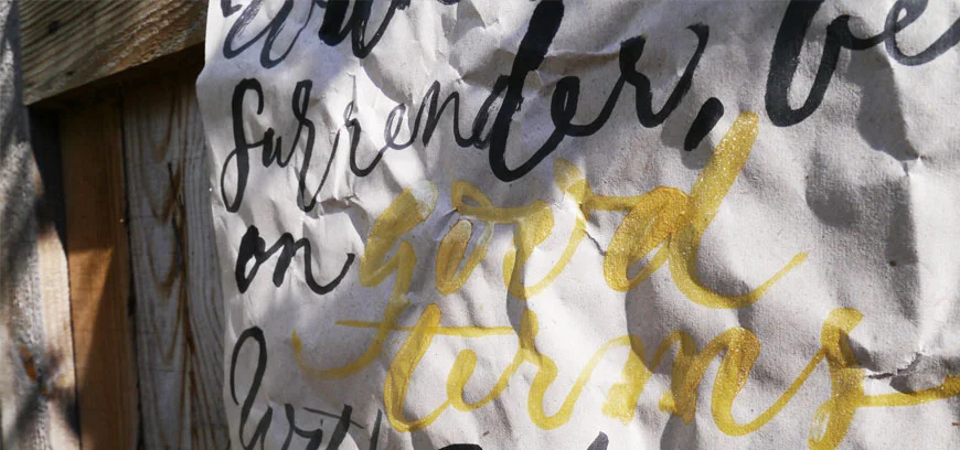
When Joyce from Artsy Nibs recently shared a fun hand lettered project by revamping her Amazon packaging, I just had to give it a go.
Turned that @AmazonUK packaging paper into a wall decor. Gonna be humming to @OneRepublic everyday now. #letteringpic.twitter.com/hgIR8TFQ6o
— Joyce Lee (@artsynibs) September 13, 2016
I had a brief window this weekend to try it out — yep, a rush job — but thought I'd get a feel for it at least. My first hand lettered project attempt was for a wall hanging of my favourite poem, Desiderata, featuring black writing with gold highlights of key (positive) words:
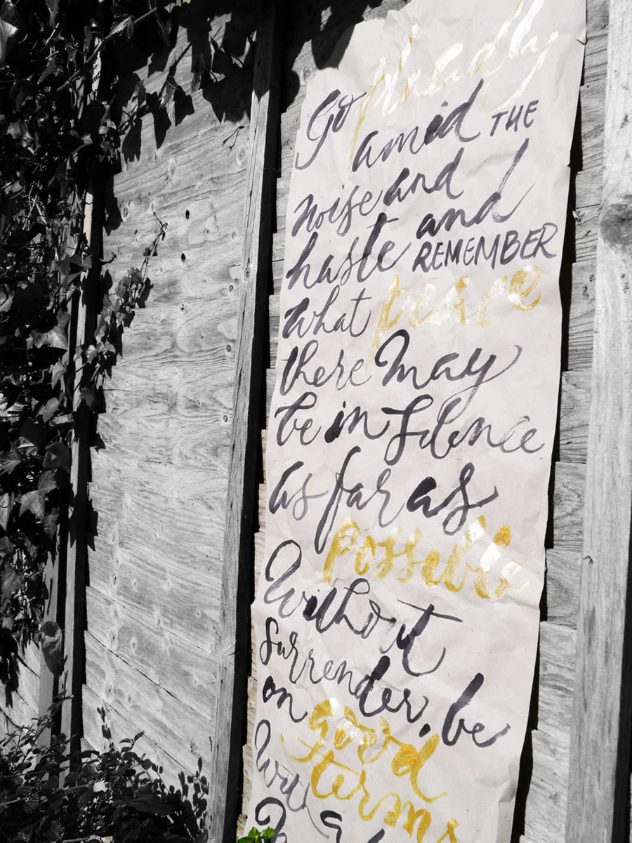
For this I used black Parker Quink and Speedball gold and a size 6 round brush. The black bled a little with too much on the brush, and seemed to flow better after I'd first dipped the brush in water. The gold was not as vibrant as these pics imply, but was a lovely contrast of the positive words regardless. When I have more time, I'll test other inks and paints to see what works best.
Have you revamped something unsuspecting lately? I love that I can give this paper a little longer life — whether as a wall hanging, or some wrapping paper (my second fun hand lettered project for some ventilator bonnets for First Touch). Let me know in the comments, or share with me on social media tagging @oliveandreid.

Ever needed calligraphy ink alternatives?
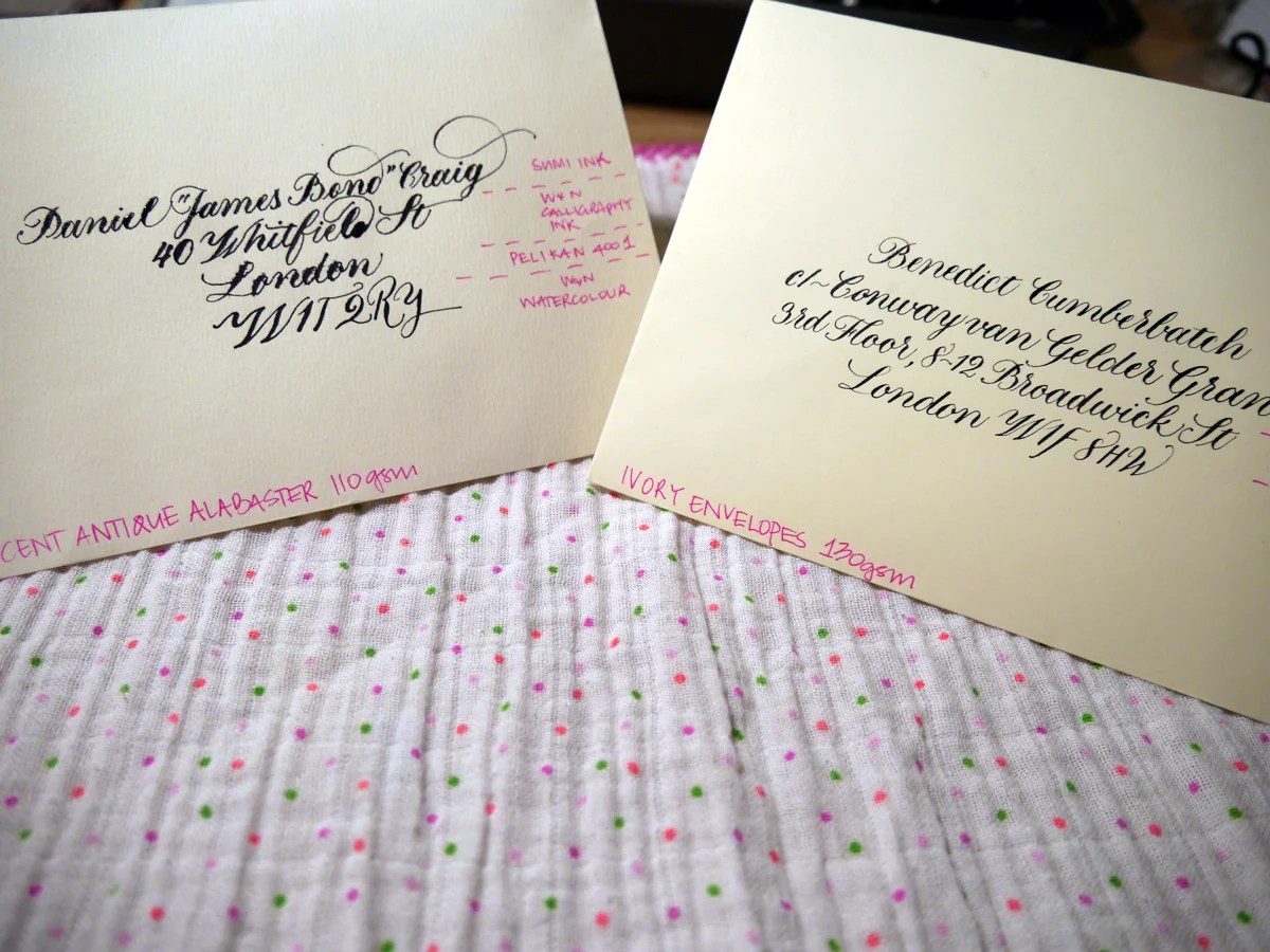
This post wasn't planned to be about calligraphy ink alternatives. Originally, I was going to talk about envelope suppliers in the UK, but during the sample testing process, I suffered some sad calligraphy ink catastrophes. ...so you bought less-than-perfect quality envelopes and now your ink is bleeding everywhere like a scene from CSI. Don't panic. All is not lost.
What's the ideal stationery gsm weight for calligraphy?
As a general rule of thumb, envelopes (well, pretty much any form of stationery) for calligraphy should be at least 120gsm. It's still always a good idea to test the paper stock if you can because you just never know.
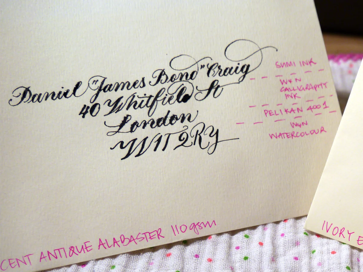
I recently made the schoolgirl error of buying 110gsm envelopes... I swear I thought it was 160 gsm! With a solid helping of optimism, I tested it out, and things did not go so well. Next to the 130 gsm counterpart I was testing, it was a right mess. Hollywood superstar Daniel Craig doesn't deserve to receive this trash calligraphy.
Ideal-110gsm-close-sml
Testing sample envelopes for calligraphy
The sample envelopes I used for testing
C6 Ivory Envelopes 130 gsm (£7.20/50)
Accent Antique Magnolia 110 gsm (£11.04/50)
Do you think it was the fancy name of the 110 gsm ones that blinded me? Before you answer, it's important to know that I'm a sucker for marketing. And as a marketer, I should know better. Maybe I thought more expensive meant better? I wish we could just forget they ever happened. But they did, and now we have to find a way to fix this.
The black inks I used to test with
Accent Antique Magnolia 110 gsm envelopes
You can see for yourself how the envelope fared with these inks. I used Leonardt Principal EF nib and within seconds of nib to paper I knew it was going to be hazardous. It takes a lot of effort to persist when your writing looks like this. You're wiping away tears and clutching at your heart and reputation all while creating the calligraphy version of a Pinterest Fail that you very absolutely intend to share with the internet. You're welcome.
Ideal-110gsm-close-sml
There really isn't much point in assessing each ink, but I would say that the watercolour may make them usable, and the Pelikan 4001 suffered the most. Sad, really.
Although I went to bed annoyed at myself for these envelopes, I woke thinking, "I CAN FIX THIS".
What can you use instead of ink for calligraphy?
You see, calligraphy isn't restricted to inks. There's a range of water-based paints and products that can be diluted to the right consistency to write with. Rummaging through my inky tool box, I pulled out four alternatives that I thought could be worth a try.
Ideal-110gsm-paint-full
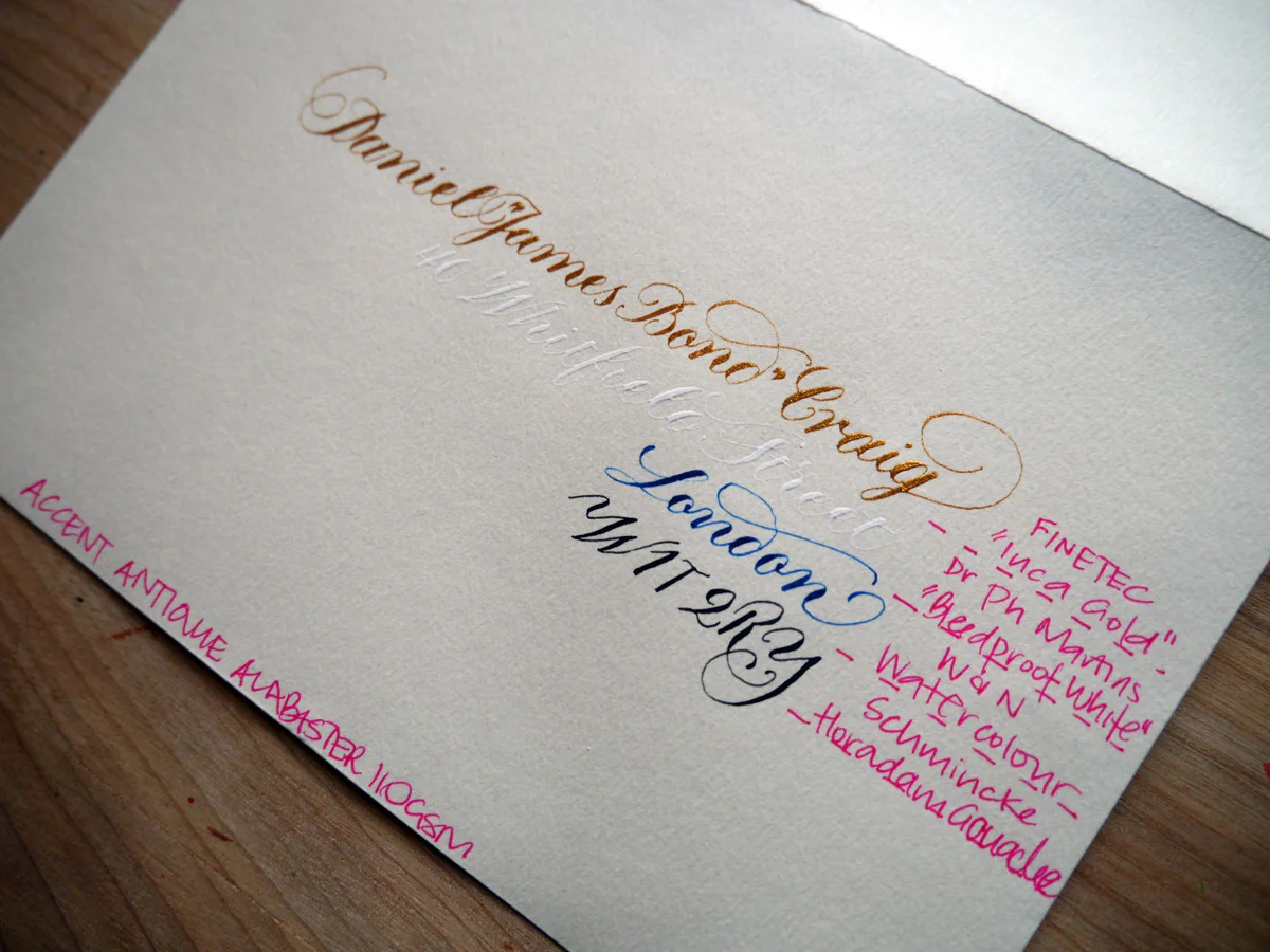
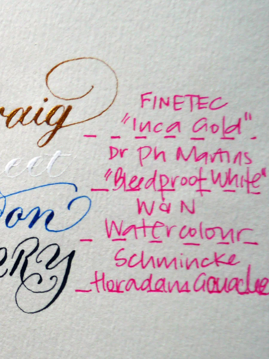
Every single one of the alternatives to ink works on these envelopes. Well, the fact that the white is barely legible is beside the point; it didn't bleed. Cos it's "bleed proof". Dr Ph Martin did not lie. And — come on! — secret writing is exactly perfect for James Bond. Maybe not for Royal Mail.
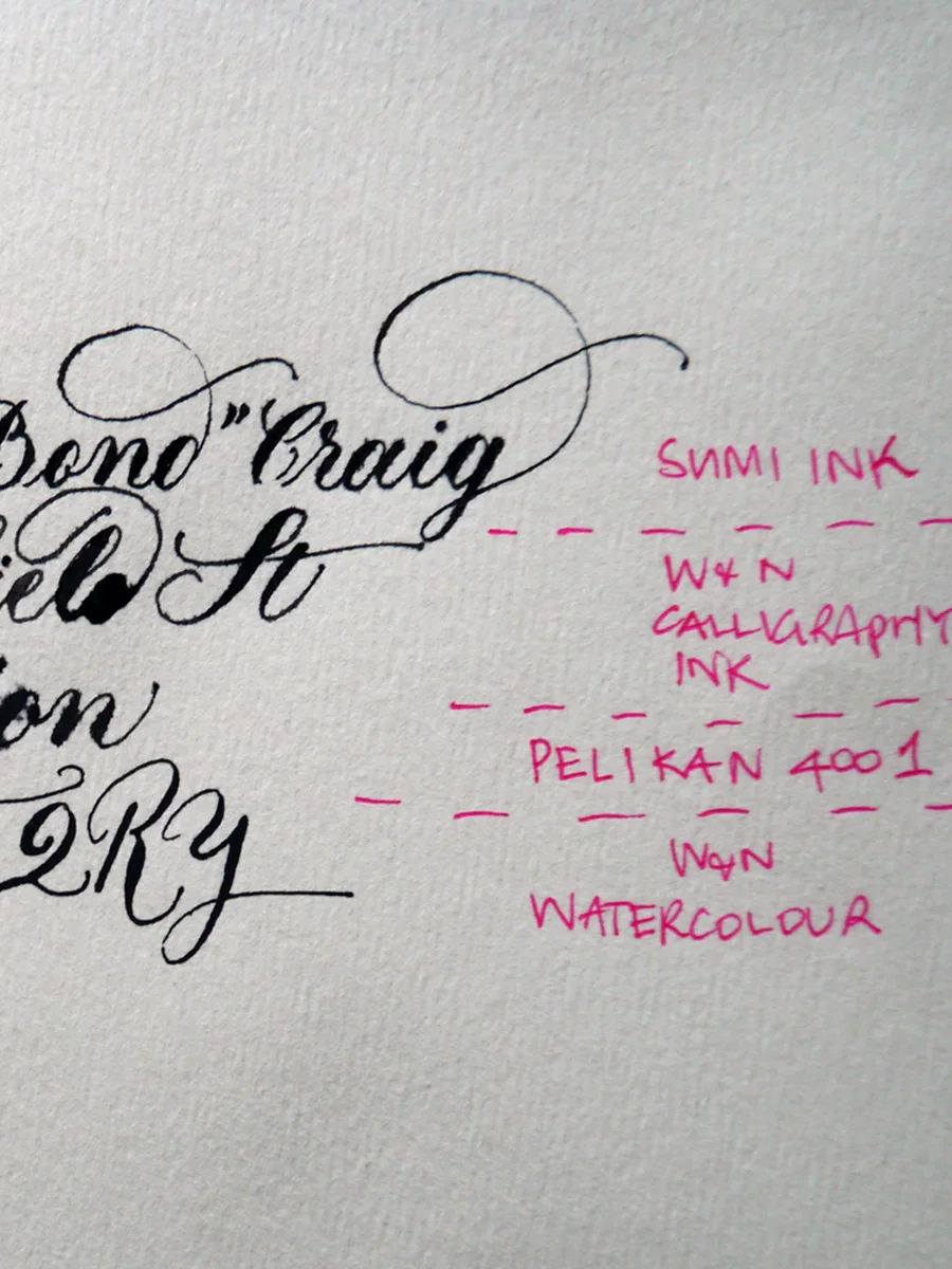
Let's compare the inks with the paints in close view to just really prove the point that all is not lost with the envelopes — we have many alternative options to play with.
Ideal-110gsm-ink
Ideal-110gsm-paint
Ivory envelopes 130 gsm
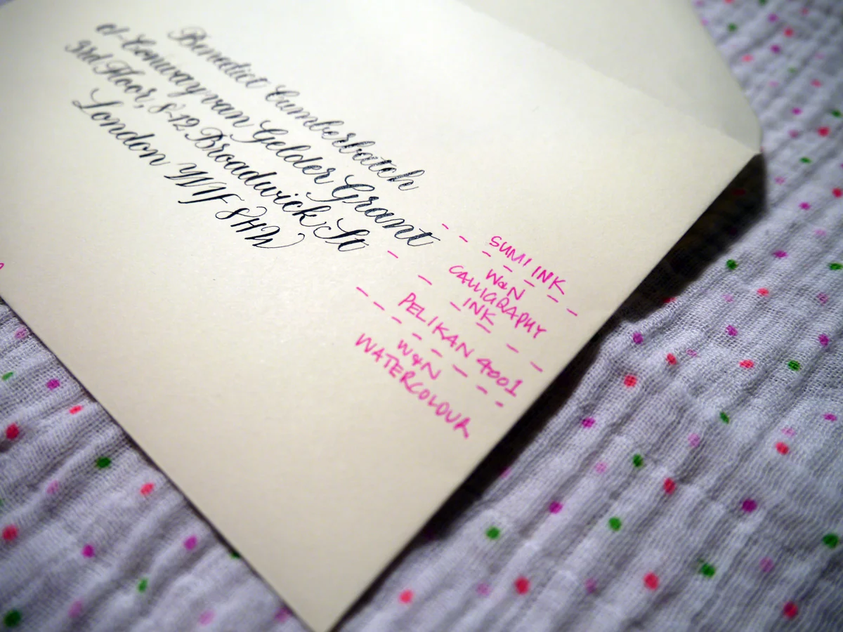
Now, this is more like it! Bring on the inks, I say. I used Gillott's 303 nib for this test. My only struggle was that they were a little hard to see through in parts on the light box, but, if all else fails, rule it up my friends. Draw those guidelines and erase once you're done. Old school.
Ideal-120gsm-sml
Sumi - was lovely! It created beautiful hairlines and was easy to write with on this envelope. It did dry slowly, though.
W&N Calligraphy Ink - slight bleeding and the hairlines aren't so fine, but still works. I do find this ink thicker than it should be, so could be watered down for a better result. I just haven't tried it yet.
Pelikan 4001 - went on smoothly and hairlines still very nice
Watercolour - also lovely and created thin hairlines and a smooth experience.
Top tip for troubleshooting calligraphy inks and stationery
At the end of the day, the main thing is to test your stationery and be ready to adjust your expectations. Be willing to experiment with different media, and have fun!

Protect your mail art with clear envelopes
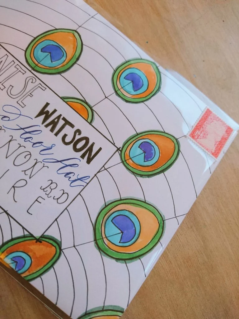
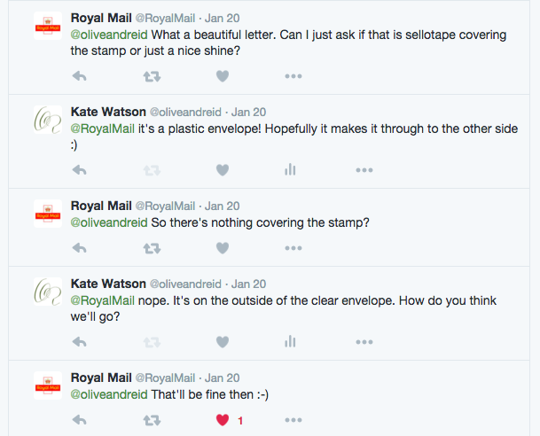
This year, I plan to create a little mail art with my envelopes, inspired by Lindsey over at The Postman's Knock. She mentioned that she sometimes puts her envelopes in a clear plastic envelope to protect the 'art'. Part of me is all about maintaining a certain sense of 'post' — marks and all, but another part of me likes the idea that you can have a higher level of quality control over how your envelope arrives. I have seen some dismal end results. So, being unsure about how I feel, I'm just going to jump in and try it. Lindsey has investigated (successfully via Reddit) how using a clear envelope works for the US postal system, so I wasn't sure how it would go with the UK's Royal Mail. I talked to someone in store, who suggested it wouldn't be a problem, so I decided to send a test envelope to myself (well, my daughter specifically) so I'd know how it all went down. I thought I'd do a final check via Twitter (praise be to social media) because in the US they charge a little extra to manage non-machinable envelopes.
@oliveandreid ...there's no surcharge. — Royal Mail (@RoyalMail) January 18, 2016
The day I posted the test envelope, I also copied @RoyalMail into the fun
Sending #mailart via @RoyalMail in polythene envelope. Testing testing. #snailmail. Love letter to my daughter pic.twitter.com/mxfLRvdWvB — Kate Watson (@oliveandreid) January 19, 2016
And they responded with compliments and further confirmation:
Can mail art survive the postal system?
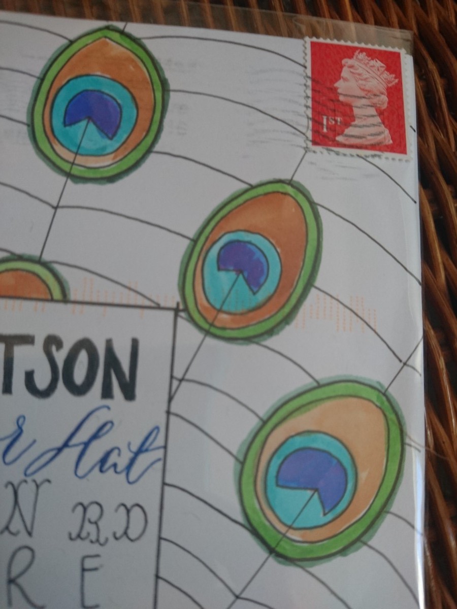
It sure can. My envelope, sent first class, arrived the next day and perfectly protected by the clear envelope. It didn't cost anything extra to send via Royal Mail. The outside bears all the hallmarks of postage, machine markings and all. I guess you just have to decide whether you want to remove those 'sent' identifiers from your envelope that you may love to see one day in the future.
For reference, I bought my clear envelopes from Ideal Envelopes.
Easy Copperplate guidelines with Joy Daniels
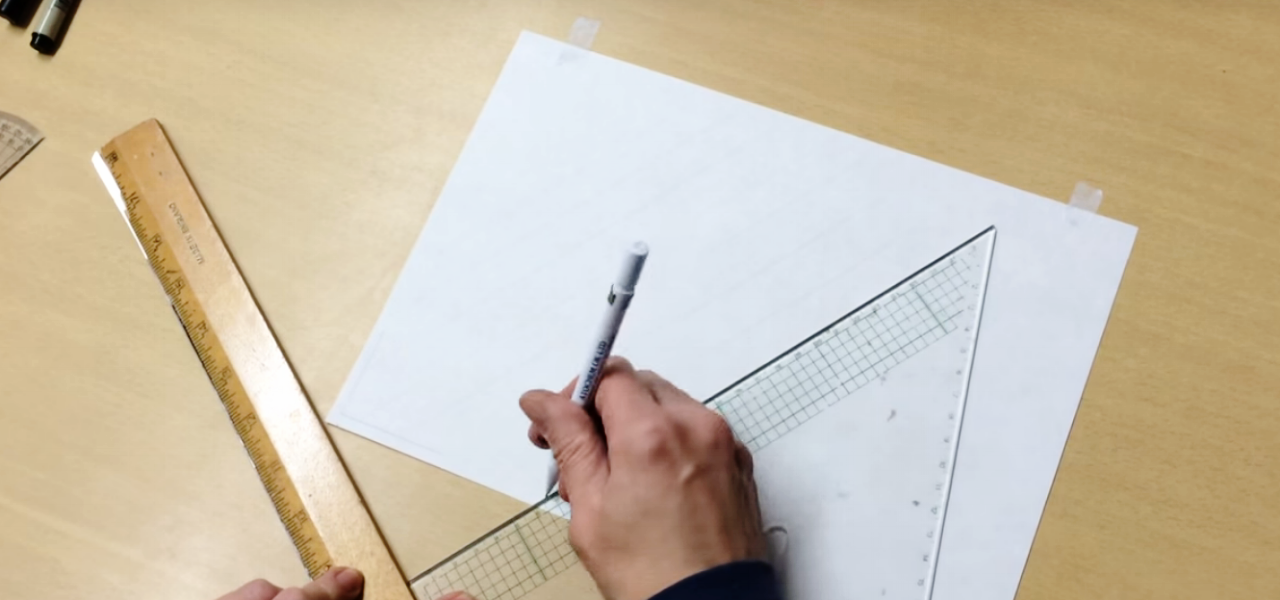
If the thought of ruling your Copperplate guidelines leaves you frustrated and thinking that you may never create that wonderfully consistent calligraphy composition, then today is your lucky day. While it's fantastic that calligraphy skills can be honed online and through books, there's something to be said for meeting face to face with other calligraphers to help you out with problem areas. As soon as I saw Northampton calligrapher, Joy Daniels, swiftly rule her guidelines in a recent Copperplate Capitals workshop through the South London Lettering Association, I knew it was going to be a powerful tool in my belt. Ruling calligraphy guidelines has just not been something I could get my head around. I could practice with pre-drawn guidelines under thin paper, but when it comes to working on a final piece, it's baffled me (I don't yet own a lightbox).
Go forth and rule your copperplate guidelines!
Joy has been kind enough to take the time to create a short video outlining the process. I hope it helps you as much as it has helped me.
About Joy Daniels
You can find out more about Joy and her Northampton Calligraphy Studio via her website and Facebook page. You can email her at joydaniels@ntlworld.com.
Joy also runs the Copperplate Special Interest Group. When you join, you receive a quarterly newsletter of calligraphic happenings, and can become part of the group's envelope exchange. Get in touch with Joy to become a member.
Share your calligraphy tips
If you've got a great calligraphy tip that you'd love to share and have featured on the blog, please get in touch — either in the comments below, or via email. I'd love to hear from you.