

Anna Akhmatova's Requiem for the SLLA exhibition
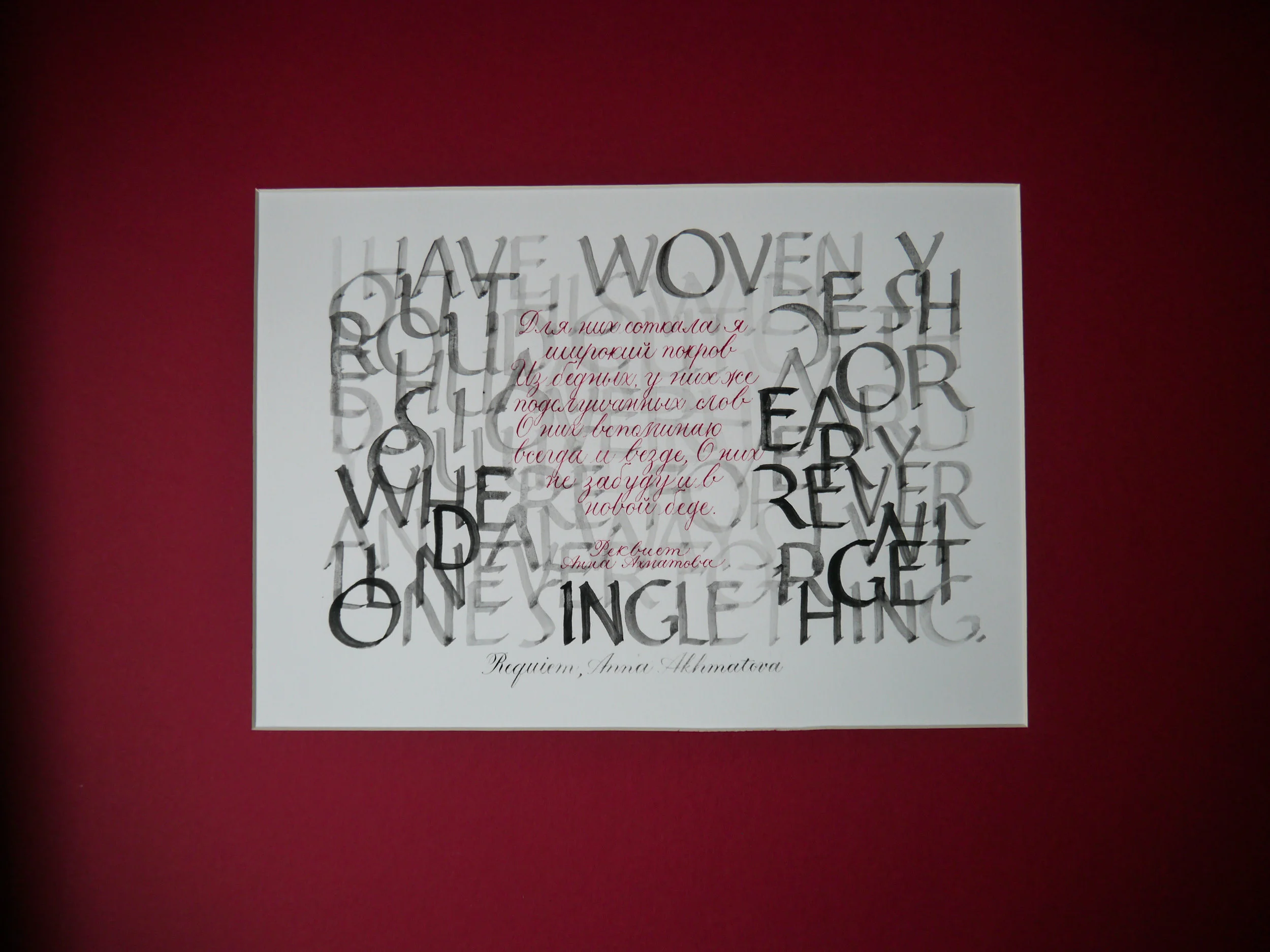
I nearly did not submit a piece of work for this year's South London Lettering Association SLLA exhibition. With a toddler and a three month old, I didn't think I would have the gumption to get it done. Last year I exhibited a commissioned work which I had already prepared, but this year I needed to create something specifically for the exhibition. With the theme, Romance & Revolution: commemorating 200 years since Jane Austen's death and 100 years since the Russian Revolution, it would be natural for my experience with the traditionally romantic copperplate script to inspire me toward Jane Austen. However, I was drawn to the Russian Revolution, and quickly decided that I would not only work with a key piece of prose of the time, but that I would also capture both English and Russian versions.
I discovered seminal poet, Anna Akhmatova's Requiem resonated with me. In particular:
I have woven you this wide shroud out of the humble words I overheard you use. Everywhere, forever and always, I will never forget one single thing. Even in new grief.
Для них соткала я широкий покров Из бедных, у них же подслушанных слов. О них вспоминаю всегда и везде, О них не забуду и в новой беде
Creating bilingual calligraphy for the SLLA exhibition
My first task was to find the Russian text of the poem. I could easily find the English translation, but not the original, so I asked Anton at Ufoblique Penholders to help me out. Then I set to work studying the Cyrillic alphabet and determining how to create the letters in Copperplate script. I sought help from local Russian mums via Facebook groups, as well as the lovely calligraphy community on Instagram, to make sure that my script was correct and legible. (I really hope it is!)
This piece is purely my own design, not for a client, and I felt a great sense of freedom for where it could go. I ruminated over a number of nights letting thoughts develop into what could be possible. Black, red and strength were my inspiration.
I wanted a striking juxtaposition of the two languages. I work predominantly in fine, pointed pen scripts such as Copperplate, Spencerian, Uncial and modern calligraphy, so it seems crazy that I decided to create the English translation with Roman capitals — the most daunting of broad-edged hands, which I have never even dared attempt. I dunno, I just decided that's what needed to be done, so I grabbed my copy of Veiko Kespersaks' Calligraphy in 24 One-Hour Lessonsand hoped for the best!
My intention was for these English letters to be a curtain, a shroud,a backdrop — almost illegible and unimportant — to the original text. It's why I wasn't worried that words wrapped from line to line, rather than being complete. The letters had to be bold enough to carry the weight of this duty, yet light enough that the Cyrillic script stood out on top. I created the Roman capitals in watercolour, ensuring that the letters faded significantly in the centre where the Russian would overlay. For the Russian prose — the main feature — it had to be delicate yet striking, hence created in blood red copperplate script.
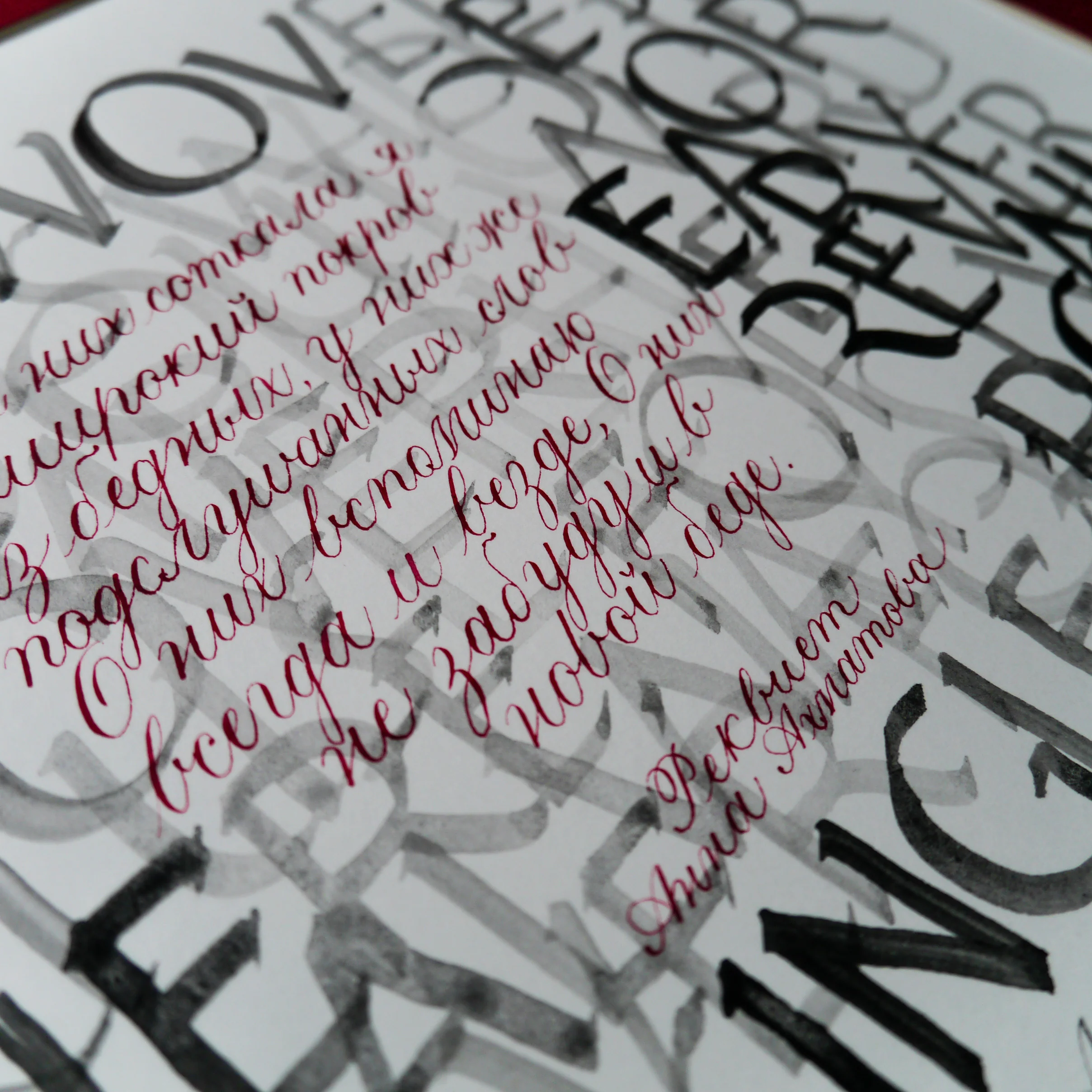
Although my Roman caps would make someone more experienced cringe, I feel heartened by the fact that SLLA welcomes amateurs and the piece itself is written by a woman who was not following the rules but succeeding nonetheless. I'm so proud of this piece for so many reasons:
- I challenged myself to develop a new alphabet into my existing script
- I shook off my nerves and just bloody well painted some Roman capitals, Sinatra style (aka, my way)
- I learned to cut mount board, you know — fancy angles and whatnot and did that too
I'm so excited to be showcasing this piece (which is also for sale, FYI, wink wink). I hope that if you're in London between Oct 17 – Nov 3, that you might just drop in to the SLLA exhibition and see it in the flesh, alongside some fantastic works from local calligraphers.
I also welcome all feedback, but don't tell me I spelt something wrong in Russian or I'll cry.

What is modern calligraphy?
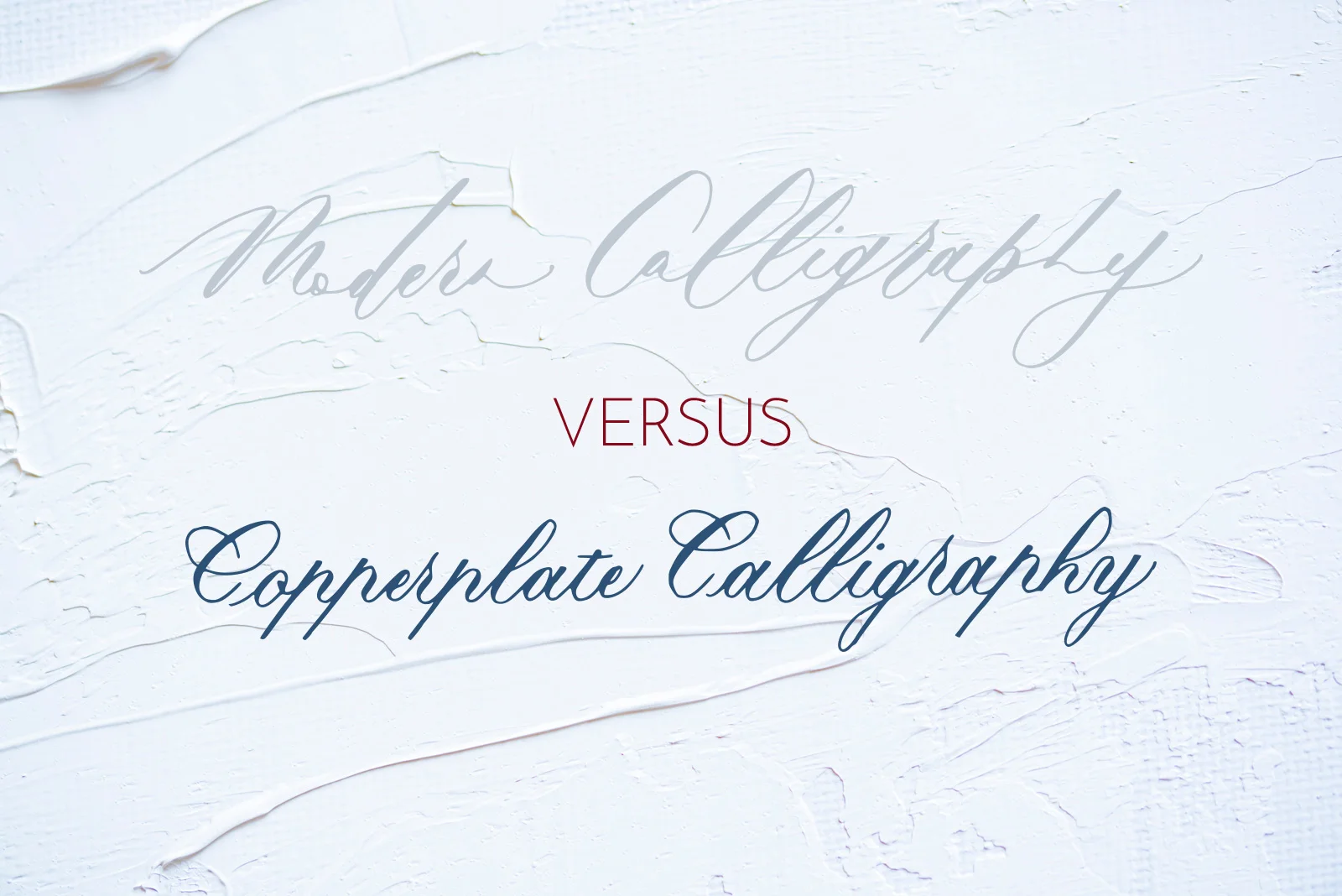
Modern calligraphy has swiftly become the go-to script for brides looking for a unique finishing touch for their wedding, or for learners looking to ease themselves into dealing with calligraphic scripts and paraphernalia.
When I started teaching myself calligraphy in 2014, I didn't start with modern calligraphy. I didn't even know that was a thing. I instead found a style that I like the most, and seemed the most practical out of them: Copperplate.
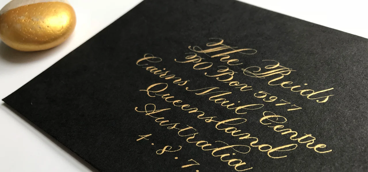
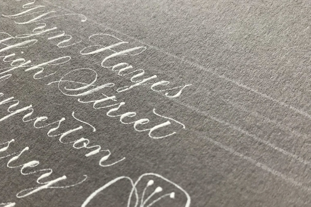
What I quickly found was that Copperplate script, with its distinctive thick downstrokes and thin upstrokes, has now taken on a contemporary twist into what's termed "modern calligraphy". Although this style may be considered disdainfully by some traditionalists, I have seen it executed with breathtaking beauty by some of my favourite calligraphers.
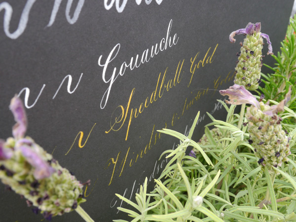
The difference between Copperplate script and modern calligraphy
Modern calligraphy has its grounding in Copperplate script, which is why many teachers recommend getting Copperplate under your belt first. Copperplate calligraphy:
is structured with specific, individual strokes used to form the letters
requires varying pressure on up and down strokes to create thick down lines, and thin — hairline — upstrokes.
Therefore, mastering these techniques not only give you an excellent foundation, but also confidence, for doing modern calligraphy. The only difficulty I've been having is loosening up and being free outside of the Copperplate constraints. Beautiful constraints.
Modern calligraphy is a fresh, new style that brings a flexibility and uniqueness that is both appealing and accessible. Where Copperplate dictates form and function, modern calligraphy lends itself to a more fluid, closer-to-your-handwriting approach. With some practice, dedication, and inspiration, anyone can define their own modern calligraphic style.
My top resources for learning traditional and modern calligraphy:
Mastering Copperplate Calligraphy by Eleanor Winters
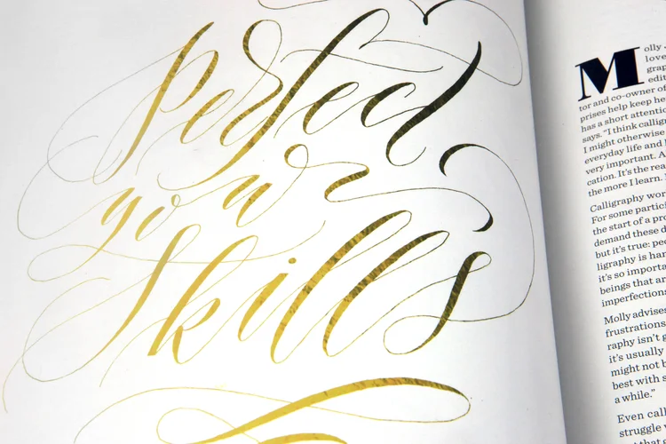
Modern Calligraphy by Molly Suber Thorpe
Modern calligraphers to follow

Graded watercolour calligraphy
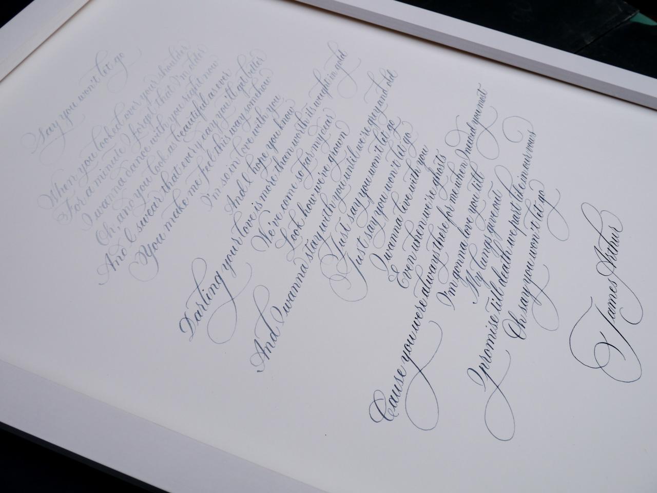
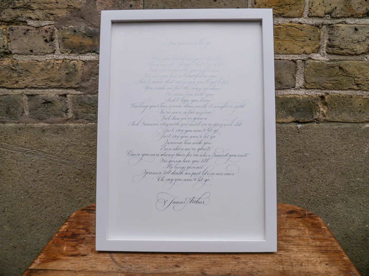
Taking inspiration from the abstract blue hues of a painting, I decided to give graded watercolour calligraphy a try. The plan was to start with very diluted colour (Cotman's Indigo: links to Amazon.co.uk) and gradually add more pigment over the course of the piece. I worked with a section of the moving James Arthur lyrics from his song, Say You Won't Let Goon Bockingford 300gsm watercolour paper at A3 size. I used flourished Copperplate script for a traditional style with a little flair. Satisfyingly, the gorgeous blue gradient ended up looking exactly as I planned — deepening dramatically with the words down the page. Before I started, I worked out that, for 23 lines, I would add more colour approximately every 3.5 lines, building up the hue six times over the course of the full piece.
My method of mixing was an inexact science, simply dipping my brush into the saturated watercolour pan and moving across into my diluted colour. Of course, the saturation could be decreased or increased, depending on how long your piece and the final look you're going for.

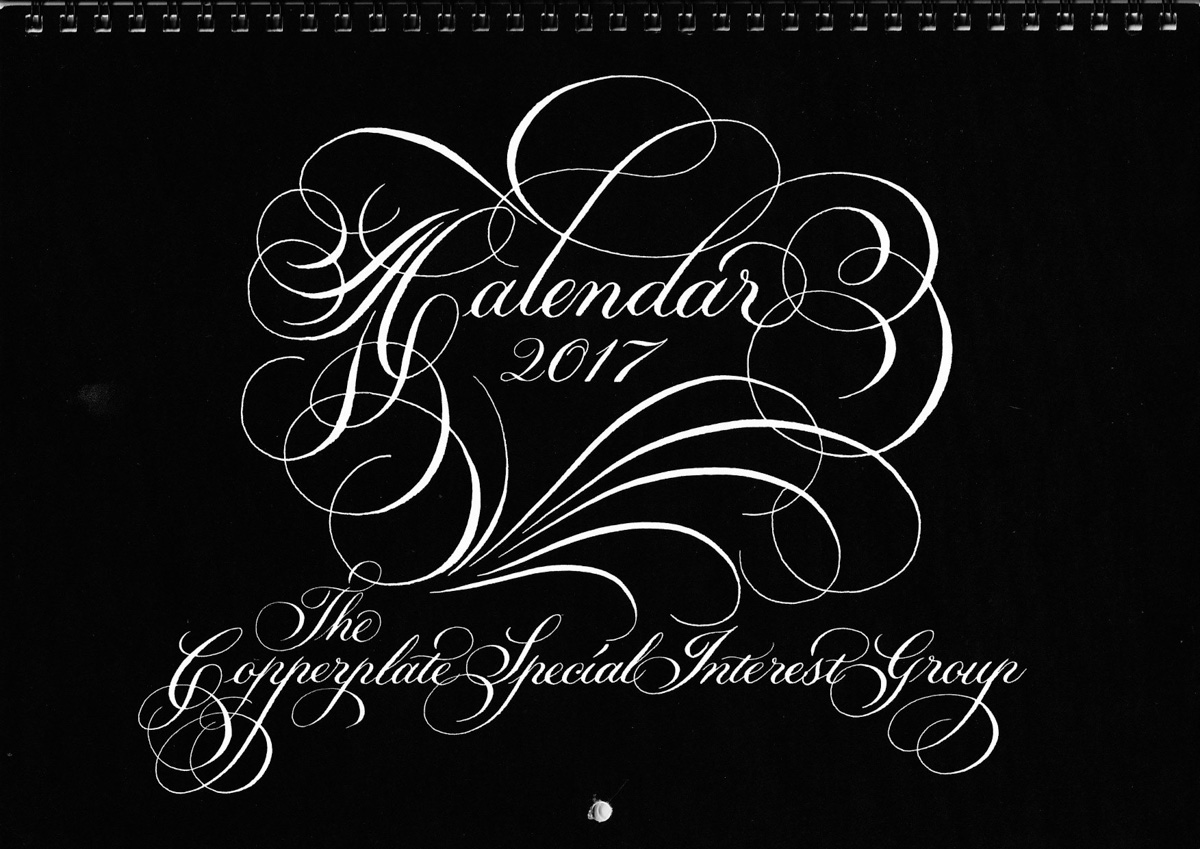
Copperplate Special Interest Group Calendar 2017
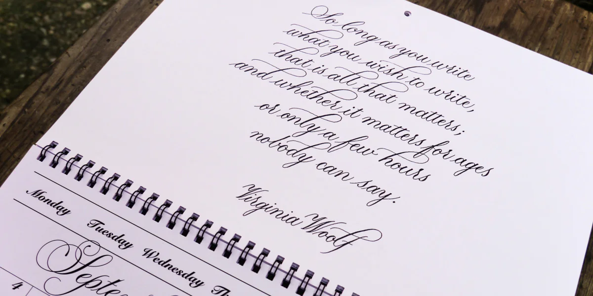
I’ve been a member of the Copperplate Special Interest Group (CSIG) since 2014, participating in its envelope exchange for the past year. When coordinator, Joy Daniels, asked me to submit a piece for the 2017 calendar, I am glad I was able to say yes. My quote by Virginia Woolf is written in flourished black and white copperplate calligraphy and features for the month of September.
So long as you write what you wish to write, that is all that matters; and whether it matters for ages, or only a few hours, nobody can say.
It sits alongside the wonderful company of artists such as David Simons, Gwnyneth Hibbert, Keiko Shimoda, Rachel Yallop and Charles Wrigglesworth.
Order your copy of the CSIG 2017 calendar
If you would like to order a copy of the calendar, or would like to be part of the CSIG, please get in touch with Joy via joydaniels@ntlworld.com.

A Simple Copperplate Manual
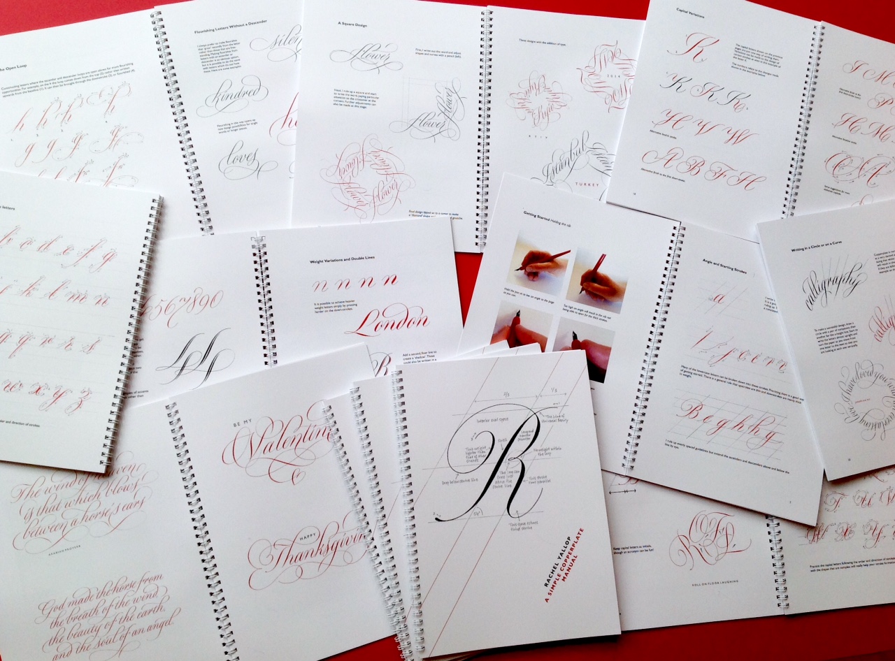
In 2016, British calligrapher and lettering designer, Rachel Yallop, released a back-to-basics Copperplate calligraphy manual that promptly sold out. It's now in its first reprint, so get in touch with Rachel via her website or Facebook page. if you're interested in ordering a copy (or see ordering details below). Adapting her workshop handouts, Rachel has created a "collection of examples to help and inspire", rather than a weighty 'how-to' manual. But don't be fooled by her humble description. This is still a great guide for anyone learning Copperplate calligraphy script.
This comprehensive manual covers:
- minuscule (small letter) construction, joining, spacing and double letters
- common problems you might face
- majuscule (capital letter) construction and variations
- numerals and punctuation
- weight variations and double lines
- the open loop and flourishing
- writing in a circle, on a curve, or in a square
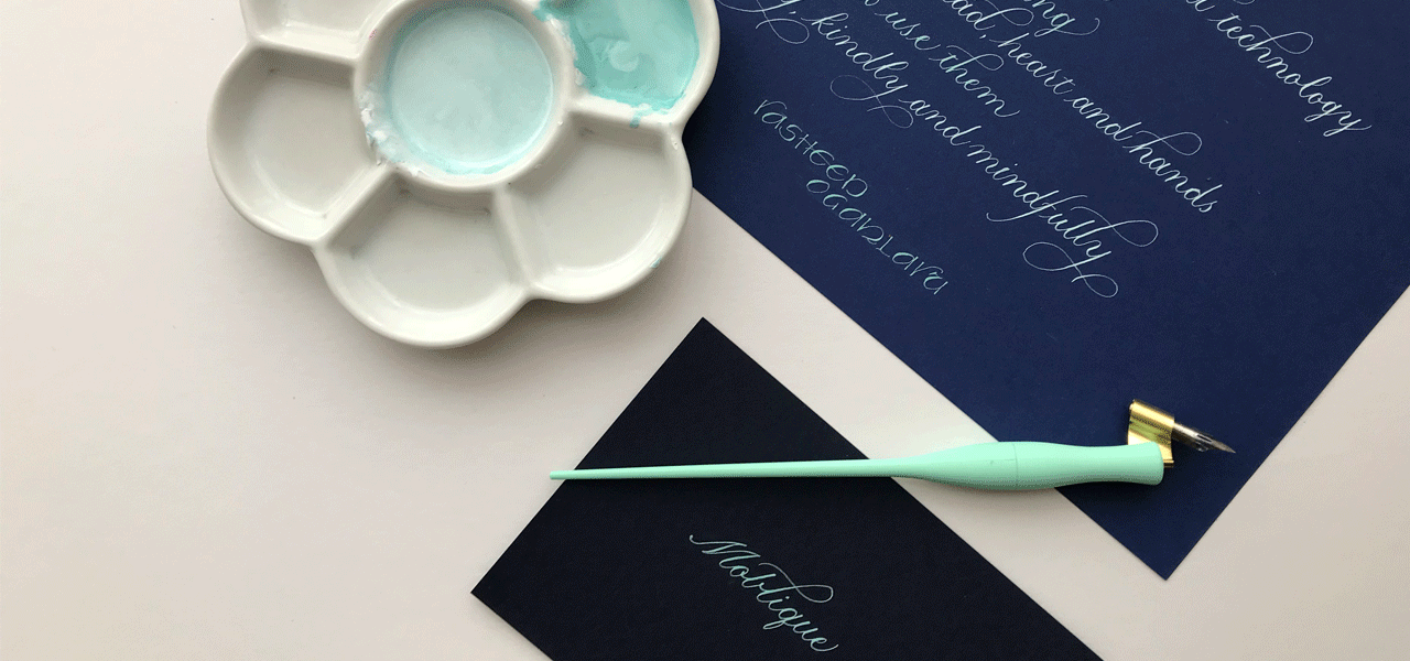
- white on black
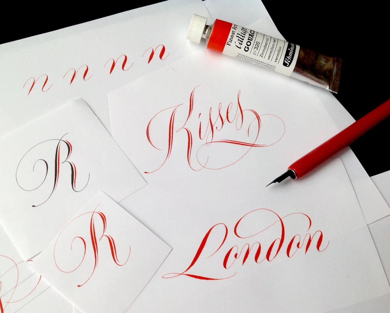
Features of Rachel's Copperplate manual
- 50 A4-size pages, printed on 150 gsm silk coated paper with 300 gsm covers.
- Wire bound so that it will open flat on your table or drawing board.
- 35 instructional pages covering lowercase letters and capitals, joining and spacing, numerals, weight variations, flourishing and design ideas.
- 15 pages of gallery pieces.
I've been poring over A Simple Copperplate Manual since I bought my copy late last year, and I love the simple styling — black and red font throughout, and how accessible Rachel makes the script. It's a little different from what I'm used to as Rachel's style avoids the 'square tops and bottoms' I've learnt, but I love seeing variations of script to keep things interesting! Her manual has given me courage to try a little flourish!
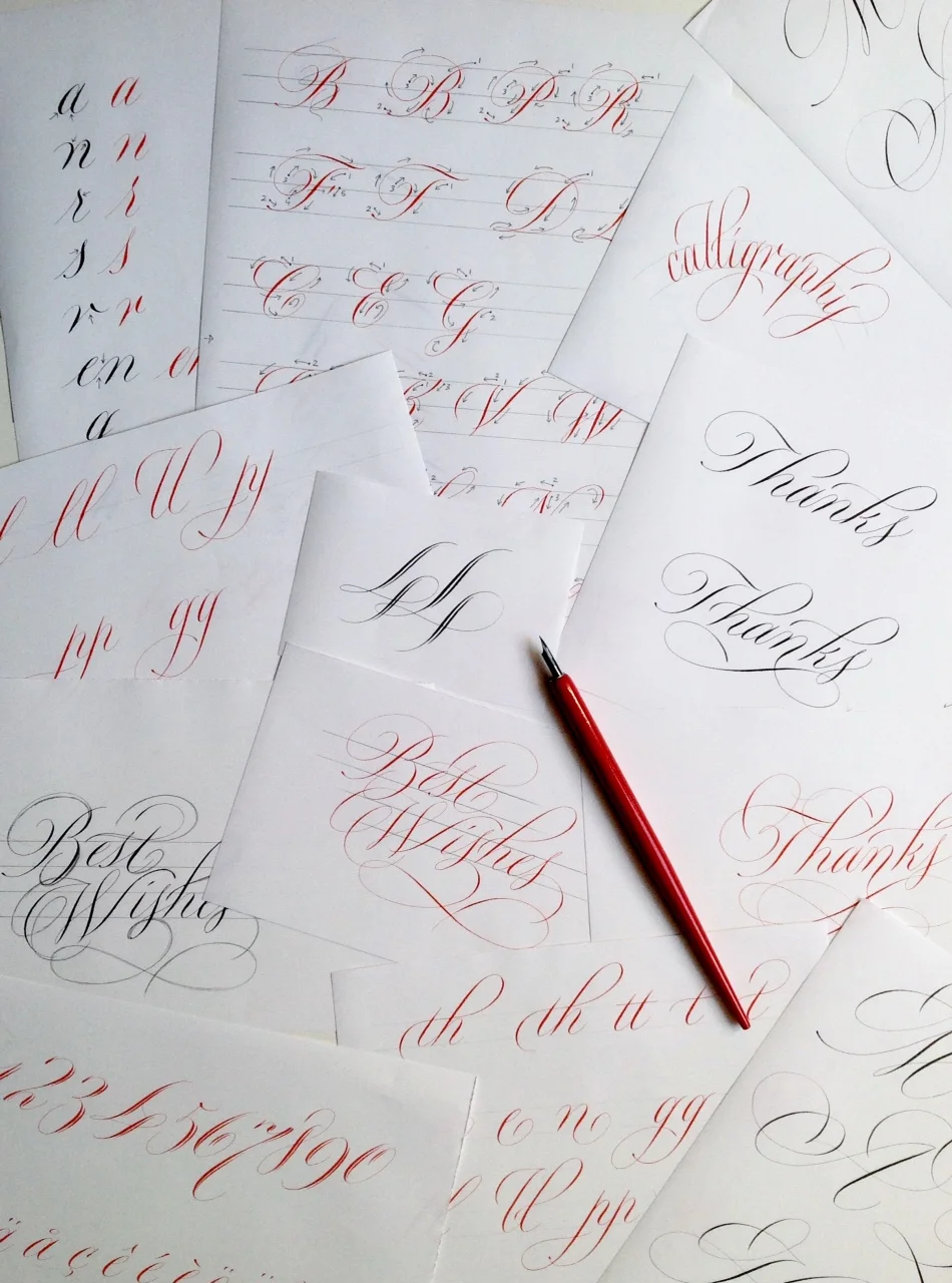
Buy your copy of A Simple Copperplate Manual
If you are interested in buying a copy, prices including shipping, are as follows:
- UK: £18
- USA: $38
- Europe: €31
- Australia: AUD$53.
You can pay Rachel by her PayPal web page. You can find out more about Rachel or get in touch with any questions via her website or Facebook page.

The Pen Museum, Birmingham UK
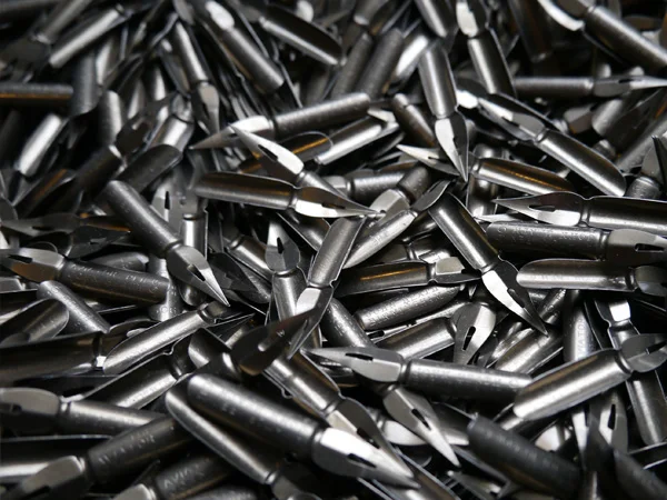
I came home from work one Friday night, and JW was quietly working away on his laptop. Suddenly, he pronounced that he had found cheap train tickets to and accommodation in Birmingham (we live in London). I wasn't expecting a weekend away, so I was a little bit hesitant, but I got involved and started investigating "things to do in Birmingham".
There, ranked 13th on the list of Birmingham attractions, was The Pen Museum. I suddenly couldn't wait to go, and also didn't really care what else we did in the city (although the Birmingham Museums & Art Gallery and the Barber Institute of Fine Art were calling my name, too). I was a kid on Christmas eve: "TO THE PEN MUSEUM". It did not disappoint.
A handsome gent welcomed us in, inviting us to take a look around before he would show us the nib-making machines that were used in the booming business of the time, when Birmingham produced 75% of the world's pen nibs.
Step by step, he took us through five of the 17 steps in the nib-making process: "blanking", "piercing", "marking", "raising", and "slitting" (thanks to C Brandauer & Co blog for the process details). I'd come across as the ultra nerd I am if I tried to explain how awesome it was to do that, so, suffice it to say that it was good fun for a calligrapher.
The nib-making process
Blanking
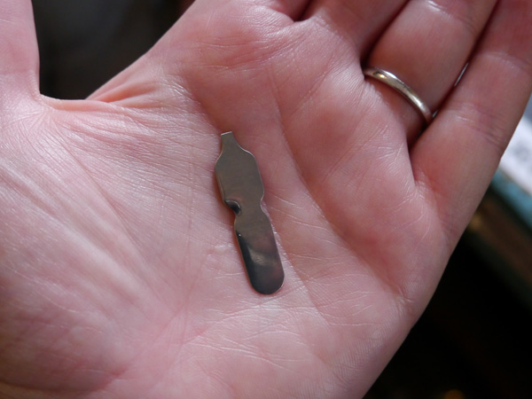
Piercing
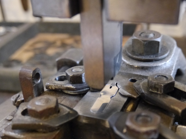
Marking

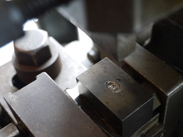

Raising


Slitting

JW got to have his time in the sun when we sat ourselves at old-school school desks and tried out the nibs they had on display. To be fair, they had been pretty trashed by the unseasoned calligraphers, but I think it's more important for people to be able to feel and see and have the technique become more accessible in that way than keeping them locked up.
Naturally, when surrounded by boxes and boxes of nibs at 25p a pop, there was no doubt that I would leave with a fair selection. I bought 10 different nibs The Pen Museum; four were perfect for copperplate.
I also bought 1 gross (144 nibs) pack, Victor Series Exhibition Pen, for a fiver. I had no idea if that boxed set of nibs was going to be any good for copperplate, but they were vintage, and a great price so worth the risk. I'm glad I did, because they're lovely.
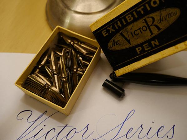

- John Heath's Golden Coated
- Victor Series Exhibition Pen
- John Heath's First Class Selected
- British Pens Co. 5005
- University School Pen
I'm so super excited to have found The Pen Museum, and looking forward to visiting again. Run by volunteers, the museum relies on donations and support. You can support in lots of ways:
- donate a couple of quid every time you visit
- support them with an online donation
- become a member
- shop online (the nibs I've noted aren't listed in the shop, but get in touch with them; I'm sure they'll be happy to help).
Take a look also at this blog post from Tiger Pens, which gives more detailed information about the history and venue details of The Pen Museum.
So, where's your favourite calligraphy spot?