

The UK's 5 best white calligraphy inks
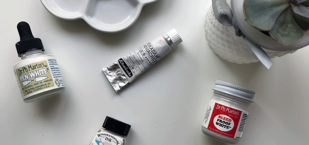
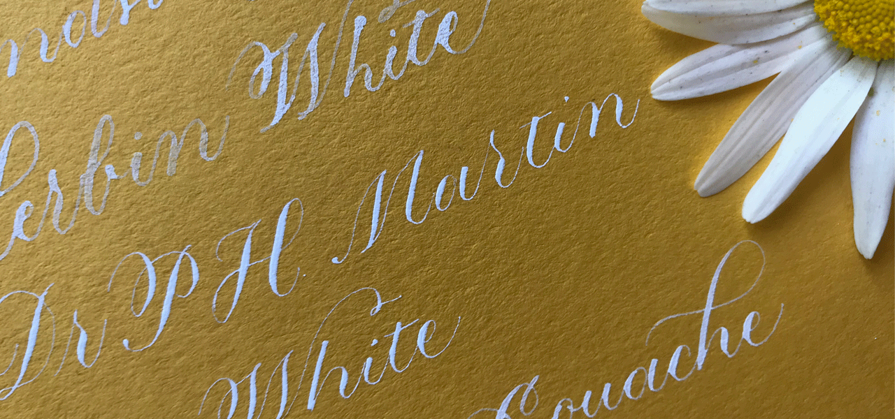
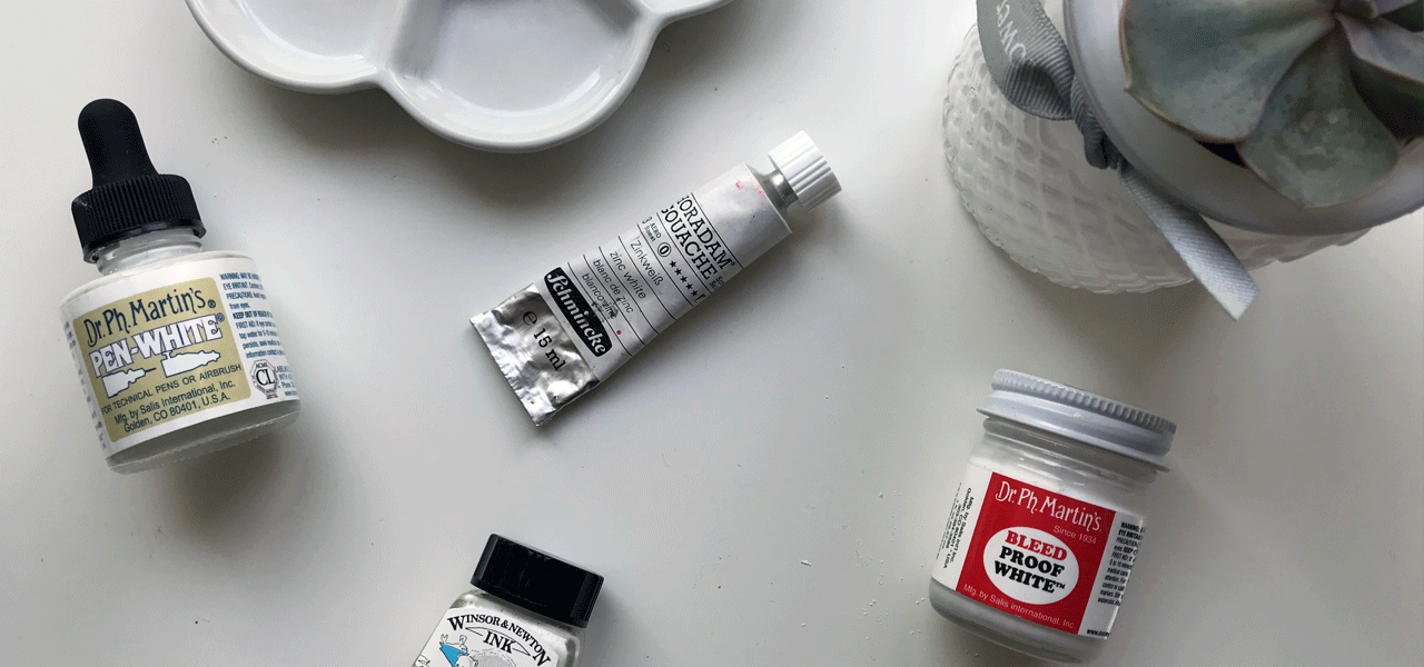
photo of the various white calligraphy inks
I have long been a convert to Dr Ph Martin's Bleed Proof White™ as the best white calligraphy ink. But over the last year, I've been introduced to two new products, so I thought it was time to pull open the bottom drawer and surround myself with my white ink options, some of which needed little more dusting than others.
Find out what's in my white calligraphy ink stash and how they fit into my work. There are more white inks I'll be adding to the review (I'm keen to try out W&N calligraphy ink as reviewed by The Postman's Knock), but, for now, these are my top 5. The details are correct at the time of publishing.
#1 Dr Ph Martin's Bleed Proof White™
1 fl. oz / 29.57ml £9.49 (buy from Scribblers)
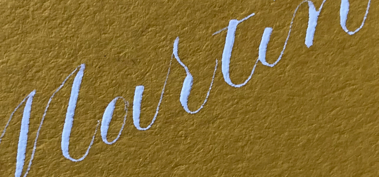
close up of dr ph martin's bleedproof white calligraphy ink
It feels a little unfair to include Dr Ph Martin's Bleedproof White because for so long it has been incomparable. Consistently and reliably creating bold downstrokes and fine hairlines, I have never questioned or even strayed far from using this product as a white calligraphy ink.
It is supplied in a very thick fluid form, which requires you to dilute to the right consistency. I usually mix with water (you can either do this in the supplied pot, or transfer to another container) until it's runny enough to write, but not so runny that it slides right off the nib. Others will call this the texture of heavy cream, and I guess that would be about right! I got a great tip from Suz Cunningham's Calligraphy Master's video that suggested if the ink was bit too thick to write, you could simple dip your nib tip in water to get the flow going. It works for me every time.
Watch the video of me writing calligraphy with Dr Ph Martin's Bleedproof White
#2 Dr Ph Martin's Pen White
1 fl. oz / 29.57ml £9.95 (buy from Scribblers)
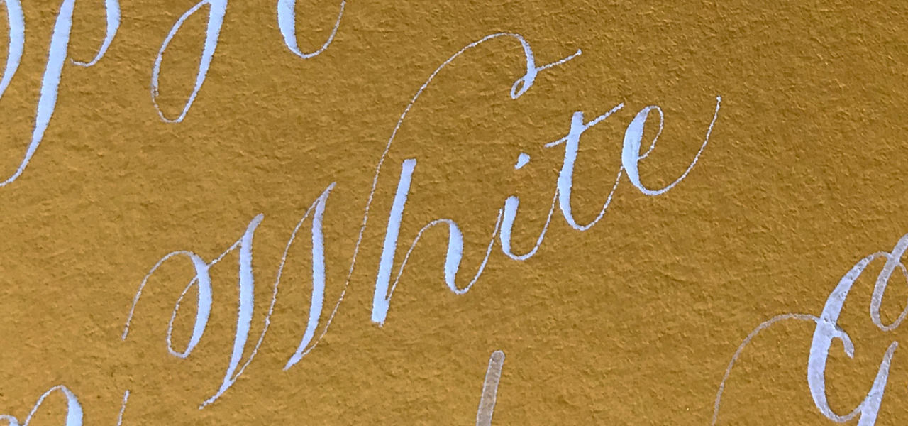
In May 2017, Lauren from Oh Wonder Calligraphy brought Bleedproof's sister, Pen White, to our attention.
Of course, I leapt aboard the Pen White train, but my first impression was that it was a little too thick and globbed all over my paper. I think I might have just needed to shake it like a polaroid picture as the image included above was written straight from the bottle just fine. If you're really having trouble, you could add a little water or gum arabic to get it to the right consistency.
Watch the video of me writing calligraphy with Dr Ph Martin's Pen White
#3 Gouache
15ml (W&N - £4.99 Amazon.co.uk / Horadam - £8.45 +pp Amazon.co.uk)
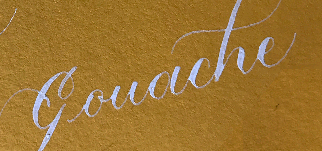
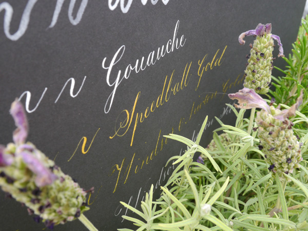
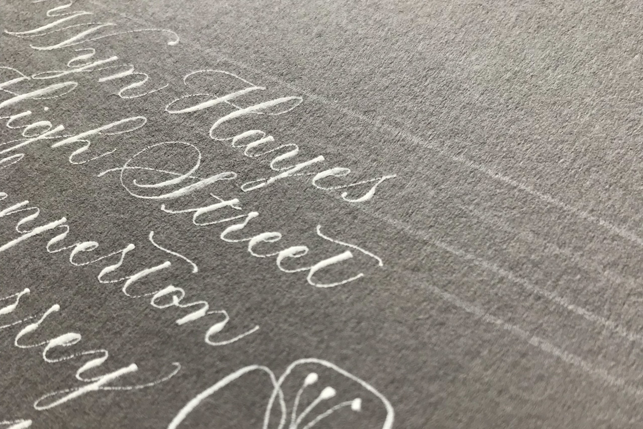
I've never met a paper that gouache cannot perfectly suit. Where other inks bleed or pool (often unexpectedly) on certain card stocks, gouache has always come to the rescue. I recently had a limited number of customer-supplied place cards to calligraph, and my first attempt was a complete shambles when the ink when skating across the page at first nib touch. I mixed up gouache and was able to carry on without losing any more of the cards.
Gouache is so versatile for use across different lettering styles and on different textures and surfaces, and can be used to mix gorgeous unique colours, so it will always be one of my best white calligraphy inks. In the image I've included, the mix was a little too watery, but don't let that put you off. Just ensure you've got a creamy consistency and you're set.
A fantastic tip I received from Tina Warren of Alphabition Calligraphy is:
I use permanent white gouache for using as pure white and zinc white for mixing with colours.
Watch the video of me writing calligraphy with white Gouache
#4 Winsor & Newton Drawing Ink
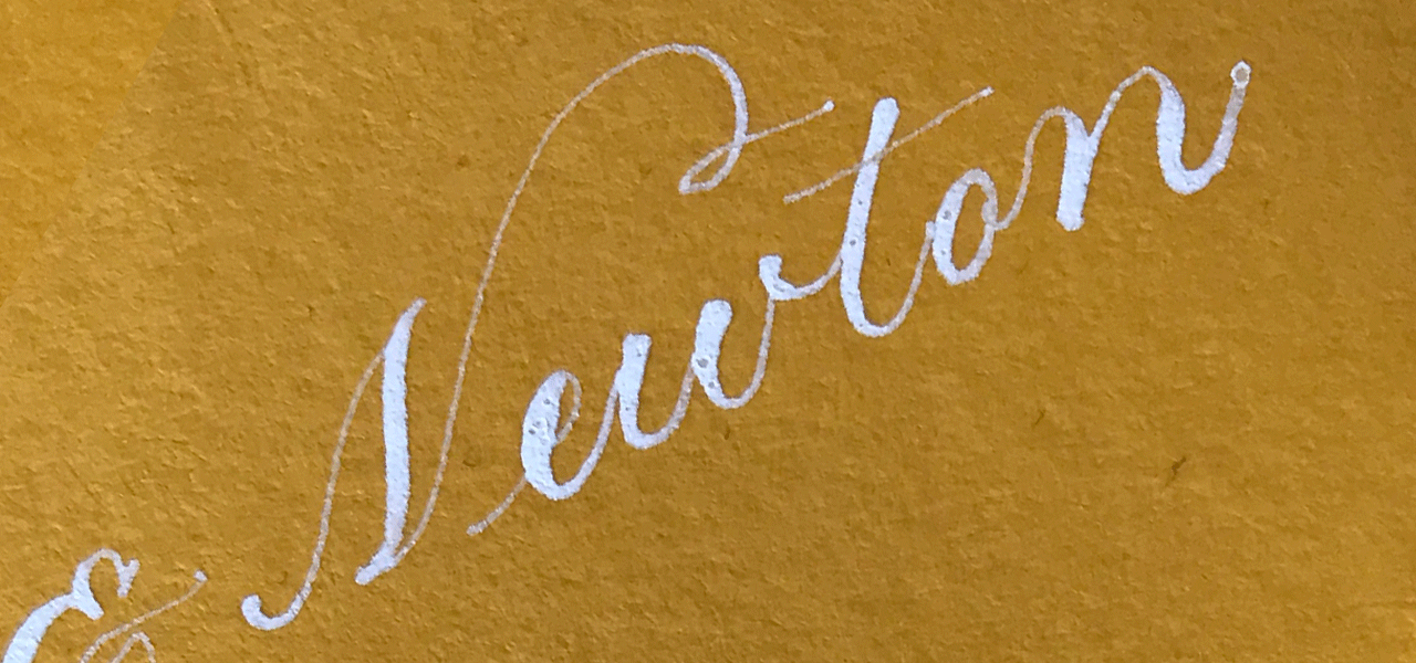
14ml £3.50 (buy from Amazon.co.uk)
Winsor & Newton's white drawing ink was one of the first calligraphy purchases I made when I had no clue what materials I needed, so I just bought stuff that seemed relevant. Ink, yep. That should do it. But, of course, it's never that simple is it? Not all inks are created equal. I quickly relegated this ink to the box, fast to be forgotten until right now. It was useless for creating fine hairlines. I wasn't going to give it another chance, but seems I couldn't part with it either.
So, here we are, and with vastly more experience behind me, I can say that there's now not an ink I won't do battle with. Four years ago, I was looking for inks that I could use for delicate copperplate calligraphy. Now, my repertoire and confidence has expanded so that I'm more willing to try an old ink on a new application.
While I don't find this ink useful for copperplate script due to consistency issues (I *could* spend time trying to get it to work with gum arabic or distilled water, but when I already have other excellent options, I just don't need to) there's nothing to stop it from being a fantastic go-to for brush lettering work. It's not as opaque as some of the others, but lettering with some transparency definitely has its charm. Or, unlike with nib work, you could easily do a second layer with the brush to get a more opaque finish.
I plan to test W&N calligraphy ink, as recommended by Lindsey over at The Postman's Knock.
Watch the video of me writing calligraphy with W&N white drawing ink
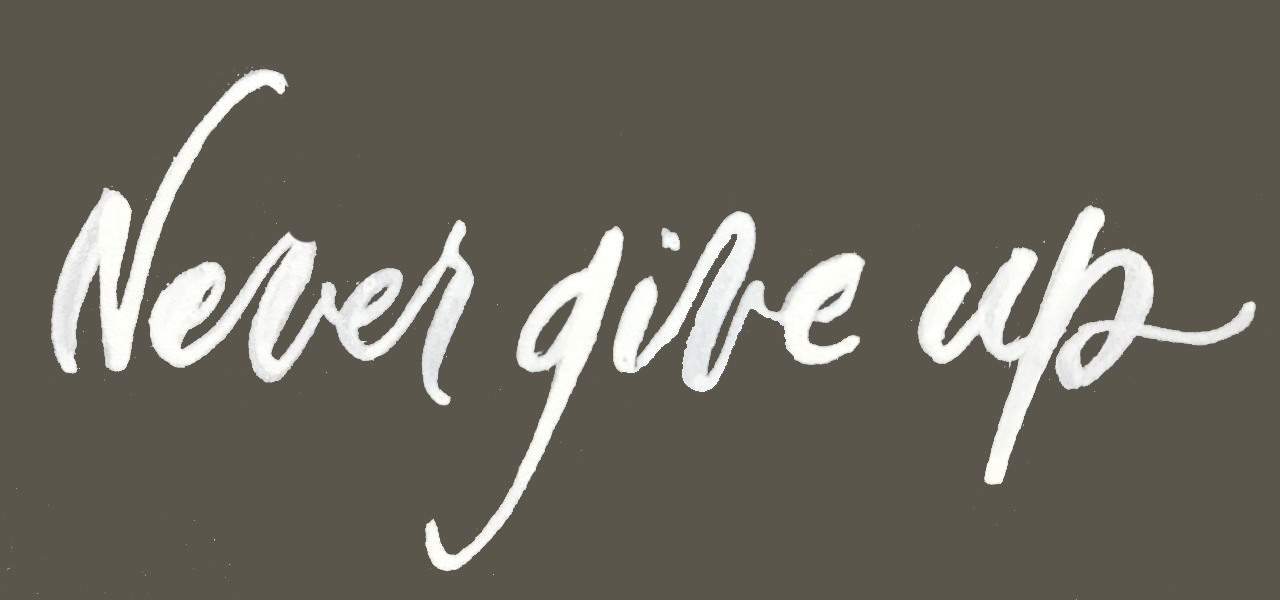
#5 Herbin White Ink
10ml (part of a set of 5 inks) £13.95 (buy from Bureau Direct)
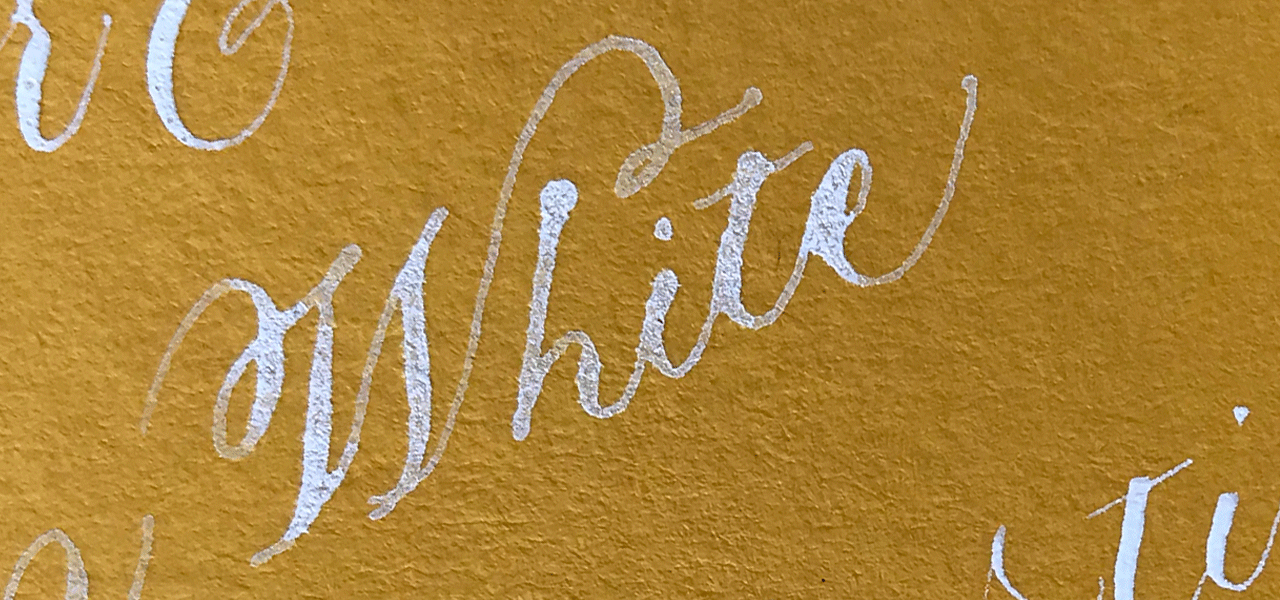
The Herbin set of inks has been awaiting a review for an embarrassingly long time. Dominic from Bureau Direct (home of my favourite calligraphy paper) kindly sent them to me just before my second daughter was born in June 2017. I'm writing this in May 2018. I'll be honest, I did briefly set about testing the inks back in 2017, but realised that they would need more work than I had time for then.
I will do a more detailed review of its metallic counterparts, but for the purpose of this article, I will say that, like the W&N drawing inks, these inks are best suited for brush lettering. They come in liquid form, making it easy to get going with the brush immediately. Though these pigment-heavy inks need frequent shaking as the pigment quickly settles to the bottom. Also, they would be a great way to pen a letter quickly using one of the sturdier nibs (such as the Nikko G), where you don't need to worry about pressure creating thicks and thins — you can create monoline handwriting as though using a pen, but with much higher opacity pigment.
These inks are not suitable for delicate pointed pen work. They are dense and do not allow for fine hairlines required.
Watch the video of me writing calligraphy with Herbin White Ink
What's your best white calligraphy ink
Are you a Bleedproof fan like me, or do you use something I haven't even mentioned?
I've already heard from @simonethessa on Instagram in response:
My favourite white ink is North Wind White from Ziller Ink. Scribblers sells it! I like it so much because it’s waterproof and perfect for envelopes 💌 It’s an acrylic ink and you have to clean your nib more often in between, but I don’t mind. I somehow never get a nice consistency with Bleed Proof White....
Share your thoughts in the comments. I'd love to chat ink.
A note about links
The prices and links in this blog post are provided for ease of comparison, and most of these should be available by a number of suppliers. If you choose to buy from Scribblers or Amazon.co.uk via the links here, I will receive a small percentage of the sale. Thank you!

6 tools to address envelopes in calligraphy
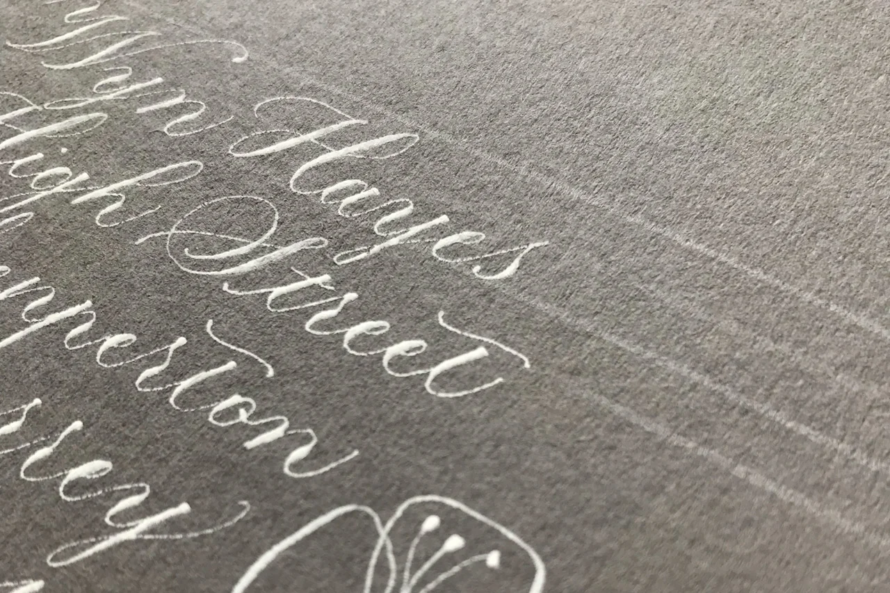
Once upon a time, when I wanted to address envelopes in calligraphy, I painstakingly calculated and ruled every single one. For copperplate, this included four lines per address line, and slanted 54° guidelines. While an excellent practice for learning good techniques and spacing, it doesn’t scale well on the big jobs.
Address envelopes in calligraphy like a boss
Now when it comes to writing calligraphy on envelopes, I have many tools to help. These are my favourites for both personal and professional work.
Ollie’s Studio envelope template
Lightbox
Laser Level
Reflections Phantom Liner
Ruler + pencil/soapstone
A piece of paper or no tool (aka freestyle)
To work out what’s best for you, you need to consider some key factors. Each tool has benefits but not without compromising something. For me, it’s a matter of considering:
how experienced / confident you are at maintaining script consistency
what script you’re going to use
the material you’re writing on (can you use a lightbox?)
how quickly you need work
whether your envelopes for personal or professional use
For example, I’m fairly confident to calligraph with a laser level for professional jobs or freehand for personal correspondence, but might turn to a lightbox (light envelopes) or phantom liner (dark envelopes) if I want to be exacting in my formal copperplate script. An envelope template is a fantastic middle ground for relaxed formal script, and also lends itself perfectly to modern calligraphy.
1. Ollie’s Studio envelope guideline template
(£14, Ollie’s Studio)
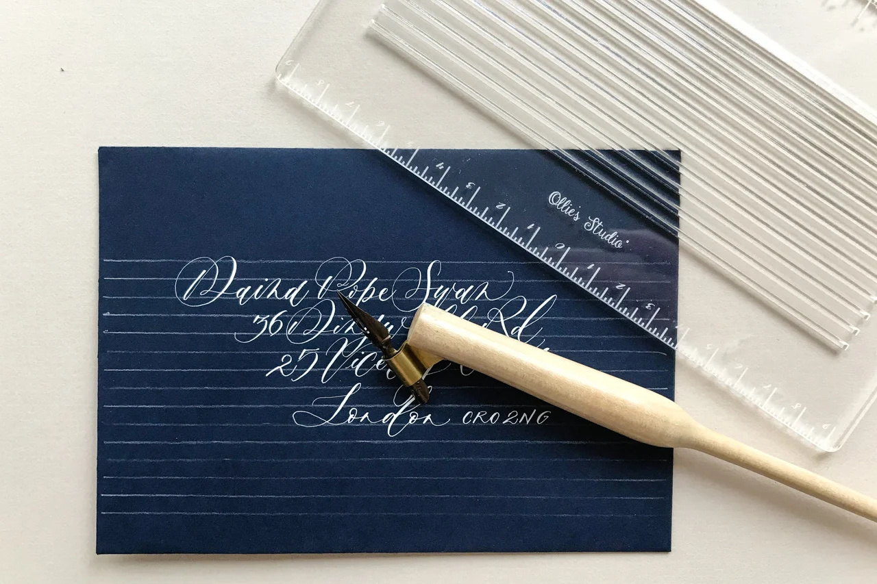
ollie's studio lettering template to address envelopes in calligraphy
Thanks to Ofe at Ollie’s Studio giving me a test drive, an envelope template is now my go-to tool for personal envelope addressing.
I designed this template to quickly create perfectly spaced guidelines and it's cut my envelope addressing time significantly. – Ofe Oyasor, Ollie’s Studio
Tools required:
graphite mechanical pencil of your choice
white fabric pencil of your choice
envelopes (any size)
What is an envelope guideline template?
An envelope template is a stiff shape (Ollie’s Studio’s is a sturdy 3mm acrylic) with spaces cut out where the lines of your address will go. You lay the template over your envelope, use a pencil to mark a line the length of each space, and, voila, you’ve got your address lines. Once you’ve addressed your envelope, you erase your black or white lines (I use an eraser and a soft cloth respectively).
You could make your own template using thick card stock, but having a professionally made tool is so much nicer and more reliable than having bits and pieces of paper flying around the place.
Note: I have always used this soap stone pencil on dark envelopes, but it won't fit through the stencil spaces, which is why I now use the amazingly awesome quilter's pencil.
The pros of a calligraphy envelope template
Grab and go! Place the template where it suits the address layout on your envelope, draw your lines (mark you vertical centre if you’re centre aligning), and write your address. Job done.
It adapts to different envelope sizes I originally thought the template was suited to C6 envelopes, but have since had a bit more sleep and realised that it can be used on many different sizes.
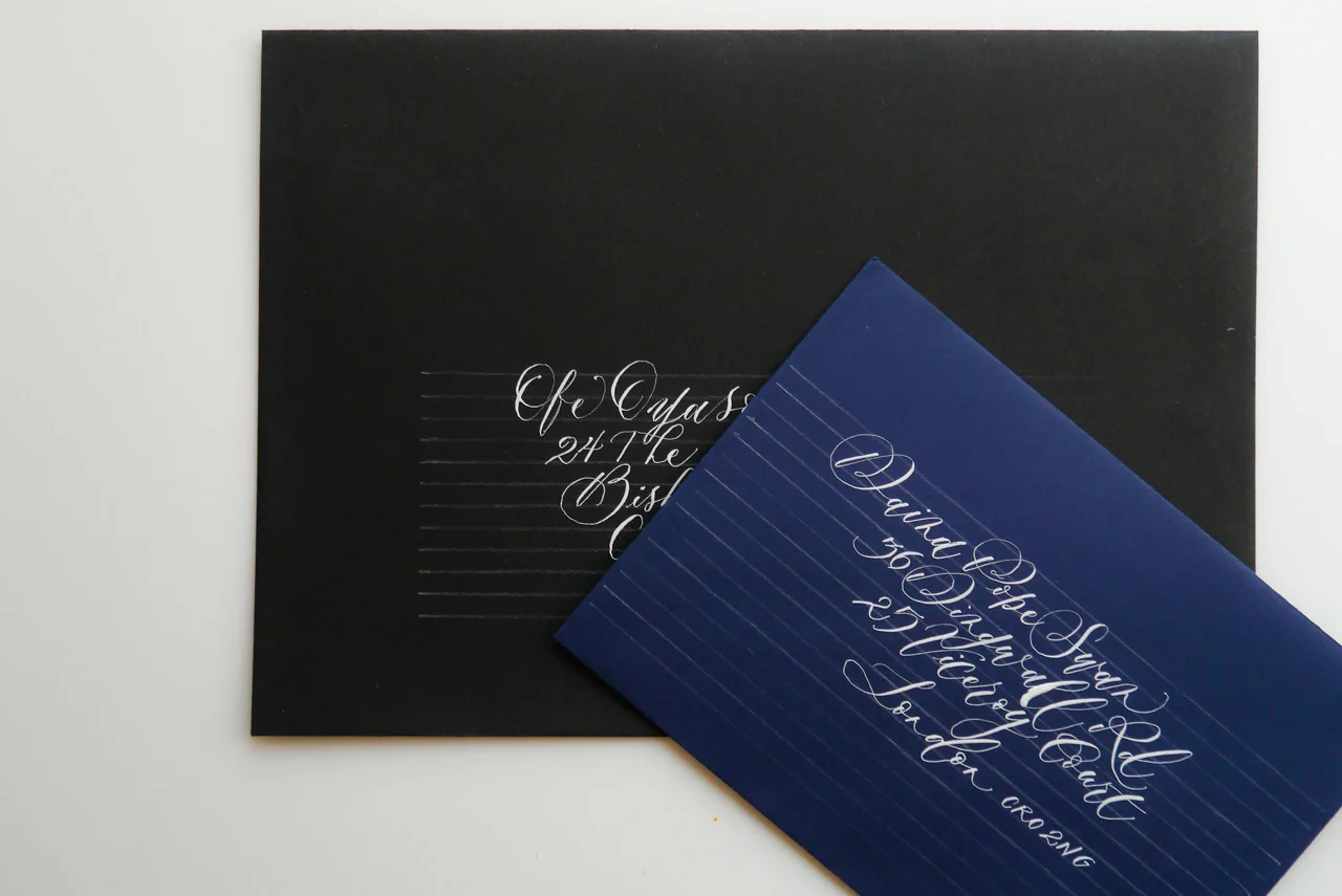
different scripts to address envelopes in calligraphy
You just need to make sure you can line it up consistently at the start (if it’s a professional job) so that your address lines are around the same place on each envelope. But that’s not so hard to do.
It can be used on different coloured envelopes Whether you’re writing on light or dark envelopes, as long as you’re marking up with the right tool, then you can use the template on any envelope.
Create gorgeous envelopes in your own style Assessing it straight off the bat, I thought that the template didn’t cater to the three key lines I work with (ascender, x height, and descender), or to longer (overseas addresses) but Ofe clarified that you can add more lines as you required just by sliding the template down the envelope and drawing more. This gave me more scope to play around with script spacing, and also means I can work with formal copperplate as well as modern calligraphy scripts. I just use about two-thirds of the x-height for copperplate as it would otherwise be a rather bulky 5mm lowercase letter.
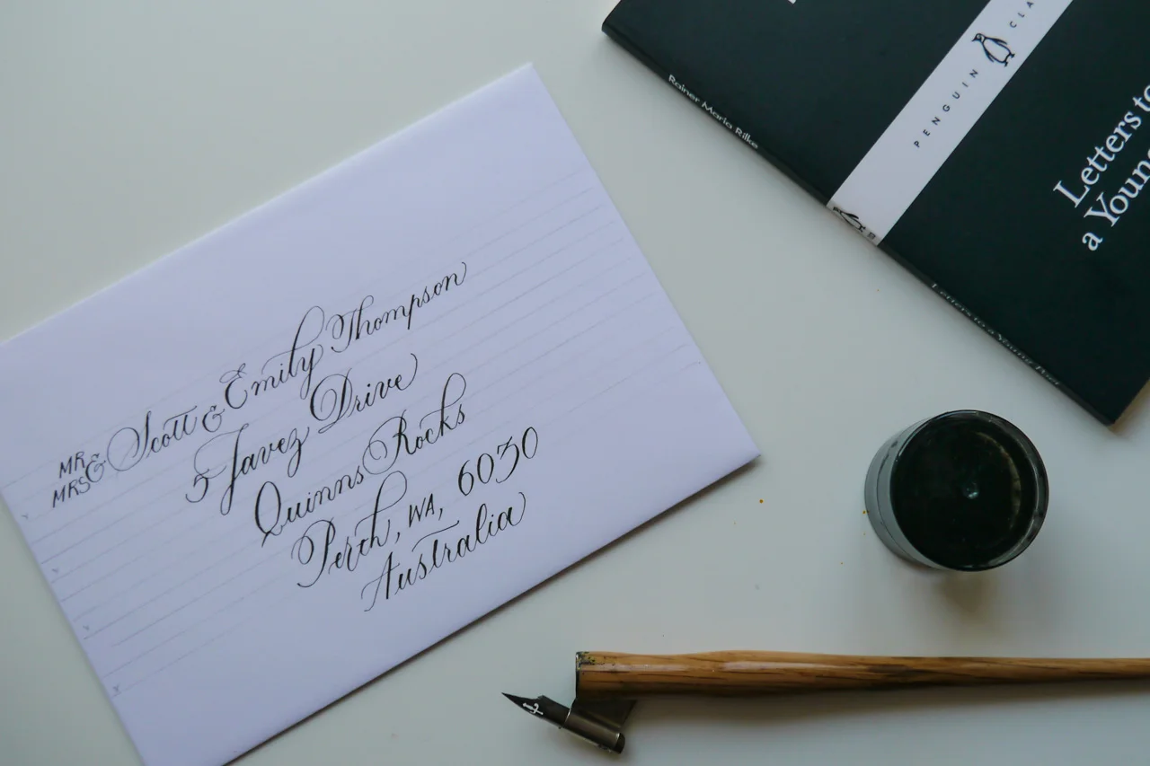
using a lettering template to address envelopes in copperplate calligraphy
It’s a kind of meditation Once I got into the rhythm of ruling up my envelopes with the guideline template, I found it oddly soothing.
The cons of a calligraphy envelope template
Because you need to erase the lines, I tend not to use it for large batches of jobs. Writing the calligraphy is slow going so I try to limit any additional work, but love that I can just grab my template and get straight to work without any fuss. It’s worth testing to make sure that what you’re using will easily erase. I had some issues on metallic finish envelopes and the graphite mechanical pencil.
While I had my reservations in initial testing with the template, I’ve had more time to work with it and determine how it best fits into my calligraphy kit. It is now a mainstay on my desk.
2. Lightbox
(approx £70, Amazon.co.uk)
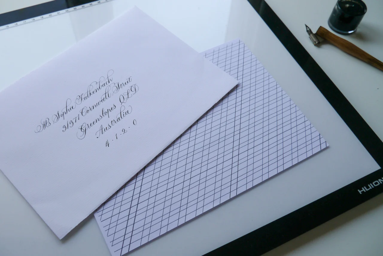
using a lightbox and guidelines to address envelopes in calligraphy
The lightbox has been with me since the very early days of starting Olive & Reid Studio and will always be an essential tool for much of my work. I don’t use it all that much for envelopes, though, as it can be restrictive in terms of ensuring you’re working with light envelopes of just the right thickness (GSM).
Tools required:
lightbox of your choice (I have a Huion A3 Light Box)
address template drawn/printed on paper cut to just smaller than your envelope
envelopes (any size)
The pros of a lightbox for calligraphy on envelopes
Reliable and fuss free As long as you’ve set your guidelines up correctly, and you can see them through your envelope with the lightbox, you can rely on creating consistently spaced and angled addresses in calligraphy.
The cons of a lightbox for calligraphy on envelopes
Specific A lightbox won’t be suitable for all envelopes, and, unless you’re supplying the envelopes you prefer to work with (that work with a lightbox), you will often need to find alternative ways to address them.
Repetition repetition repetition You may not be able to see your guidelines through the double thickness of an envelope, so your only option may be to cut your guidelines to fit inside the envelope, which you move to each new envelope. This will slow your progress a little.
3. Laser level
(approx £20, Amazon.co.uk)
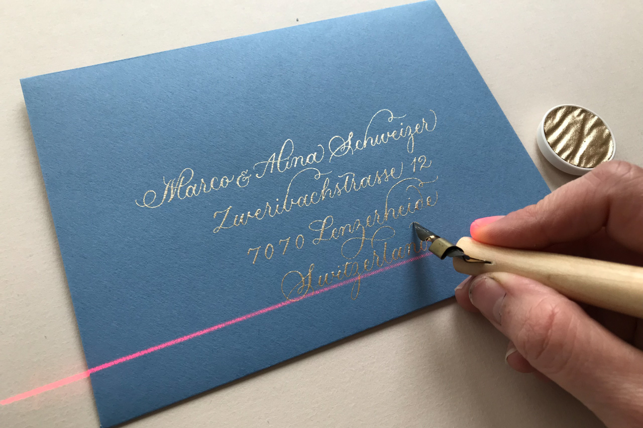
using a laser level to address envelopes in calligraphy
For some reason, I thought that a laser level was going to cause me serious health issues, so I avoided getting one for way too long. Now, I just ensure that I keep the beam away from eyes, and I can put my super duper danger alarm back on the shelf.
Tools required:
Laser level (I have Black & Decker Laser Level and a 90° laser level)
Printed/drawn guideline template to sit under and extend beyond your envelope
Envelopes (any size)
The pros of calligraphing envelopes with a laser level
Super efficient calligraphy A laser level is by far the most efficient way to professionally calligraph envelopes... with one caveat. With just a baseline to follow, a laser level heavily relies on you “getting your eye in” (calligrapher speak for writing consistent letter forms) fairly quickly. I did once use two laser levels for a particularly precarious job (copperplate on curved porcelain), but that would be overkill for envelopes.
Compared to other methods, the setup time for a laser level is minimal and requires no additional intervention as you work (such as moving guidelines from envelope to envelope on a lightbox) or after you’ve finished (such as erasing template guidelines).
To see a master at work, check out Suz Cunningham’s video via Calligraphy Masters to see how she uses a laser tool specifically designed for calligraphy, the laser square and mat.
The cons of calligraphing envelopes with a laser level
The likelihood of inconsistencies That little caveat I mentioned — the one where you need get your eye in. If you don’t, it can mean obvious inconsistencies across a batch of envelopes (which you may be able to live with, depending on your degree of perfectionism), or across a single envelope (which your client may not be able to live with).
Bumping the tool This might just be me, but I’m pretty prone to bumping stuff, so I’m always setting up my laser, bumping my laser, setting up my laser, etc. This is where the laser square and mat would probably make the world of difference (rather than my portable builders’ tool).
4. Phantom Line Lettering Guide
(approx £45 + import taxes, Paper & Ink Arts USA)
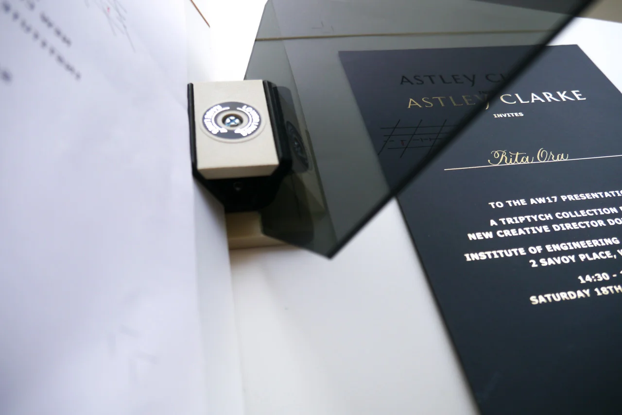
using a phantom liner to address envelopes in calligraphy
For creating precise copperplate script on dark or very thick paper, the Phantom Liner has been essential for my work.
Tools required:
Phantom Line Lettering Guide (Reflections)
Guidelines with reversed slant lines
Envelopes (larger sizes may be trickier)
What is a phantom liner?
The liner is an optical instrument, which you can use to reflect guidelines onto your writing surface (paper or otherwise). It comprises three key pieces: a base, the guideline holder (angled on the left), and the reflection plastic (angled on the right) upon which the light shines through.
This YouTube video kinda sorta explains what I mean with that set up, but I found this Paper & Ink Arts blog post from Nan Deluca more detailed and useful.
The pros of using a phantom line lettering guide for envelope calligraphy
Extending your scope The phantom liner can allow you to take on jobs that you might otherwise have to forego. I used it to address Astley Clarke’s AW17 collection invitations — 500 in a weekend — which would have been a logistical impossibility otherwise (unless I were willing to sacrifice letterform quality).
Precision tactics With the exact guidelines reflecting, as though drawn, directly onto your paper, you can be very precise with your script. This is perfect for dark or very thick paper that would otherwise become a very laborious task to rule up to perfect proportions.
The cons of using a phantom line lettering guide for envelope calligraphy
The eyes, the eyes! This tool can really send you cross eyed and cause some headaches. The depth of field can take some getting used to, and confuse where your nib or guidelines are in relation to the paper. You must ensure your set up, including light source, is in the best position to reflect the guidelines.
5. Ruler and pencil
Tools required:
Ruler
Pencil/soapstone/fabric pencil
Printed/drawn guideline template to sit under and extend beyond your envelope
I mentioned at the start of this blog post, that I once spent a lot of time measuring and ruling up individual envelopes. Madness! A very basic upgrade on this would be to place paper with printed guidelines underneath the envelope. You'd use the same method for the laser level and just switch the ruler for the level. The lines should extend out horizontally beyond the envelope, and then you can use your ruler to match up the lines and draw across your envelope. I currently use a standard steel ruler, but I’ve been eyeing off a rolling ruler or parallel glider that Lindsey from The Postman’s Knock mentions in her posts.
This method is still a lot more work than any of the above mentioned techniques, but it certainly has its place in the calligrapher’s toolbox.
6. A piece of paper or no tool at all (aka freestyle)
This is, of course, my favourite tool of all because it is the ultimate fuss-free solution to address envelopes in calligraphy: no ruling up, no erasing, no fancy gizmos. It’s right up my street. But unless you do a lot of loose script envelopes and have a loads of consistency confidence, then I would suggest it’s more for your one-offs and personal communications.
Option 1: freehand
Be confident and prepared to adjust your layout as you go to try and accommodate anything that goes awry.
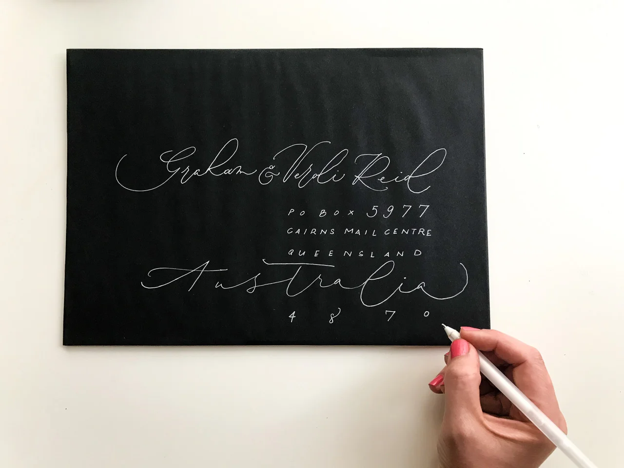
freehand addressed envelopes monoline calligraphy
Option 2: a piece of paper
If your layout calls for straight lines, simply lay a piece of paper just below where you want to write and parallel to the envelope and you have a non-invasive visual guide to help you. In time, you'll no doubt get better at spacing your lines consistently, but, as per option 1 above, just be willing to adapt as you need to create a balanced address layout.
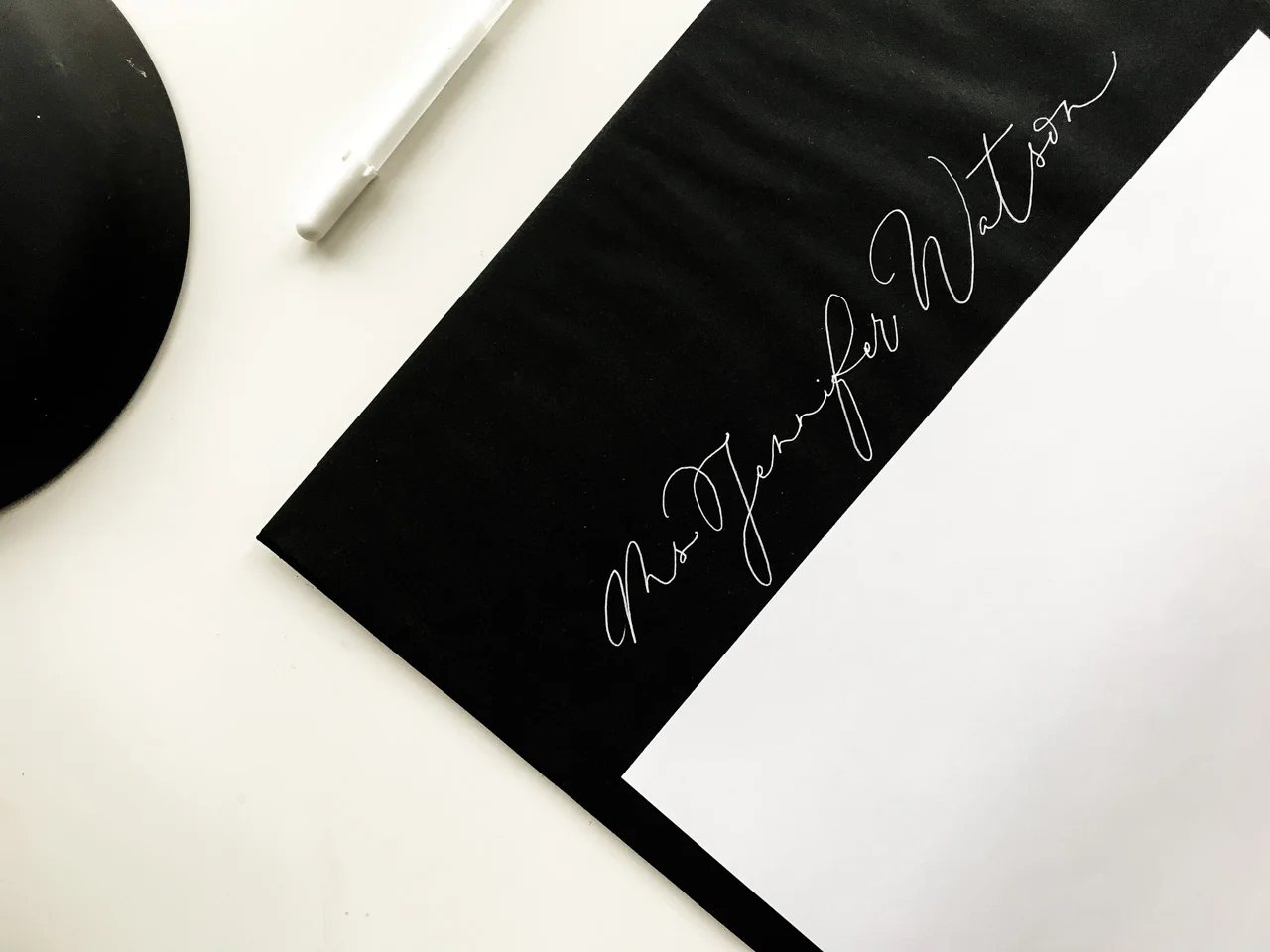
freehand envelope addressing monoline calligraphy
Share your thoughts about addressing envelopes in calligraphy
I'd love to hear from you about your wild and wonderful ways when it comes to envelope calligraphy. What have I missed? What haven't I explained very clearly? What have I been doing the wrong way? What's your favourite method? Let's chat in the comments section below.
A note about links in this blog post
Some of the links in this post are to Amazon.co.uk, which, as an affiliate means I may earn a small commission if you purchase. I only ever link to products I have purchased or tried, or know from my trusted calligraphy counterparts (in this post, from Lindsey at The Postman's Knock and Suz Cunningham). While it is a small amount of money, it does help to keep me blogging so that I can share tips, supplies and techniques with you. Consider it a donation that you don't have to donate, if you will.

UK oblique pen holders for all calligraphy budgets
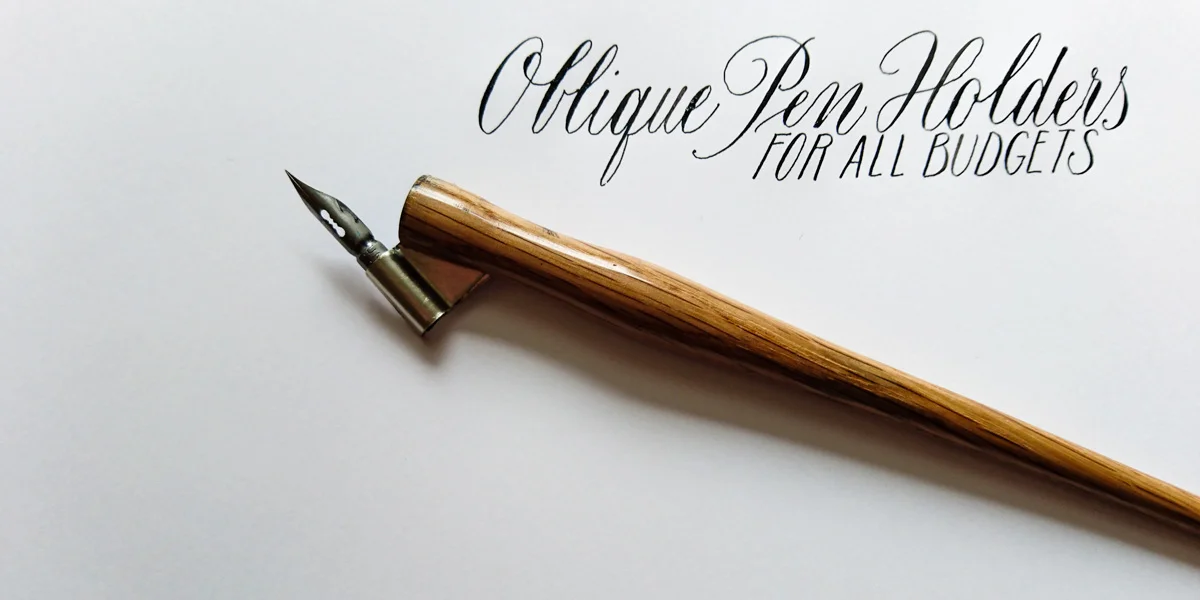
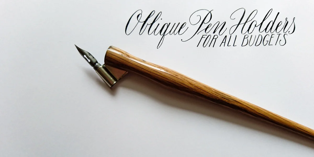
If you're in the UK and on the hunt for oblique pen holders a step above the standard plastic Speedball oblique holder (which ain't a bad little tool, might I add), you might feel you're out of luck. It wasn't that long ago that I was scouring the web for something a little more unique, elegant and handmade (having seen the fantastic work of our US counterparts such as Unique Obliques). Finally, I'm starting to see more of a range available to UK calligraphers for varying budgets.
Here are a range of holders that I know are available at the moment. I'm sure there may be more out there, and I'll update as I find them. Feel free to let me know of any via the comments.
*NOTE: this blog post was originally posted in 2016, and has since been updated to include other oblique holders now available in the UK.
Scribblers was the first on the scene with its US Yoke collaboration, so I put my hard earned pennies towards that. Meantime, I'll admire Chic Oblique's and English Pen Crafts oblique pen holders from my computer screen. Please let me know if you do buy/own any of these. I'd love to see some pictures and hear how they're going for you.
Scribblers
£54.95 (Buy online)
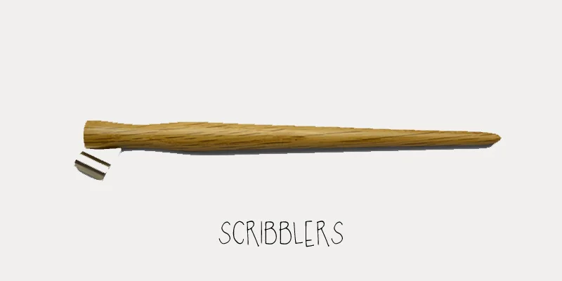
Scribblers and Yoke Co. collaboration for oblique pen holder
Scribblers teamed up with US Yoke Pen Company to deliver this oak finished dip pen holder, Scribblers Classic. Technically not handmade in the UK, but one of the first I found available locally at least. I own this one, and definitely enjoy its smooth texture and feel, and how nice it is to move the nib about.
Scribblers now has a wide array of oblique holders ranging from £2.50 to £54.95, so there's a selection for many budgets.
English Pen Crafts oblique pen holder
Approx £40–£110 (buy online)
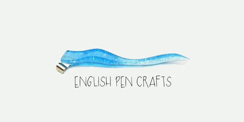
English Pen Crafts oblique pen holder
Melanie is a local UK calligrapher who has turned her hand to holder turning. They're in demand so tough to get a hold of, but I spotted one in the hands of Rosella Garavaglia at a recent Spencerian calligraphy workshop. It was a lot lighter than I expected, with a lovely long length that reminded me of an elegant cigarette holder without the associated health hazards.
English Pen Crafts holders are handmade from wood, brass and maple with reviewers highlighting how much nicer the quality wood feels as an upgrade from the plastic, and commending that they are so lovingly packaged.
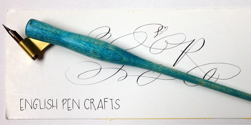
Rosella Garavaglia's English Pen Crafts oblique pen holder
UFOblique Holders
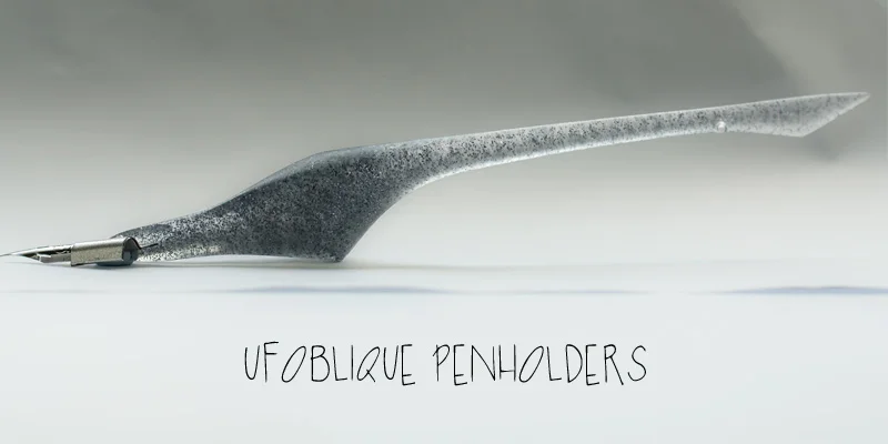
Russian based calligrapher, Anton, and his team, have created these bold, beautiful ergonomic oblique holders. I first gave the 'Alien' holder a try, but it was alas not the best shape for my hand. Anton kindly provided this sleek, streamlined 'Shark' as an alternative and it has fast become a favourite, especially for my modern calligraphy script with the Brause 361 Pumpkin nib.
Penman Direct
£44.99 (buy online)
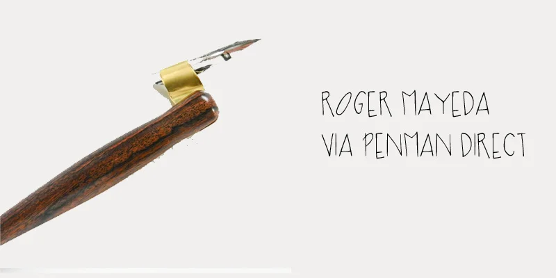
Roger Mayeda's oblique pen holder available in the UK via Penman Direct
One of my favourite calligraphy suppliers, Penman Direct, has teamed up with US artisan, Rodger Mayeda (from Rodger's Pen Box). This one is highly sought after, being a favourite of guru calligraphy blogger, Lindsey Bugbee of The Postman's Knock. While it's not a UK-made option, it's a help to avoiding those customs taxes when it's coming from a local UK supplier.
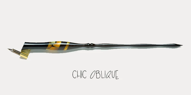
Oblique pen holder from Chic Oblique
I got a heads up via Instagram (thanks to @metamorfosiuno) about these UK oblique holder creation from Edward Curran (@curran_calligraphy).
Currently, Chic Obliques holders are well out of my price range, but they look to be great quality and very creative and unique.
"You will receive a very unique pen ... created by hand using a wide variety of materials, from exotic woods and Acrylics to everything in between. The flanges are cut and shaped by hand to fit each individual oblique pen holder."
Tom's Studio
£125+ (buy online)
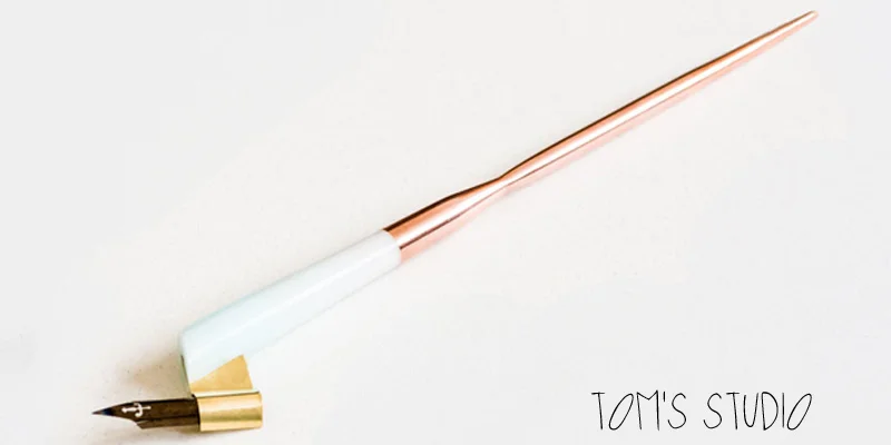
Tom's Studio oblique pen holder featuring solid copper
All the girls go crazy for...
I found out about Tom's Studio oblique calligraphy pen holder from a Facebook group I recently joined. I've seen this one posted in the group a couple of times. Personally, I'm happy enough with something that will get the job done (read: Speedball and Yoke are my go-to holders at the moment), I appreciate the appeal of this sexy little number with its sleek copper tail.
Blots Pen & Ink Supplies
£30 (buy online)
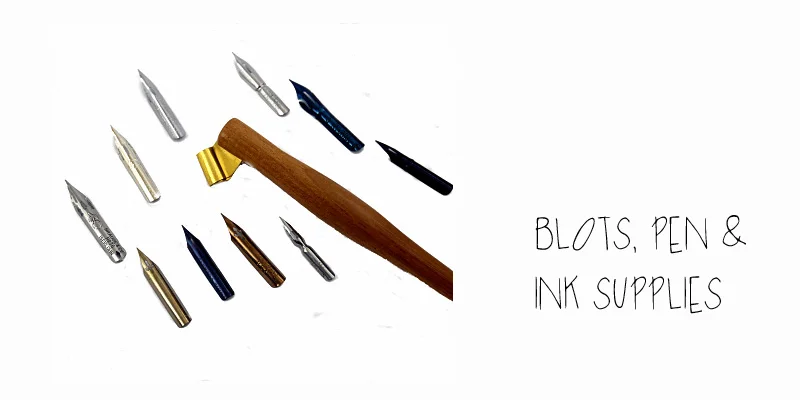
Oblique holder, nibs and ink available from Blots, Pen & Ink supplies
This teak offering from Blots, Pen and Ink Supplies is great value as a calligraphy starter kit: at £30, the holder is supplied with 10 nibs and a wide-necked jar of Blots Iron Gall ink. You can also buy the teak oblique holder on its own for £16.50, or check out all of Blots holders to see if something takes your fancy.
Share your oblique holder experience
I'm looking forward to hearing from you if you own any of these pens. Feel free to share in the comments below, or send me an email and I'll update the with your thoughts here.
-- Kate

What is modern calligraphy?
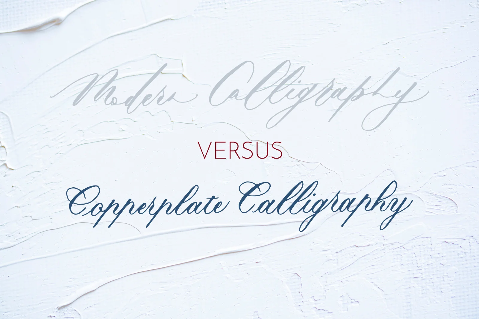
Modern calligraphy has swiftly become the go-to script for brides looking for a unique finishing touch for their wedding, or for learners looking to ease themselves into dealing with calligraphic scripts and paraphernalia.
When I started teaching myself calligraphy in 2014, I didn't start with modern calligraphy. I didn't even know that was a thing. I instead found a style that I like the most, and seemed the most practical out of them: Copperplate.
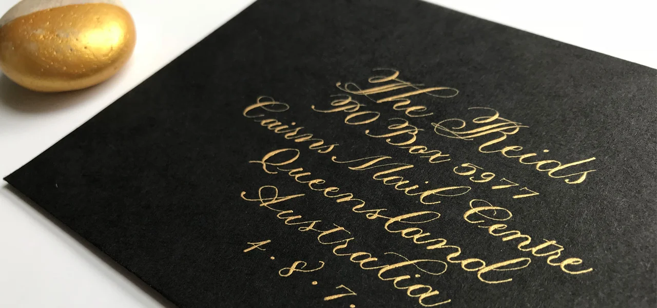
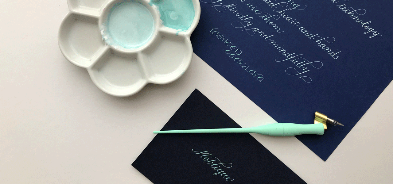
What I quickly found was that Copperplate script, with its distinctive thick downstrokes and thin upstrokes, has now taken on a contemporary twist into what's termed "modern calligraphy". Although this style may be considered disdainfully by some traditionalists, I have seen it executed with breathtaking beauty by some of my favourite calligraphers.
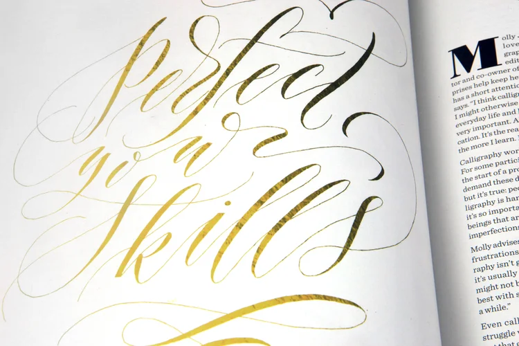
The difference between Copperplate script and modern calligraphy
Modern calligraphy has its grounding in Copperplate script, which is why many teachers recommend getting Copperplate under your belt first. Copperplate calligraphy:
is structured with specific, individual strokes used to form the letters
requires varying pressure on up and down strokes to create thick down lines, and thin — hairline — upstrokes.
Therefore, mastering these techniques not only give you an excellent foundation, but also confidence, for doing modern calligraphy. The only difficulty I've been having is loosening up and being free outside of the Copperplate constraints. Beautiful constraints.
Modern calligraphy is a fresh, new style that brings a flexibility and uniqueness that is both appealing and accessible. Where Copperplate dictates form and function, modern calligraphy lends itself to a more fluid, closer-to-your-handwriting approach. With some practice, dedication, and inspiration, anyone can define their own modern calligraphic style.
My top resources for learning traditional and modern calligraphy:
Mastering Copperplate Calligraphy by Eleanor Winters
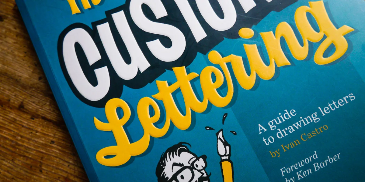
Modern Calligraphy by Molly Suber Thorpe
Modern calligraphers to follow

My favourite must-have calligraphy paper (includes giveaway)
Bureau Direct, one of my favourite UK stationery suppliers, is offering an exclusive giveaway of my must-have calligraphy paper: Rhodia and Clairefontaine Triomphe. Enter to win via the widget at the end of this blog post, but, for now, find out why these papers are my go-to calligraphy paper choices for practice and digitising. A quick overview of Clairefontaine and Rhodia paper is that both have an exceptionally smooth finish which is perfect for calligraphy nibs and ink. With a little research for this post, I learned that, while they are two separate brands, Clairefontaine is the parent company and produces the paper for both.
The official US Rhodia website states:
"The Rhodia pad... features superfine vellum Clairefontaine paper in white with an exceptionally smooth satin finish."
Why is Rhodia grid paper the best for calligraphy practice
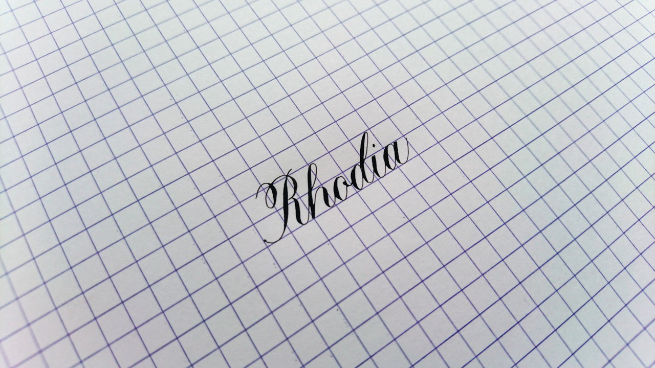
There’s nothing quite like Rhodia paper for calligraphy practice. A high grade vellum paper, it’s by far the smoothest I’ve come across. If you were just looking at specs alone, the 80gsm weight of this paper belies its ability to heartily withstand just about any ink you want to splotch on it -- and the ink won’t bleed.
I have always used the grid-style in A4 format. It doesn’t have Copperplate’s 54 degree angled guidelines and traditional 3:2:3 letter height ratio (it’s 1:1:1), but the ease with which the ink glides across it lets me focus on specific areas for creating calligraphy letter forms.
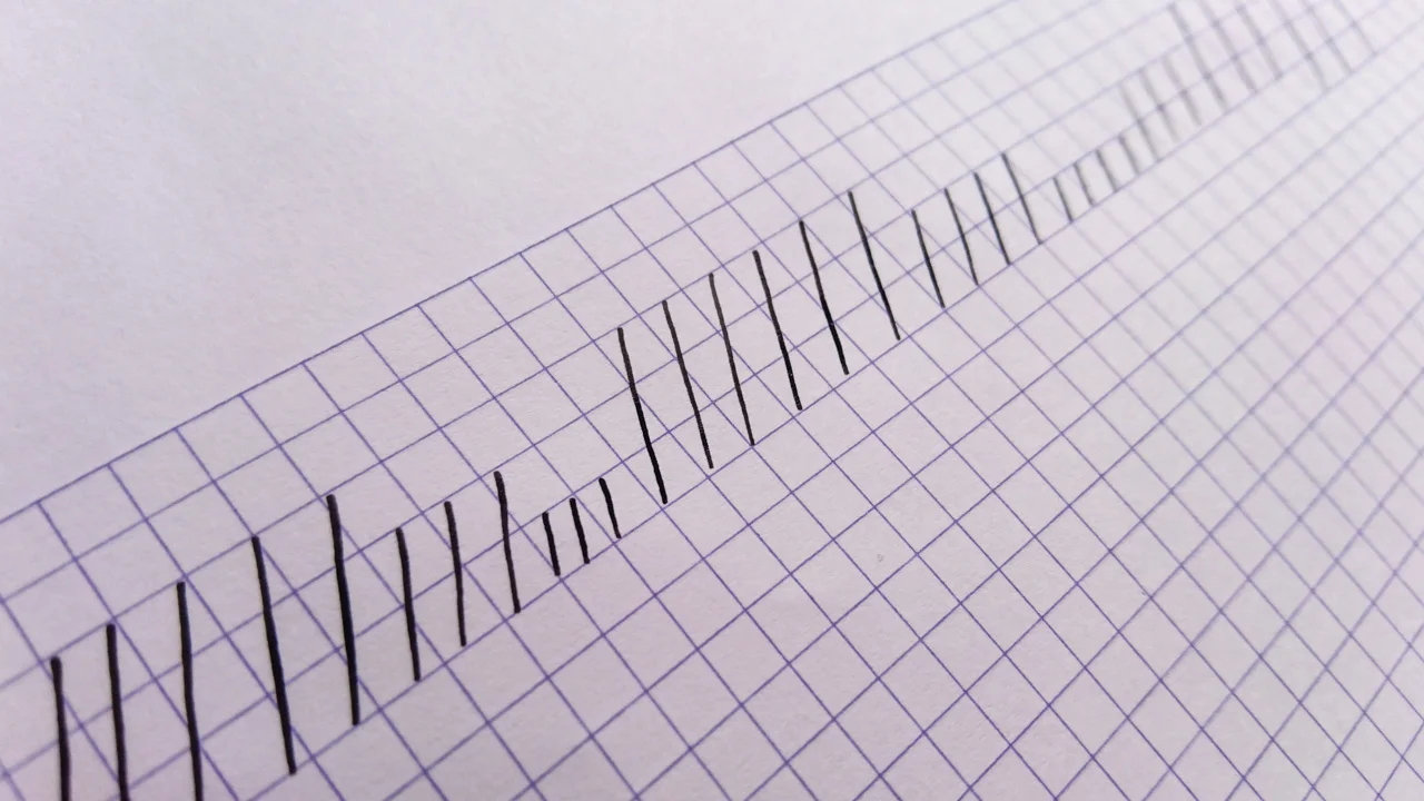
For example, I might spend time on squaring my tops and bottoms — a difficult but very aesthetically pleasing skill to master. Or I might practice consistent straight lines
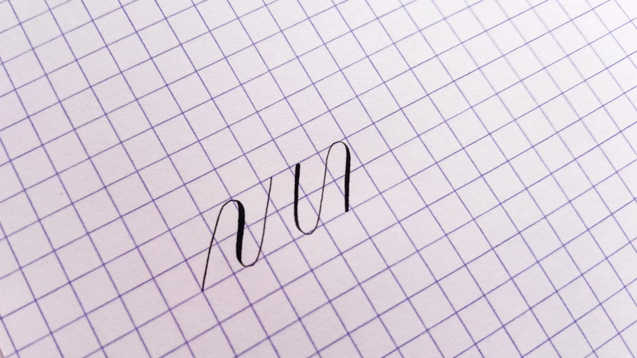
Or I’ll get in the rhythm with some underturns
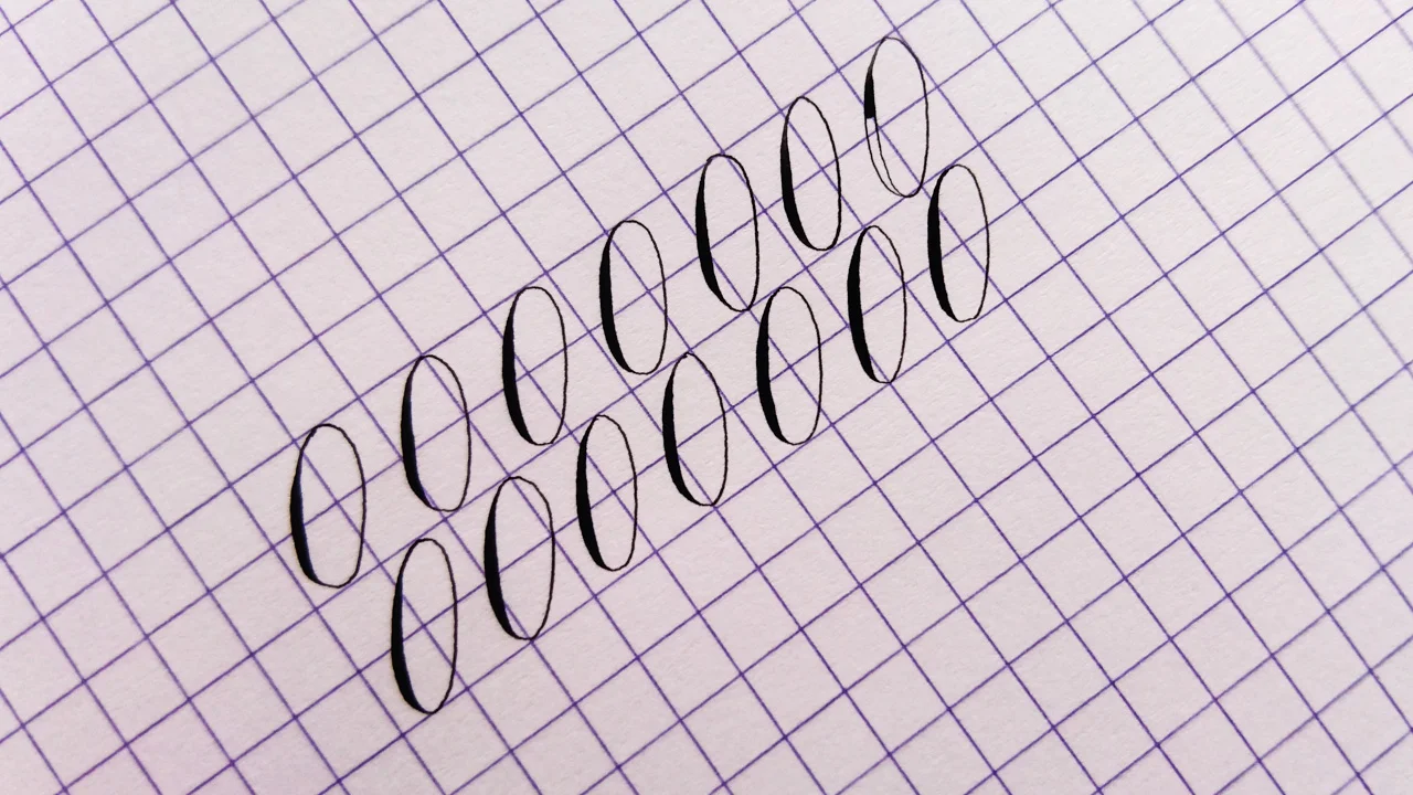
Or belt out some ovals
Of course, you could opt for plain Rhodia paper and draw/print your own guidelines, but, for me, for practice purposes, the grid works out just fine.
Buy online from Bureau Direct
Rhodia Pad (no. 18) — £4.95 / pad (80 sheets) — plain, lined, grid and dot grid.
Why I love Clairefontaine Triomphe paper for creating digitised calligraphy
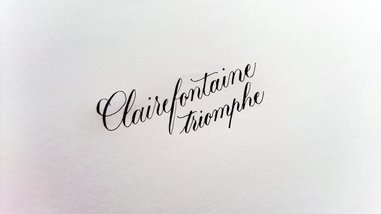
My go-to blank paper for writing calligraphy that I plan to digitise is now undisputedly Clairefontaine’s Triomphe. This 90gsm high white paper, like Rhodia, is exceptionally smooth and a dream under any calligraphy nib. When there’s so many factors that can influence whether your calligraphy ends up looking good or bad (apart from your own cruel self examination), I really appreciate having a foolproof paper to hand that will take any ink or nib I bring to it.
Buy online from Bureau Direct
Clairfontaine Triomphe (A4) — £3.50 / pad (50 sheets)
While these papers — from high quality French stationery brands — aren’t the cheapest, I’ve always found them flawless and so reliable that I’m happy to spend the money (and, when you break it down, they work out to around £0.07 per sheet). I do use other, more economical paper choices when working solely on calligraphy layout, but I’ll save that for another blog post.
Rhodia paper in action
Watch this clip of me writing "Rhodia" on Rhodia to demonstrate the paper's delightfully smooth texture (at double speed).

Ever needed calligraphy ink alternatives?
This post wasn't planned to be about calligraphy ink alternatives. Originally, I was going to talk about envelope suppliers in the UK, but during the sample testing process, I suffered some sad calligraphy ink catastrophes. ...so you bought less-than-perfect quality envelopes and now your ink is bleeding everywhere like a scene from CSI. Don't panic. All is not lost.
What's the ideal stationery gsm weight for calligraphy?
As a general rule of thumb, envelopes (well, pretty much any form of stationery) for calligraphy should be at least 120gsm. It's still always a good idea to test the paper stock if you can because you just never know.
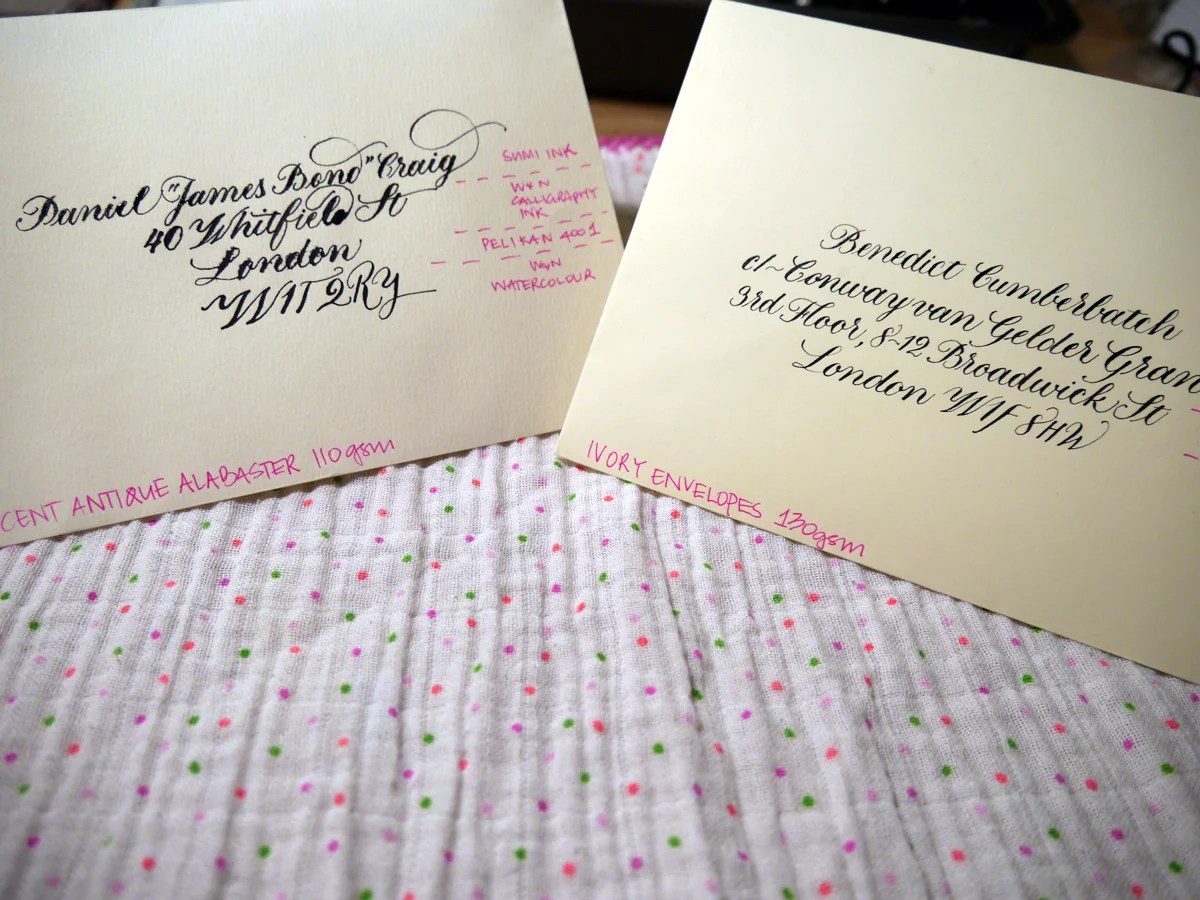
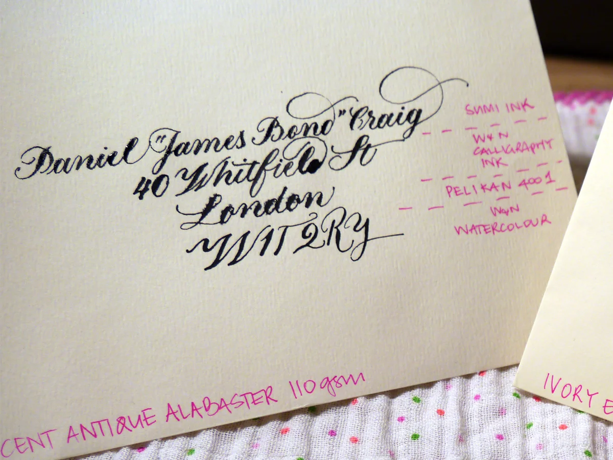
I recently made the schoolgirl error of buying 110gsm envelopes... I swear I thought it was 160 gsm! With a solid helping of optimism, I tested it out, and things did not go so well. Next to the 130 gsm counterpart I was testing, it was a right mess. Hollywood superstar Daniel Craig doesn't deserve to receive this trash calligraphy.
Ideal-110gsm-close-sml
Testing sample envelopes for calligraphy
The sample envelopes I used for testing
C6 Ivory Envelopes 130 gsm (£7.20/50)
Accent Antique Magnolia 110 gsm (£11.04/50)
Do you think it was the fancy name of the 110 gsm ones that blinded me? Before you answer, it's important to know that I'm a sucker for marketing. And as a marketer, I should know better. Maybe I thought more expensive meant better? I wish we could just forget they ever happened. But they did, and now we have to find a way to fix this.
The black inks I used to test with
Accent Antique Magnolia 110 gsm envelopes
You can see for yourself how the envelope fared with these inks. I used Leonardt Principal EF nib and within seconds of nib to paper I knew it was going to be hazardous. It takes a lot of effort to persist when your writing looks like this. You're wiping away tears and clutching at your heart and reputation all while creating the calligraphy version of a Pinterest Fail that you very absolutely intend to share with the internet. You're welcome.
Ideal-110gsm-close-sml
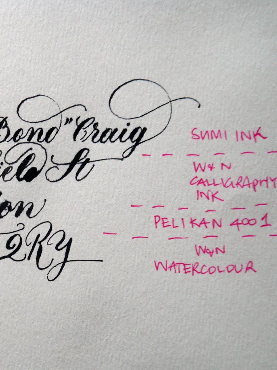
There really isn't much point in assessing each ink, but I would say that the watercolour may make them usable, and the Pelikan 4001 suffered the most. Sad, really.
Although I went to bed annoyed at myself for these envelopes, I woke thinking, "I CAN FIX THIS".
What can you use instead of ink for calligraphy?
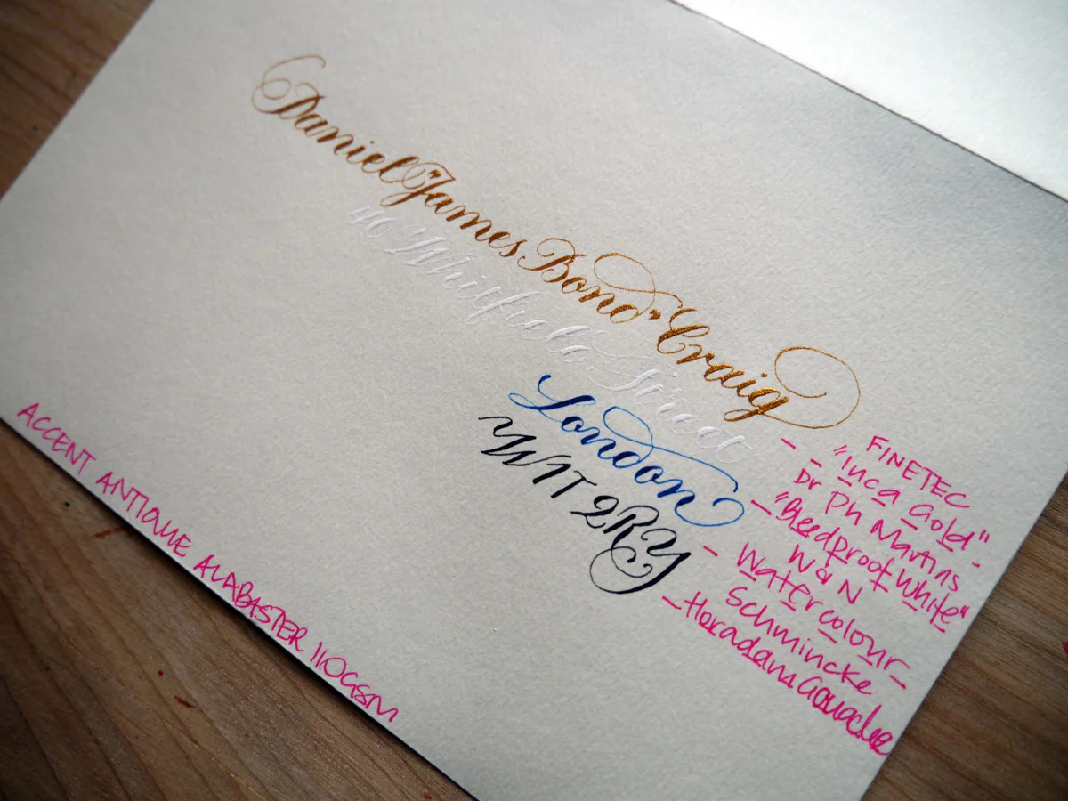
You see, calligraphy isn't restricted to inks. There's a range of water-based paints and products that can be diluted to the right consistency to write with. Rummaging through my inky tool box, I pulled out four alternatives that I thought could be worth a try.
Ideal-110gsm-paint-full
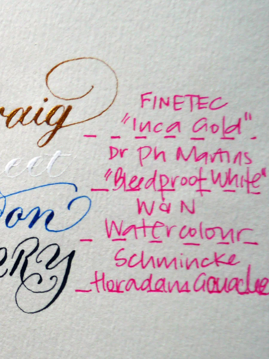
Every single one of the alternatives to ink works on these envelopes. Well, the fact that the white is barely legible is beside the point; it didn't bleed. Cos it's "bleed proof". Dr Ph Martin did not lie. And — come on! — secret writing is exactly perfect for James Bond. Maybe not for Royal Mail.
Let's compare the inks with the paints in close view to just really prove the point that all is not lost with the envelopes — we have many alternative options to play with.
Ideal-110gsm-ink
Ideal-110gsm-paint
Ivory envelopes 130 gsm
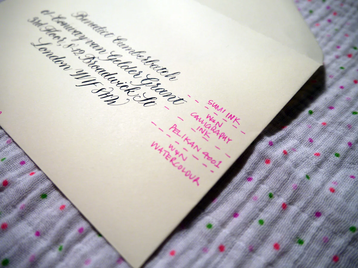
Now, this is more like it! Bring on the inks, I say. I used Gillott's 303 nib for this test. My only struggle was that they were a little hard to see through in parts on the light box, but, if all else fails, rule it up my friends. Draw those guidelines and erase once you're done. Old school.
Ideal-120gsm-sml
Sumi - was lovely! It created beautiful hairlines and was easy to write with on this envelope. It did dry slowly, though.
W&N Calligraphy Ink - slight bleeding and the hairlines aren't so fine, but still works. I do find this ink thicker than it should be, so could be watered down for a better result. I just haven't tried it yet.
Pelikan 4001 - went on smoothly and hairlines still very nice
Watercolour - also lovely and created thin hairlines and a smooth experience.
Top tip for troubleshooting calligraphy inks and stationery
At the end of the day, the main thing is to test your stationery and be ready to adjust your expectations. Be willing to experiment with different media, and have fun!