

Hand lettering workshop with sign painter Mike Meyer
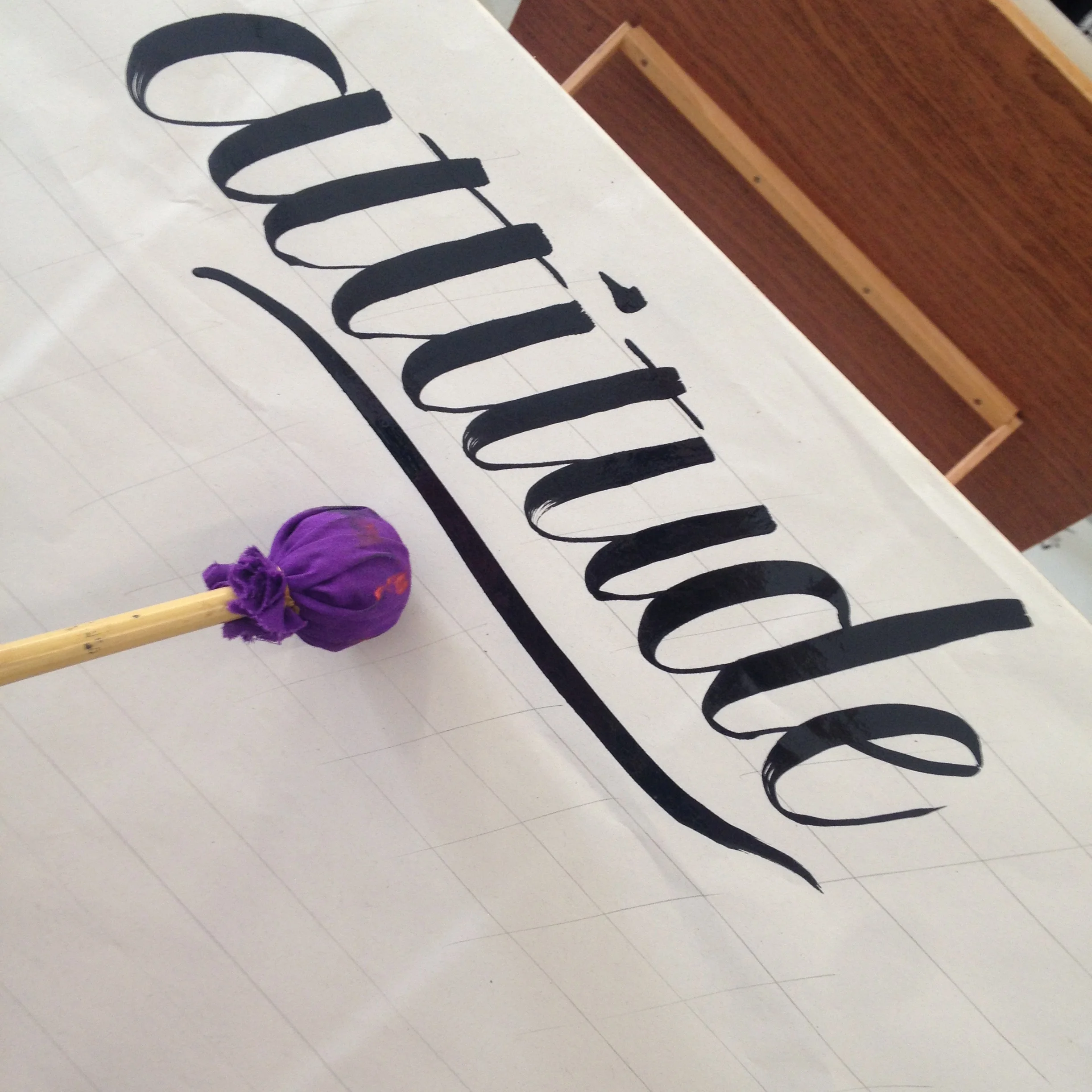
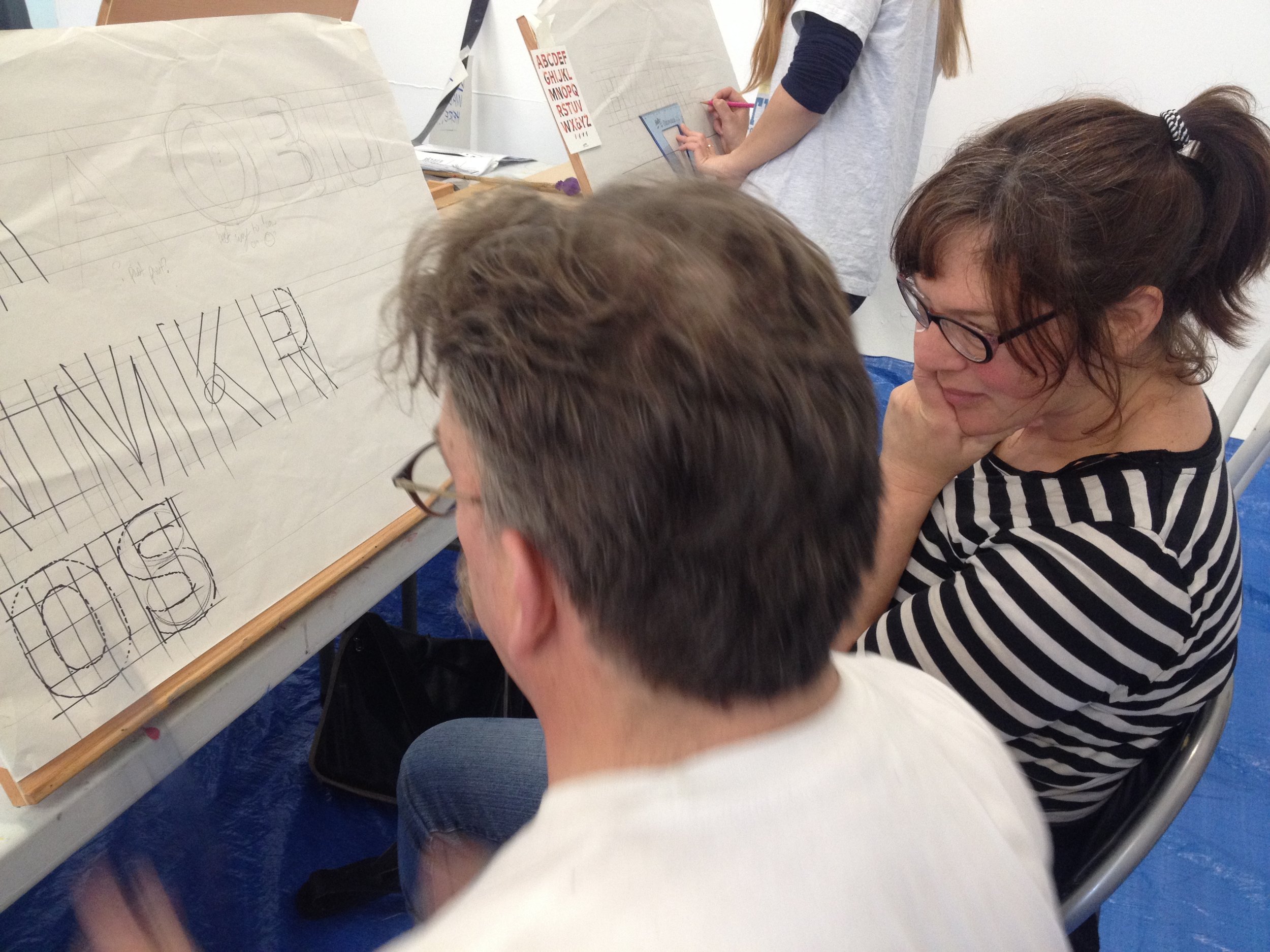
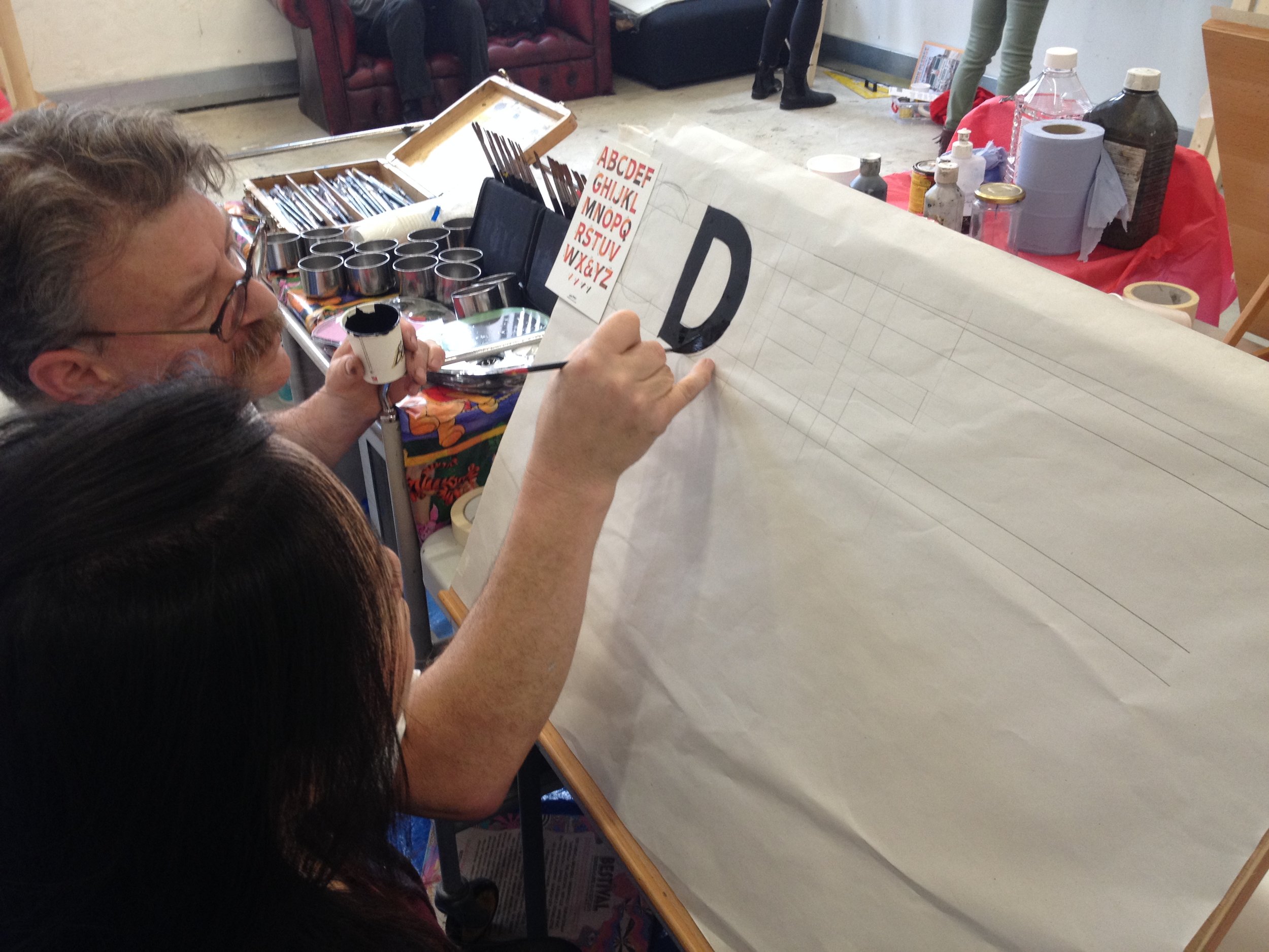
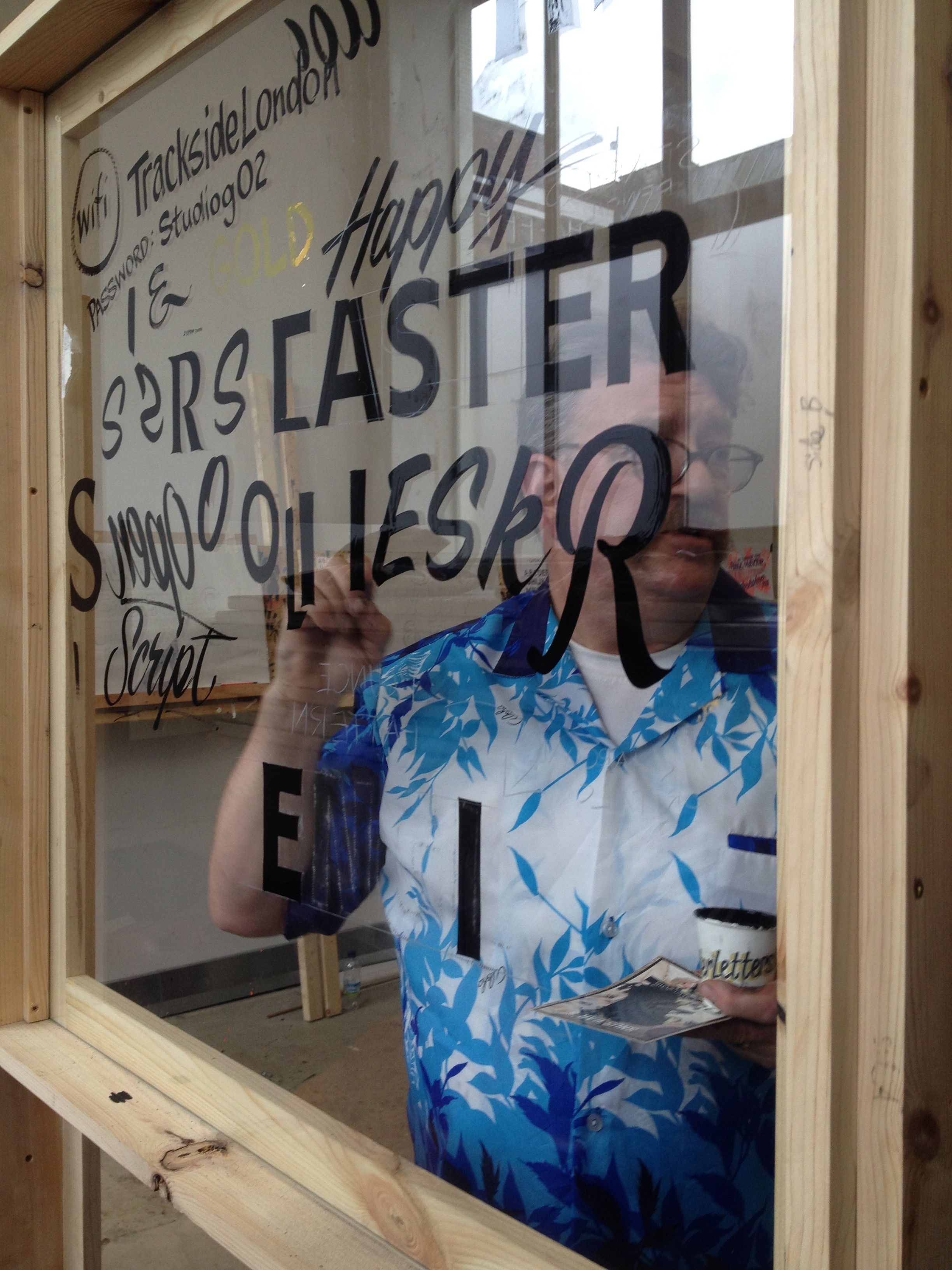
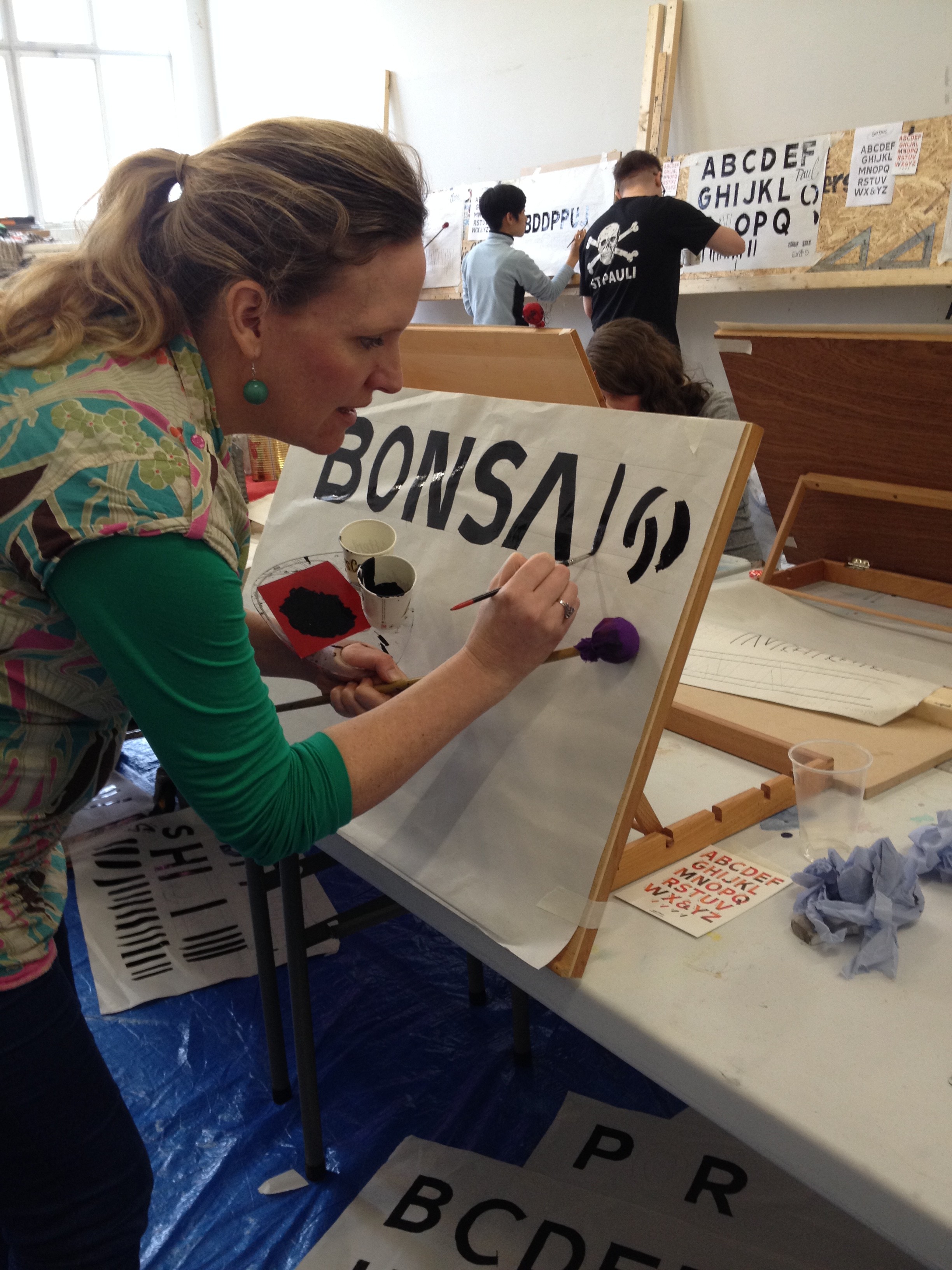
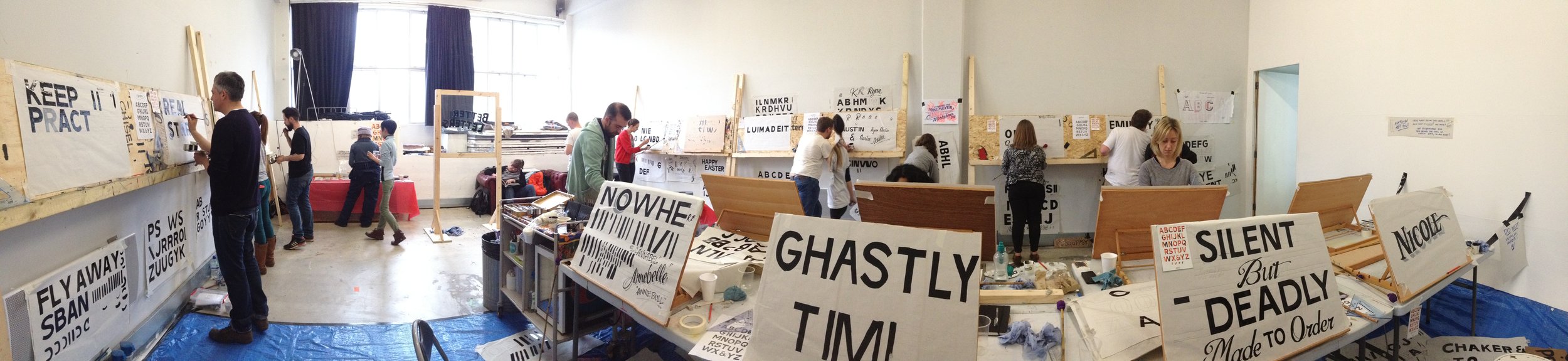
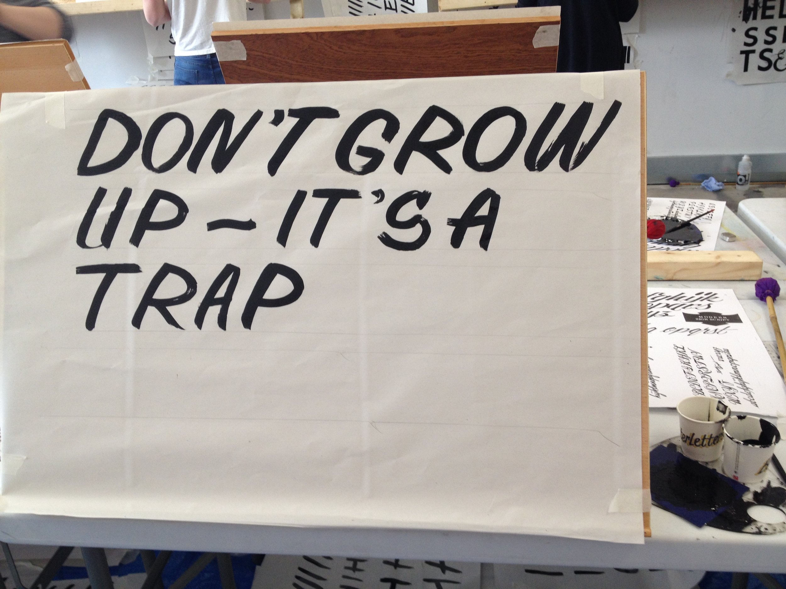
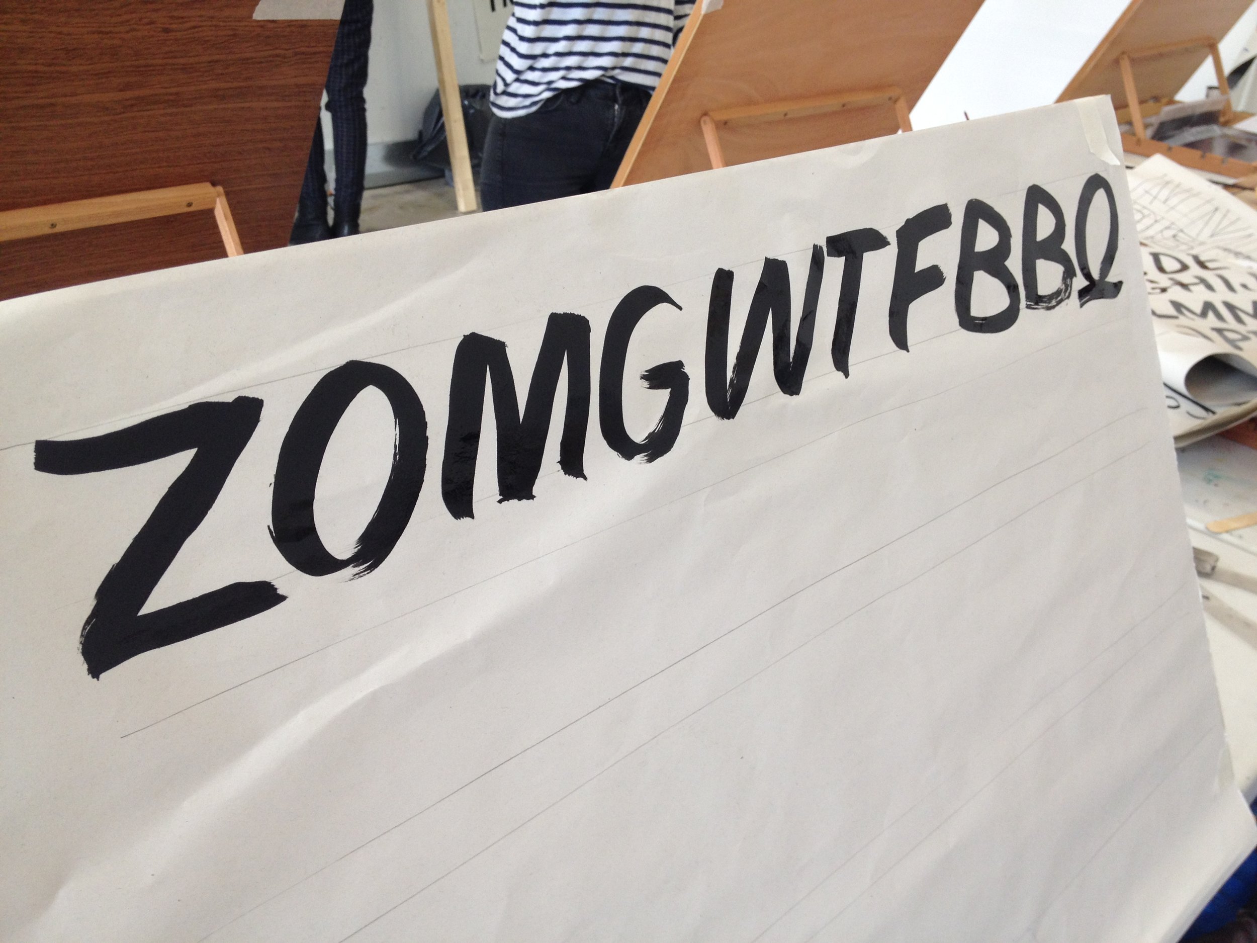
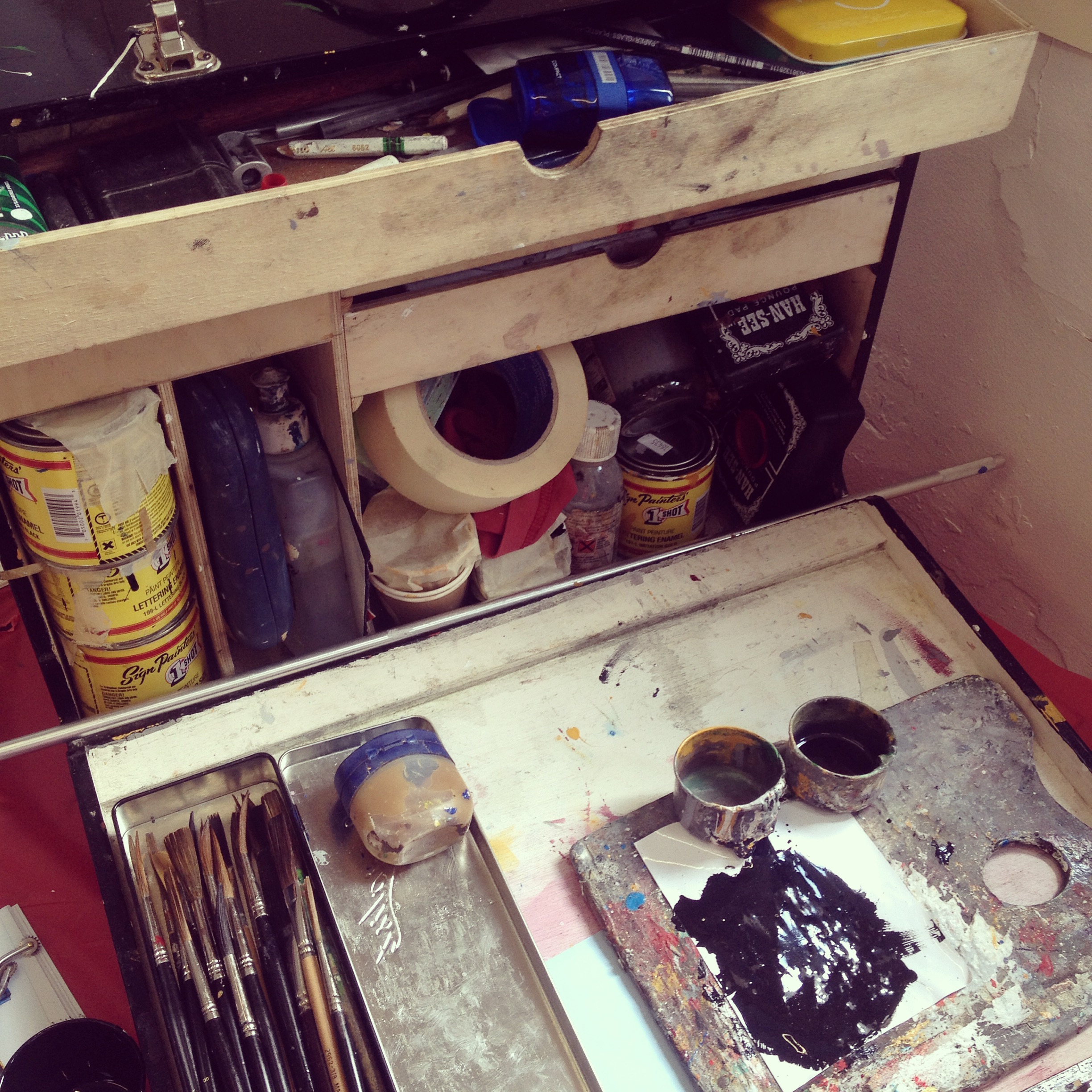
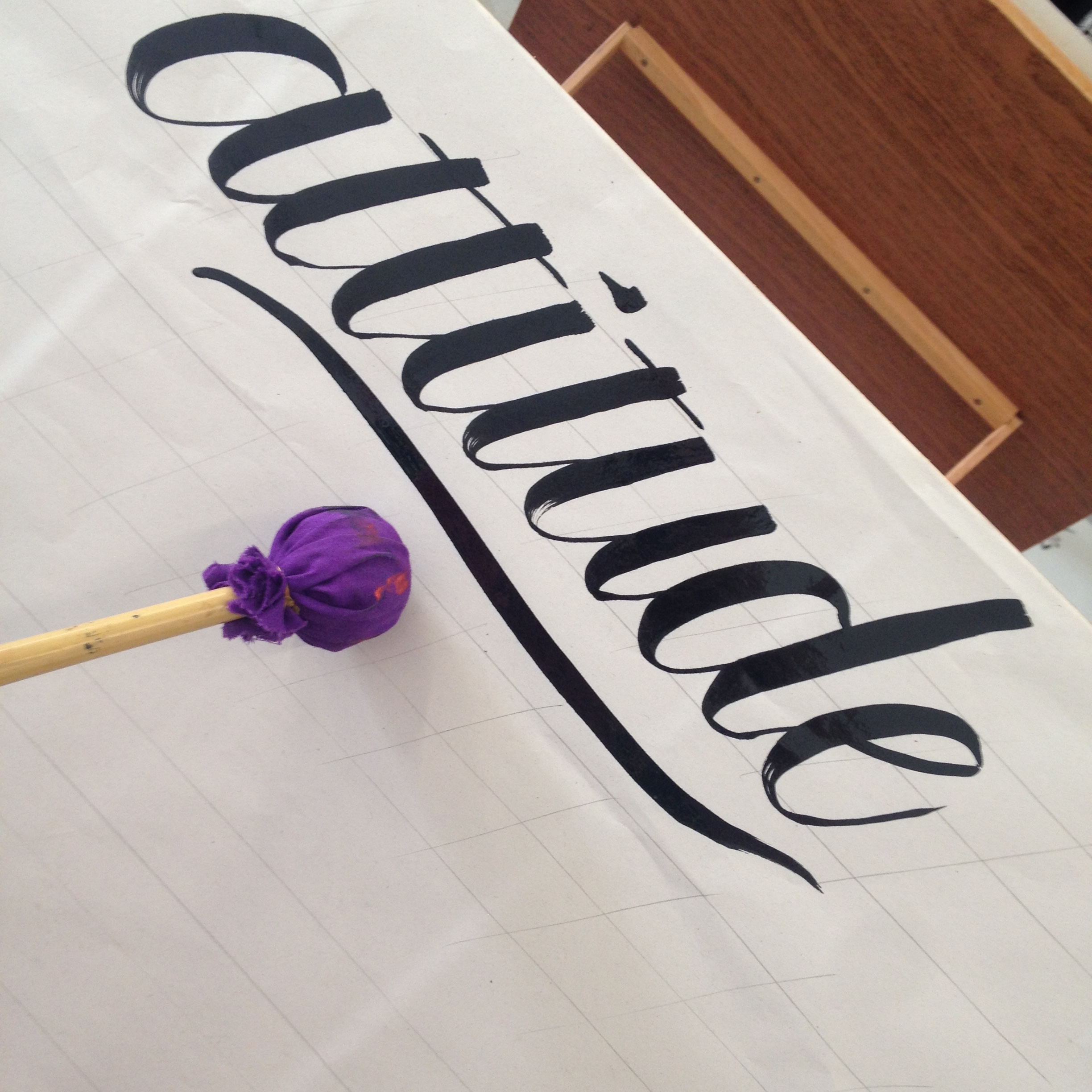
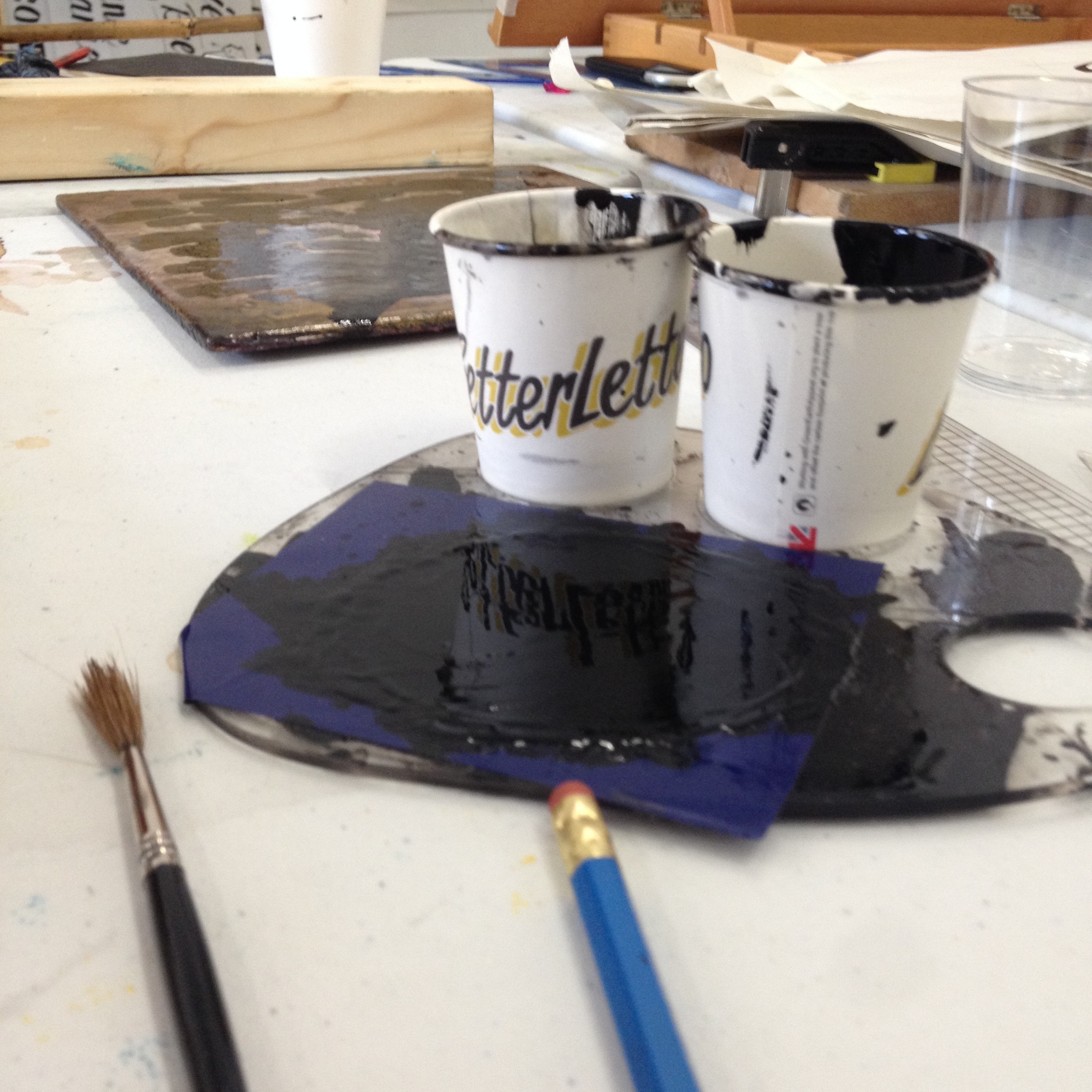
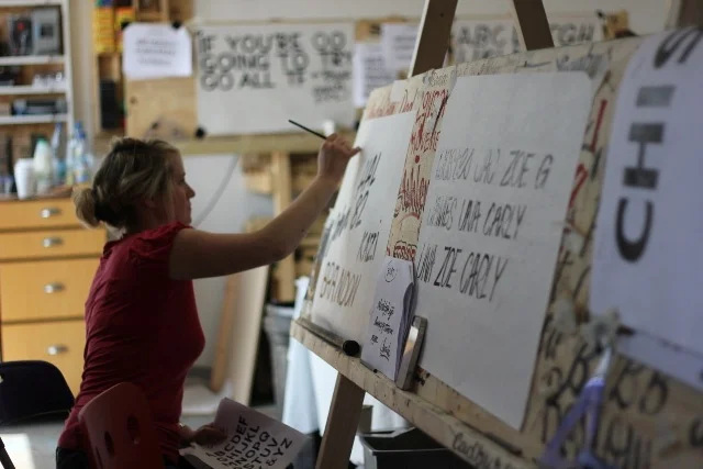
It’s the end of two long days of intense, but satisfying, lettering learning put on by Better Letters at Trackside London. Led by Mike Meyer, travelling sign painter extraordinaire from Minnesota, US, and supported by local awesome sign painter, Mark Josling of Spectrum Signs, about 20 predominantly amateur students took to the easels, newsprint, enamel paint and palettes with certain trepidation and gusto.
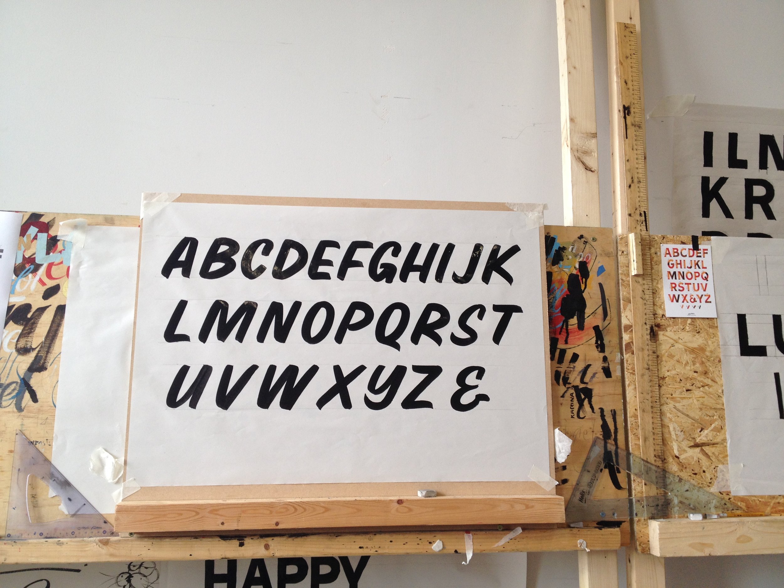
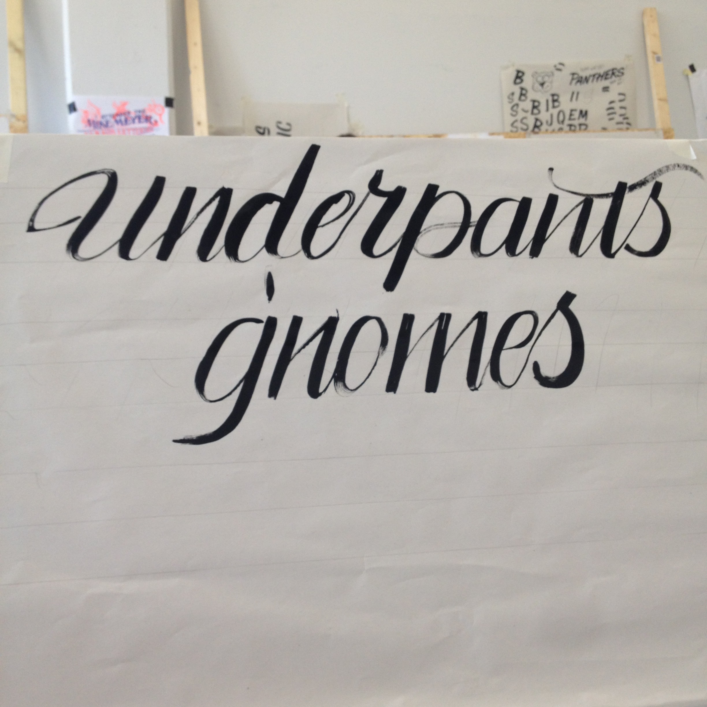
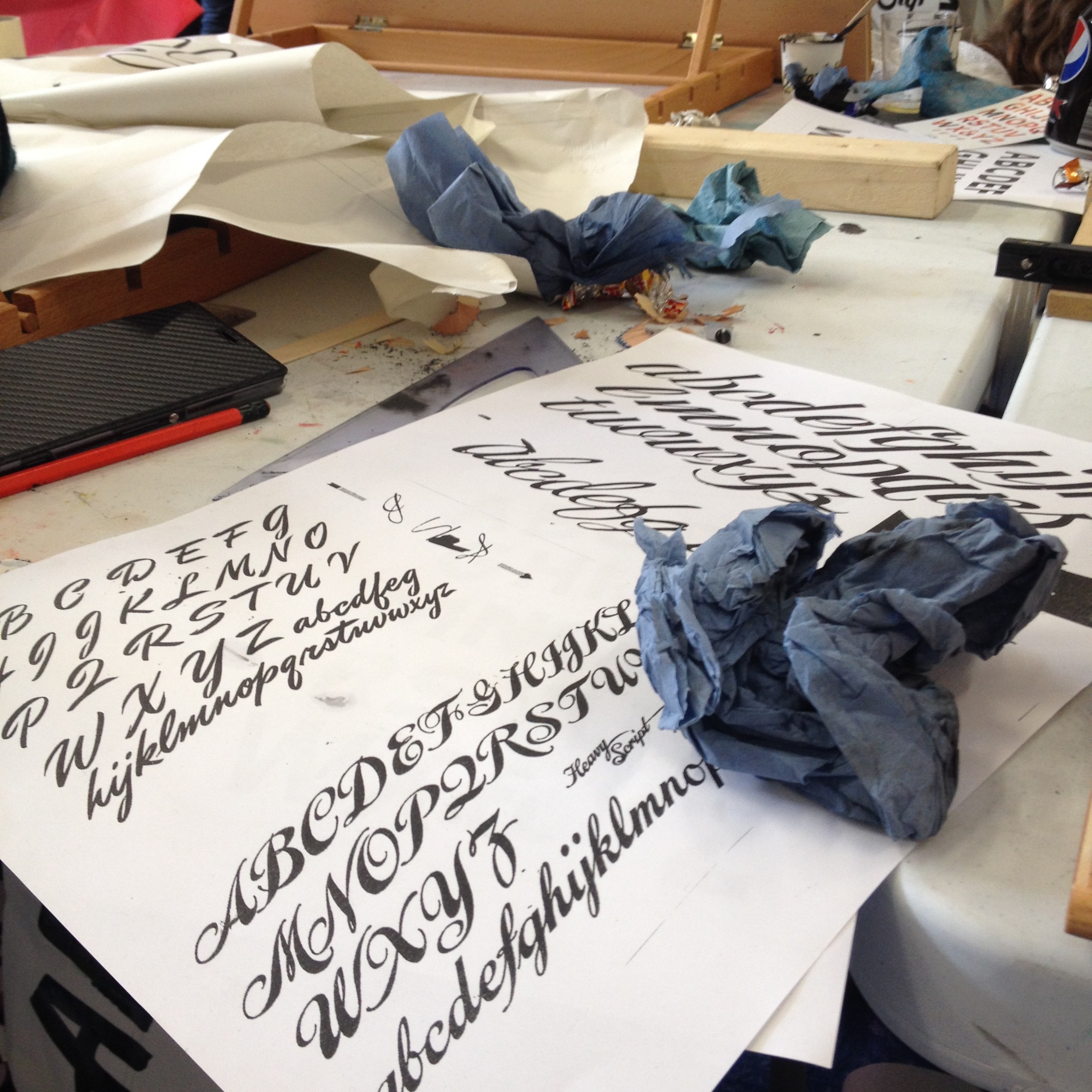
Focusing on three lettering styles over the weekend: Gothic, Casual, and Script, we had Mike and Mark on hand to first show us their exemplar stylings, which we would then attempt to replicate as they moved around and guided us on any specifics we were having trouble with. I had to often remind myself, in fits of frustration, and as they made it look so easy, that this was my first ever attempt at this style or format of lettering.
After solidly practising one script for a block of hours, quite unperfected, it was nice to move on to another only to come back again and see that the muscle memory was forming and the progress was happening.
The workshop format was relaxed and informative, albeit a little overwhelming on the enamel fumes at day’s end, and really allowed for pretty significant progress over two days. All materials were included in the cost of the workshop, as was lunch — locally made artisan bread much like my favourite Swiss style that I can find nowhere outside of Switzerland — and refreshments (mmm, so many McVities Digestives and Celebrations). It was excellent to meet other students, particularly my lettering partners, Annabel, and Suzy from Muddy Creek Sign Painting.


Learn calligraphy with Keith and Amanda Adams
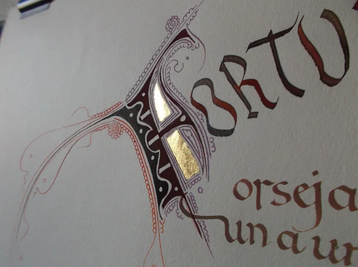
Nothing sounds more peaceful and soothing to me than a six-day calligraphy workshop in the stunning Lake District, UK, learning from masters Keith and Amanda Adams. Both Keith and Amanda are these days based predominantly in Spain, and this is a wonderful rare opportunity to learn from them here in the UK, hosted by Laya Point Permaculture.
You will be initiated into the beautiful Catalan interpretation of Charlemagne’s [or Alcuino’s] elegant minuscule, the first script to have both a capital and a small letter, and the most legible historical calligraphic letter form to our modern eyes.
Calligraphy course specifics
What: learn calligraphy with Keith and Amanda Adams
When: July 17 - July 22
Cost: £400 (includes materials and lunch)
Where: The Old School, Ulpha, LA206DT
Notes: Visit the Layapoint website for full course details
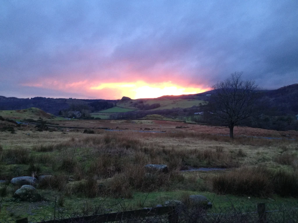
Learn calligraphy in the Lake District

Sponsored: Valentine's Day calligraphy haikus
 This post is brought to you by Pen Heaven, who, this Valentine's day, is collaborating with calligraphers to bring a little lettering love to the V-day spirit with calligraphed haikus.
I've never been great with Valentine's Day romance (or any gift giving particularly). I think one year JW got a small tin of (4) Ben's Cookies. I appreciate that people use the day to celebrate their love, but I'm usually not that organised.
This year, I got a little heads up from Pen Heaven, when they asked me to bring a love haiku to life with my calligraphy.
If there is one thing that I will profess love for any day of the week, it's haikus, so it felt right that Olive & Reid's first foray into an online collaboration like this would satisfy all forms of my word nerd tendencies. Pens, calligraphy, haikus!
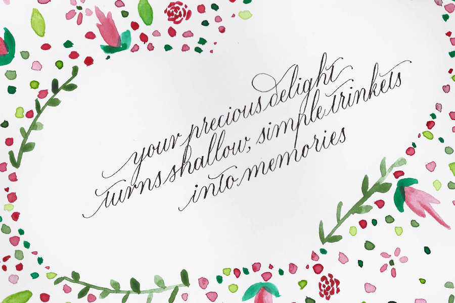
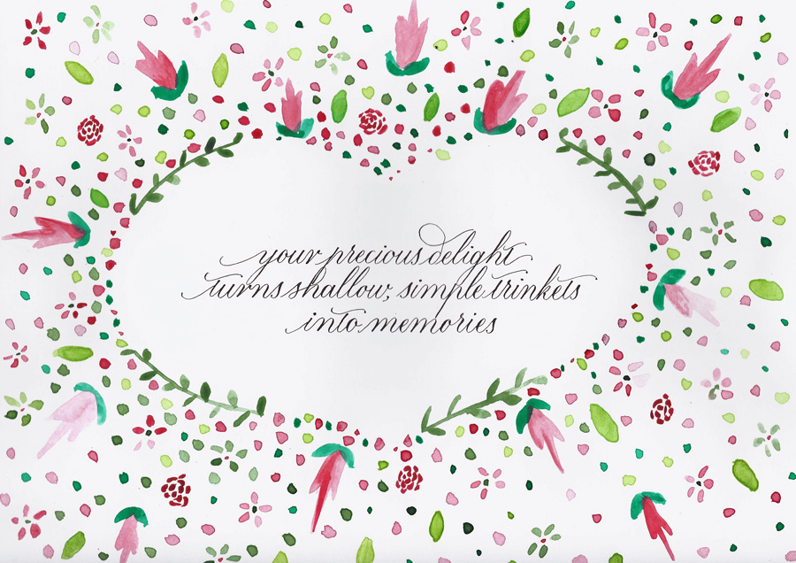
I was asked to calligraph the following haiku:
Your precious delight
Turns shallow, simple trinkets
Into memories
When I considered which style I would go with for this piece, I knew that another contributor, Chiara Perano from Lamplighter London, had presented a stunning, simple modern white copperplate on black background, which probably would have been my modus operandi, so I decided to go out on a limb, and, working with what The Postman's Knock tutorial has taught me, bring a little floral watercolour into the mix.
Why love and calligraphy go hand in hand
As I got to work on the calligraphy for the haiku, I started thinking what it is about beautiful handwriting that is so well connected to the art of romance. I think, at the heart of it (do NOT excuse the pun) is the fact that handwriting is so unique and personal much like the way we love. Everyone can write, everyone can love: they are a perfect pair.
Floral watercolour and calligraphy baby updates
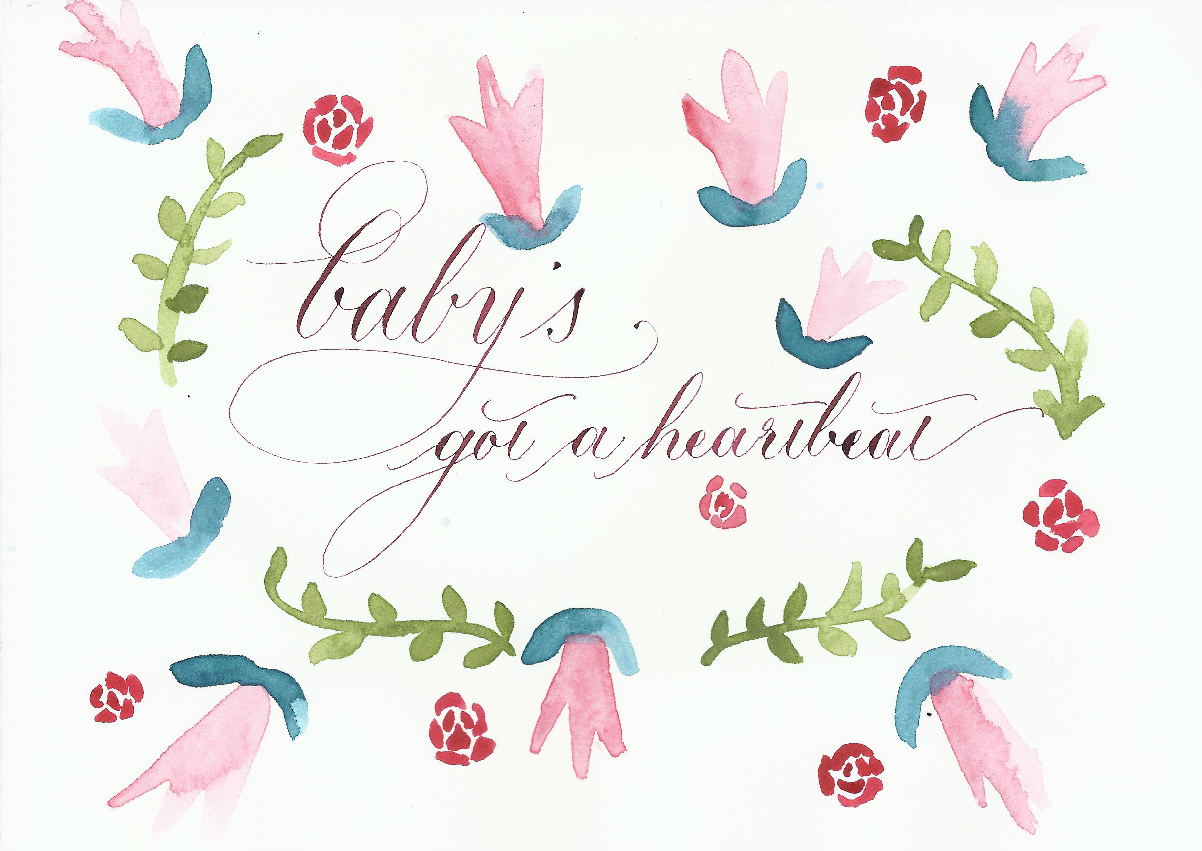 I'm just going to put this out there: if you haven't checked out Lindsey Bugbee's blog, The Postman's Knock, you really should. She is so willing to share her knowledge and skills to help other people learn, and I have already learned so much from her.
This post comes from a combination of inspiration. Today I heard my baby's heartbeat for the first time, and I just had to put it down on paper.
It seemed a perfect opportunity to try out Lindsey's Watercolour Lettering tutorial I've been looking at for ages. I didn't quite get this watercolour and calligraphy combo finished (because I didn't scroll down enough and then got distracted by spaghetti bolognese), but it's a start and, as always, gave me the confidence to keep trying new things. I feel very lucky to be surrounded by such creative teachers like Lindsey.
So, break out the watercolours and get over to Lindsey's blog so you can learn to immortalise your own life moments in uniquely creative ways.

Hand lettering workshops in the UK and Europe
I love the internet. Oh, the places we go. You know where I mean, don't you? Sometimes, you're off on a Sunday stroll for hours of fun to see the stupidly addictive Bored Shorts TV, and other times, you're whipped out of your reverie and on the most wonderful wild hunt with your goals and aspirations in tow. I can't even tell you the intricacies of my online journey to where we are now, but here we are.
Better Letters: fun, creative hand lettering workshops
Sign writing? Hand lettering? Yes, please. Better Letters has confirmed workshops (selling out quick) throughout Europe and UK that are designed to inspire and shake the intimidation of creating something as glorious as what seems like the lost art of hand lettering.
We show you the benefit of what we've wrestled with for in some cases up to 20 – 30 years. And hopefully that little bit of advice will help you overcome the problems and hurdles we've had a little bit quicker.
Quote via Hand Lettering Workshop London February 2014 (YouTube). See how I fared learning lettering with Mike Meyer at this year's April 2015 workshop.
I had a quick chat via email with Better Letters founder, Sam Roberts, and my typographical journey took a swift jaunt down a side street.
Ghostsigns: Tours of London's best ghostsigns
Sam started Ghostsigns to promote the art of hand lettering, especially sign writing. So, in addition to a suddenly, wonderfully accessible world of hand crafted lettering learning available on my doorstep via Better Letters, I now see that I can go wandering about this awesome city of London looking at painted signs, fading on walls: ghostsigns. Sign me up!
If like me, you're feeling a little intimidated by all this big school, old school stuff, then just listen to Sam:
What I have learned is that everyone is a teacher, and always willing to share knowledge. I've never met such a group of people more welcoming and keen to pass on their skills and passion. Embrace it!
So, that's what I'm going to do. Time to start this hand lettering journey. Who's with me? Book your local workshop, or a London ghostsigns tour!
Photo — Norman Hayes, Waste Studio in Nottingham
A new website for the South London Lettering Association
 Way back when I started my calligraphy journey in January 2014, I started searching for workshops and associations. South London Lettering Association came up early in my search, and, as I'm based in the area, it seemed a logical step to join such an avid community of letterers.
I've since realised, though, that it's not a geographically inclined organisation: anyone is welcome, and, while the workshops are held in Southfields, many of the exhibitions are held centrally in London. At one of my first workshops with Joy Daniels, I got chatting with one of SLLA's committee members and offered any help. With my background in web content management, we quickly worked out that a new website was in order.
So, after seven months of on-off building in my spare time, I'm very proud to have launched the new website for SLLA, and look forward to continuing to support them in growing their community of artists and enthusiasts. I've received some lovely feedback, which, as a long-time web nerd keen to make people's time finding what they need more enjoyable, is very rewarding:
I must say I really love the new SLLA website it’s so contemporary, fresh looking and easy to navigate - layout and pictures are excellent! I love the pop of the SLLA colour ‘blue’.
Please take a look, and why not join the association for lots of great calligraphy and lettering info.
Wedding beer label design
Even though I don't drink any more doesn't mean that I don't enjoy the company of those who do. Very early in our wedding planning, Jim and I decided that we would have a special beer brew in honour of the brewing he and my brother used to do regularly at Brew Brothers Microbrewery when we all lived in Brisbane. We call the boys the "Brew Brothers". Bonded by beer. Jim and Mitch agreed that the Honey Cream lager was their favourite, and since then my creative cogs have been whirring about designing a bespoke wedding label for the beer bottles.
Here's how the beer label design process played out.

Beer label design: sourcing the label
After a bit of searching the internet, we went with an American company called GrogTag.
- Their website was the easiest to navigate
- They provided downloadable templates
- The price seemed comparable, even with shipping to the UK
- The quality (vinyl stickers) looked pretty good.
We weren't disappointed. The labels arrived in under a week, and look fantastic.

Beer label design: Concept phase
The name: "You owe me 25 cents for the honey"
Every beer has a name, and when the boys decided on a honey lager, it was a no brainer what we should call the beer. Throughout my childhood (and still now), whenever we would ask mum for the honey (or sometimes even when we didn't), the following dialogue would have to play out:
Mum: "You owe me 25 cents for the honey."
Us: "What honey?"
Mum: "Oh, I never knew you cared."
I now carry on the tradition forever more, a Pavlovian response, into our future life together; it was the perfect thing to call our wedding brew.
Jim has been a big part of all of the stationery design decisions for the wedding, and if anything, I was going to give him even more say with the beer label (with mild trepidation, given his and my eye for design slightly differ). It was, after all, his thing.
Our criteria for design:
- oval tag
- something related to honey
- my calligraphy
I wanted the beer label to be stylish, and I wanted to try out some typography skills I've been learning, so I started a little conceptual drawing.
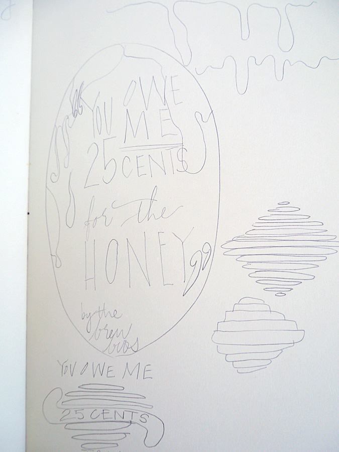
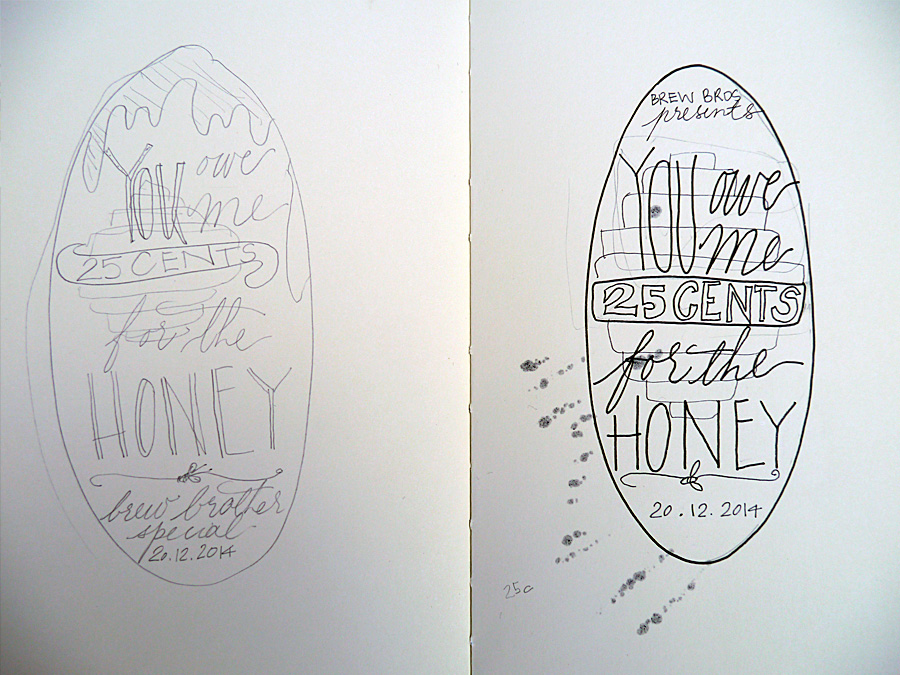
At this stage, Jim interjected with some thoughts. Namely, he didn't like the beehive or the dripping honey, and that he wanted a cartoon bee. So, with a somewhat reluctant heart, I went to task to include this guy in the design. I was not convinced about including a cartoon bee on our beer label, but it was what Jim wanted.
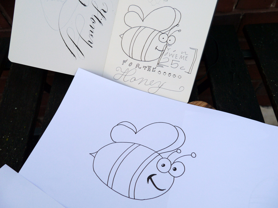
Beer label design: Calligraphy phase
I wrote out all the words I wanted in either calligraphy or another handwriting style to scan in at high res. While I kept the calligraphy in the end, I ditched the other handwriting styles because, to be frank, I haven't done enough typographical study to be confident with my work. We instead found a great complimentary font and rolled with that.

Beer label design: Layout
The final step was for us to put it all together in Photoshop. We had the GrogTag template to guide us on sizes, so all that was left was to import the scanned images and writing, style and adjust to fit, and choose our colours.
In addition to the calligraphy and the bee, we both wanted to add some honeycomb. Jim smartly suggested using the hexagonal tool (I was trying to draw them very shoddily), and after a general colour agreement of green and gold, a nod to our Aussie heritage, we shifted from pastels to the deep hues we settled on in the end.
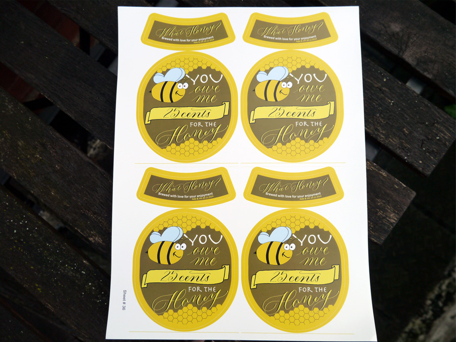
I think we've all earned a brew, don't you!
Designed by: Olive & Reid Studio Printed by: GrogTag

Calligraphy at the Writing Equipment Show
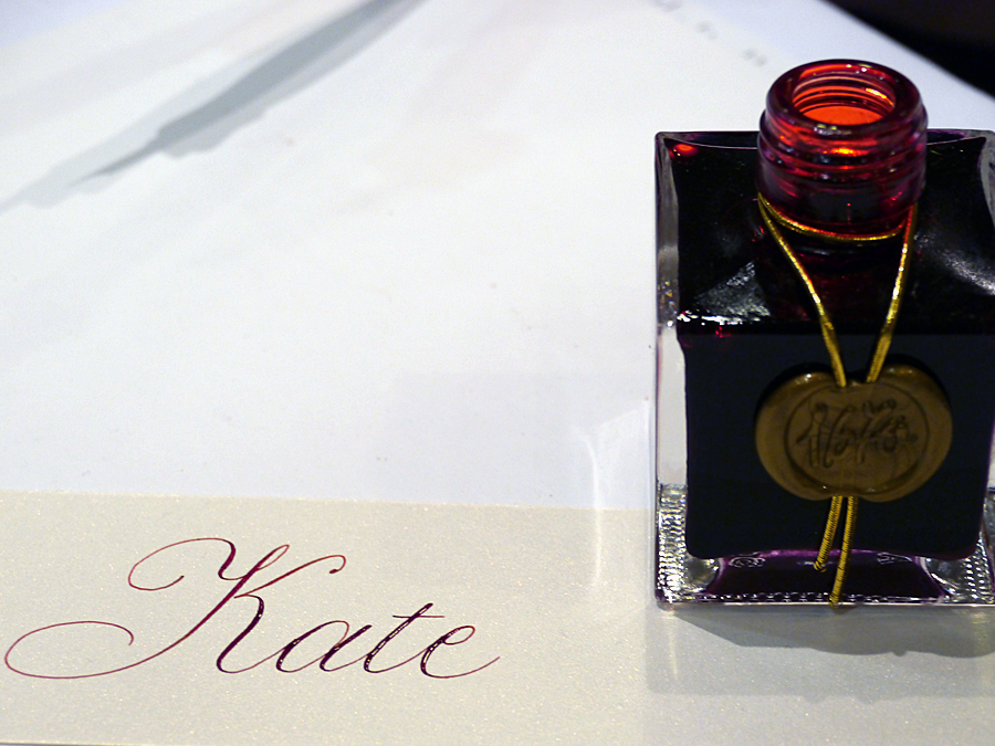
The London Writing Equipment Show was heaving. My first visit and it was interesting. The majority of stalls were for fountain pen collectors and repairers, but a couple of tables caught this little calligrapher's eye.
What I bought at the London WES
I was drawn to some hot coral coloured Lamy fountain pens at The Writing Desk's table because my pink Safari had just run out of ink. Time to buy some refills.
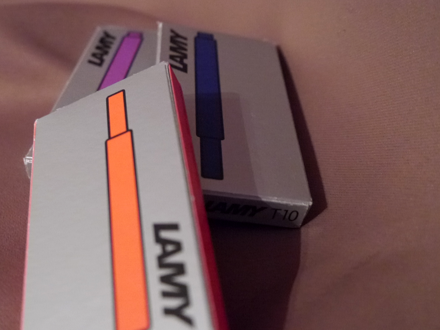
I then noticed that they stocked Dr Atramentis (and on special for the show), which is one I've been trying to find in the UK for months. I bought two document inks in blue and fuchsia, and a black archive ink.
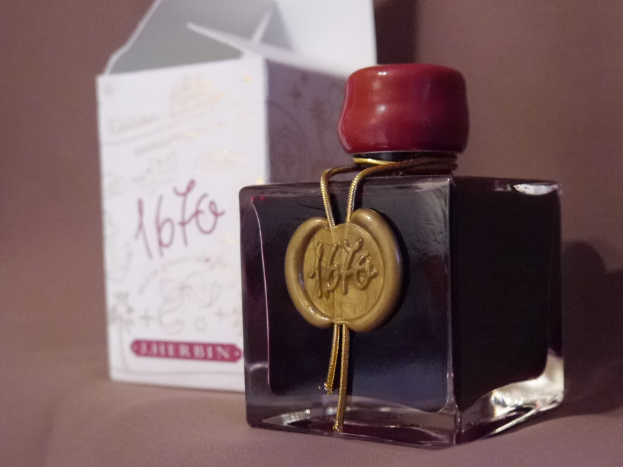
Before I could stop spending any more money on inks, I saw this gorgeous bottle with its blood red innards staring up at me, willing me to take it home. Oh alright, beautiful. It's J.Herbin anniversary edition, "1670", in Rouge Hematite.
I stopped by Joy Daniels table (from Northampton Calligraphy Studio) and asked her to try my new ink out. She said it was a nice to write with as it looked.

What I did not buy at the London WES
These really ridiculously good looking collectible dip pens. But I did buy the book about collectible dip pens by Jim Marshall :)
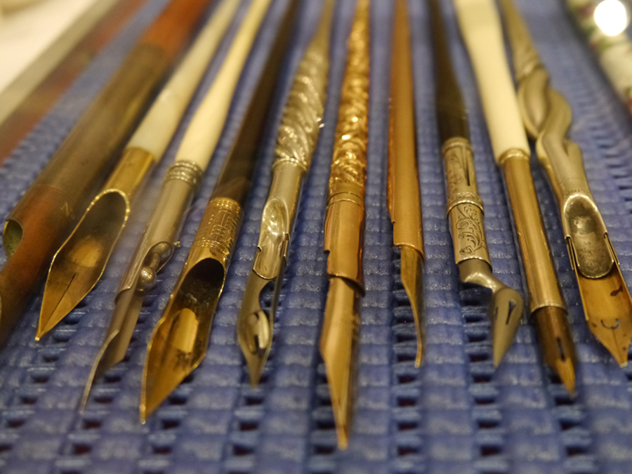

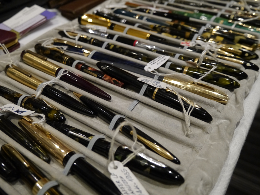


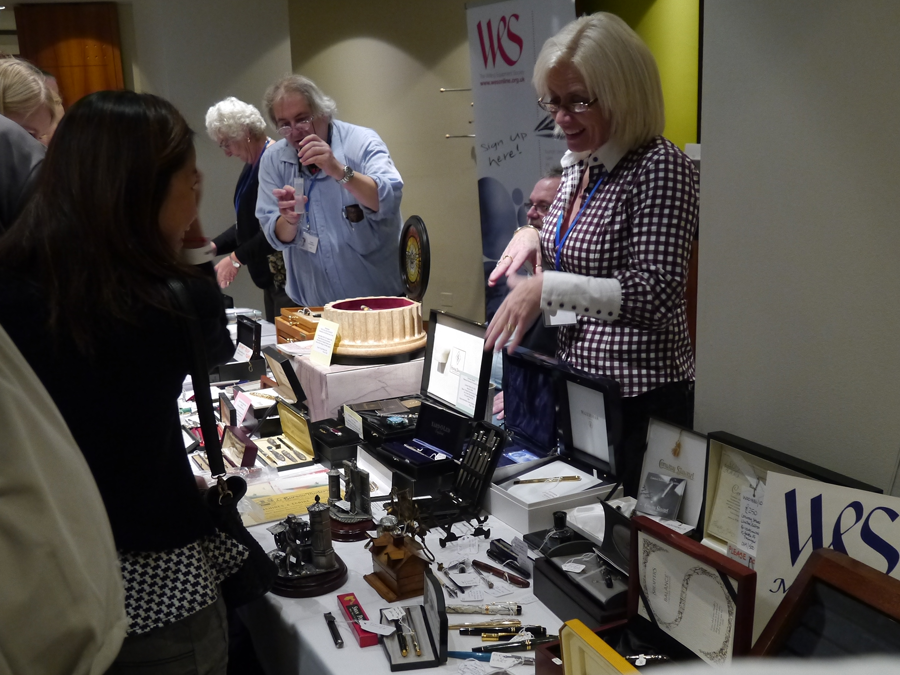
It was intriguing to bear witness to London's underbelly of fountain pen (and other minority writing equipment) connoisseurs, and great to see Joy showcasing her beautiful copperplate calligraphy.

Calligraphy at The Handmade Fair 2014, London
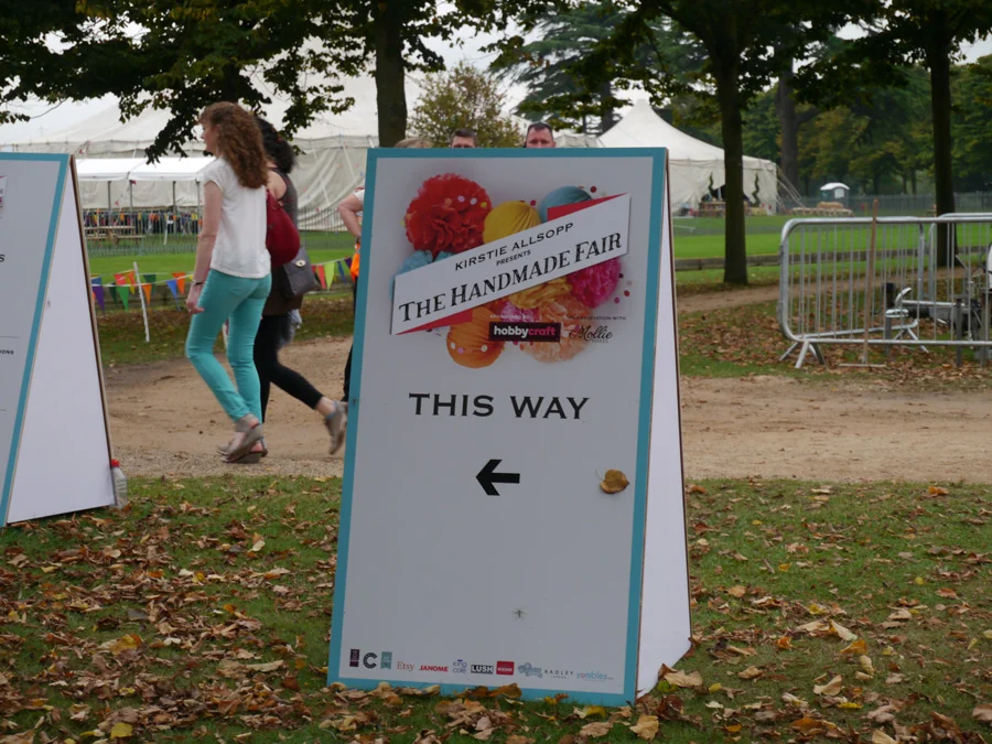
I found out about the Handmade Fair because Claire Gould, calligrapher and owner of Calligraphy for Weddings, was running a workshop. She lives in the Lake District, so it was a rare chance to meet her in London.
I won't lie, I'm not a crafter, so felt very out of place among the knitting needles and fat quarters (whatever that means). So overwhelmed that I didn't even take photos of my day, mostly.
I fortunately did find some things a little more my artistic style:
- Anna Wright designs (I bought two of the book she illustrated, "How the Birds Started an Orchestra")
- FabFunky Dictionary Prints (amazing prints!)
For my calligraphy inspiration, I stumbled upon a medium I thought would be cool to try: chalk paint. Mainly attracting up-cyclers looking to renovate furniture, I saw a brilliant example of what you could do with American Decor and Annie Sloane chalk paint.
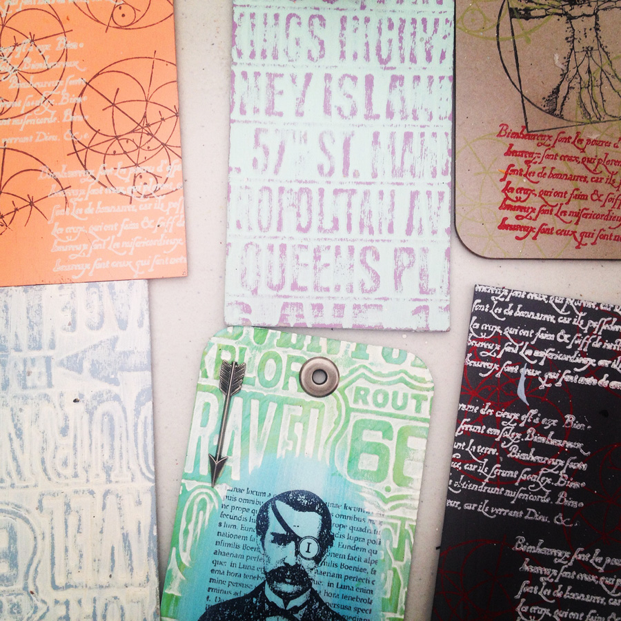
I tried it out on some tile offcuts, but I think I need some kind of glaze to finish it off.

By the time 2.30pm rolled around, when it was time for my calligraphy workshop with Claire, I had:
- stopped off for ice cream at 10.30am
- watched two people battle it out for 45mins on stage to transform a white cotton t-shirt into something (a somewhat surreal scenario in which they were on stage and I was in an audience filled with enthusiastic card waving crafty lady fiends!)
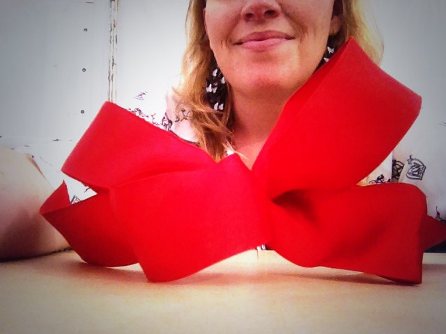
- learn the art of creating the perfect bow with Jane Means
Calligraphy workshop with Claire Gould
I said my quick 'hi' to Claire before she got started, and got settled in with the others in the class. I really enjoyed seeing people pick up a calligraphy nib for the first time, and listening to the kinds of things that they said about it. Check out Claire's wrap up of the fair. She did a brilliant session, and I was trying not to be too much of crazy fan girl especially while she was so busy setting up and packing up.
The best thing take away from the session for me was Claire's advice to not think of calligraphy writing as you would with a normal ballpoint pen, but rather to consider that you're moving ink around the page. That's a brilliant way to describe it. My other takeaway is that if you're carrying a nibbed pen in a plastic bag, be careful where you put that bag. I put it under my butt, and that nib ripped a hold in my jeans and gouged its way straight into my flesh.
Apart from the show, I really loved visiting another new cool place in London: Hampton Court. I mean, would you look at this place!
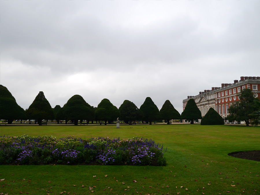


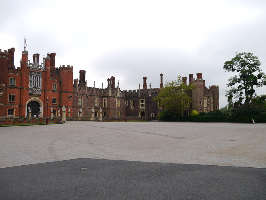
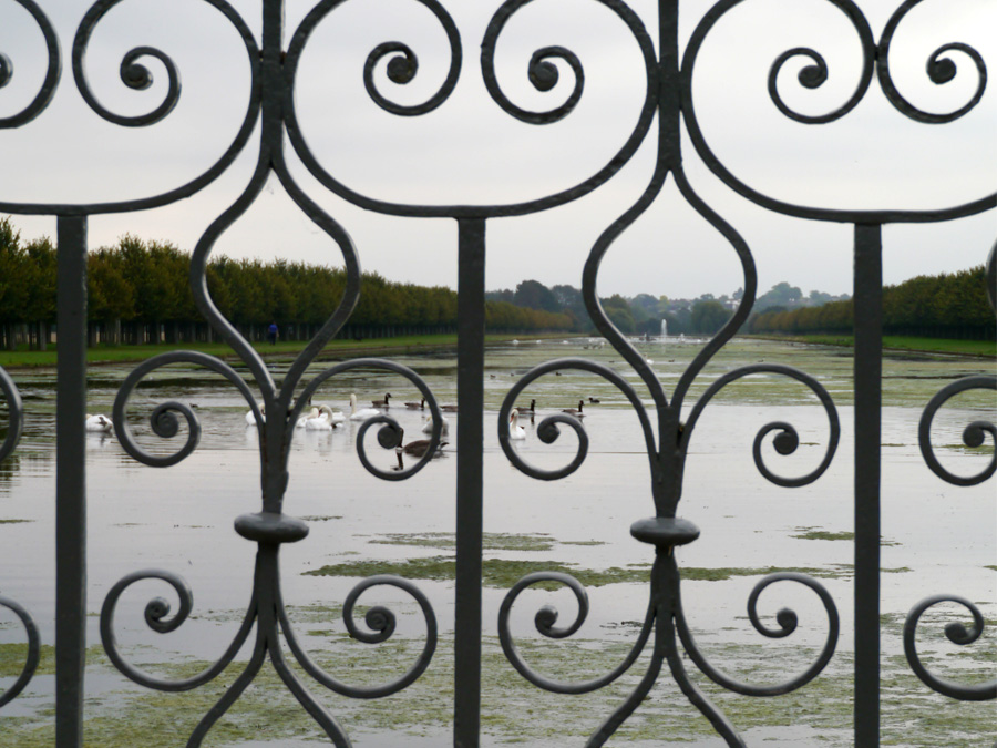
I even got to see Kirstie Alsopp in the flesh!


The Pen Museum, Birmingham UK
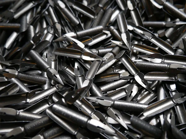
I came home from work one Friday night, and JW was quietly working away on his laptop. Suddenly, he pronounced that he had found cheap train tickets to and accommodation in Birmingham (we live in London). I wasn't expecting a weekend away, so I was a little bit hesitant, but I got involved and started investigating "things to do in Birmingham".
There, ranked 13th on the list of Birmingham attractions, was The Pen Museum. I suddenly couldn't wait to go, and also didn't really care what else we did in the city (although the Birmingham Museums & Art Gallery and the Barber Institute of Fine Art were calling my name, too). I was a kid on Christmas eve: "TO THE PEN MUSEUM". It did not disappoint.
A handsome gent welcomed us in, inviting us to take a look around before he would show us the nib-making machines that were used in the booming business of the time, when Birmingham produced 75% of the world's pen nibs.
Step by step, he took us through five of the 17 steps in the nib-making process: "blanking", "piercing", "marking", "raising", and "slitting" (thanks to C Brandauer & Co blog for the process details). I'd come across as the ultra nerd I am if I tried to explain how awesome it was to do that, so, suffice it to say that it was good fun for a calligrapher.
The nib-making process
Blanking
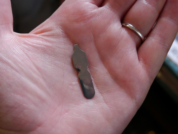
Piercing
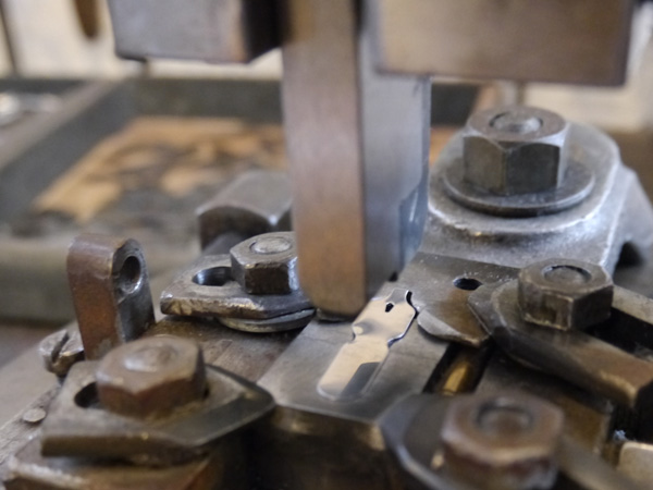
Marking

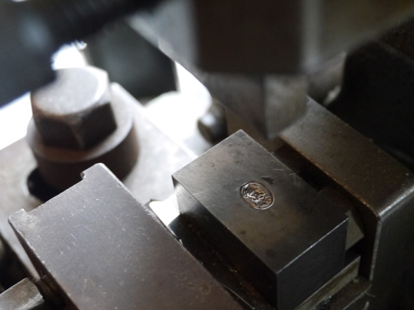

Raising


Slitting

JW got to have his time in the sun when we sat ourselves at old-school school desks and tried out the nibs they had on display. To be fair, they had been pretty trashed by the unseasoned calligraphers, but I think it's more important for people to be able to feel and see and have the technique become more accessible in that way than keeping them locked up.
Naturally, when surrounded by boxes and boxes of nibs at 25p a pop, there was no doubt that I would leave with a fair selection. I bought 10 different nibs The Pen Museum; four were perfect for copperplate.
I also bought 1 gross (144 nibs) pack, Victor Series Exhibition Pen, for a fiver. I had no idea if that boxed set of nibs was going to be any good for copperplate, but they were vintage, and a great price so worth the risk. I'm glad I did, because they're lovely.
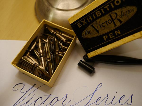

- John Heath's Golden Coated
- Victor Series Exhibition Pen
- John Heath's First Class Selected
- British Pens Co. 5005
- University School Pen
I'm so super excited to have found The Pen Museum, and looking forward to visiting again. Run by volunteers, the museum relies on donations and support. You can support in lots of ways:
- donate a couple of quid every time you visit
- support them with an online donation
- become a member
- shop online (the nibs I've noted aren't listed in the shop, but get in touch with them; I'm sure they'll be happy to help).
Take a look also at this blog post from Tiger Pens, which gives more detailed information about the history and venue details of The Pen Museum.
So, where's your favourite calligraphy spot?

Event | UK calligraphy at The Handmade Fair
In my search for UK calligraphers to herald, Claire Gould, from Calligraphy for Weddings, was the first I was recommended to contact. Her work is beautiful, and I was excited to hear that she's doing a calligraphy skill workshop at Kirstie Allsop's Handmade Fair, 19–21 September 2014. So I bought myself a ticket to the Fair.
I'll admit that I'm boasting a weird sense of satisfaction today about my soon to be masterful gift wrapping skills, and how I will be a knowledgable espouser of the values of Etsy — additional sessions that I get to attend for the cost of my £29 ticket (plus booking fee).
You can, of course, just go along to the fair and bathe yourself in its crafty glory for £12.50 (plus booking fee). I'll be there on Sunday 21st September, so let me know if you'll be about. We can catch up over origami tulips.
Gold on blue calligraphy wedding envelopes
I'm leaving London for the weekend, and heading to Norwich. I've no idea what I'll find there, but I know what I'll take there: a little modern calligraphy wedding note card for friends celebrating their wedding last year in Australia.
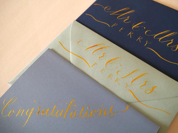


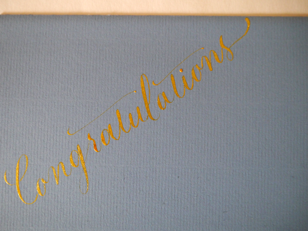

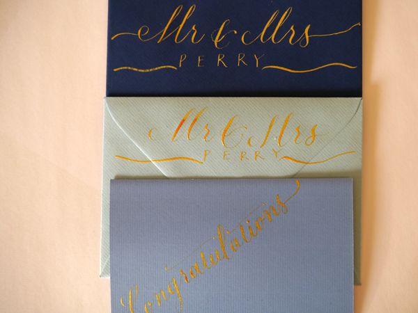

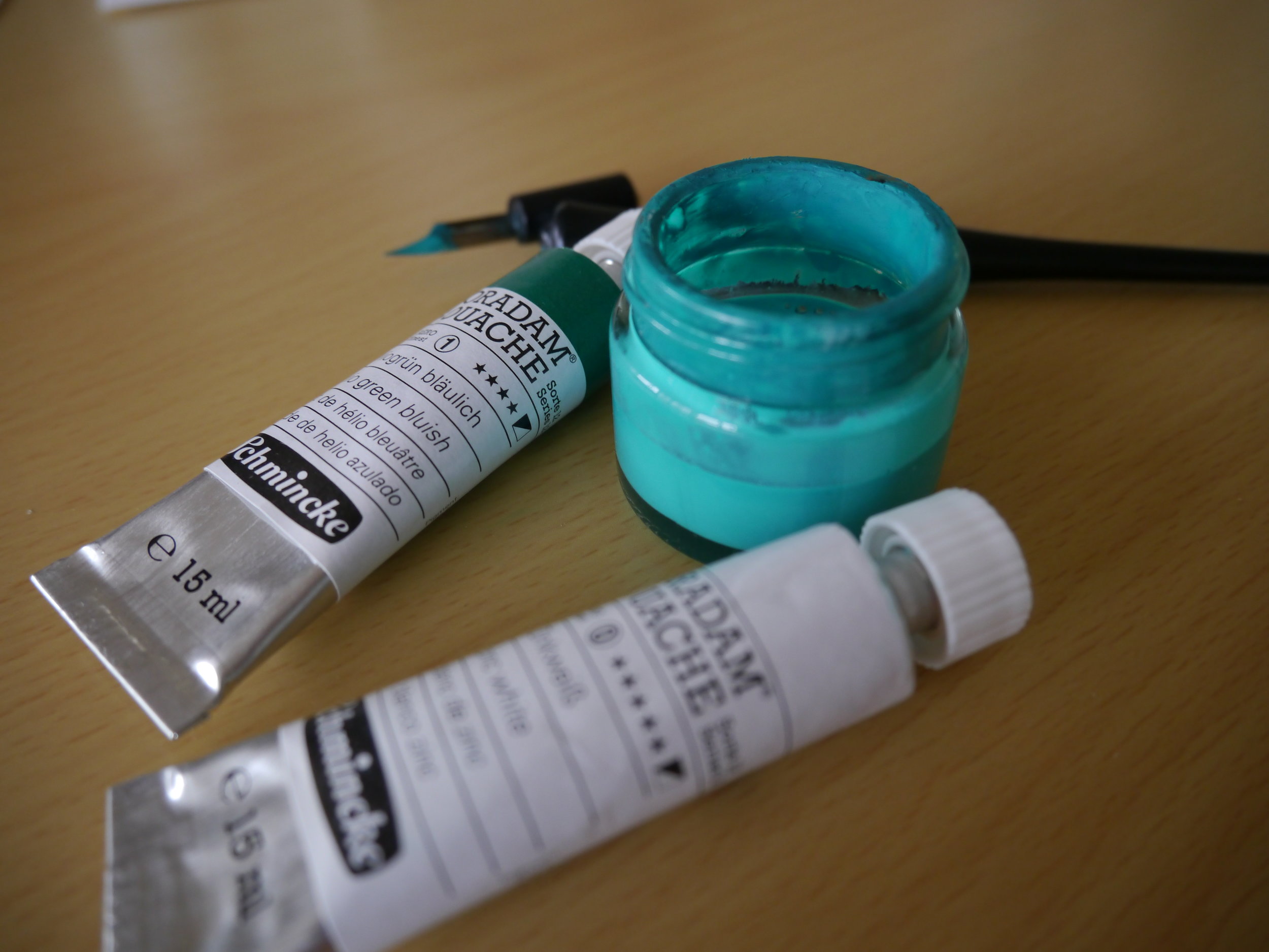
Equipment for modern calligraphy envelopes
- Speedball Super Pigmented Acrylic: "Gold"
- Gillott's 303 nib
- Nib holder (I used Cornellisen's Cork Ended Nib Holder)
- Envelopes/notecard from Partridges Clapham Junction
Calligraphy by Olive & Reid Studio

Event | London Writing Equipment Show
What's your stationery addiction: fountain pens, beautiful card stock, journals? I just received the Summer Edition of The Special Copperplate Interest Group (contact Joy Daniels via Facebook or email joydaniels[at]ntlworld[dot].com for more information) and saw an upcoming event:
- The London Writing Equipment Show 5 October 2014 Holiday Inn Bloomsbury Coram Street London WC1N 1HT
Tickets: £5 on the door
I'll be heading along to the show, and would love to meet some other pen and paper lovers. Let me know in the comments if you'll be in London.
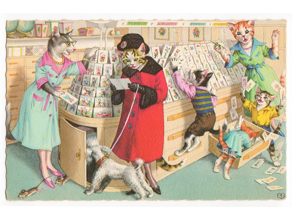
Banner image: Mainzer's Cats by Emma Paperclip is licenced under CC BY 2.0
Summer and street art wedding invitation suite
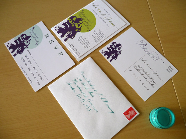
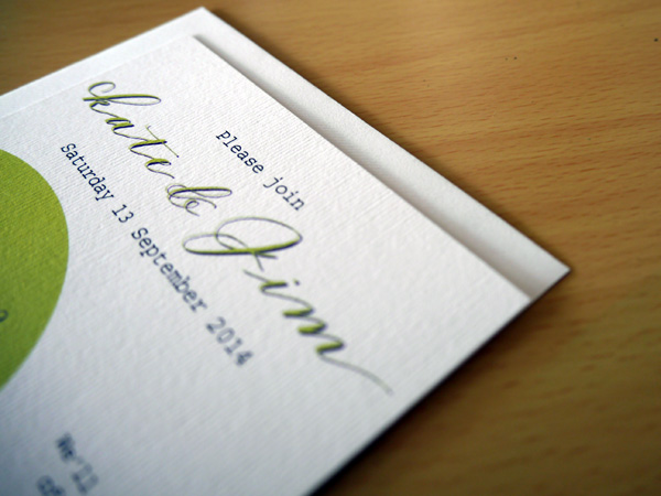
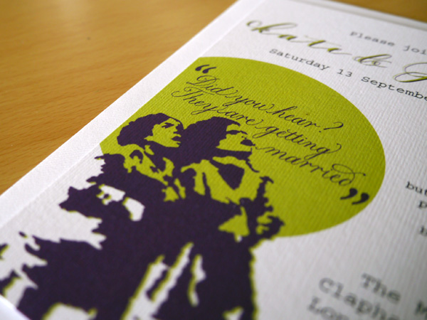
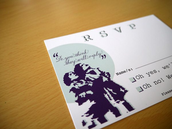
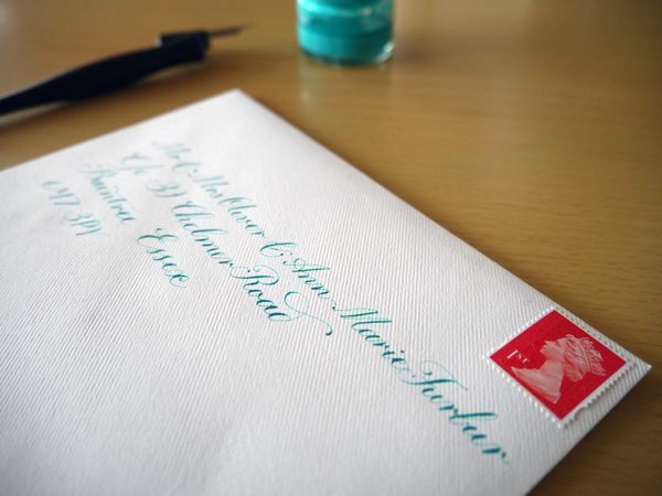
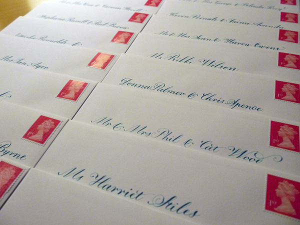
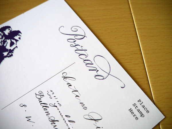
Inspired by my fiance's photograph of stencil graffiti that he took in Passau while kayaking the Danube for three months last year — and our mutual love for street art — this invitation suite strikingly represents all of the beautiful moments we've had travelling the UK and Europe full of clever artwork accessible to all. Calligraphy & Design: Olive & Reid Studio Printing: Printed.com (on Nettuno)
Customised wooden rubber stamps in the UK

rubber-stamp-1
Oh, the frustration. I see so many exciting projects featuring design-your-own personalised art-mounted stamp — where you can upload your own image to a supplier's website and receive a lovely wooden rubber stamp with which to replicate your designs forever and ever — but I was surprised that this isn't a common (or at least easily findable) service in the UK.
Of course, many Etsy stores sell these things, but, as we're into designing our own stamps, it seems financially savvy to cut out the middle man and go direct to the supplier.
For my first stamp, I gave up and opted to go with a US-based stamp supplier, Rubberstamp.net, who supplied the stamp featured here. I recommend them, but bear in mind you'll be charged customs tax when you receive it in the UK.
It seems crazy that no-one is offering this customised service within the arts and crafts field (as opposed the awful-looking business stamp option). I have since found a UK personal stamp maker, but I haven't tried them out yet.

rubber-stamp-2
Benefits of customised rubber wooden stamps
My first reason for treading the stamp route was to save time in calligraphing return addresses on wedding invitations. I also decided to get the image we've used for our invitation suite (two cute little kids taken from a photograph of a graffiti stencil) turned into a stamp so we could also stamp it on the envelopes, and anywhere else we see fit in the lead up to the big day.
Other rubber stamp projects include a fully lettered invitation or save the date converted to stamp (I saw this first in Modern Calligraphy by Molly Suber Thorpe).
Have you created or used rubber stamps for a design project? Do you have any tips for artists just starting out? Share with us in the comments, or check out whether you might like to submit your project.
Light touch calligraphy and modern lettering
 Since finishing up my first round of wedding invitations and handwritten calligraphy envelopes two weeks ago, and feeling a sense of certain completion about that goal, I've not been as focused on my calligraphy practice. But it's Friday, and I had a hankering all day to get my calligraphy nibs moving.
It's amazing how rusty you can become so quickly, so I spent a lot of time focusing on slowing down, and holding my calligraphy pen as lightly as possible that would still let me have control over the lettershapes I was making. A workshop teacher once told me that I should pretend as though I'd burnt the tips of my fingers and how I would have to hold the pen if I had. That really helps when I remember.
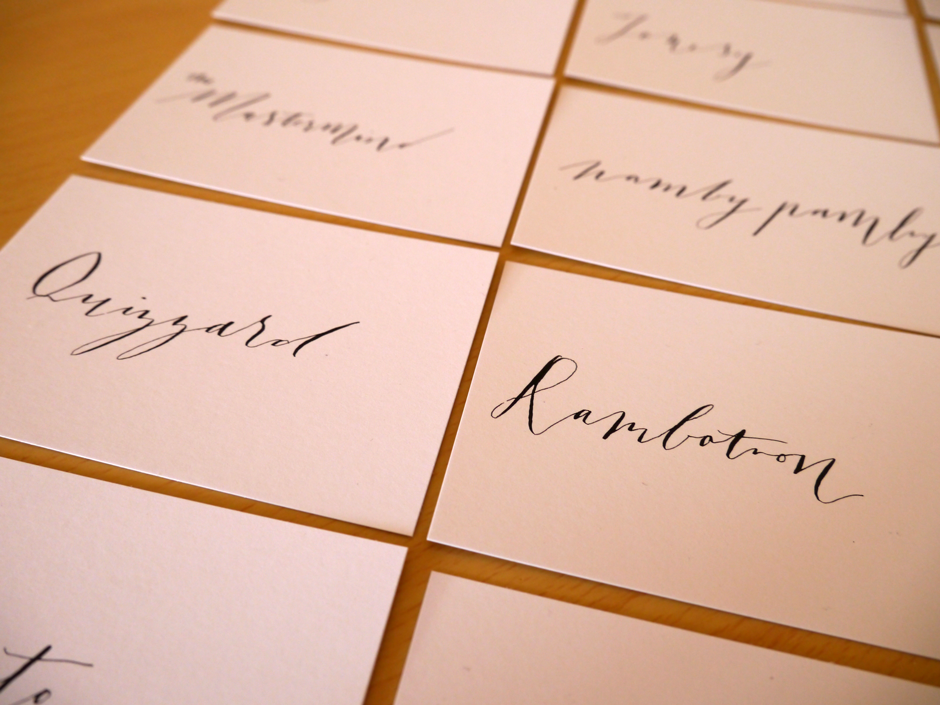
So after doing some copperplate drills, I decided to have some Friday fun relaxing into some modern calligraphy of imaginary party guests. I had some plain business cards lying around, and put them to use to create a name for every letter of the alphabet.
I do look forward to the time when I can have a style of writing that is easily identifiable as mine, and I imagine it could be something a little unique like this.

A cool, young master penman talks about the power of writing
I love finding out about new writing gurus. It's my new favourite thing. I just downloaded Joe Vitolo's eBook, and then I found this brilliant talk from Jake Weidmann.
Jake impressively took to carving his own calligraphy pens, and is responsible for this wondrous image of Jesus Christ drawn in one continuous line. Quite astounding. So check out the vid, check out his sutff on all of the platforms, then pick up your pen and go go go!