

Ever needed calligraphy ink alternatives?
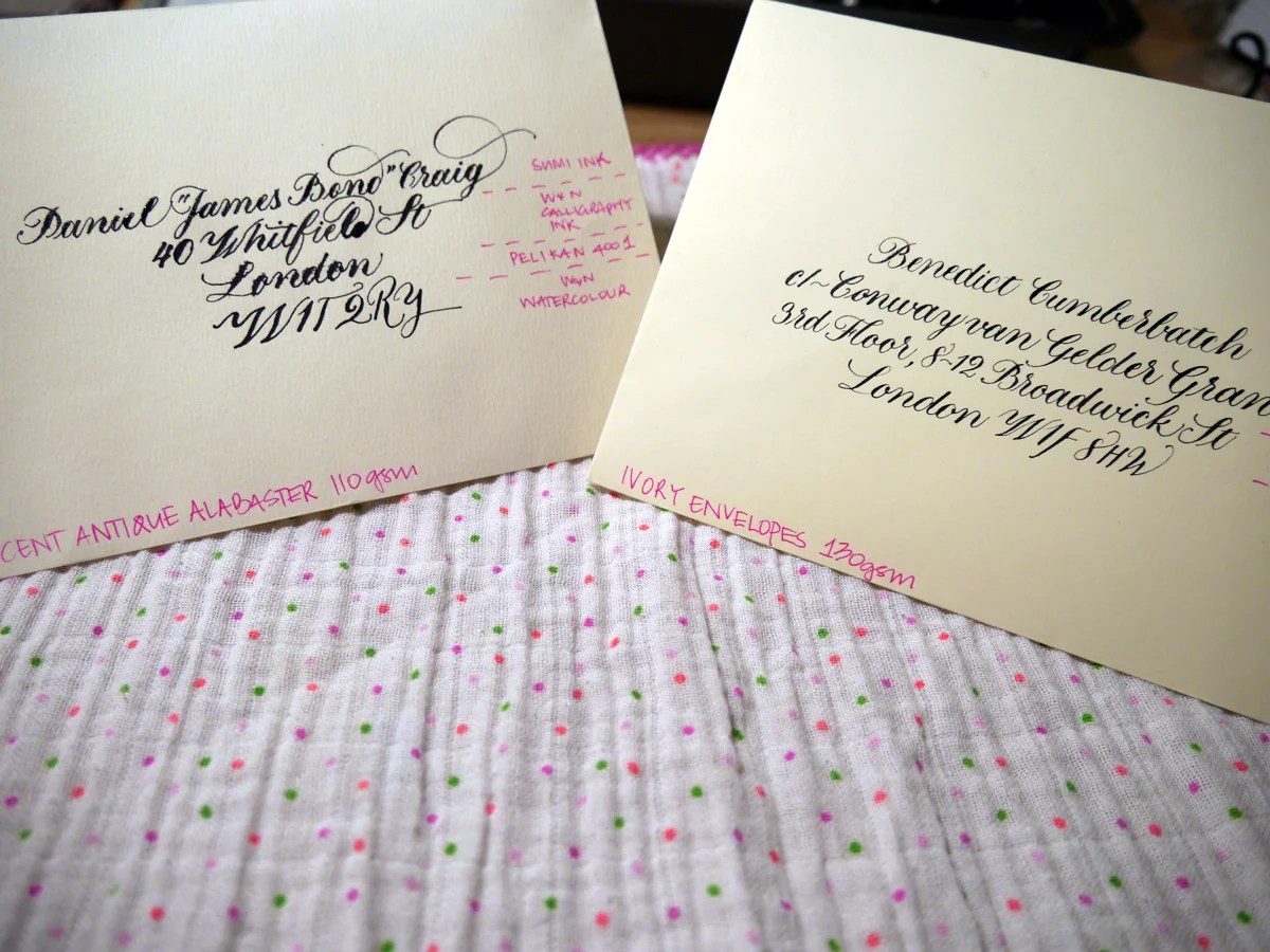
This post wasn't planned to be about calligraphy ink alternatives. Originally, I was going to talk about envelope suppliers in the UK, but during the sample testing process, I suffered some sad calligraphy ink catastrophes. ...so you bought less-than-perfect quality envelopes and now your ink is bleeding everywhere like a scene from CSI. Don't panic. All is not lost.
What's the ideal stationery gsm weight for calligraphy?
As a general rule of thumb, envelopes (well, pretty much any form of stationery) for calligraphy should be at least 120gsm. It's still always a good idea to test the paper stock if you can because you just never know.
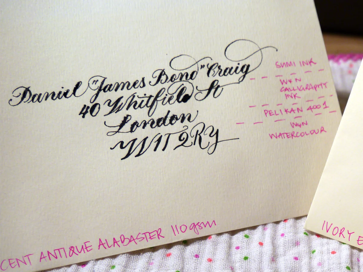
I recently made the schoolgirl error of buying 110gsm envelopes... I swear I thought it was 160 gsm! With a solid helping of optimism, I tested it out, and things did not go so well. Next to the 130 gsm counterpart I was testing, it was a right mess. Hollywood superstar Daniel Craig doesn't deserve to receive this trash calligraphy.
Ideal-110gsm-close-sml
Testing sample envelopes for calligraphy
The sample envelopes I used for testing
C6 Ivory Envelopes 130 gsm (£7.20/50)
Accent Antique Magnolia 110 gsm (£11.04/50)
Do you think it was the fancy name of the 110 gsm ones that blinded me? Before you answer, it's important to know that I'm a sucker for marketing. And as a marketer, I should know better. Maybe I thought more expensive meant better? I wish we could just forget they ever happened. But they did, and now we have to find a way to fix this.
The black inks I used to test with
Accent Antique Magnolia 110 gsm envelopes
You can see for yourself how the envelope fared with these inks. I used Leonardt Principal EF nib and within seconds of nib to paper I knew it was going to be hazardous. It takes a lot of effort to persist when your writing looks like this. You're wiping away tears and clutching at your heart and reputation all while creating the calligraphy version of a Pinterest Fail that you very absolutely intend to share with the internet. You're welcome.
Ideal-110gsm-close-sml
There really isn't much point in assessing each ink, but I would say that the watercolour may make them usable, and the Pelikan 4001 suffered the most. Sad, really.
Although I went to bed annoyed at myself for these envelopes, I woke thinking, "I CAN FIX THIS".
What can you use instead of ink for calligraphy?
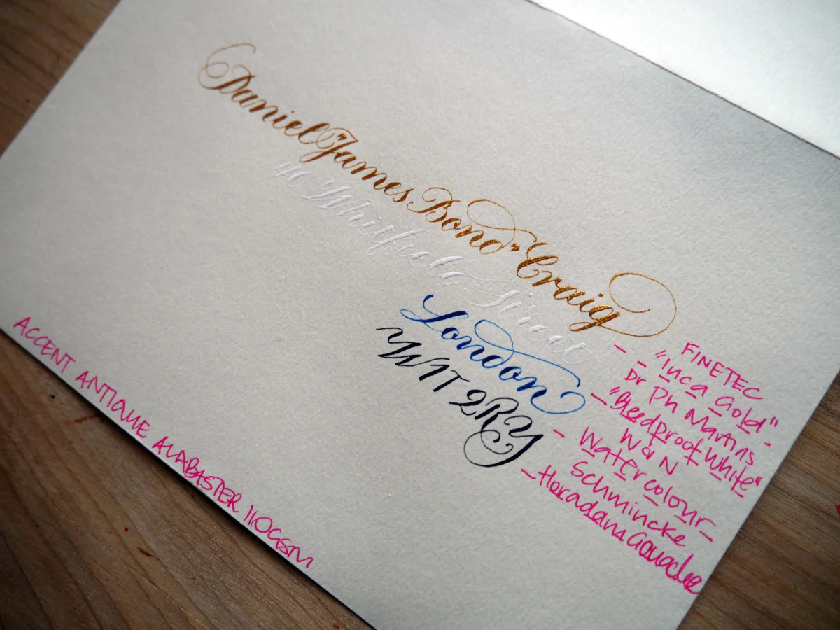
You see, calligraphy isn't restricted to inks. There's a range of water-based paints and products that can be diluted to the right consistency to write with. Rummaging through my inky tool box, I pulled out four alternatives that I thought could be worth a try.
Ideal-110gsm-paint-full
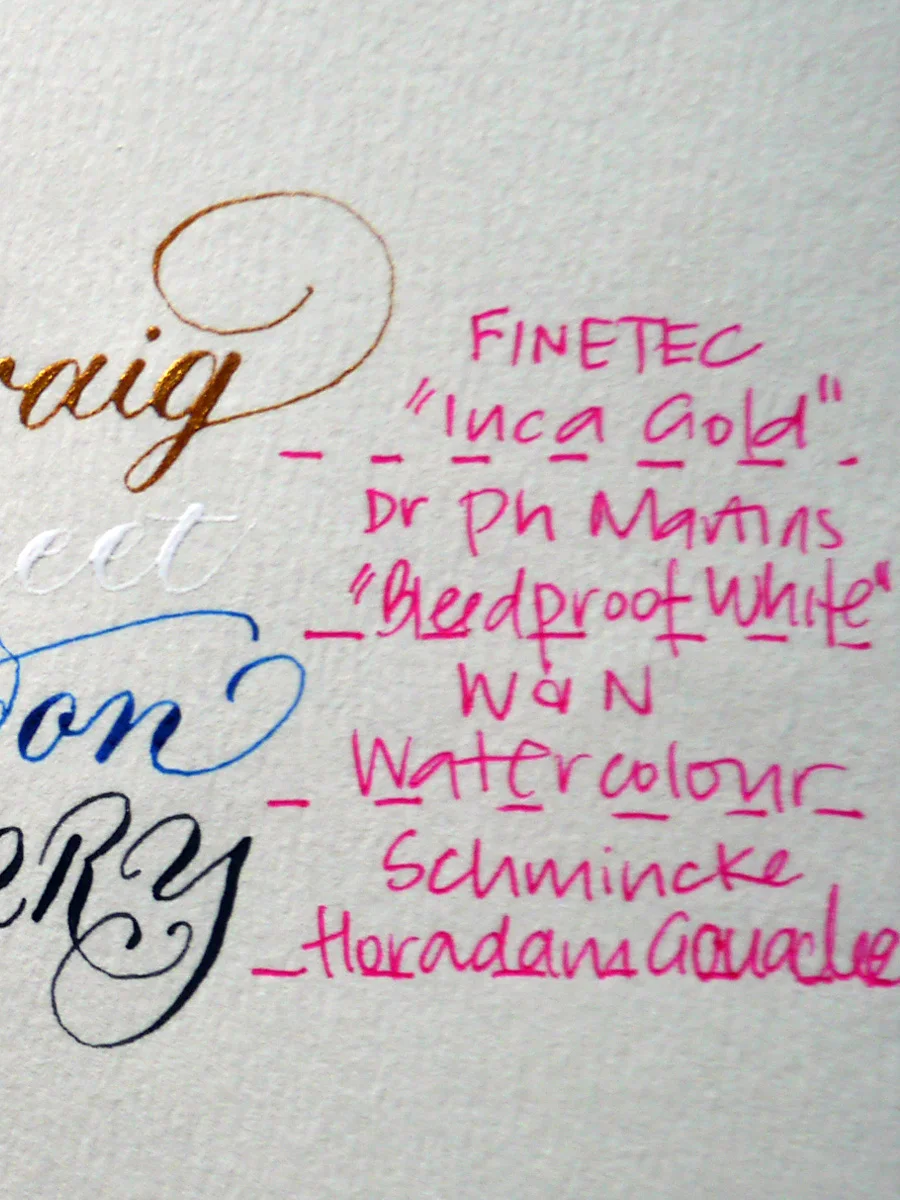
Every single one of the alternatives to ink works on these envelopes. Well, the fact that the white is barely legible is beside the point; it didn't bleed. Cos it's "bleed proof". Dr Ph Martin did not lie. And — come on! — secret writing is exactly perfect for James Bond. Maybe not for Royal Mail.
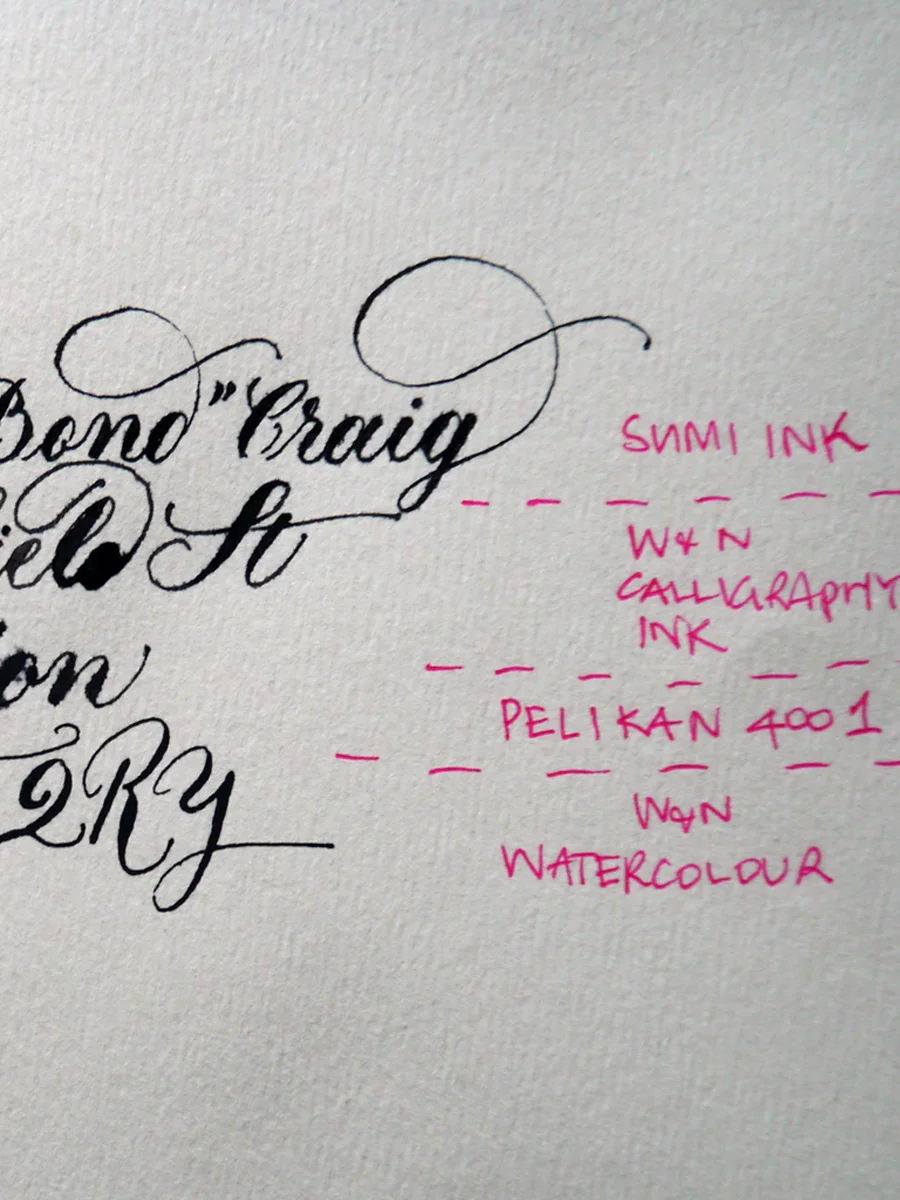
Let's compare the inks with the paints in close view to just really prove the point that all is not lost with the envelopes — we have many alternative options to play with.
Ideal-110gsm-ink
Ideal-110gsm-paint
Ivory envelopes 130 gsm
Now, this is more like it! Bring on the inks, I say. I used Gillott's 303 nib for this test. My only struggle was that they were a little hard to see through in parts on the light box, but, if all else fails, rule it up my friends. Draw those guidelines and erase once you're done. Old school.
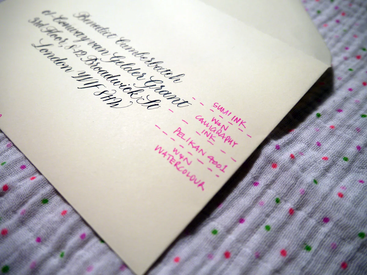
Ideal-120gsm-sml
Sumi - was lovely! It created beautiful hairlines and was easy to write with on this envelope. It did dry slowly, though.
W&N Calligraphy Ink - slight bleeding and the hairlines aren't so fine, but still works. I do find this ink thicker than it should be, so could be watered down for a better result. I just haven't tried it yet.
Pelikan 4001 - went on smoothly and hairlines still very nice
Watercolour - also lovely and created thin hairlines and a smooth experience.
Top tip for troubleshooting calligraphy inks and stationery
At the end of the day, the main thing is to test your stationery and be ready to adjust your expectations. Be willing to experiment with different media, and have fun!
Festive calligraphy gift tags
I'm never usually organised enough to make festive gift cards, but, as always, Lindsey at The Postman's Knock sent a shot of inspiration to my inbox with her tutorial DIY Holiday Gift Tags. I had to give it a go.
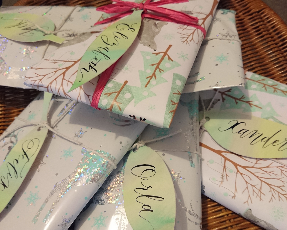
I love how simple these watercolour and calligraphy leaves are to make, but really are a stunning addition to your wrapping.
These calligraphy tags took me about half an hour to make, and I used practice Canford card stock used for a recent quote commission.
I used my Winsor & Newton watercolour set to paint a wash of three hues of green/blue. Once that was dry, I drew my leaf shapes and cut them out with my scalpel. Before I applied my calligraphy ink (Winsor & Newton black calligraphy ink), I did a little test on some excess card to make sure it wouldn't bleed. Then I used an informal modern style to keep the process easy and quick.
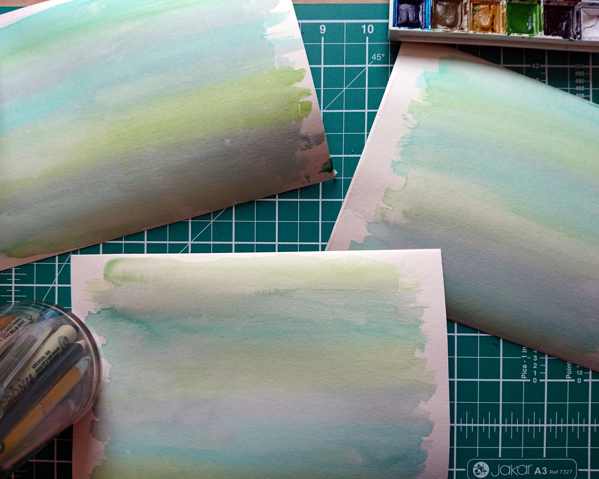

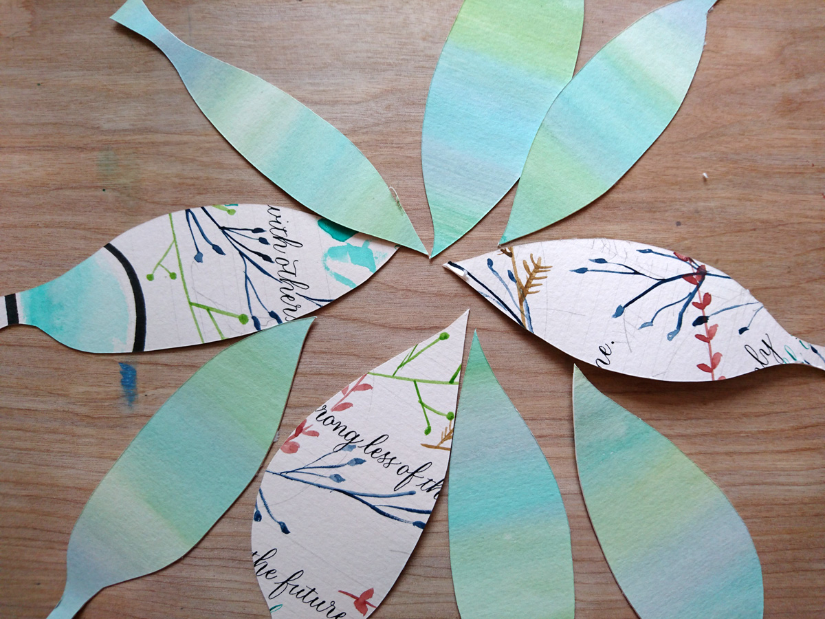
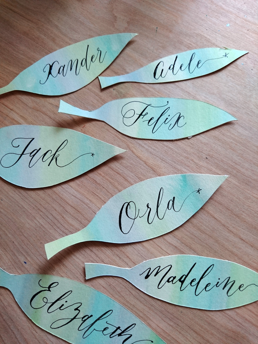
Head over to Lindsey's blog post for a detailed tutorial on how to do this project, and have fun!
Easy Copperplate guidelines with Joy Daniels
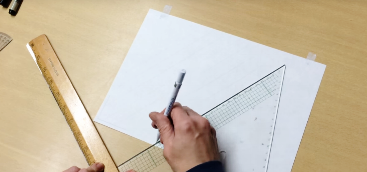
If the thought of ruling your Copperplate guidelines leaves you frustrated and thinking that you may never create that wonderfully consistent calligraphy composition, then today is your lucky day. While it's fantastic that calligraphy skills can be honed online and through books, there's something to be said for meeting face to face with other calligraphers to help you out with problem areas. As soon as I saw Northampton calligrapher, Joy Daniels, swiftly rule her guidelines in a recent Copperplate Capitals workshop through the South London Lettering Association, I knew it was going to be a powerful tool in my belt. Ruling calligraphy guidelines has just not been something I could get my head around. I could practice with pre-drawn guidelines under thin paper, but when it comes to working on a final piece, it's baffled me (I don't yet own a lightbox).
Go forth and rule your copperplate guidelines!
Joy has been kind enough to take the time to create a short video outlining the process. I hope it helps you as much as it has helped me.
About Joy Daniels
You can find out more about Joy and her Northampton Calligraphy Studio via her website and Facebook page. You can email her at joydaniels@ntlworld.com.
Joy also runs the Copperplate Special Interest Group. When you join, you receive a quarterly newsletter of calligraphic happenings, and can become part of the group's envelope exchange. Get in touch with Joy to become a member.
Share your calligraphy tips
If you've got a great calligraphy tip that you'd love to share and have featured on the blog, please get in touch — either in the comments below, or via email. I'd love to hear from you.

Learn calligraphy with Keith and Amanda Adams
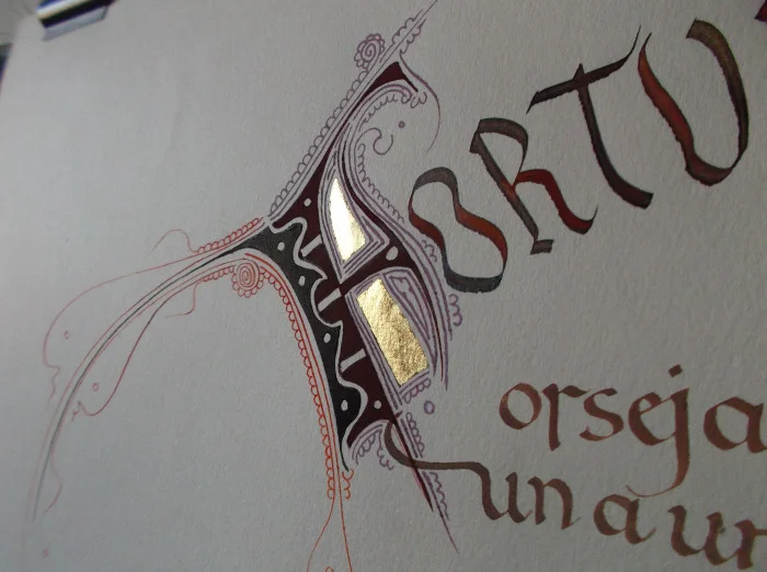
Nothing sounds more peaceful and soothing to me than a six-day calligraphy workshop in the stunning Lake District, UK, learning from masters Keith and Amanda Adams. Both Keith and Amanda are these days based predominantly in Spain, and this is a wonderful rare opportunity to learn from them here in the UK, hosted by Laya Point Permaculture.
You will be initiated into the beautiful Catalan interpretation of Charlemagne’s [or Alcuino’s] elegant minuscule, the first script to have both a capital and a small letter, and the most legible historical calligraphic letter form to our modern eyes.
Calligraphy course specifics
What: learn calligraphy with Keith and Amanda Adams
When: July 17 - July 22
Cost: £400 (includes materials and lunch)
Where: The Old School, Ulpha, LA206DT
Notes: Visit the Layapoint website for full course details
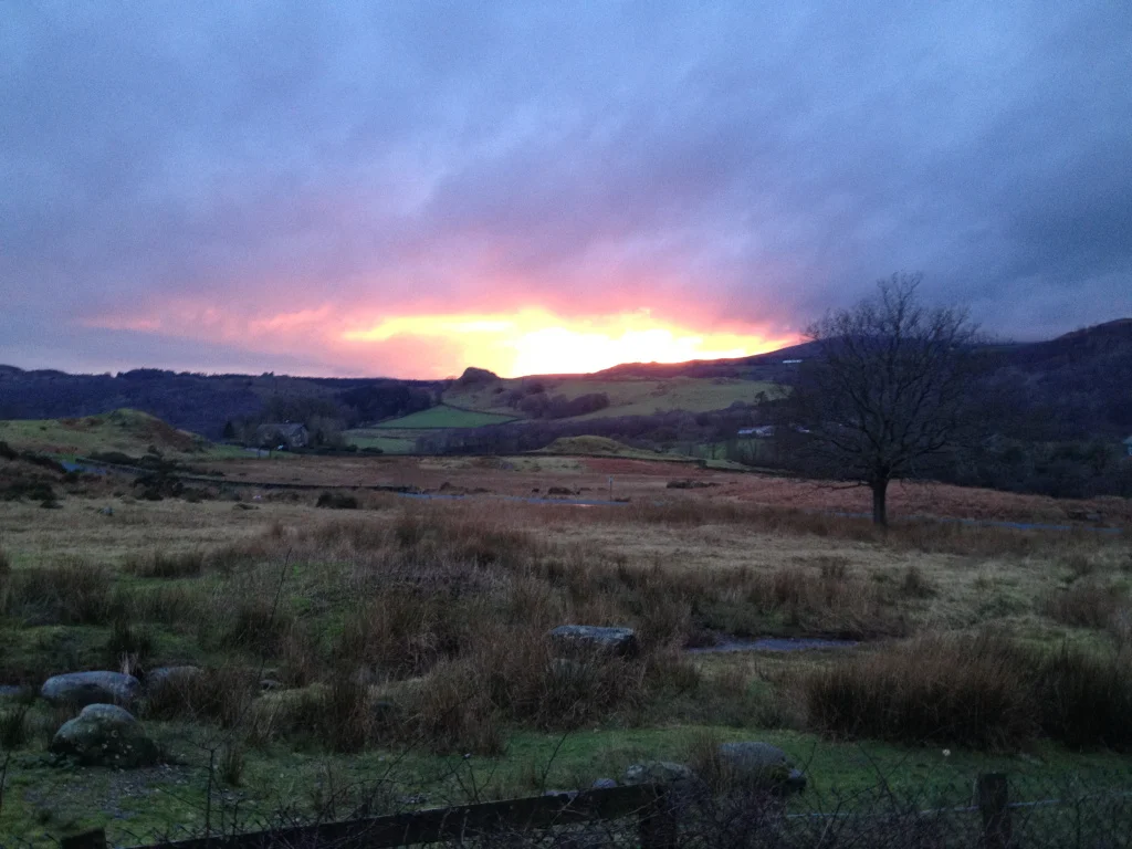
Learn calligraphy in the Lake District
A new website for the South London Lettering Association
 Way back when I started my calligraphy journey in January 2014, I started searching for workshops and associations. South London Lettering Association came up early in my search, and, as I'm based in the area, it seemed a logical step to join such an avid community of letterers.
I've since realised, though, that it's not a geographically inclined organisation: anyone is welcome, and, while the workshops are held in Southfields, many of the exhibitions are held centrally in London. At one of my first workshops with Joy Daniels, I got chatting with one of SLLA's committee members and offered any help. With my background in web content management, we quickly worked out that a new website was in order.
So, after seven months of on-off building in my spare time, I'm very proud to have launched the new website for SLLA, and look forward to continuing to support them in growing their community of artists and enthusiasts. I've received some lovely feedback, which, as a long-time web nerd keen to make people's time finding what they need more enjoyable, is very rewarding:
I must say I really love the new SLLA website it’s so contemporary, fresh looking and easy to navigate - layout and pictures are excellent! I love the pop of the SLLA colour ‘blue’.
Please take a look, and why not join the association for lots of great calligraphy and lettering info.
Wedding beer label design
Even though I don't drink any more doesn't mean that I don't enjoy the company of those who do. Very early in our wedding planning, Jim and I decided that we would have a special beer brew in honour of the brewing he and my brother used to do regularly at Brew Brothers Microbrewery when we all lived in Brisbane. We call the boys the "Brew Brothers". Bonded by beer. Jim and Mitch agreed that the Honey Cream lager was their favourite, and since then my creative cogs have been whirring about designing a bespoke wedding label for the beer bottles.
Here's how the beer label design process played out.

Beer label design: sourcing the label
After a bit of searching the internet, we went with an American company called GrogTag.
- Their website was the easiest to navigate
- They provided downloadable templates
- The price seemed comparable, even with shipping to the UK
- The quality (vinyl stickers) looked pretty good.
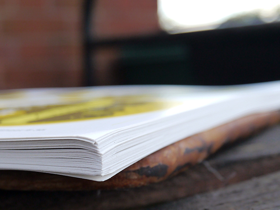
We weren't disappointed. The labels arrived in under a week, and look fantastic.

Beer label design: Concept phase
The name: "You owe me 25 cents for the honey"
Every beer has a name, and when the boys decided on a honey lager, it was a no brainer what we should call the beer. Throughout my childhood (and still now), whenever we would ask mum for the honey (or sometimes even when we didn't), the following dialogue would have to play out:
Mum: "You owe me 25 cents for the honey."
Us: "What honey?"
Mum: "Oh, I never knew you cared."
I now carry on the tradition forever more, a Pavlovian response, into our future life together; it was the perfect thing to call our wedding brew.
Jim has been a big part of all of the stationery design decisions for the wedding, and if anything, I was going to give him even more say with the beer label (with mild trepidation, given his and my eye for design slightly differ). It was, after all, his thing.
Our criteria for design:
- oval tag
- something related to honey
- my calligraphy
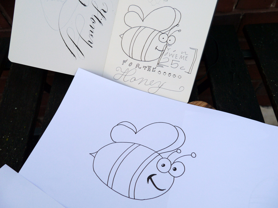
I wanted the beer label to be stylish, and I wanted to try out some typography skills I've been learning, so I started a little conceptual drawing.
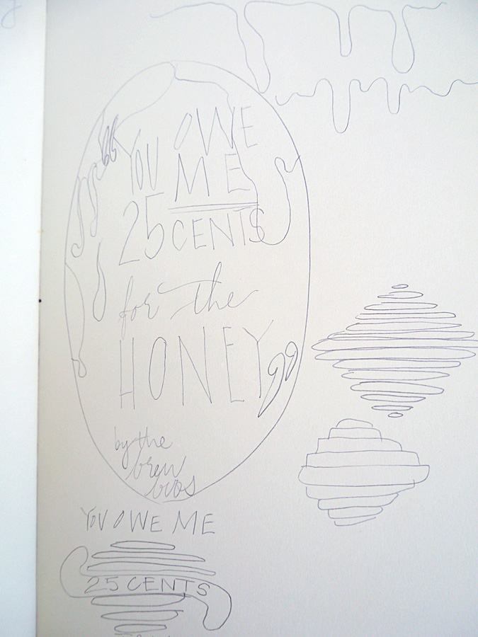
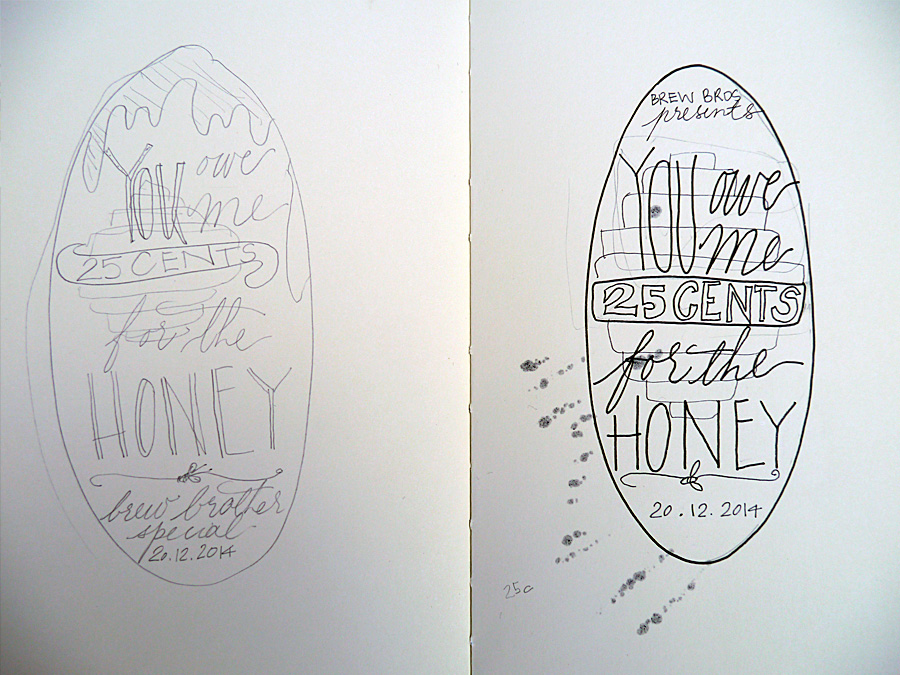
At this stage, Jim interjected with some thoughts. Namely, he didn't like the beehive or the dripping honey, and that he wanted a cartoon bee. So, with a somewhat reluctant heart, I went to task to include this guy in the design. I was not convinced about including a cartoon bee on our beer label, but it was what Jim wanted.
Beer label design: Calligraphy phase
I wrote out all the words I wanted in either calligraphy or another handwriting style to scan in at high res. While I kept the calligraphy in the end, I ditched the other handwriting styles because, to be frank, I haven't done enough typographical study to be confident with my work. We instead found a great complimentary font and rolled with that.

Beer label design: Layout
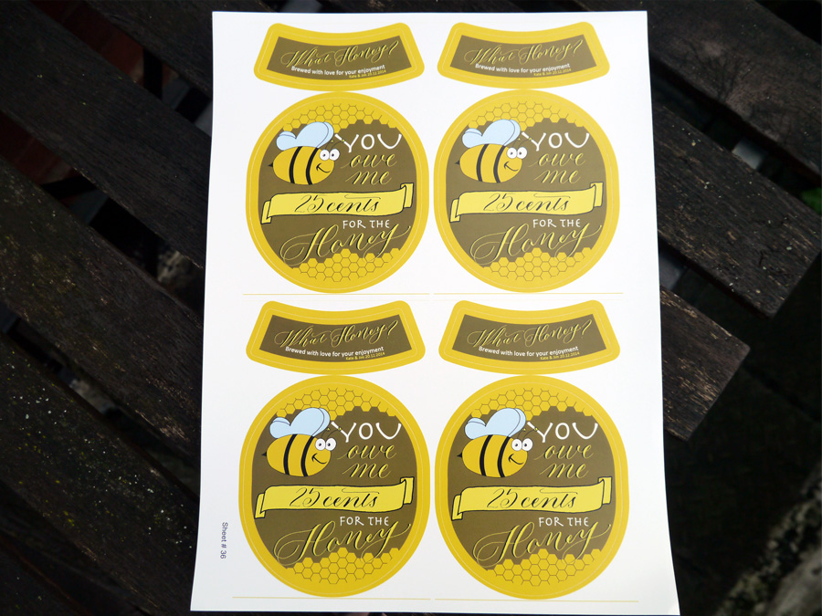
The final step was for us to put it all together in Photoshop. We had the GrogTag template to guide us on sizes, so all that was left was to import the scanned images and writing, style and adjust to fit, and choose our colours.
In addition to the calligraphy and the bee, we both wanted to add some honeycomb. Jim smartly suggested using the hexagonal tool (I was trying to draw them very shoddily), and after a general colour agreement of green and gold, a nod to our Aussie heritage, we shifted from pastels to the deep hues we settled on in the end.
I think we've all earned a brew, don't you!
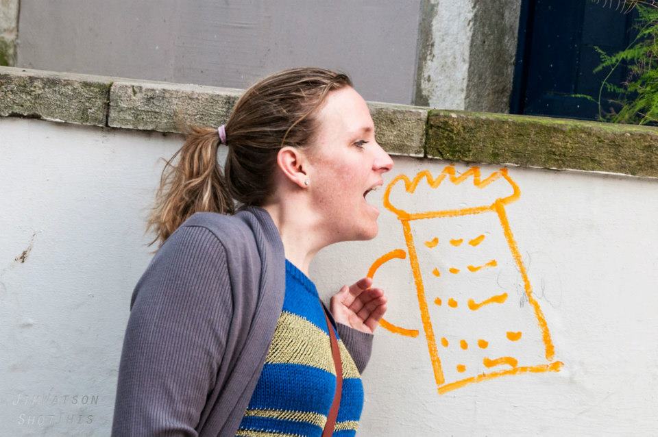
Designed by: Olive & Reid Studio Printed by: GrogTag

Calligraphy at The Handmade Fair 2014, London
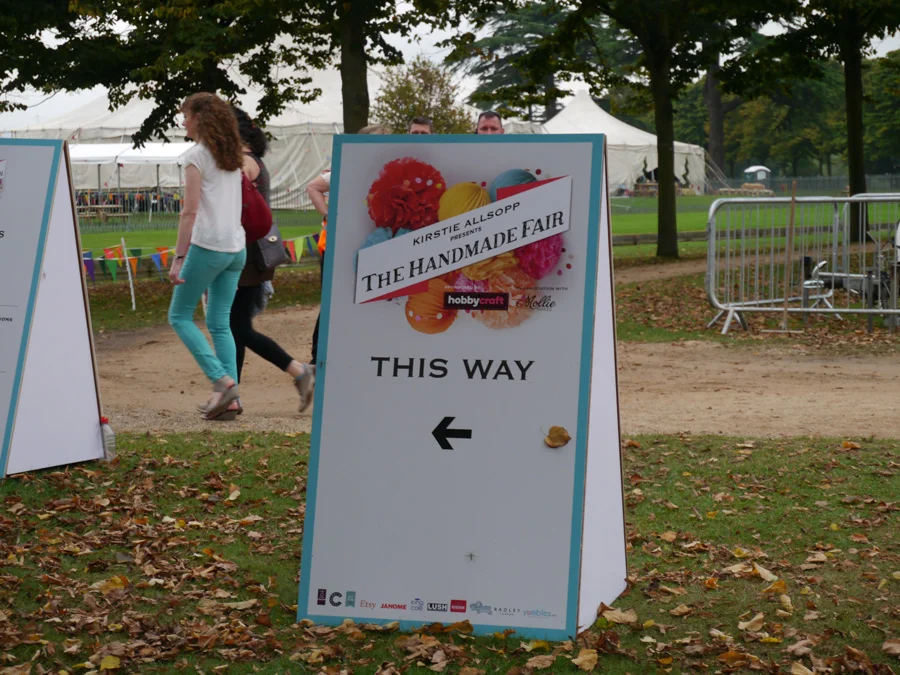
I found out about the Handmade Fair because Claire Gould, calligrapher and owner of Calligraphy for Weddings, was running a workshop. She lives in the Lake District, so it was a rare chance to meet her in London.
I won't lie, I'm not a crafter, so felt very out of place among the knitting needles and fat quarters (whatever that means). So overwhelmed that I didn't even take photos of my day, mostly.
I fortunately did find some things a little more my artistic style:
- Anna Wright designs (I bought two of the book she illustrated, "How the Birds Started an Orchestra")
- FabFunky Dictionary Prints (amazing prints!)
For my calligraphy inspiration, I stumbled upon a medium I thought would be cool to try: chalk paint. Mainly attracting up-cyclers looking to renovate furniture, I saw a brilliant example of what you could do with American Decor and Annie Sloane chalk paint.
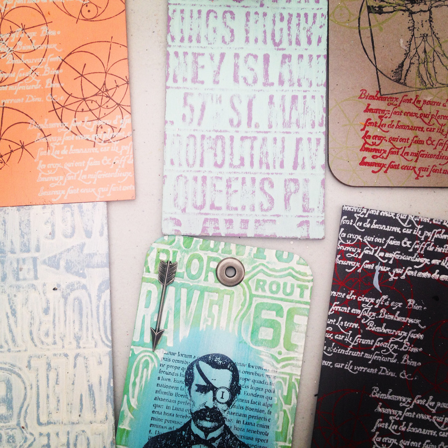
I tried it out on some tile offcuts, but I think I need some kind of glaze to finish it off.

By the time 2.30pm rolled around, when it was time for my calligraphy workshop with Claire, I had:
- stopped off for ice cream at 10.30am
- watched two people battle it out for 45mins on stage to transform a white cotton t-shirt into something (a somewhat surreal scenario in which they were on stage and I was in an audience filled with enthusiastic card waving crafty lady fiends!)
- learn the art of creating the perfect bow with Jane Means
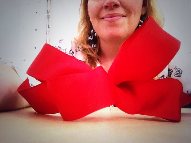
Calligraphy workshop with Claire Gould
I said my quick 'hi' to Claire before she got started, and got settled in with the others in the class. I really enjoyed seeing people pick up a calligraphy nib for the first time, and listening to the kinds of things that they said about it. Check out Claire's wrap up of the fair. She did a brilliant session, and I was trying not to be too much of crazy fan girl especially while she was so busy setting up and packing up.
The best thing take away from the session for me was Claire's advice to not think of calligraphy writing as you would with a normal ballpoint pen, but rather to consider that you're moving ink around the page. That's a brilliant way to describe it. My other takeaway is that if you're carrying a nibbed pen in a plastic bag, be careful where you put that bag. I put it under my butt, and that nib ripped a hold in my jeans and gouged its way straight into my flesh.
Apart from the show, I really loved visiting another new cool place in London: Hampton Court. I mean, would you look at this place!
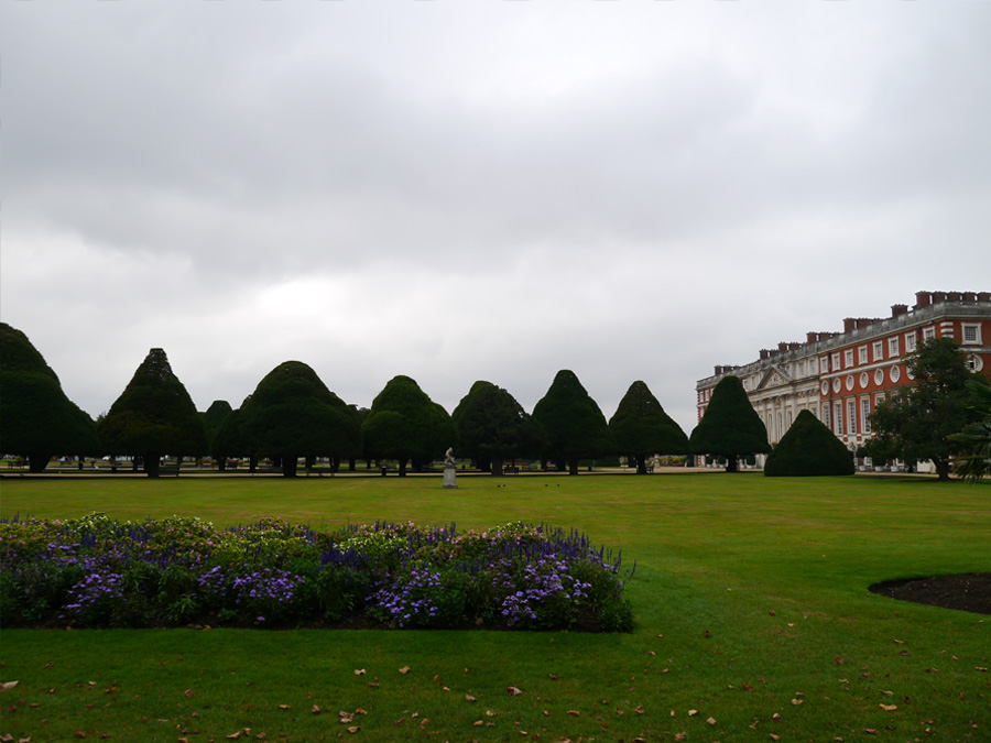


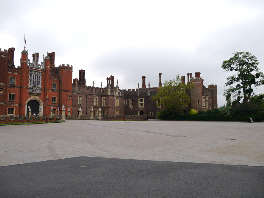
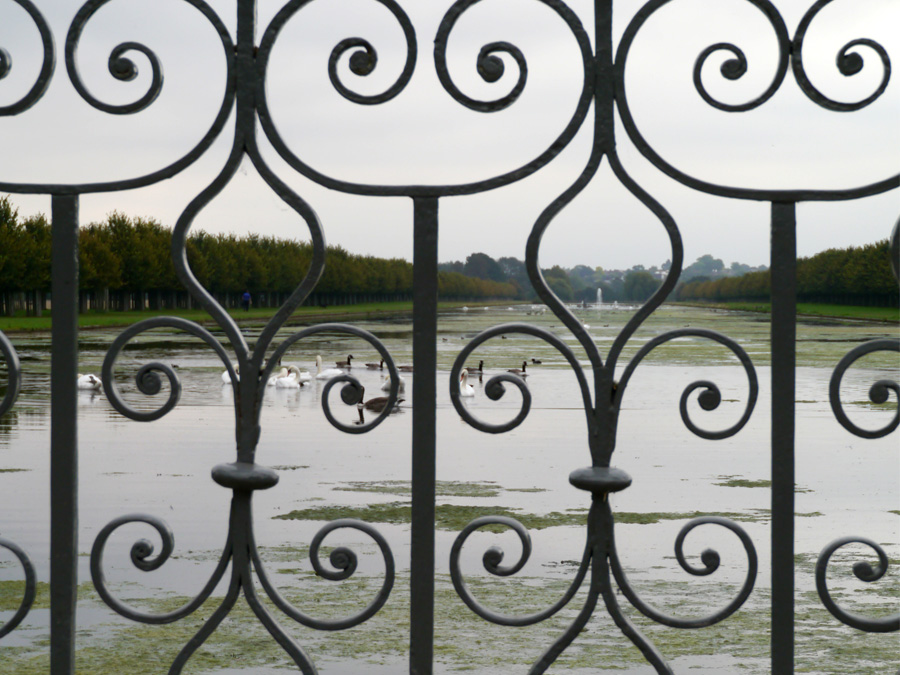
I even got to see Kirstie Alsopp in the flesh!


The Pen Museum, Birmingham UK
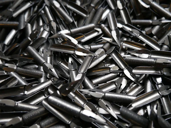
I came home from work one Friday night, and JW was quietly working away on his laptop. Suddenly, he pronounced that he had found cheap train tickets to and accommodation in Birmingham (we live in London). I wasn't expecting a weekend away, so I was a little bit hesitant, but I got involved and started investigating "things to do in Birmingham".
There, ranked 13th on the list of Birmingham attractions, was The Pen Museum. I suddenly couldn't wait to go, and also didn't really care what else we did in the city (although the Birmingham Museums & Art Gallery and the Barber Institute of Fine Art were calling my name, too). I was a kid on Christmas eve: "TO THE PEN MUSEUM". It did not disappoint.
A handsome gent welcomed us in, inviting us to take a look around before he would show us the nib-making machines that were used in the booming business of the time, when Birmingham produced 75% of the world's pen nibs.
Step by step, he took us through five of the 17 steps in the nib-making process: "blanking", "piercing", "marking", "raising", and "slitting" (thanks to C Brandauer & Co blog for the process details). I'd come across as the ultra nerd I am if I tried to explain how awesome it was to do that, so, suffice it to say that it was good fun for a calligrapher.
The nib-making process
Blanking
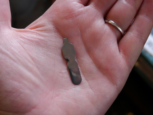
Piercing
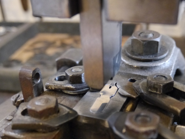
Marking

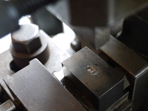

Raising


Slitting

JW got to have his time in the sun when we sat ourselves at old-school school desks and tried out the nibs they had on display. To be fair, they had been pretty trashed by the unseasoned calligraphers, but I think it's more important for people to be able to feel and see and have the technique become more accessible in that way than keeping them locked up.
Naturally, when surrounded by boxes and boxes of nibs at 25p a pop, there was no doubt that I would leave with a fair selection. I bought 10 different nibs The Pen Museum; four were perfect for copperplate.
I also bought 1 gross (144 nibs) pack, Victor Series Exhibition Pen, for a fiver. I had no idea if that boxed set of nibs was going to be any good for copperplate, but they were vintage, and a great price so worth the risk. I'm glad I did, because they're lovely.
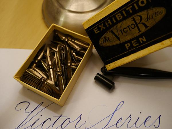

- John Heath's Golden Coated
- Victor Series Exhibition Pen
- John Heath's First Class Selected
- British Pens Co. 5005
- University School Pen
I'm so super excited to have found The Pen Museum, and looking forward to visiting again. Run by volunteers, the museum relies on donations and support. You can support in lots of ways:
- donate a couple of quid every time you visit
- support them with an online donation
- become a member
- shop online (the nibs I've noted aren't listed in the shop, but get in touch with them; I'm sure they'll be happy to help).
Take a look also at this blog post from Tiger Pens, which gives more detailed information about the history and venue details of The Pen Museum.
So, where's your favourite calligraphy spot?