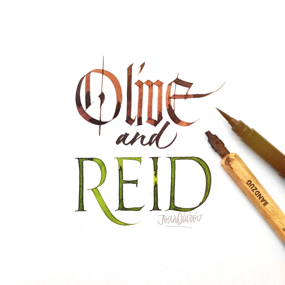
Knitting ventilator bonnets for sick and premature babies
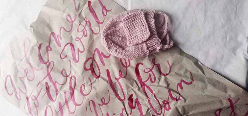
A friend recently shared a post on Facebook from First Touch, which has led me on a wonderful journey to knitting ventilator bonnets for sick and premature babies at St George's Hospital, London.
I emailed First Touch about the fairy mice pattern, but when they said they could use some bonnets, that was my priority. I have also offered to donate some of my watercolour birth announcements, although it's not as practical. I'll be wrapping these head warmers in paper I've reused from Amazon packaging, hand lettered with messages of love.
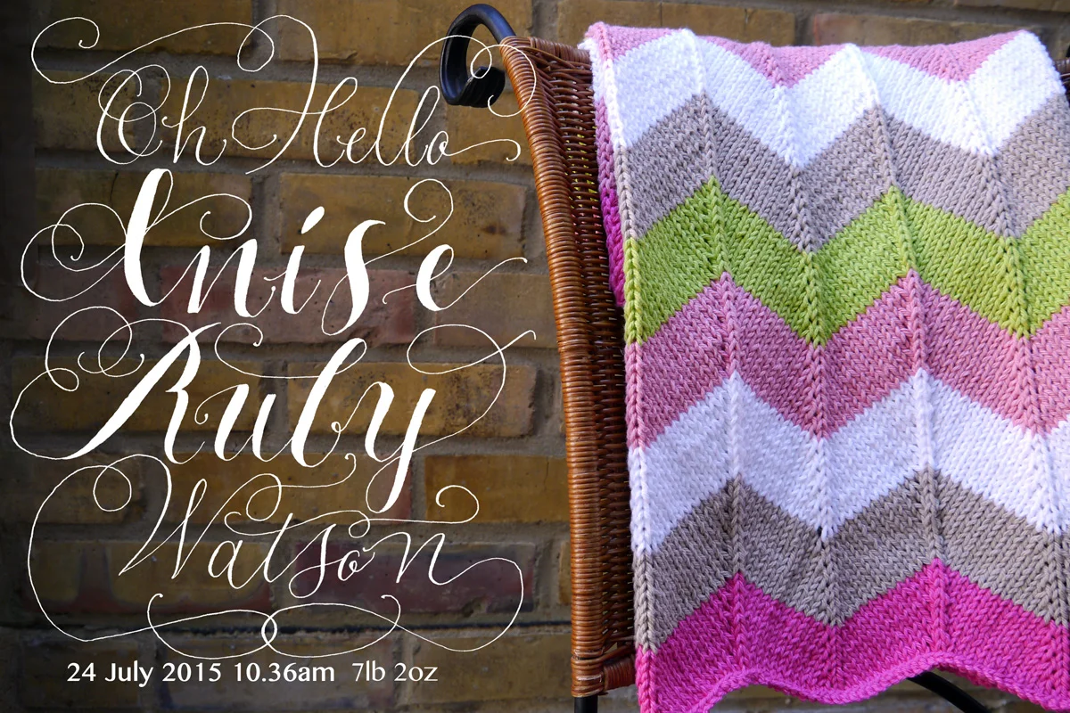
I took up knitting when I was pregnant in 2015, and was pretty proud of my first efforts at a "monkey snuggler" sock for a newborn baby, alongside a pretty intense chevron blanket.
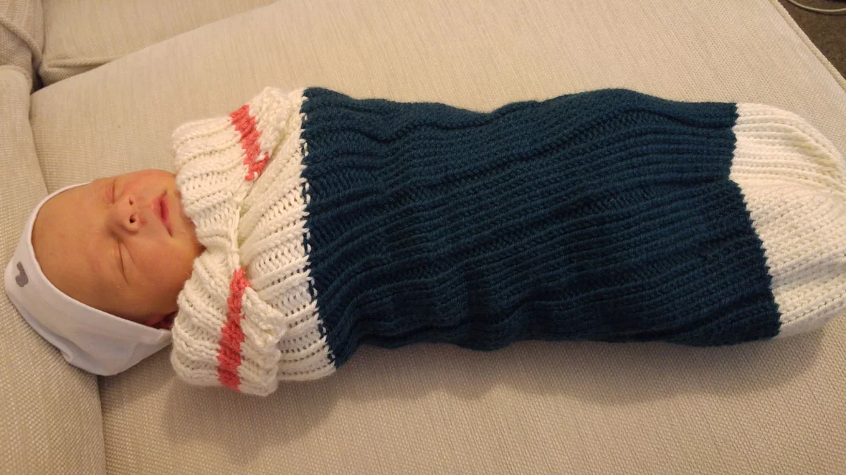
I knitted beanies for all of our NCT group babies, one of whom was just a little tyke born on the cusp of being premature and weighing just five pounds. When I met him, he was five days old and just the tiniest thing (and going absolutely great guns now). I can't imagine the struggles that parents of very premature babies (some weighing just a pound) must go through, or the stress of having a sick baby in hospital. I know that medical staff work wonders to care for them (and their parents) through some very rocky days.
If you'd like to help too, you can email the First Touch team: info@first-touch.org.uk or visit their website to find out how you can help. I'd love to see what you make if you do, so please feel free to tag @oliveandreid on social media.

Recycling Amazon packaging for fun hand lettered projects
When Joyce from Artsy Nibs recently shared a fun hand lettered project by revamping her Amazon packaging, I just had to give it a go.
Turned that @AmazonUK packaging paper into a wall decor. Gonna be humming to @OneRepublic everyday now. #letteringpic.twitter.com/hgIR8TFQ6o
— Joyce Lee (@artsynibs) September 13, 2016
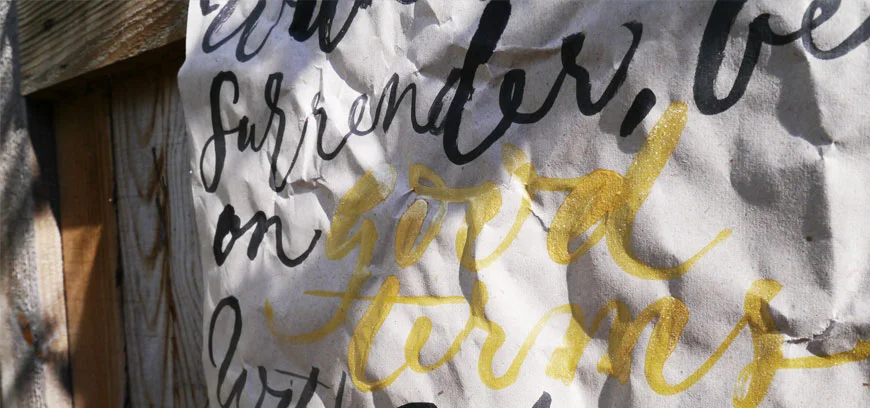
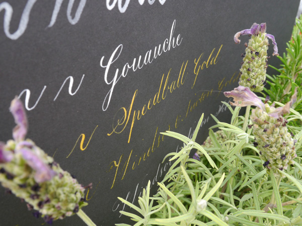
I had a brief window this weekend to try it out — yep, a rush job — but thought I'd get a feel for it at least. My first hand lettered project attempt was for a wall hanging of my favourite poem, Desiderata, featuring black writing with gold highlights of key (positive) words:
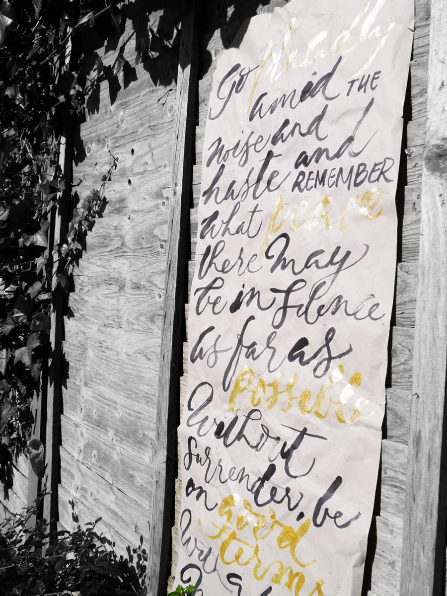
For this I used black Parker Quink and Speedball gold and a size 6 round brush. The black bled a little with too much on the brush, and seemed to flow better after I'd first dipped the brush in water. The gold was not as vibrant as these pics imply, but was a lovely contrast of the positive words regardless. When I have more time, I'll test other inks and paints to see what works best.
Have you revamped something unsuspecting lately? I love that I can give this paper a little longer life — whether as a wall hanging, or some wrapping paper (my second fun hand lettered project for some ventilator bonnets for First Touch). Let me know in the comments, or share with me on social media tagging @oliveandreid.

A pretty little giveaway: wattle you win?
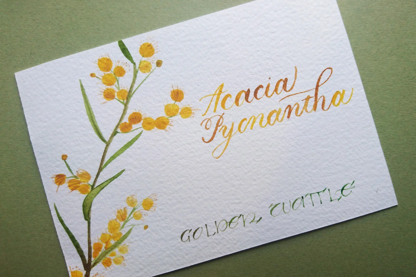
I'm often 'giving away' a lot of calligraphy and lettering information here on the blog, but have never given away a prize. Today, it begins. Giveaways giveaways giveaways! A wattle giveaway, to be precise. How exciting! At this year's South London Lettering Association's exhibition — themed 'celebrations and festivities' — I'll be exhibiting a celebration of my Australian heritage with two floral prints. Featuring Callistemon Citrinus (Bottle Brush) and Acacia Pycnantha (Golden Wattle), these two A6 pieces combine watercolour illustration with brush lettering and calligraphy script.
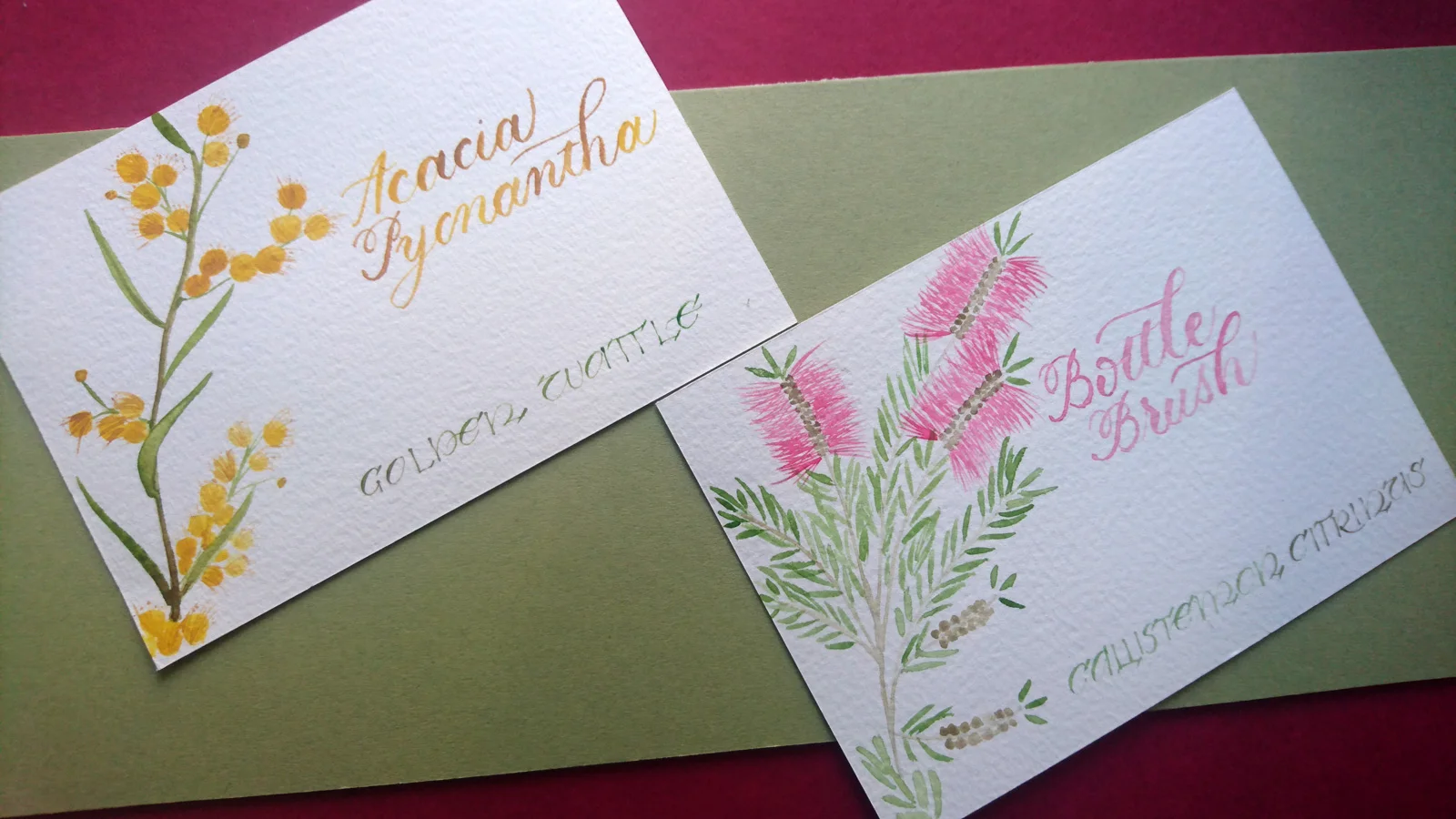
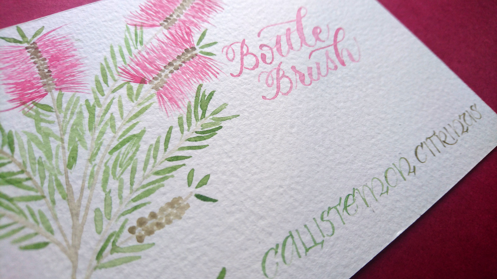
I'm really excited to be exhibiting for the first time and wanted to share it with you, not just the description, but the real life, real deal original artwork.
Your golden ticket to the golden wattle
In this wattle giveaway, I'm offering the chance to win not one, but two!, original A6 hand lettered and illustrated print of Australia's national flower, the Golden Wattle.
All you need to do to win is fill out the widget below. The competition ends on 25 September 2016.
It's worth noting: as I try to be a calligrapher with a conscience, this artwork has been created on exceptionally high quality paper (300gsm cold pressed watercolour) that I have reused after trialling another artwork on the other side.
Good luck!
The serious bit — Ts and Cs
Let's keep it light, but real. Here is some information that you might want to know.
- This giveaway is for 2 x A6 original print featuring wattle illustration and hand lettering, as pictured or similar
- Anyone is eligible to enter. The prize will be sent wherever you are in the world
- We us Rafflecopter to run the competition, and this service allows us to randomly pick a winner once the competition has ended. The winner will be announced on the blog post, and contacted directly afterwards.
- By entering the competition, you'll be added to our mailing list (monthly updates and news about giveaways, new prints and limited editions). You can unsubscribe from the mailing list at any time.
Kate x

London hand lettered stage props
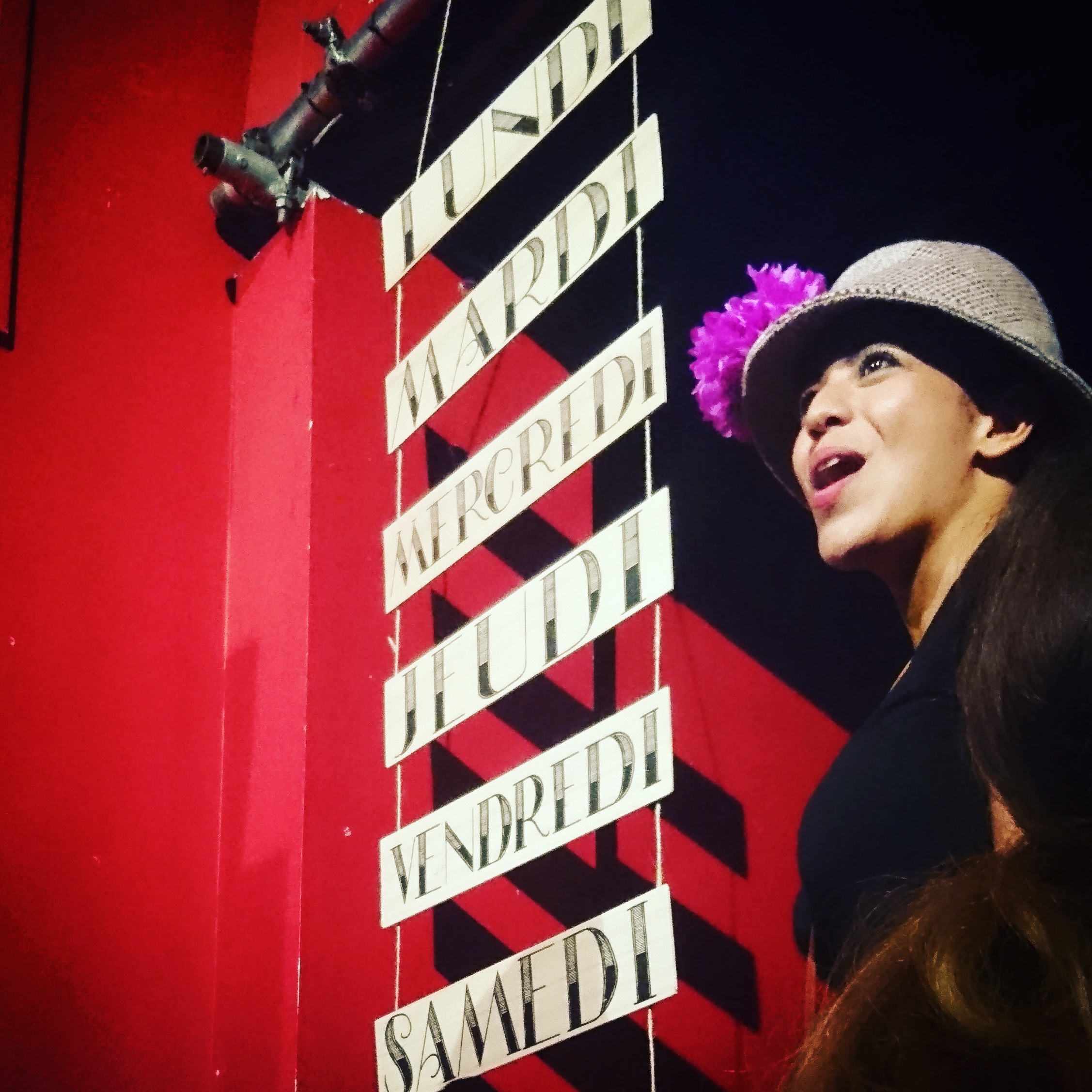
As my first foray into hand lettered stage props, I was given the fantastic opportunity of helping Sing in French with some signage for the musical theatre production of Pinot the Musical. I slipped in to see the final summer showing for 2016. Although I don't speak French and was way above the demographic age, I had the best time watching Pinot the Musical. In an intimate South West London venue at the Merton Abbey Mills (a most perfectly quaint piece of British history) and it was just so much fun! A ridiculously awesome plot, and epically charming cast, my cheeks were sore from smiling so much.
About Pinot the Musical
{taken from Get Surrey}
Pinot The Musical is a fun, family singalong-in-French show suitable for all ages and especially effective with 8 – 14 year olds (Key Stages 2 and 3) A young Russian cyclist, Petrov Popov, has a dream to win the Tour de France in memory of his champion-cyclist great-grandfather. So he and his Cossack-dancing friends escape from Russia and enter France illegally. Aided by a wily beggar and two rival gangs, Petrov gets a job, changes his name to ‘Pinot Blanc’, acquires a brand new racing bike and does his training in secret between police chases. After a spell in jail and a dramatic escape, he achieves victory as the winner of the Tour de France and the police give him and his friends their freedom. Kids absolutely love it. The show is an audience participation event. Sing along with 18 educational songs specially written for this show. Dance styles include Cossack dancing, Rock n Roll, Jazz, Ragtime, Waltz, Bluegrass, Charlston, the Twist, Tap and more! Pinot The Musical will leave you and your kids buzzing – in French!’
See the hand lettered stage props

A ruling pen workshop to rule them all
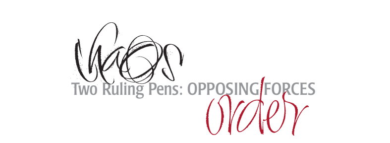
Join the ruling pen workshop
The key things you need to know about the upcoming ruling pen workshop with Rachel Yallop & Michael Clark:
- 15 & 16 October 2016, 9.30 - 4.30
- The Village Hall, Rectory Lane, Cradley, Malvern WR13 5LH
- £120 including lunches and evening reception on Friday 14 October
- Contact rachel.yallop@btopenworld.com to book your place
Rachel and Michael come from different calligraphic cultures/backgrounds yet ascribe to very similar beliefs about design, colour and order. This workshop is a challenge to break down your ideas to their basic components and then build them back up, based on the need to engage and educate the viewer. Michael and Rachel are capable of both the restrained and the outrageous, but in their joint designs, it sometimes requires one, or the other, to seek out the subtle while the other responds with the riotous. In this workshop there will be a thorough exploration of the ruling pen that each teacher has spent their careers trying to master: and their ability to paint different moods and emotions.
The ruling pen, for us, is the most expressive tool we have at hand. Unlike many of the tools in our arsenal that have specific purposes, the ruling pen requires you to determine what it will ultimately produce. The results can be as idiosyncratic as the wielder. It is capable of everything from explosive and brutal to delicate and subtle, traditional or contemporary. In our case we have always treated words done with the ruling pen as a process, both directed intentions, and skeletal forms that can be amended. The exciting thing is that success is nothing more than a string of failures that finally pay off. If you look at lettering in this fashion, always with your eyes on the process and not the finished product, fear disappears and learning begins. With the ruling pen this is extremely important. Each venture provides valuable insight into its potential.
This class will explore the myriad possibilities of the ruling pen’s “line” and begin with familiarising the student with the tool(s). We will move on to honing handling skills and then to working with expressive “words”. From there the class will work with word groups and alphabetic compositions and ultimately page texture experiments. A group project will be incorporated into the workshop ... a collaborative effort to ‘affect a phrase’; this exercise will bring home the concept that first stroke down informs all subsequent decisions. This class is about experimentation and learning without judgment. The ruling pen is we think the most individualistic tool available.
About your teachers
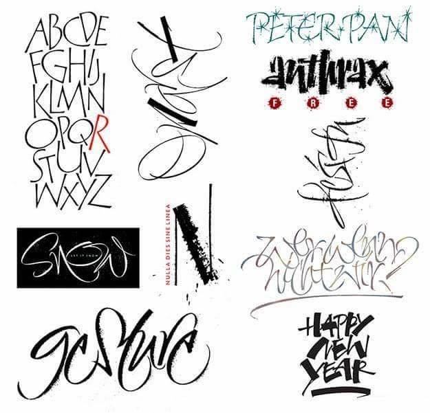
Rachel and Michael have many years teaching experience, both internationally and at home. Rachel Yallop has pursued a freelance career specialising in creative and expressive calligraphy for 30 years. Her love of letters stems from a lifelong passion for drawing, with her original works exploring form, space, tension and freedom of line. Rachel is a Founder Member and past Chairman of Letter Exchange and an Honoured Fellow of CLAS.
Michael Clark is a commercial lettering artist and font designer who resides in Virginia, USA. Two of his fonts won international awards and he has been featured twice in Letter Arts Review. His work is a mix of traditional and contemporary lettering for book covers, logos, CD covers and titling for magazines and printed ephemera and the web.
The venue: The Village Hall, Malvern
The Village Hall is a beautiful 16th century building close to the church in the picturesque village of Cradley. It lies to the west of the stunning Malvern Hills and is just five miles from the spa town of Malvern itself. Malvern can be reached easily by road and rail.
For booking and accommodation information contact Rachel at rachel.yallop@btopenworld.com

Introducing YInMn Blue
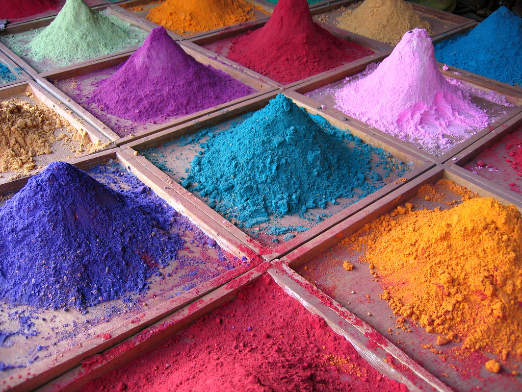
Try a new shade, YInMn Blue
Praise be to science for both its intentional, and, in this case, accidental discoveries. Scientists have discovered a way to bring the newly harnessed pigment, YInMn Blue, to your paint box, albeit at a pricey price.
A long way from being commercially available, the pigment comprises the metals Yttrium and Indium making it wondrously expensive. For US$1000/kg, you could procure your sample stash from Shepherd Color Company. They've teamed up with the scientists at Oregan State University, who made the discovery, to "bring the new blue pigment to the market place".
While the pigment hit my radar through a Tech Insider article in June 2016, it's been thriving since its discovery in 2009. A licensing agreement to bring it to market was reached in 2015, so we are getting ever closer (even if it will cost you a pretty penny).
While $1000/kg sounds a lot, calligrapher, Christina Janoszka, noted:
1$ for 1 gram probably isn't an impossible price for an illuminated manuscript where only touches of colour are used (i.e. $20 for 20 grams.)
Check out this lovely video of YInMn Blue
Besides being a sweet shade of blue, the pigment is versatile. In the press release from OSU in 2015, it was noted that: "The vibrant blue is so durable, and its compounds are so stable – even in oil and water – that the color does not fade. These characteristics make the new pigment versatile for a variety of commercial products. Used in paints, for example, they can help keep buildings cool by reflecting infrared light. Better yet...none of the pigment’s ingredients are toxic." Image: Indian Pigments by Dan Brady is licensed under CC BY 2.0

Do you use dinky dips to store your calligraphy ink?
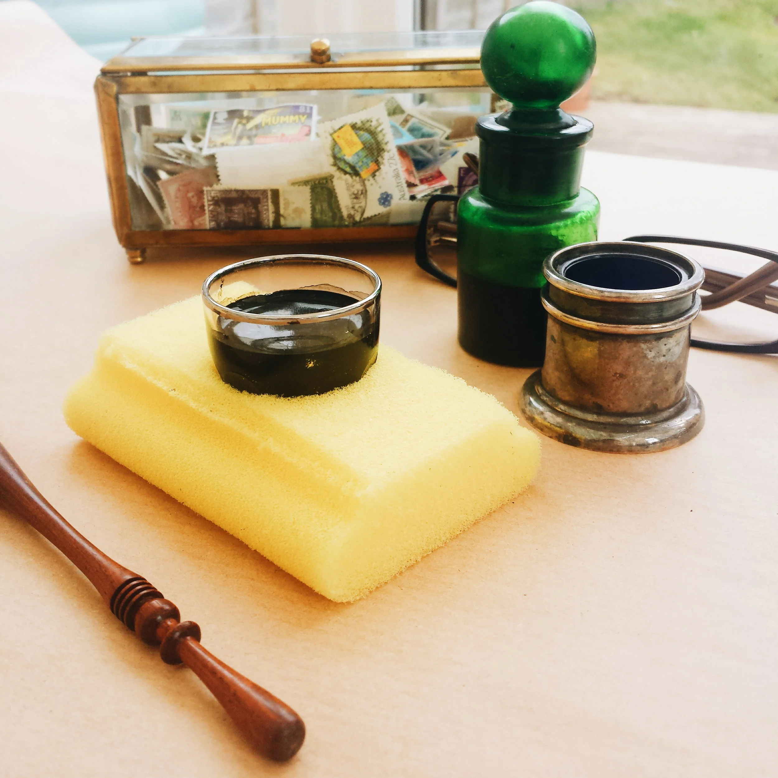
I've long heard from US calligraphers that it's great to use dinky dips to store your calligraphy ink for pointed pen scripts.
"These are so good to have on hand! I had my share of ink spills, too, before I found out about the magic of dinky dips."
All well and good when dinky dips are easily sourced in the US via suppliers like Paper & Ink Arts and John Neal Bookseller.
Until last week, I've struggled to find dinky dips in the UK. But I received a newsletter from Blots Pen & Inks Supplies, and here they are!
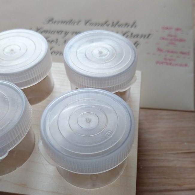
Description of the Jumbo Dinky Dips from Blots:
Four clear plastic 30ml bottles with push on lids in wooden tray. The clear plastic allows you to see your nib as you dip. The tray is sanded and finished but unpolished so that it can be decorated or personalised. Approximately 3½"square x 1½" high. Provides stable containment for bottles.
How do you store your calligraphy inks?
Before using dinky dips for storgae, I was just using a selection of moisturiser storage containers that I found at Muji.
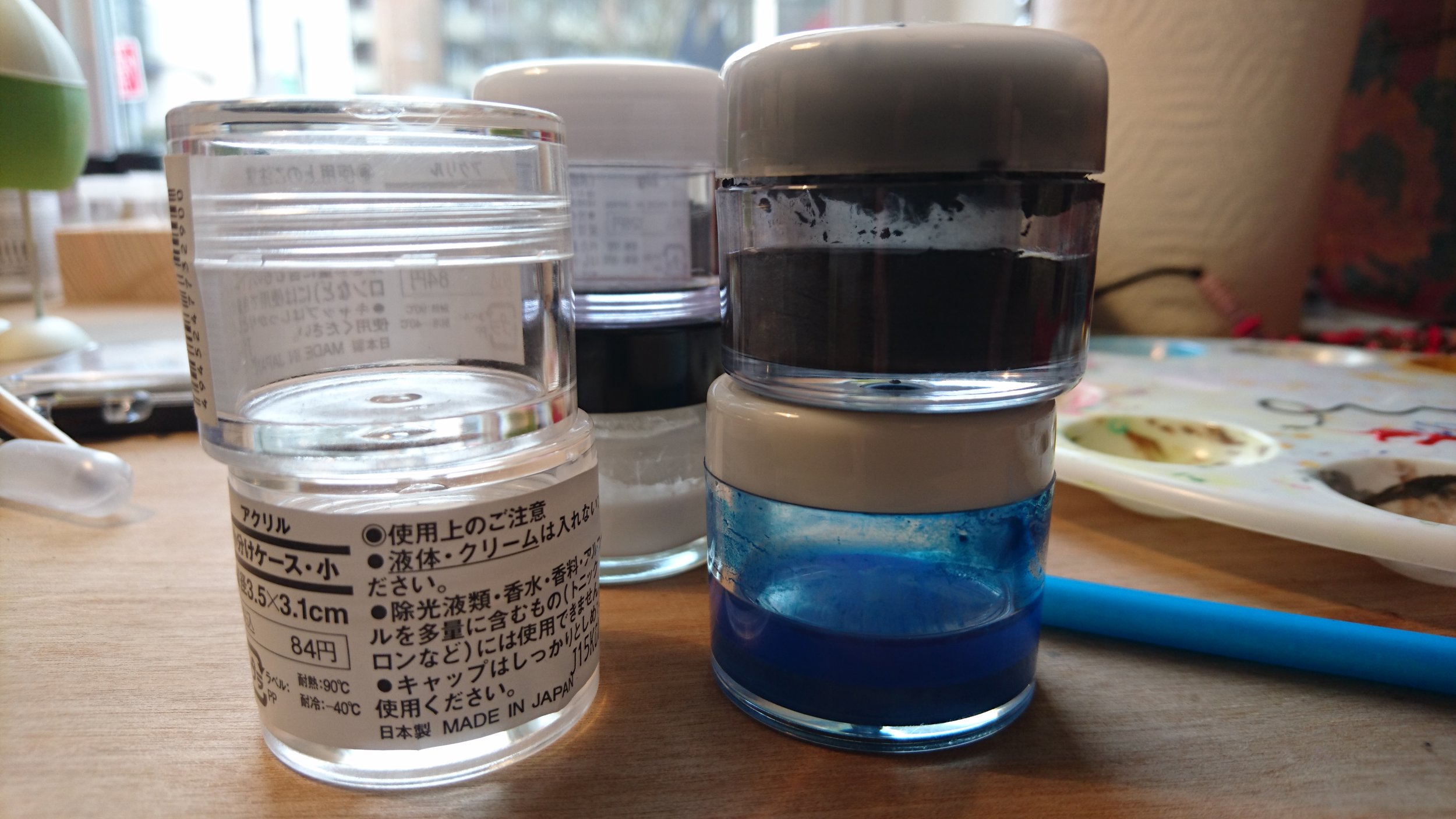
I also picked up a shot glass at Tiger, but have to be verrrrry careful because I'm a walking ink spill waiting to happen. I put it in a baking tray on the desk after my first spill (within just hours of using it!)
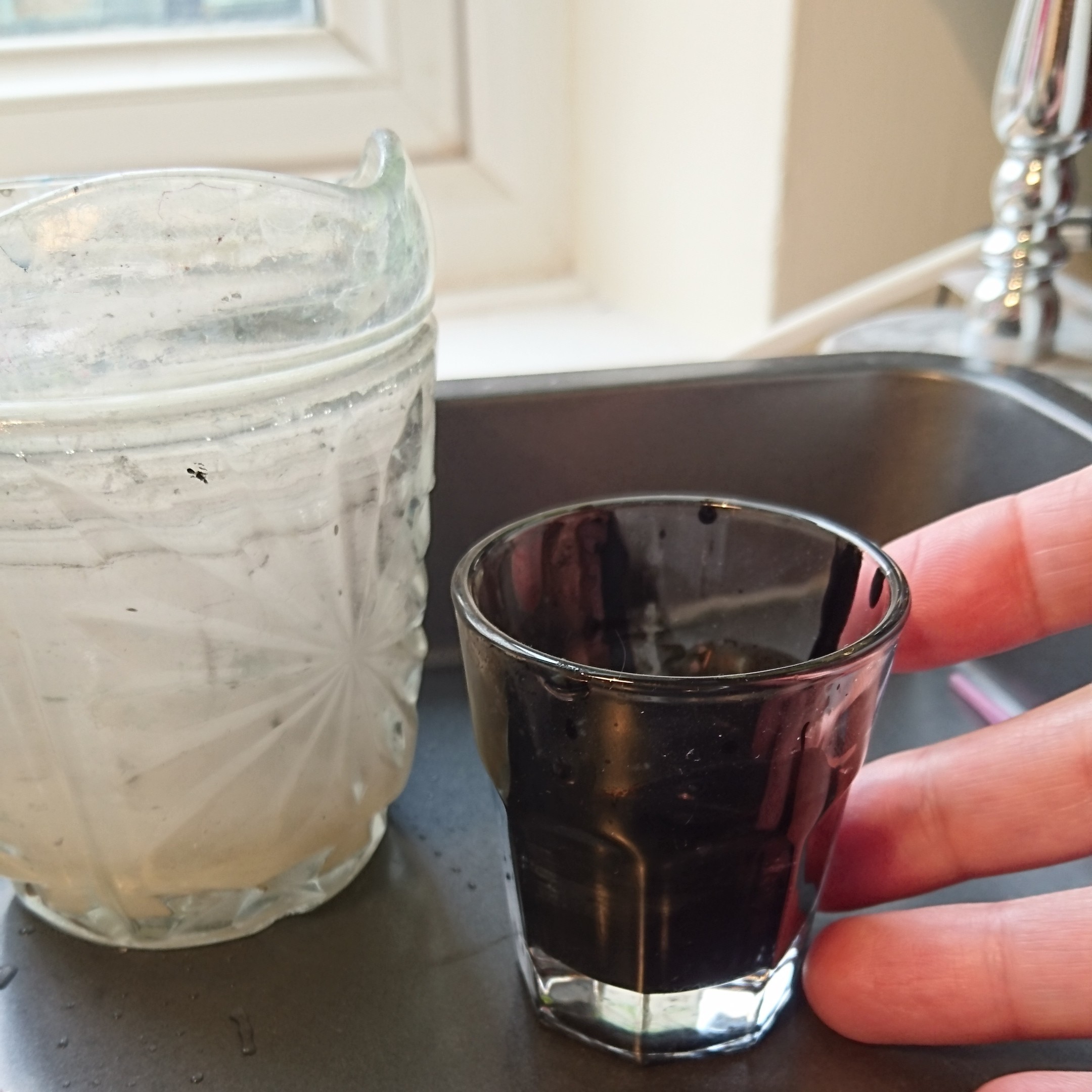
So, I'd love to hear about what you use for storage. Will you be moving to dinky dips to store your calligraphy ink?

Ever needed calligraphy ink alternatives?
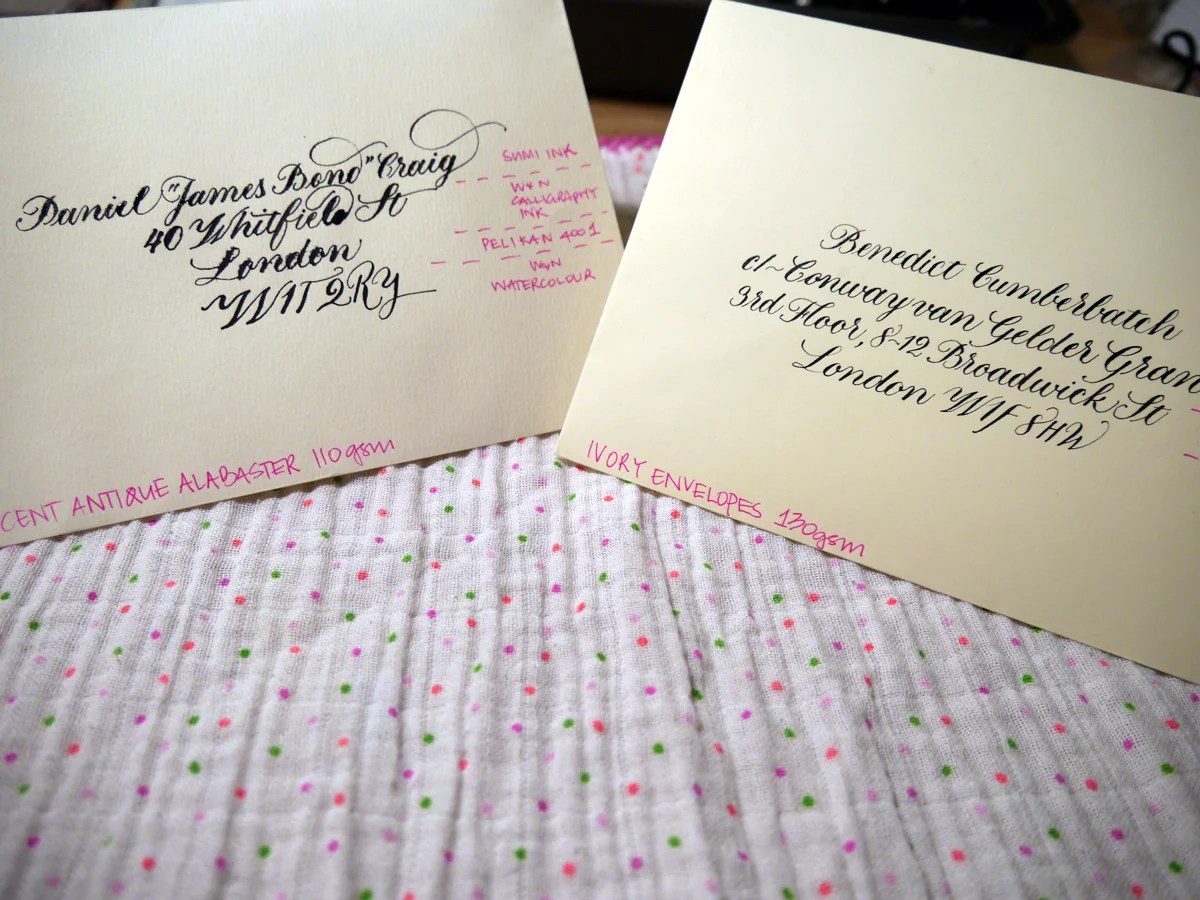
This post wasn't planned to be about calligraphy ink alternatives. Originally, I was going to talk about envelope suppliers in the UK, but during the sample testing process, I suffered some sad calligraphy ink catastrophes. ...so you bought less-than-perfect quality envelopes and now your ink is bleeding everywhere like a scene from CSI. Don't panic. All is not lost.
What's the ideal stationery gsm weight for calligraphy?
As a general rule of thumb, envelopes (well, pretty much any form of stationery) for calligraphy should be at least 120gsm. It's still always a good idea to test the paper stock if you can because you just never know.
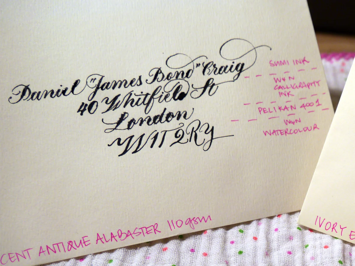
I recently made the schoolgirl error of buying 110gsm envelopes... I swear I thought it was 160 gsm! With a solid helping of optimism, I tested it out, and things did not go so well. Next to the 130 gsm counterpart I was testing, it was a right mess. Hollywood superstar Daniel Craig doesn't deserve to receive this trash calligraphy.
Ideal-110gsm-close-sml
Testing sample envelopes for calligraphy
The sample envelopes I used for testing
C6 Ivory Envelopes 130 gsm (£7.20/50)
Accent Antique Magnolia 110 gsm (£11.04/50)
Do you think it was the fancy name of the 110 gsm ones that blinded me? Before you answer, it's important to know that I'm a sucker for marketing. And as a marketer, I should know better. Maybe I thought more expensive meant better? I wish we could just forget they ever happened. But they did, and now we have to find a way to fix this.
The black inks I used to test with
Accent Antique Magnolia 110 gsm envelopes
You can see for yourself how the envelope fared with these inks. I used Leonardt Principal EF nib and within seconds of nib to paper I knew it was going to be hazardous. It takes a lot of effort to persist when your writing looks like this. You're wiping away tears and clutching at your heart and reputation all while creating the calligraphy version of a Pinterest Fail that you very absolutely intend to share with the internet. You're welcome.
Ideal-110gsm-close-sml
There really isn't much point in assessing each ink, but I would say that the watercolour may make them usable, and the Pelikan 4001 suffered the most. Sad, really.
Although I went to bed annoyed at myself for these envelopes, I woke thinking, "I CAN FIX THIS".
What can you use instead of ink for calligraphy?
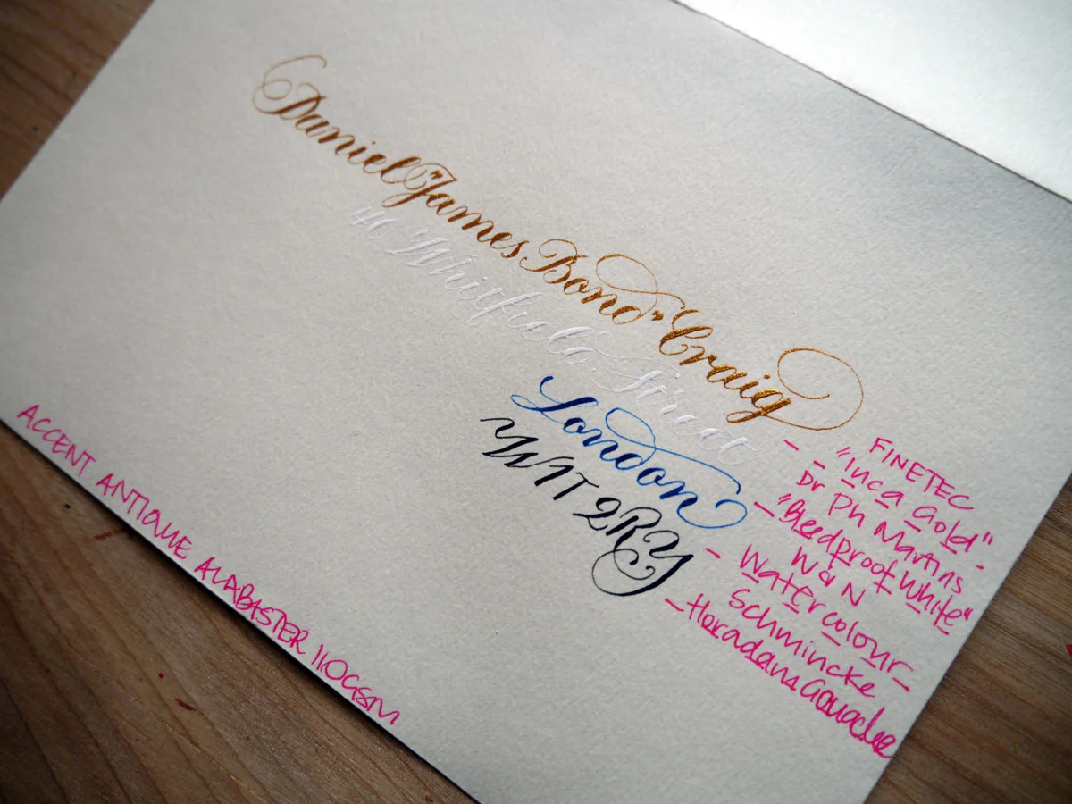
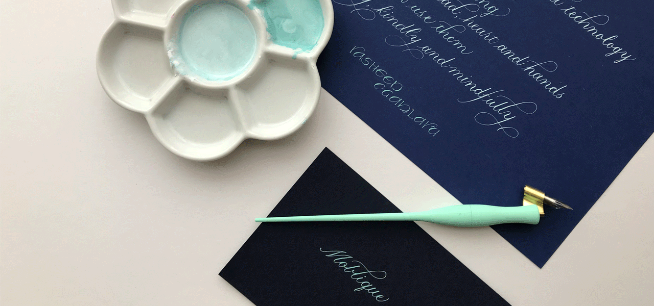
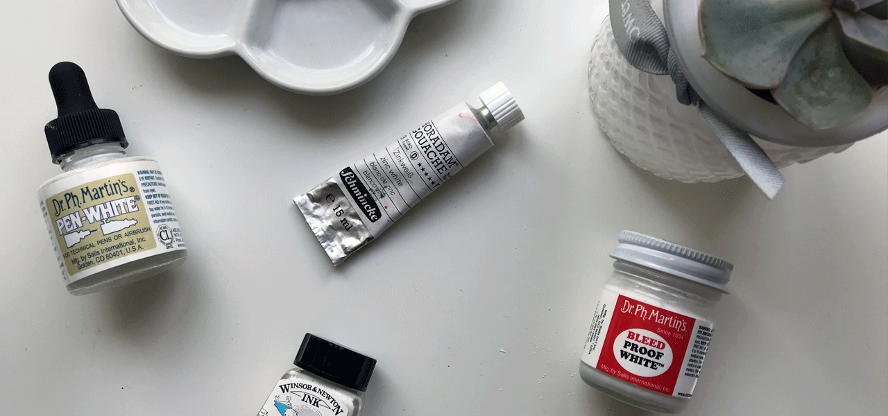
You see, calligraphy isn't restricted to inks. There's a range of water-based paints and products that can be diluted to the right consistency to write with. Rummaging through my inky tool box, I pulled out four alternatives that I thought could be worth a try.
Ideal-110gsm-paint-full
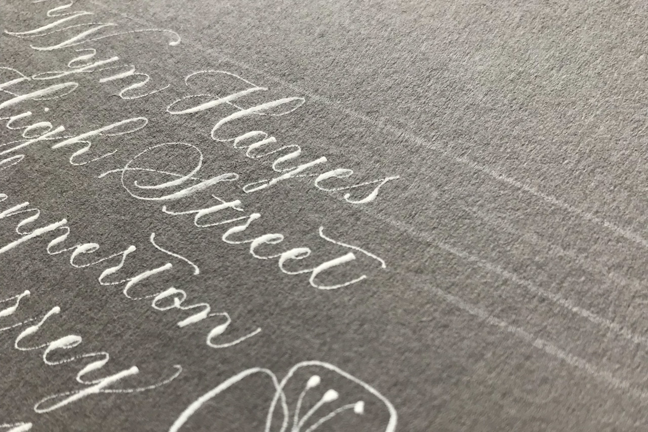
Every single one of the alternatives to ink works on these envelopes. Well, the fact that the white is barely legible is beside the point; it didn't bleed. Cos it's "bleed proof". Dr Ph Martin did not lie. And — come on! — secret writing is exactly perfect for James Bond. Maybe not for Royal Mail.
Let's compare the inks with the paints in close view to just really prove the point that all is not lost with the envelopes — we have many alternative options to play with.
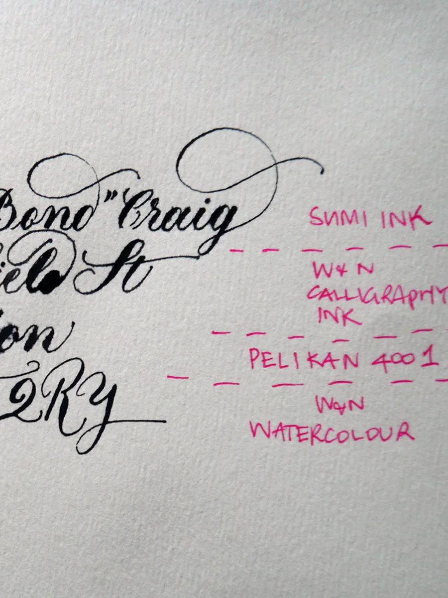
Ideal-110gsm-ink
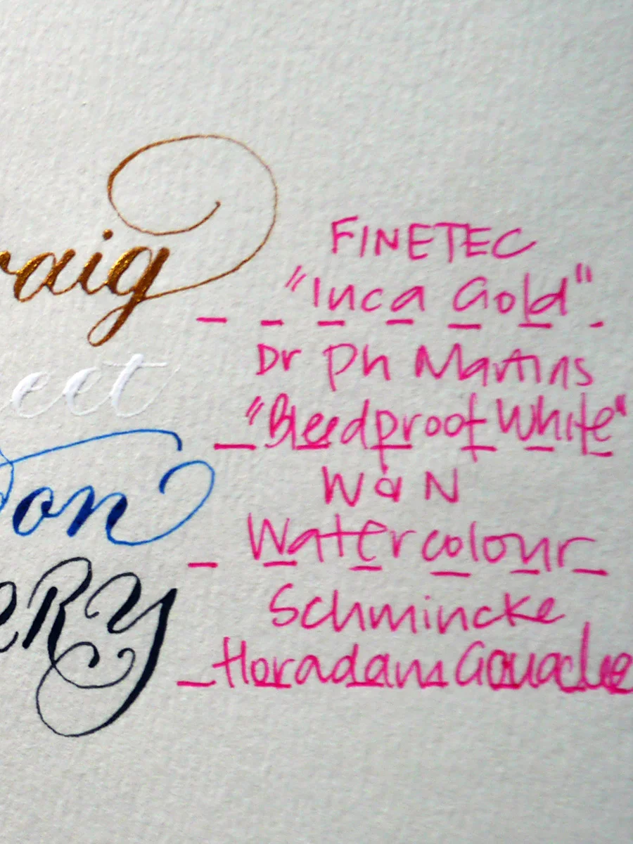
Ideal-110gsm-paint
Ivory envelopes 130 gsm
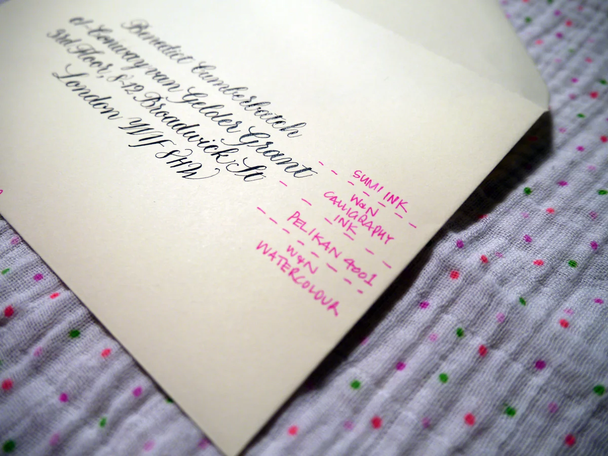
Now, this is more like it! Bring on the inks, I say. I used Gillott's 303 nib for this test. My only struggle was that they were a little hard to see through in parts on the light box, but, if all else fails, rule it up my friends. Draw those guidelines and erase once you're done. Old school.
Ideal-120gsm-sml
Sumi - was lovely! It created beautiful hairlines and was easy to write with on this envelope. It did dry slowly, though.
W&N Calligraphy Ink - slight bleeding and the hairlines aren't so fine, but still works. I do find this ink thicker than it should be, so could be watered down for a better result. I just haven't tried it yet.
Pelikan 4001 - went on smoothly and hairlines still very nice
Watercolour - also lovely and created thin hairlines and a smooth experience.
Top tip for troubleshooting calligraphy inks and stationery
At the end of the day, the main thing is to test your stationery and be ready to adjust your expectations. Be willing to experiment with different media, and have fun!

Free hand lettering gear: Ian Barnard Serifs
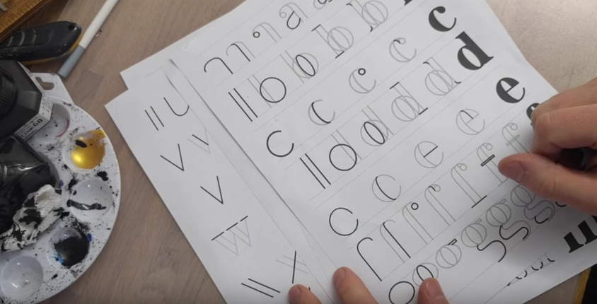
UK hand lettering artist, Ian Barnard is generously offering free hand lettering worksheets and accompanying videos. His creative journey began with calligraphy and he now offers both exceptional works of hand lettered art, as well as insight to fellow artists.
Serif capitals lettering worksheet
This free hand lettering worksheet —serif capitals, based on his recent workshops, is available to view via Ian's YouTube channel, and download via his website.
Serif lowercase lettering worksheet
This free hand lettering worksheet — serif lowercase is available to view via Ian's YouTube channel, and download via his website.
Find out more about Ian Barnard
If you ask me, Ian's a champ and you might like to see some more of his stuff. So, go on. Do yourself a favour!
- Ian Barnard's website
- YouTube channel
- Freebies!
- Social channels: Facebook, Twitter, Google+, Instagram, Pinterest

Learn Modern Calligraphy — British Style
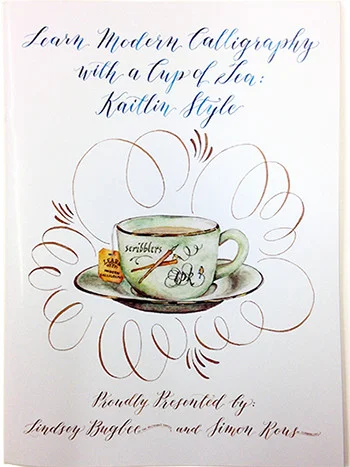
Highly regarded calligraphy supplier, Scribblers, has teamed up with Lindsey Bugbee at The Postman's Knock to create a guide to Modern Calligraphy for Brits.
Learn Modern Calligraphy with a Cup of Tea
Based on Lindsey's original downloadable Kaitlyn style, the team at Scribblers has created a special printed edition for the UK (replete with a complimentary tea bag... because, as Brits well know, tea makes everything better).
Scribblers A4 printed handbook (£9.75) boasts 32 pages of:
- Kaitlin Style Alphabet
- Letter and number formation practice sheets
- Stroke and word practice
- Letter formation practice with a dip pen
- Stroke dips
- Letter connections
- Common calligraphy problems and their solutions.
This edition also includes a complimentary 4-page pull-out practice guideline sheets.
So, make haste! Over to Scribblers to buy your copy of Learn Modern Calligraphy with a Cup of Tea.

A Simple Copperplate Manual
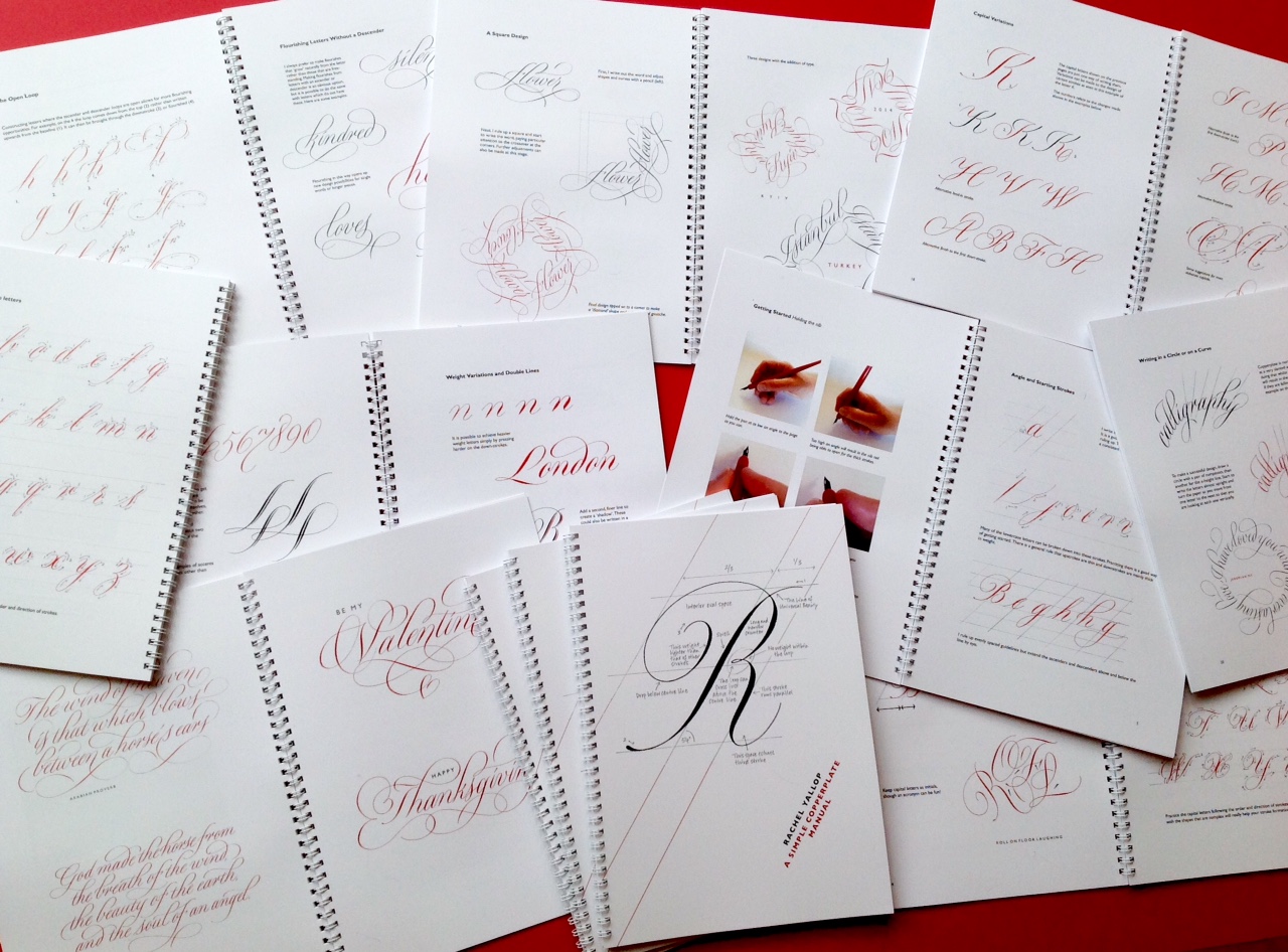
In 2016, British calligrapher and lettering designer, Rachel Yallop, released a back-to-basics Copperplate calligraphy manual that promptly sold out. It's now in its first reprint, so get in touch with Rachel via her website or Facebook page. if you're interested in ordering a copy (or see ordering details below). Adapting her workshop handouts, Rachel has created a "collection of examples to help and inspire", rather than a weighty 'how-to' manual. But don't be fooled by her humble description. This is still a great guide for anyone learning Copperplate calligraphy script.
This comprehensive manual covers:
- minuscule (small letter) construction, joining, spacing and double letters
- common problems you might face
- majuscule (capital letter) construction and variations
- numerals and punctuation
- weight variations and double lines
- the open loop and flourishing
- writing in a circle, on a curve, or in a square
- white on black
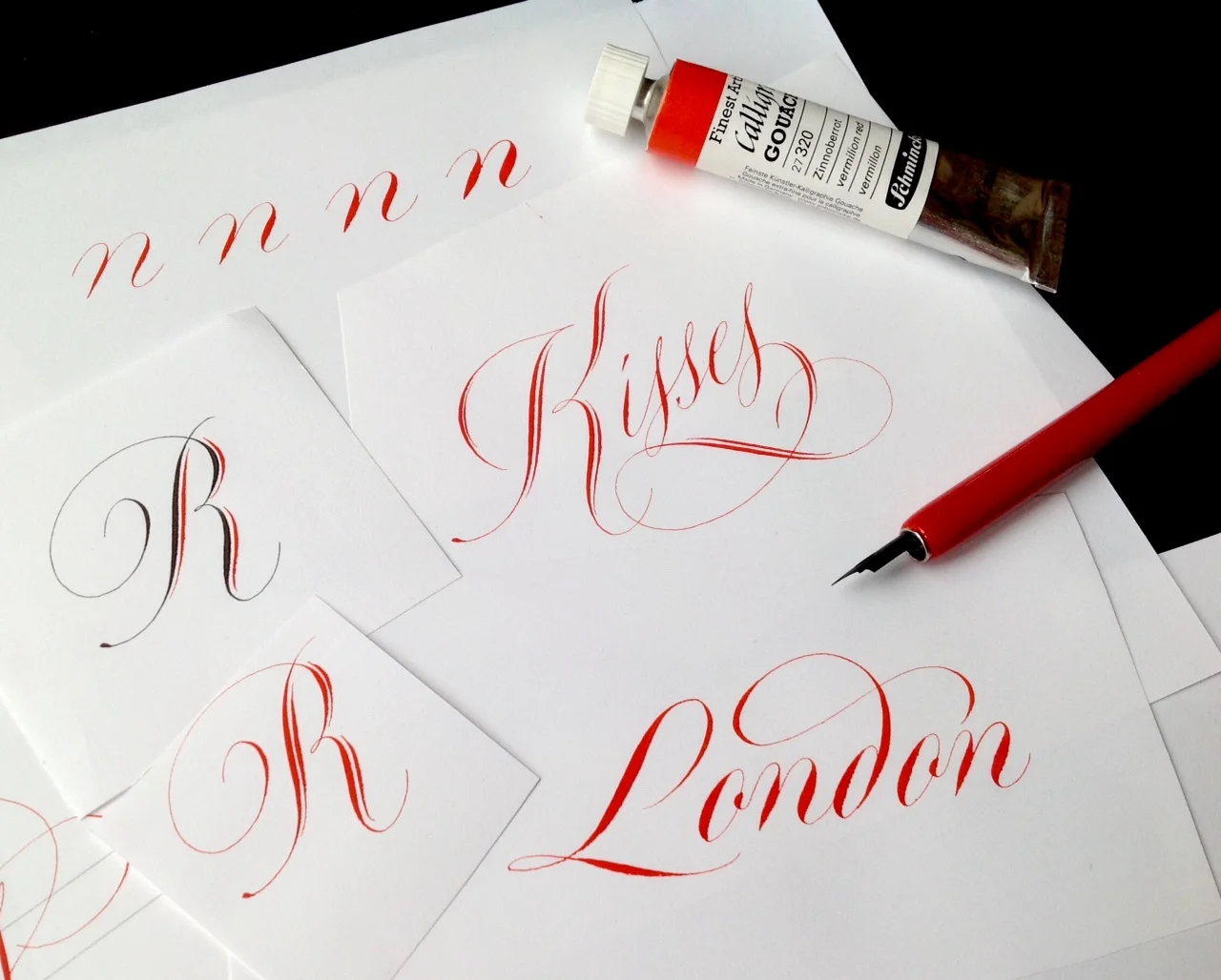
Features of Rachel's Copperplate manual
- 50 A4-size pages, printed on 150 gsm silk coated paper with 300 gsm covers.
- Wire bound so that it will open flat on your table or drawing board.
- 35 instructional pages covering lowercase letters and capitals, joining and spacing, numerals, weight variations, flourishing and design ideas.
- 15 pages of gallery pieces.
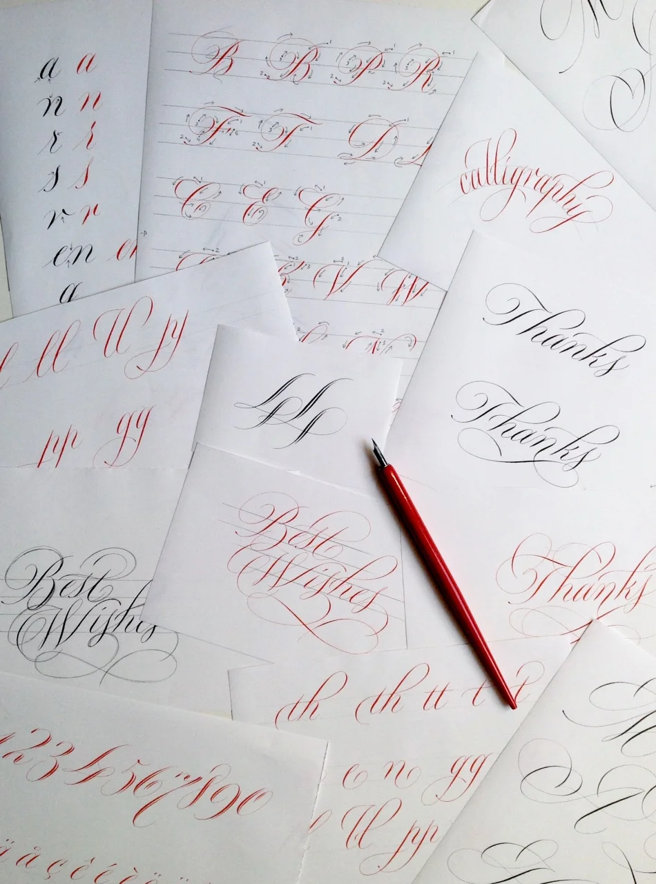
I've been poring over A Simple Copperplate Manual since I bought my copy late last year, and I love the simple styling — black and red font throughout, and how accessible Rachel makes the script. It's a little different from what I'm used to as Rachel's style avoids the 'square tops and bottoms' I've learnt, but I love seeing variations of script to keep things interesting! Her manual has given me courage to try a little flourish!
Buy your copy of A Simple Copperplate Manual
If you are interested in buying a copy, prices including shipping, are as follows:
- UK: £18
- USA: $38
- Europe: €31
- Australia: AUD$53.
You can pay Rachel by her PayPal web page. You can find out more about Rachel or get in touch with any questions via her website or Facebook page.

Protect your mail art with clear envelopes
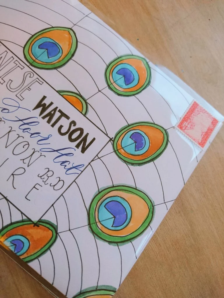
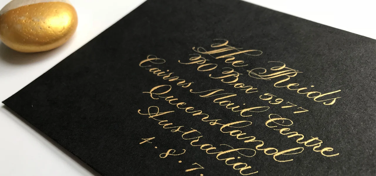
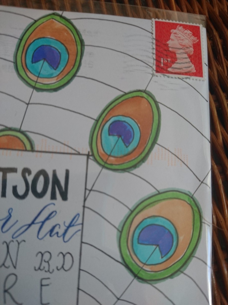
This year, I plan to create a little mail art with my envelopes, inspired by Lindsey over at The Postman's Knock. She mentioned that she sometimes puts her envelopes in a clear plastic envelope to protect the 'art'. Part of me is all about maintaining a certain sense of 'post' — marks and all, but another part of me likes the idea that you can have a higher level of quality control over how your envelope arrives. I have seen some dismal end results. So, being unsure about how I feel, I'm just going to jump in and try it. Lindsey has investigated (successfully via Reddit) how using a clear envelope works for the US postal system, so I wasn't sure how it would go with the UK's Royal Mail. I talked to someone in store, who suggested it wouldn't be a problem, so I decided to send a test envelope to myself (well, my daughter specifically) so I'd know how it all went down. I thought I'd do a final check via Twitter (praise be to social media) because in the US they charge a little extra to manage non-machinable envelopes.
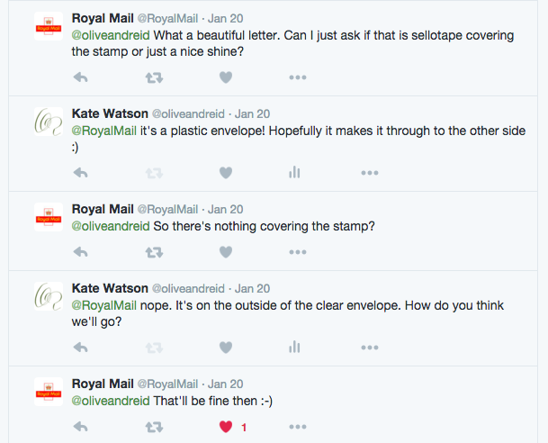
@oliveandreid ...there's no surcharge. — Royal Mail (@RoyalMail) January 18, 2016
The day I posted the test envelope, I also copied @RoyalMail into the fun
Sending #mailart via @RoyalMail in polythene envelope. Testing testing. #snailmail. Love letter to my daughter pic.twitter.com/mxfLRvdWvB — Kate Watson (@oliveandreid) January 19, 2016
And they responded with compliments and further confirmation:
Can mail art survive the postal system?
It sure can. My envelope, sent first class, arrived the next day and perfectly protected by the clear envelope. It didn't cost anything extra to send via Royal Mail. The outside bears all the hallmarks of postage, machine markings and all. I guess you just have to decide whether you want to remove those 'sent' identifiers from your envelope that you may love to see one day in the future.
For reference, I bought my clear envelopes from Ideal Envelopes.

Nib & Ink — A modern calligraphy book
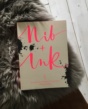


I always love finding out about modern calligraphy books to add to my growing collection of calligraphy reference material. I saw on Lamplighter London's Instagram account that Chiara is publishing a new handbook: Nib & Ink: The New Art of Modern Calligraphy.
I love Chiara's way with romance and whimsy when creating her personal style of calligraphy, so this modern calligraphy book is definitely one I've pre-ordered via Amazon.co.uk. I'll get a review posted for the summer. Who's with me?
A photo posted by Lamplighter • Creative • Type (@lamplighterlondon) on Jan 19, 2016 at 10:50am PST

Add artisitic flair with vintage British postage stamps
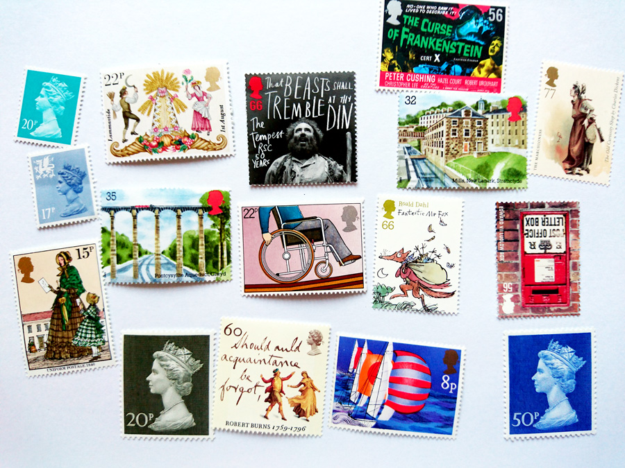
I've been on the hunt for some lovely alternatives to the standard Royal Mail postage stamps for both UK and international post.
Where to buy quirky British postage stamps
I did stumble upon a stamp store in Brighton last year, but I got caught up in an intellectual fracas about the investment potential of stamp collecting and had to hightail my not-coping 8-month-pregnant brain out of there (I managed to buy 10 1st class stamps before I made my exit).
Resuming the search online, I found Philatelink and the Dauwalders of Salisbury (via Collect GB Stamps), which have exactly what I'm after... varied beautiful vintage postage stamps.
Philatelink offers free postage on all purchases, which is brilliant for keeping your per-stamp costs down, and had despatched my order so quick, it arrived the next day. The only surprise was that I ordered specific-value stamps (e.g. 50p to 97p) for their image, but didn't realise that they are a random mix as well. Fair enough, and I'm not bothered, but some people might be, so worth mentioning it.
Alternative stamps for UK postage
Local UK stamps (1st and 2nd class) have been presented in the Machin series, a sculpted profile of the Queen's head, since 1957 and varies only in colour from year to year.
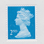
The beauty of vintage British stamps, is not only in a more exciting artistry (no offence, Queenie) than the definitive stamp in use, but also in the value. First-and Second-class stamps are known as non-value indicator (NVI) postage, which means that they don't have a currency value printed on them. This was done to prevent wastage and the need to produce small price value stamps to make up the postage after a price hike. Therefore, these stamps can be used even after the price has gone up, and you can often buy them at a discounted price (just be sure to factor the cost of P&P for your online purchase into the equation).
While I've got local post covered easily with a selection of vintage NVIs, international post isn't so easy. I have heard of Worldwide NVIs, but haven't yet found any that I liked, so I'm getting a mix-and-match bag of various values to make up the postage myself. It could end up taking quite a number of stamps to reach the basic value (£1.33 up to 20g letter), but should be fun creating a visual compliment to the envelope, especially with one that's almost half the size of a C6 envelope! My favourite.
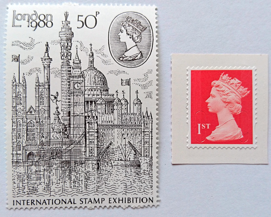
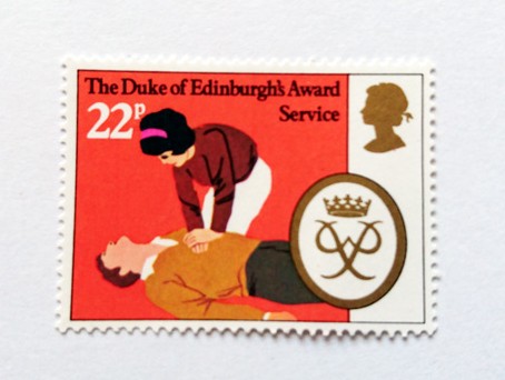
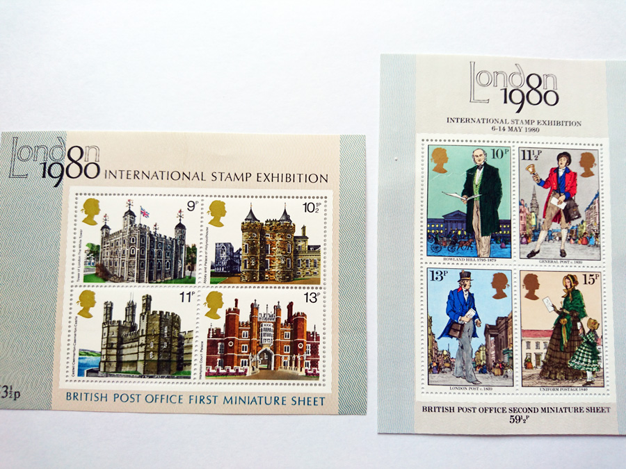
So, all that's left to know is...where do you buy your stamps?
Free download: January envelope template
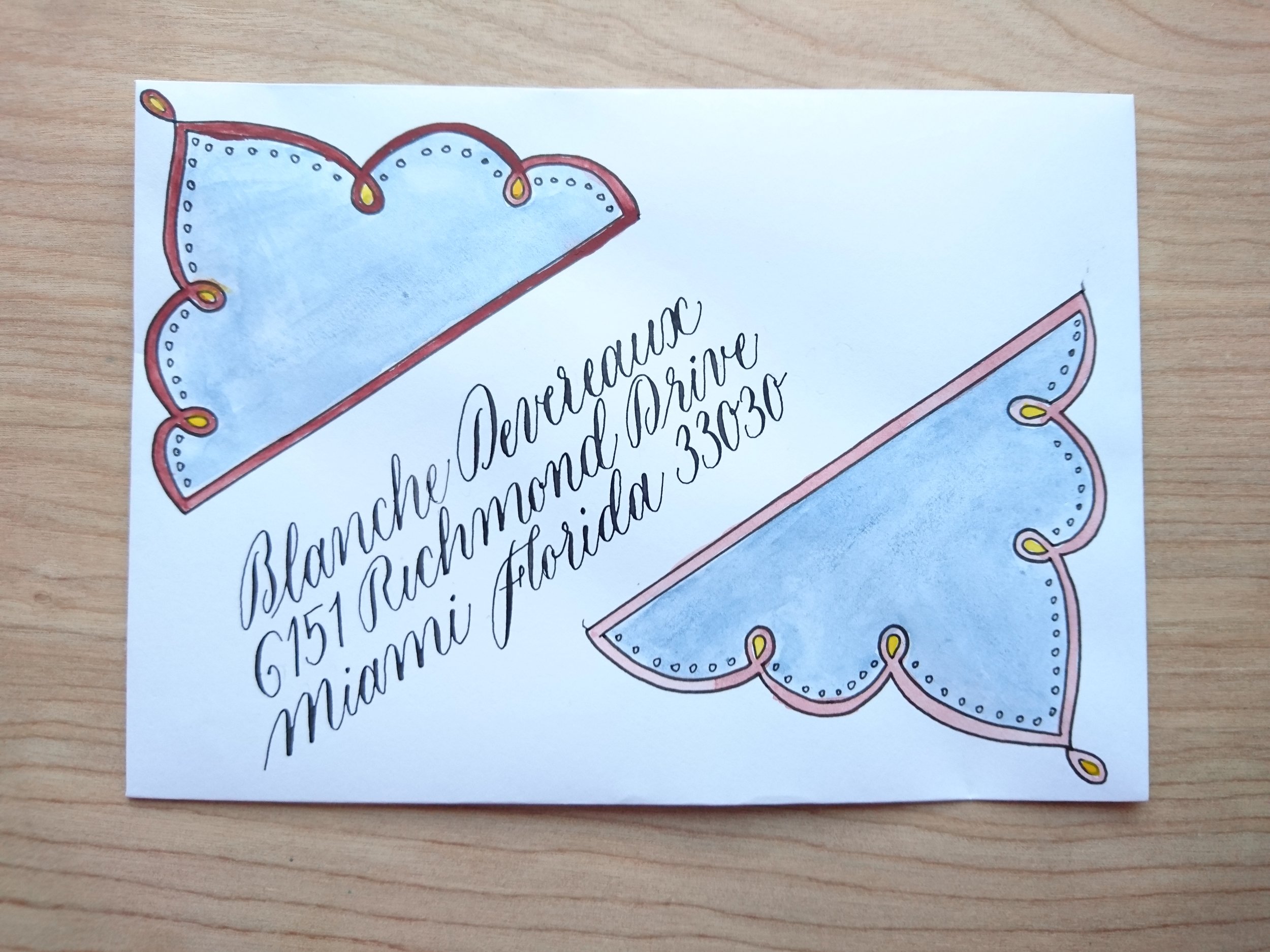
January envelope template
I was just creating an envelope template for my January post (yes, yes; I'm arranging my post by month now!) and thought I would share it with you. You might like some snazzy envelopes, too.
Give your post a lift with this envelope template

Cut out the template and insert into your envelope
Trace over the design (you can use a lightbox, or tape your envelope to a window)
Colour in the design however you like. I'm probably going to stick with watercolour this month, but might give colour pencil a go, too.
Address your envelope using the lines provided, or create your own within the space.
Feel free to share your own with me on Facebook, Twitter, or Instagram (#janenvelopes). I'd love to see what you get up to.
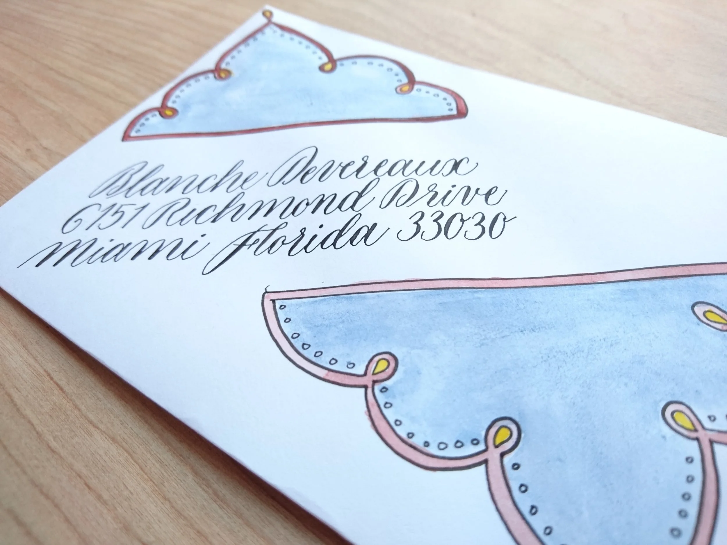
January envelope template
Mellissa and John's Wedding Place Cards
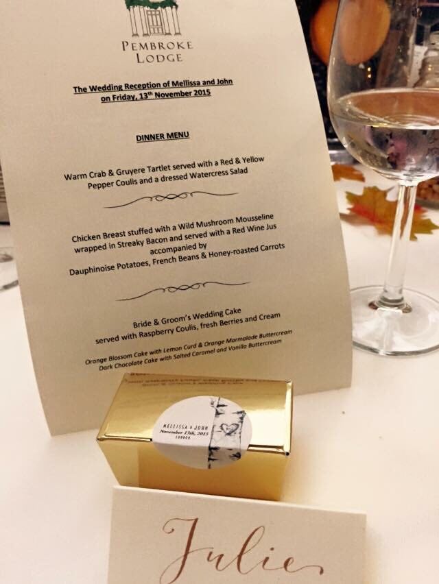 Quite by wonderful coincidence, I met with Mellissa, owner of Hercules Cakehouse. I mentioned my calligraphy work to her, should she need a little something to go along with her delicious favours, and she later got in touch with me to help out with her wedding place cards.
With a simple, yet classy brief of gold ink on ivory to suit the autumnal wedding, Mellissa was wonderful to work with. I gave her two script style options, traditional(ish) copperplate, or a more modern take on it. We went with the latter.
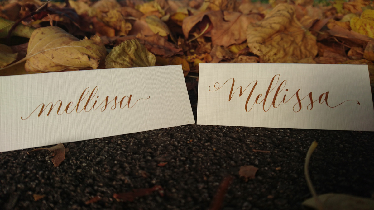
Mellissa provided the linen ivory place cards (Amazon, £6/100), and, while it's always risky working with card stock you've never tried out, her selection was perfect. It also helps that the Finetec metallic watercolour selection I used are so much more forgiving that ink.


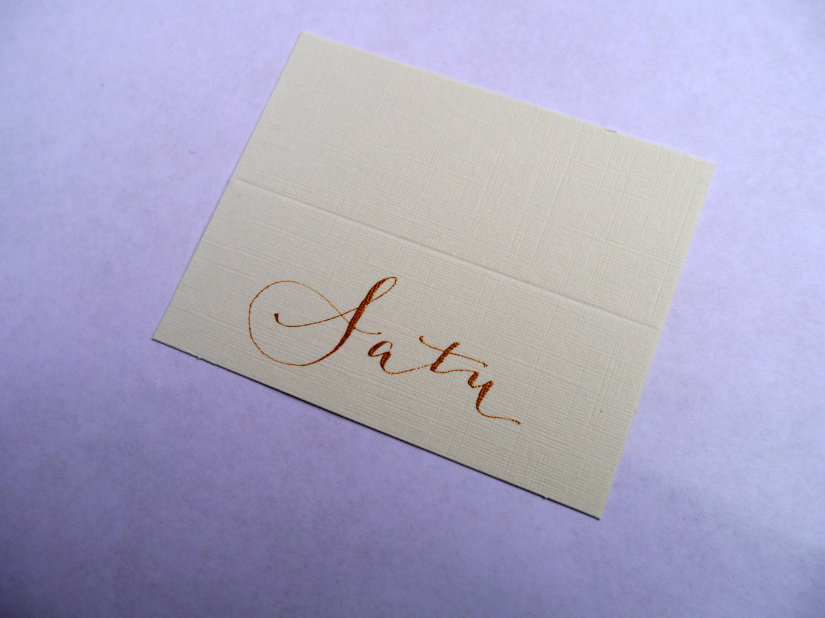
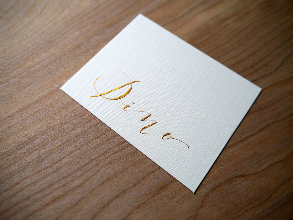
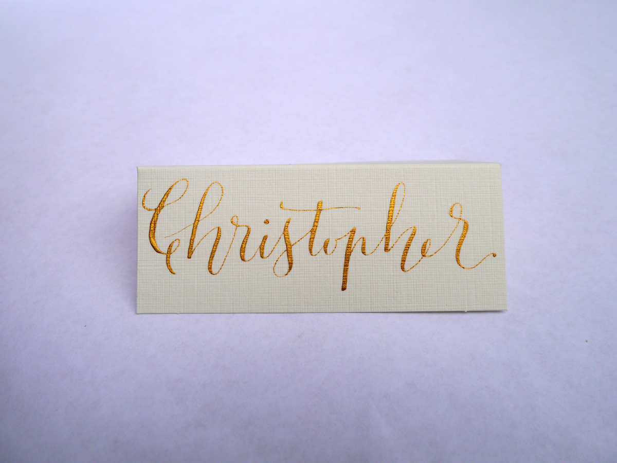
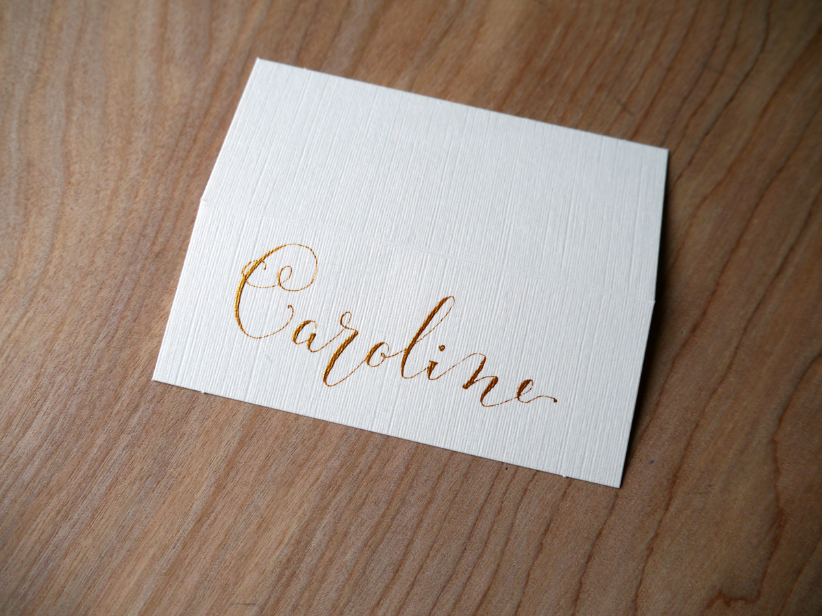
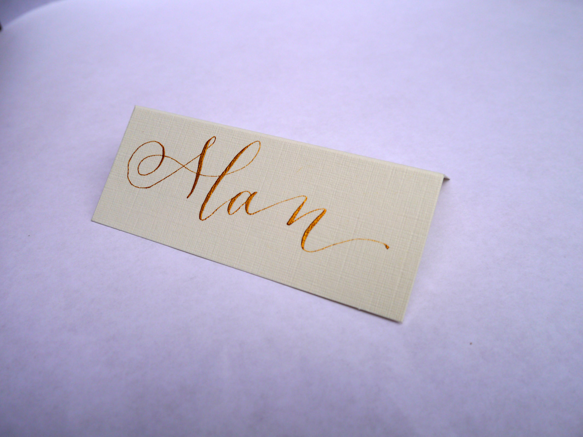
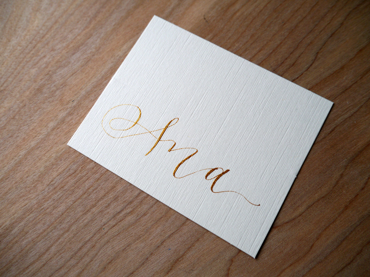
If you're looking for a unique, hand lettered piece of calligraphy, feel free to get in touch and we can chat about what you're after.
Festive calligraphy gift tags
I'm never usually organised enough to make festive gift cards, but, as always, Lindsey at The Postman's Knock sent a shot of inspiration to my inbox with her tutorial DIY Holiday Gift Tags. I had to give it a go.
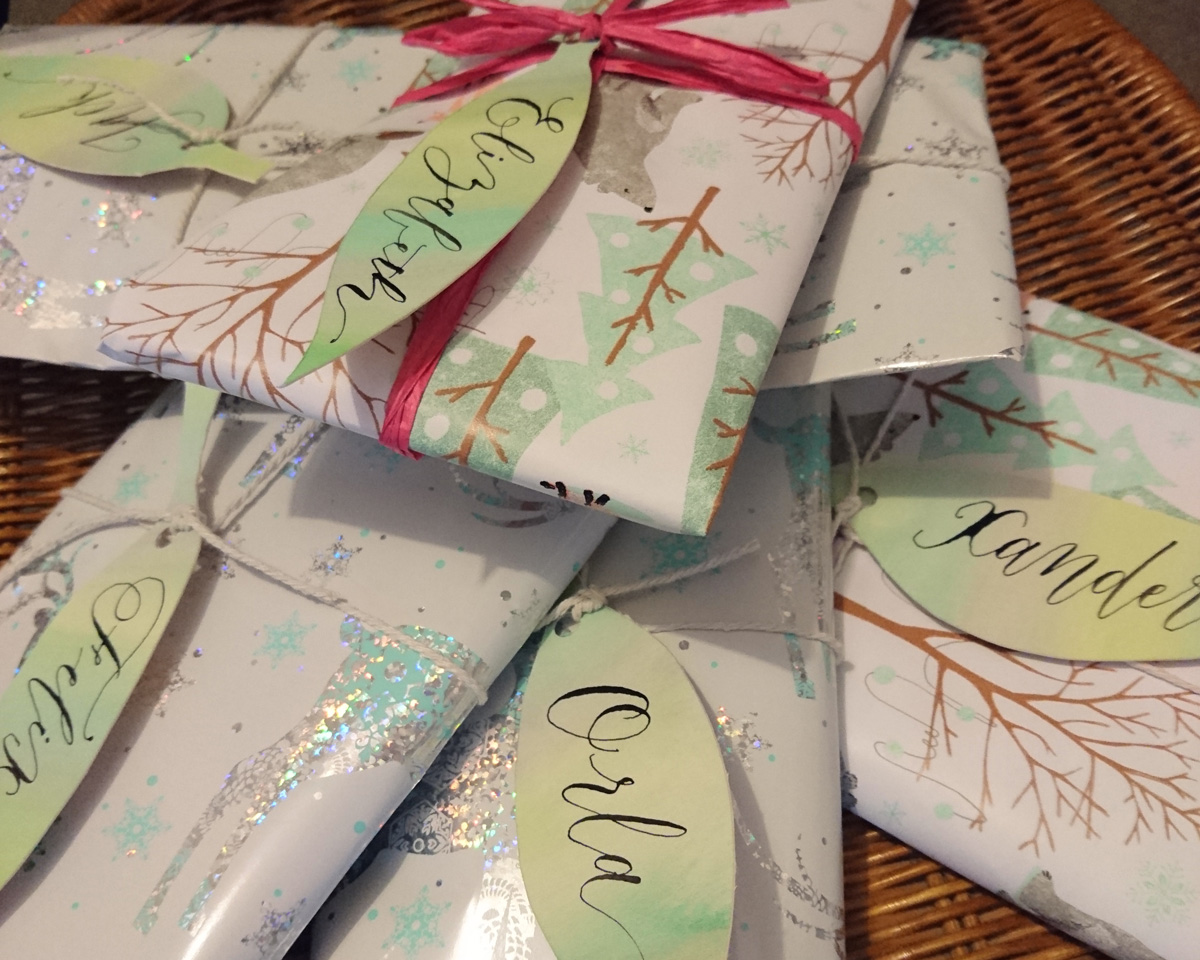
I love how simple these watercolour and calligraphy leaves are to make, but really are a stunning addition to your wrapping.
These calligraphy tags took me about half an hour to make, and I used practice Canford card stock used for a recent quote commission.
I used my Winsor & Newton watercolour set to paint a wash of three hues of green/blue. Once that was dry, I drew my leaf shapes and cut them out with my scalpel. Before I applied my calligraphy ink (Winsor & Newton black calligraphy ink), I did a little test on some excess card to make sure it wouldn't bleed. Then I used an informal modern style to keep the process easy and quick.
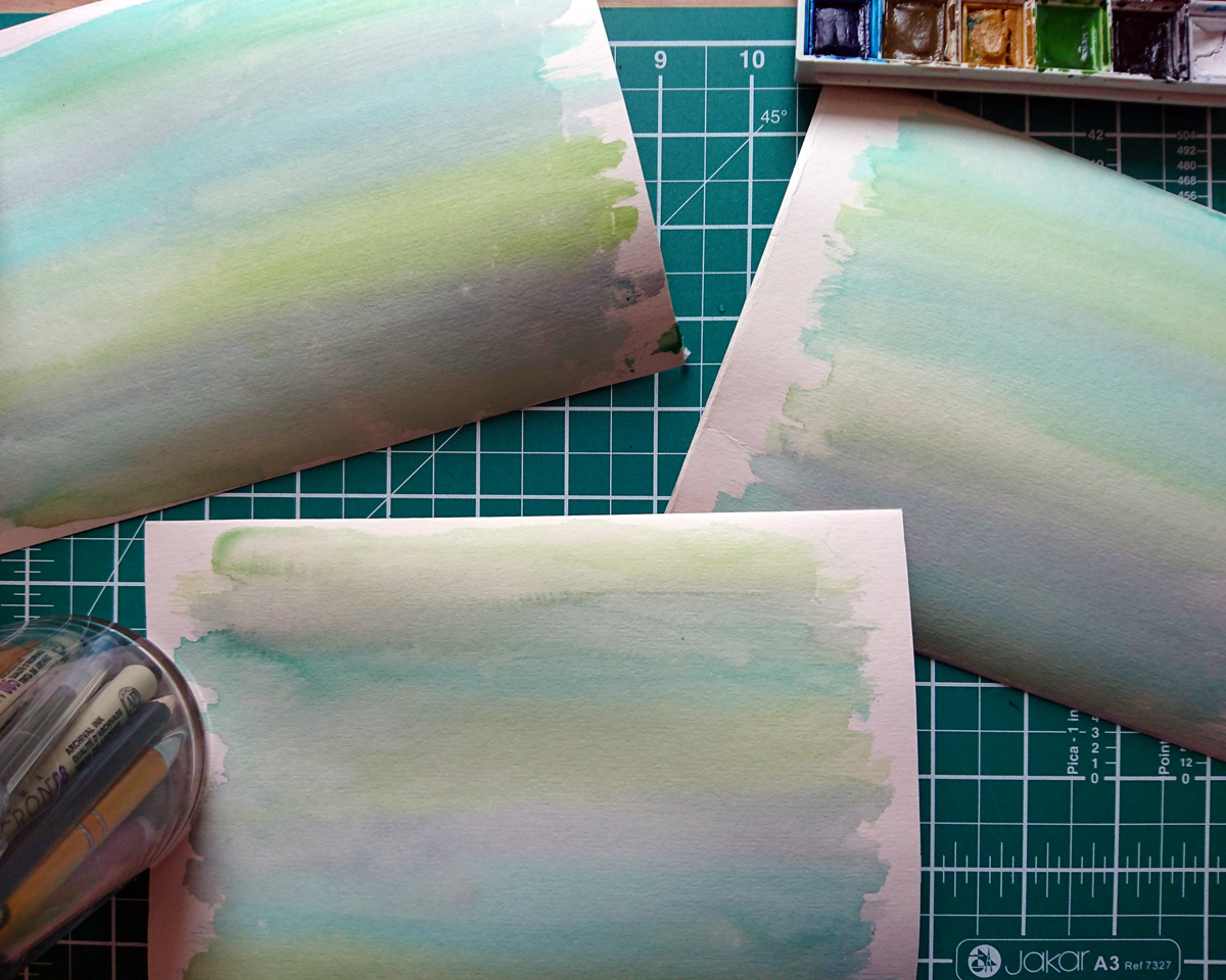

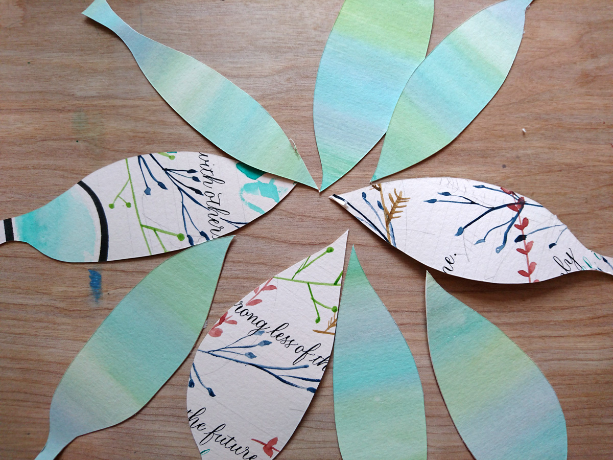
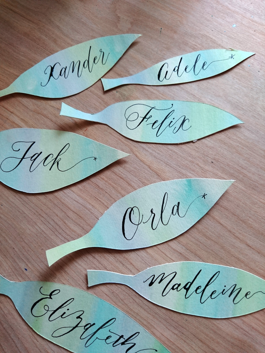
Head over to Lindsey's blog post for a detailed tutorial on how to do this project, and have fun!
Easy Copperplate guidelines with Joy Daniels
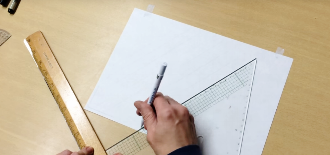
If the thought of ruling your Copperplate guidelines leaves you frustrated and thinking that you may never create that wonderfully consistent calligraphy composition, then today is your lucky day. While it's fantastic that calligraphy skills can be honed online and through books, there's something to be said for meeting face to face with other calligraphers to help you out with problem areas. As soon as I saw Northampton calligrapher, Joy Daniels, swiftly rule her guidelines in a recent Copperplate Capitals workshop through the South London Lettering Association, I knew it was going to be a powerful tool in my belt. Ruling calligraphy guidelines has just not been something I could get my head around. I could practice with pre-drawn guidelines under thin paper, but when it comes to working on a final piece, it's baffled me (I don't yet own a lightbox).
Go forth and rule your copperplate guidelines!
Joy has been kind enough to take the time to create a short video outlining the process. I hope it helps you as much as it has helped me.
About Joy Daniels
You can find out more about Joy and her Northampton Calligraphy Studio via her website and Facebook page. You can email her at joydaniels@ntlworld.com.
Joy also runs the Copperplate Special Interest Group. When you join, you receive a quarterly newsletter of calligraphic happenings, and can become part of the group's envelope exchange. Get in touch with Joy to become a member.
Share your calligraphy tips
If you've got a great calligraphy tip that you'd love to share and have featured on the blog, please get in touch — either in the comments below, or via email. I'd love to hear from you.
Watercolour calligraphy and botanical wreath
Forget adult colouring books; get over to The Postman's Knock and learn some easy watercolour and calligraphy skills to DIY art therapy the heck out of yourself. I recently spotted Lindsey's botanical watercolour wreath tutorial and had to give it a try. I'm using it to surround quotes for some newborn babies, and also to send a message of affirmation to my friend Beck, who is head deep in her university degree at the moment.
Here's how my wreath turned out on a watercolour postcard (I made a little video so you can see it come together). I don't even know if 'studier' is a word meaning 'someone who studies', but it is now! The best part about this process for me was realising a better technique for holding my paint brush (for some reason I have been wielding it like a wand rather than controlling it like a pencil...I think I was scared of the brush, so I was keeping my hands as far from the business end as possible).
Here's one of the watercolour calligraphy quotes for the newborn babe. I didn't really like the colour scheme (it was all I had in my diddy little travel watercolour set), so I headed to my local art store and grabbed a couple of other colours to work with (and what I used in the video for Beck's).

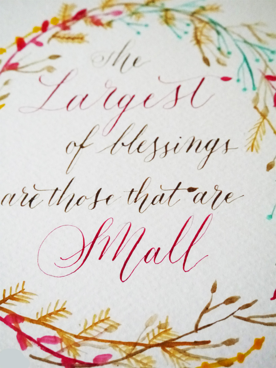
Lindsey has given me lots of ideas of where I could use these lovely motifs, so looking forward to plastering the world in tiny watercolour flora.

A look at lettering artist Joan Quirós
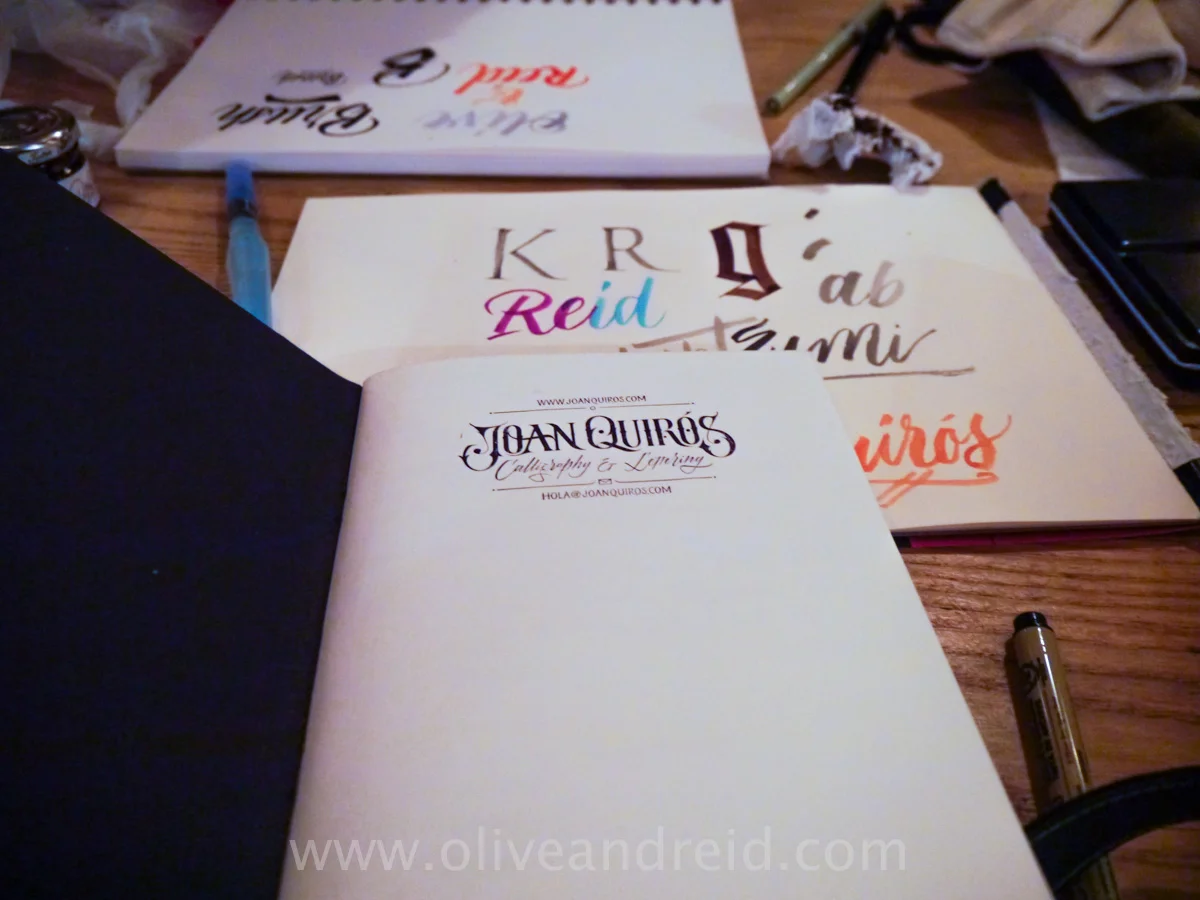
Meeting at The Book Club near Old St, I am ready to talk and do some serious lettering and calligraphy with Joan Quiros. We’d chatted many months ago via email when I first started looking into promoting the work of UK-based artists. Here we are, finally getting together in person, kind of accidentally in the midst of a sign painting exhibition, no less.
We settle in at the end of a long, shared cafeteria-style table at The Book Club, just entering its evening phase shift from workspace to after-work drinks space, with a cold drink each and an excited rattle (well, my excited rattle: Joan is much more relaxed about the whole thing than me) of our calligraphy-equipment satchels.
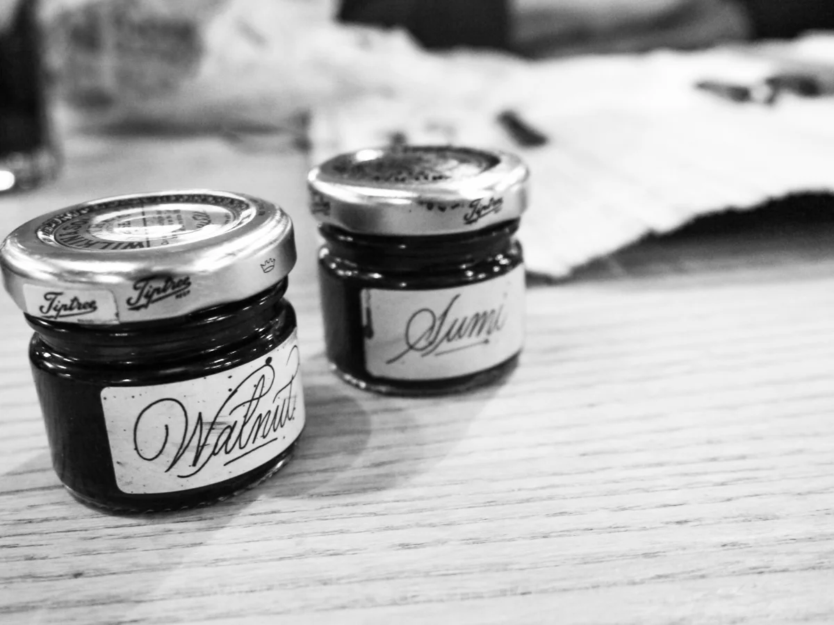
We talk for the best part of an hour about Joan — his work and inspiration — before moving into a more practical mode of him showing me his calligraphy gear and styling. The lights progressively dim to set the mood for the usual evening guests, but we plough on through trying out the assorted nibs and brush pens that he has to hand. He shows me his hand made sumi and walnut inks, stored in gorgeous little jam jars, and I’m in awe. “Make your own ink?” What a brilliant idea. For Joan, it’s part of his ritual:
"When I start the day, or when I start a practice session, I make my own ink and try to meditate. One of my calligraphy teachers in Spain was doing this, and I find it special because you’re writing with your own ink — this thing you have done with your own hands — okay, it’s not made with your hands from scratch, but you are deciding and creating how intense it is."
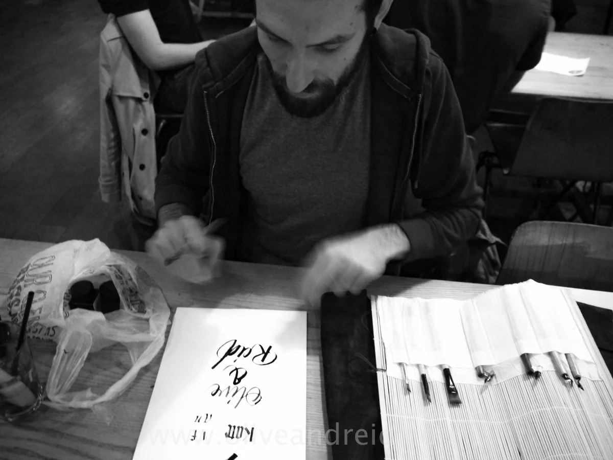
I would describe Joan’s style as organic, and, learning of this more raw and stripped back approach, I see now why. After years working as a graphic designer, Joan longed to be more tactile with his creativity — to step away from the computer screen and use his hands, taking it back to his graffiti roots in Spain where he could first stretch his creativity and connect socially with other artists. As he puts those hands to work showing me the paper and tools he uses, with graceful long fingers and a stayed patience, I watch and understand exactly how much effort goes into perfecting these techniques.
"All the stuff that I post takes me many more times than one go to get it right. It took me three, five, 10 times to make that piece. I try to push myself to the next level. It could be done better; let’s do it better. I encourage people to only upload their best. That’s your work. It’s who you are. Sometimes when people ask me for advice, I tell them 'publish only your best work', and 'be careful where you are taking your references from'.
"Recently, Oriol Miro told me the best thing you can do is to study and copy manuscripts. These are the roots, and you have to study them to improve; to look at how the ancients were doing it. I love doing this. I see a lot of people taking their references from the internet, and a lot of people doing the same things. They start breaking the rules, but they are breaking rules that they don’t know. And to break the rules, you have to know all the rules very well.
“Take Luca Barcellona, for example. You can see those roots from his work. He has studied calligraphy first — all the structures, and now he is developing his own style. He didn’t start with expressive calligraphy. He started studying calligraphy: the most academic form, and then developed his own style.”
Joan also appreciates the work of British lettering artist, Ged Palmer and US calligrapher John Stevens.
Joan acknowledges he is lucky to have outstanding teaching influences who, with their purist approach to lettering, have given him a solid foundation and continued critical eye upon which to build his own style. He credits Ivan Castro, his first teacher, Oriol Miro, and Keith and Amanda Adams for finding his groove to continue learning, when he originally threw it in.
"When I started calligraphy, I started on my own, but I got frustrated the first time. It was very chaotic because I was just attempting individual letters — an ‘a’ or an ‘o’ — and I didn’t see any progress.
"I started classes, and my teachers have taught me that you have to be disciplined; you have to be a little bit purist. I think it’s important to have that teacher figure.
"You can learn on your own; you can be self taught, but I think you need someone in your life who tells you, ‘that’s okay; that’s not okay — you’re doing it wrong’. I’m pretty lucky that two of my teachers watch what I upload and give critical feedback telling me when I can do it better."
Joan Quiros’ lettering tools of choice
Joan brought with him three rolls full of calligraphy and lettering implements, and selection of his favourite papers to show me. I’ve included some links, but you can also do some research to source the best supplier for you. Before we launch into that, check out Joan in action in his very awesome logo video.
Paper
- Greyboard cover cartridge paper (110 gsm) from Atlantis Art Materials
- Daler & Rowney Sketching paper (95 gsm) from Jackson’s Art Supplies
- Daler & Rowney 20pp A5 sketch (160 gsm)from Cornelissen & Son
Nibs and pens
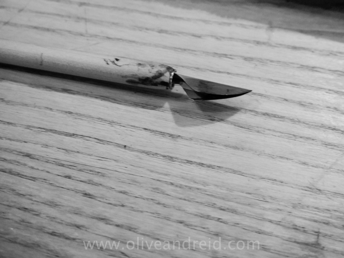
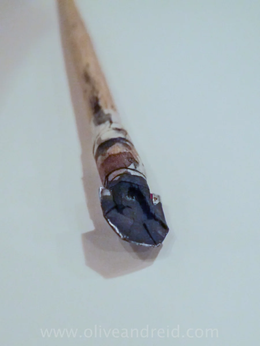
- DIY Cola pen (made from coke can) - works best on watercolour
- Baionette Baignol & Farjon
- Blanzy Poure Zig Zag
- Gillot 907 (one of Joan’s faves: so fine and flexible)
- Zebra G
- Brause Bandzug - makes you hold it right for gothic and italic 45 degree angle (max 5mm and min ½ min)
- William Mitchell Round Hand Square Cut (for Gothic and Italics — more flexible)
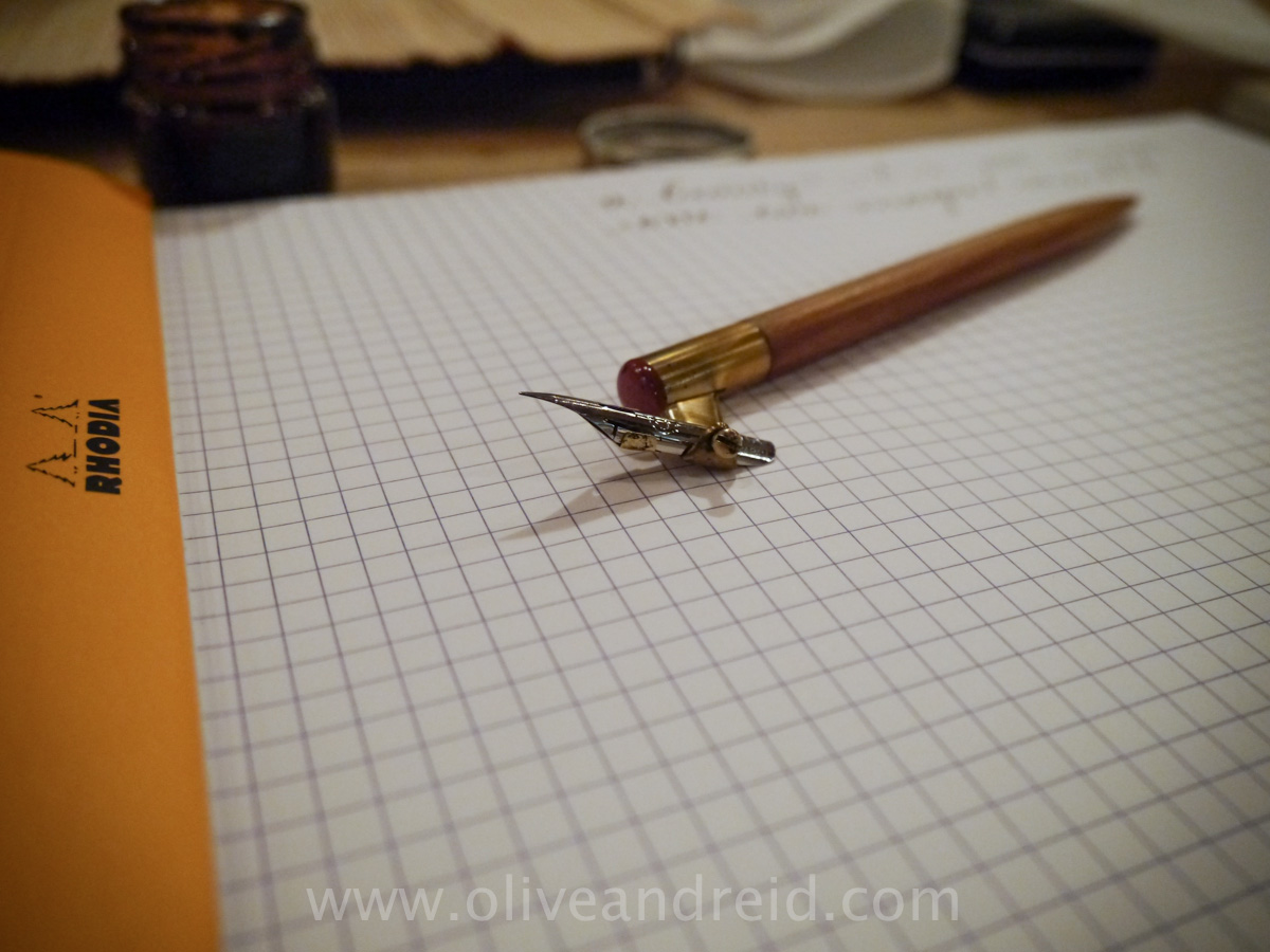
- Ruling Pen
- Folded pen
- Carpenter’s pencil (great for sketching Roman. Sharpen with a blade and sand paper).
- Automatic pen (for gothic and italic) although Joan doesn’t like as much. Same system as the Pilot Parallel Pen
Ink
- Joan buys his walnut crystals (Van Dyke crystals) from Cornellisen’s and mixes with ironing water.
- Ecoline ink (great saturated colour) from Paint Works on Kingsland St
Bushes and brush pens
- Daler Rowney — short flat ½” and ¼”
- Da Vinci 6 374
- Speedball steel brush from Scribblers
- Kuratake flat brush
- Pentel aqua brush
- Pentel pocket brush (carries easily with separate cartridges)
- Kuratake Waterbrush – 2 Way – Flat head (great for small font: more control/rubber nib)
- Muji brush pen (shorter tip and can do smaller things)
- Tombow Fudenosuke Brush Pen from Jetpens